Creating military hats for black and white mangas!
Hello! I am Ero ★ Pinku and I would like to show you an easy way for beginners to create military hats thanks to CSP tools and materials!
★ 1. GENERAL BASE.
Let’s start creating a general base to work with.
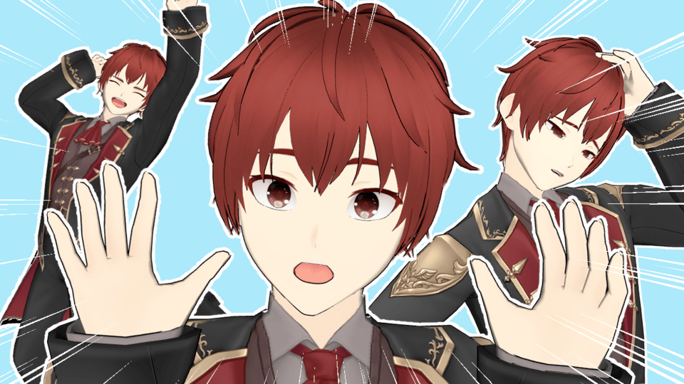
Choose a 3D model (in my case, I’ll choose a boy) from the 3D menu on the material window and drag it directly into the canvas. You don’t need to do it if you can create poses by yourself, but for beginners this is a very useful tool!
We can move the camera (you can adjust the perspective with the mouse wheel), the character, choose the genre of the model, download poses from ASSETS, etc. To make this tutorial easier and clear, I will use a standard pose, nothing dynamic or complicated.
Hats can be difficult for some people! But CSP and its generous users have a lot of 3D models that can help us with that even if you don’t find exactly the hat you really need to draw. The idea is to create a base for any military hat to start working in. I will recommend you this free one:
The good thing of this software is that you can use 3D model from outside too. This one is a *.obj file, so even if you don’t download it directly on the software, you only need to choose the file from the folder where you downloaded it and drag it to the canvas; It’s very easy!
Now, we should think about which is the right place to put the hat on the heart. Maybe this sketch can help you:
Now that we have our 3D base complete, we can start looking for references to determine which military hat we want to draw~
★ 2. SKETCH.
After we have done our research, we can start doing sketches with our designs (You can be creative!! But looking at the original/real ones will help you create personal designs keeping the military essence, for example mixing the typical components). With the 3D base only as reference for perspective and volume, we can decide if we want to do our hat with more height, with stiffer or softer material that falls from the sides, etc.
I create these 3 hats as samples based on real military hats.
As you can see, even if we are not tracing the 3D base hat, it helps a lot with perspective and it is easier to draw the shapes we want without losing proportions.
★ 3. DETAILS.
In the sketches, I didn’t draw any difficult detailed part but some hats have more complicated designs than others (like ribbons, buttons, stars, crosses…) and they are important for the aesthetics. If I add them to the third sketch, for sample, look how much it changes!
If we are going to work on a whole manga story, we will draw a lot of pages, and it means… a lot of hats! So it is useful to find brushes for those details, or create them if they are personal designs. In this software, you can find a few brushes very useful for this kind of hat, for example:
https://assets.clip-studio.com/en-us/detail?id=1695982
https://assets.clip-studio.com/en-us/detail?id=1698621
https://assets.clip-studio.com/en-us/detail?id=1603780
https://assets.clip-studio.com/en-us/detail?id=1740941
https://assets.clip-studio.com/en-us/detail?id=1727502
If you prefer to create yours, you can visit my other tutorial:
In that section, I explain how to create a brush so you only need to follow the same steps but designing what you need (buttons, laces…)
★ 4. TEXTURES/SCREENTONES.
Now, the last part is choosing the texture of our hat. Since it will be for a black and white manga, it is really cool that we can show it even without colors! In black and white mangas, we do it by using screentones and solid black/white areas.
We should know which parts are rigid and which ones are softer, because the way to do the shadows and highlights will be different for each one. Let’s see how to do it on one of my hats!
The upper part of this hat is fabric so it will be softer than the lower part, which is very rigid. For that soft part, I’ll use screentones, and I will just fill the rigid part with black, to make it shine when I do the highlights.
I set the lineart layer as "reference" and I create a layer under it for "the color". On that new layer, I select the rigid area with the <magic wand tool> and fill it with black. Then, I decide where the light comes from and I “draw” a clean highlight with transparent color, because the surface is clean and smooth and the light has no obstacles.
For the middle part, since it's rigid too, I'll do the same but I'll chose to use a "tone brush" to do the shine, just to make it different since you can choose a lot of ways to color the highlight depending of your manga style.
Now, I select the upper part and drag in a dot screentone on it from the <material> window. I will change the opacity and lineature on the <Layers properties> window until I like how it looks.
Next, I will select the area for the shadows with the <lace tool selection>, in a very rough way, and I will copy/paste to create new layer with the same screentone but only where I want the shadows. I will change the opacity on the <Layers properties> window to make it darker.
I will use the same tone brush I used before to delete the borders of the tone, making it look softer, like fabric.
You can add highlights to the fabric but I prefer not doing it since the material is very opaque, and it will contrast against the rigid part. For this sample, I will add it with little shiny details like sparkles or dots to make it looks cooler and… That’s all!
Now, you can be as creative as you want. I hope it was helpful!
If you have any question, you can write me on twitter or instagram and I will try to help you!
★ ABOUT THE ARTIST.
I'm Ero ★ Pinku, a mangaka and illustrator who has worked on videogames, novel covers, how to draw manga books, official event posters, mangas, etc.
Feel free to follow me on any of my social media~!
★ Instagram: https://www.instagram.com/ero_pinku/
★ Twitter: https://www.twitter.com/Ero_Pinku


Comment