
Hello! I am Ero ★ Pinku and in this tutorial I am going to tell you how I design, in ink and paint brushes when I work in black and white with a simple illustration ~
★ A. SKETCH.
1) Concepts of the character.
Although I want to get fully involved in drawing, I clearly define the theoretical concepts that surround my character, the characteristics that I have clear: Demon, manipulator, human appearance, seductive, attractive, dominant, dark.
★ Advice! ★: Less is more! Try not to make phrases, if you manage to synthesize your character in few concepts, it will be easier to capture it in the drawing.
2) Tools.
What I use for this sketch phase is:
♪ ※ Brush: A basic brush of the program: Maru pen. Although for the sketch it is not so necessary (because it will not be seen in the final drawing), the tip I use is hard (no softness) because the sleeves are black and white, and thus avoid the blurred edges (gray).
It responds very well to pressure and the variations of its thickness help to intensify shadows and lights grosso modo.

♪ ※ Canvas: I will work on a canvas of approximately 30x30 cm, at 350 ppi. I could work in a smaller format and enlarge it before inking, but I try to use the actual size from the beginning, because I am usually forgotten to change it;
♪ ※ Layer: I use Rasterized Layers. The layers of vectors have a lot of advantages, but I usually make sketches "with spots" more than with lines, so I feel more comfortable with the rasterized ones. They do not have any icon that distinguishes them (unlike vector layers or 3D layers).
♪ ※ Color: I like to use blue and then do the black ink on top, because it is more comfortable for the eyes. If you prefer to work in black and change the color when finishing (to ink on top), you can use the [Change color of drawing line] in the [Edit] menu. With a simple click, our drawing will change to the color that we have selected at that moment.

3) Sketching!
1) With a loose hand and without worrying about the details, we create "figures" and "forms" until we find an attractive one to develop. The idea is to try poses, angles ... until you find one that fits the personality of the character we make.
★ Advice! ★: If you have problems at this point, CSP has a very useful tool: 3D! It will help you with the structure, perspective or pose if necessary, since we can move the camera and the character as we wish. You just have to choose the model (boy or girl) or even, we can download poses from the ASSETS, where other artists share their creations.
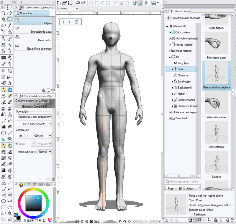
2) Once we give the right angle, we make a fit of the base character, to define the proportions we want it to have (the big head, broad shoulders, little neck ... It's like applying our style ^ - ^). We can lower the opacity of the 3D layer and make the lace in a higher layer, or just use it as a reference, as a model.
★ Advice! ★: Celsys has a very interesting program, the MODELER, with which you can work on 3D, both objects and people. If you often use 3D, you can also use the Modeler to work your own characters. In this tutorial I will not go into detail, but the world of 3D is huge!
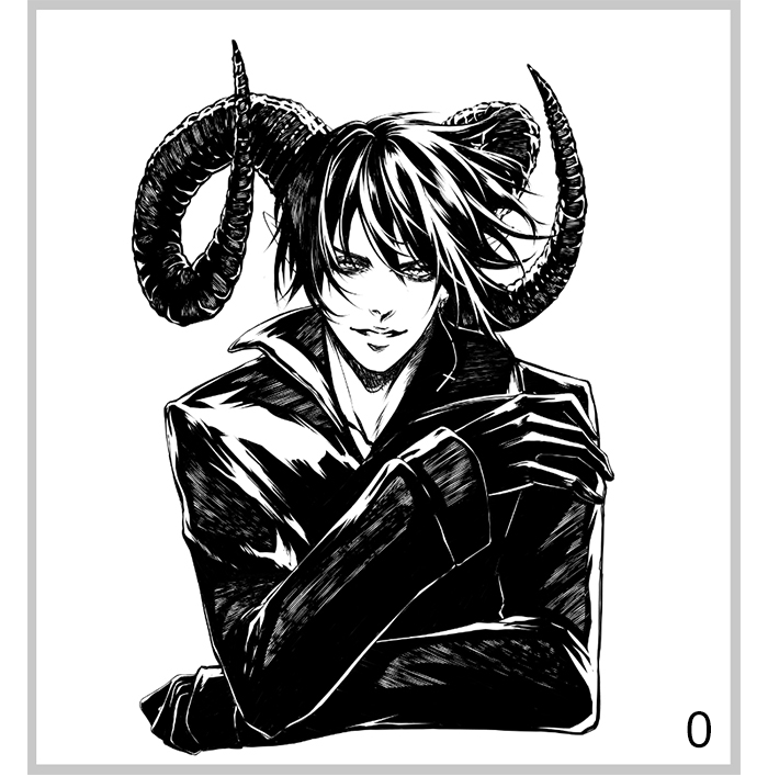
3) First I do what would be the human basis of my character, and then I begin to define characteristics that make it what I could be looking for. In my case, things that help make it look like a demon: ears on beak, horns, wings ... It's time to customize those characteristics until we are satisfied with our character. Do not be afraid to add and discard things!
When I got to the wings I realized that it was too fantastic for what I needed laughs , so I've discarded them. This is how it is going to stay!
★ Advice! ★: Take advantage of the program's tools such as the HORIZONTAL and VERTICAL DOWN buttons (A), to check if the proportions are correct; those of GIRO to not force the doll drawing (B); the QUICK ACCESS menu (C) to define the options that you use most, or customize the SHORTCUT ADJUSTMENTS, KEYS, etc. (D) with keyboard codes, you will save a lot of time! That's what I did with the option to change the line color ^ - ^.
4) If you only share sketches or leave them in plain sight in the final drawing, you may be interested in the great variety of "pencil" type brushes that can be found in the CSP ASSETS, with which we can make the sketches look very beautiful and artistic. I have some favorites:
★ B. ENTINTADO.
Some artists prefer to make a second, cleaner sketch before inking, defining lines, but I work inking directly on this type of sketches with spots, maybe because my inking is a little "dirty". If for any reason we wish to leave the sketch layer in view in the final illustration, I recommend doing the second sketch, but using vector layers, in order to modify the line as I will explain later.
♪ ※ CAPA: Use Vector Layers (A). You will differentiate them because they have a small icon, different to that of the 3D Layers (C), that did not appear is the Rasterized Layers (B). Only in case you need to fill in the Fill Cube, I will use Rasterized Layers, since it can not be used in the others.
To ink !: I reduce the opacity of the sketch layer to 20% and I begin to define the drawing with the same brush I used on it (Maru Pen), but this time in black, in a layer of vectors.
1) Inking of the face and body.
I usually start with the face, but when the hair covers part of the face, I like to indent the part that touches it a bit, because it acts as an "everything". As it is a black hair, I have decided to make the base and then, when I apply the lights, to shape it. If it were light hair, I would line it like the rest of the body. At this point, sometimes, I change the sketch a bit, which does not have to be definitive.
My line, when inking the body, is quite clean ... but you will see that it is only because when I put the black filling, it will all become too dirty and I have to set limits or it will get out of hand laughs . Now I just want to define the outline well, and then I can break it (with practice, I ended up breaking it from the beginning, but I preferred to explain it that way because it is easier to understand, as I will do with the next step). In the areas where I want to have depth, I make the line a little thicker. For example: the meeting of the clavicle with the fabric of the jacket or the jaw with the neck. With this it is achieved that the inking seems more organic.
2) Black fill.
I try to maintain the balance of full and empty, but since it is a demon, I think that if the darkness predominates a bit, it will have a better aesthetic result. I do it in a vector layer because I no longer use the cube to fill, I directly draw the black and the light since my inking style is very "scratched", besides, I will be able to take advantage of the qualities of the vector layers also in the blacks
Yes, I know that it seems a very abrupt change from one step to another; but the truth is that with practice, it really is that way. Therefore, I will explain how I did it before getting used to it, because maybe you could find it useful how you could separate the mental process:
• 2.1. In a rasterized layer, in order to use the fill cube, we fill the blacks of the drawing with the flat color.
• 2.2. Now, we lower the opacity of the black layer to 60%, to be able to see the lineart, and we delete the parts where we think there should be areas with more light (I am in favor of forcing one or the other if we think it will help the drawing, but try to make it as real and natural as possible). We take this opportunity to erase some strategic lines so that blacks do not mix in areas that have almost no light and may end up not being defined (for example, the fingers on the jacket).
• 2.3. And now, depending on the amount of light in each area, we work the striped as if it were a manual screen, offering from a soft shine to pure white, which would be light.
3) The hair.
It's the part I like the most> w <, because it seems very simple to me. I only erase the shine of the hair, using the Maru pen of always, taking into account the hair's birth and the direction of light that I want in the drawing, so that it is in agreement with the rest.
It's the part I like the most> w <, because it seems very simple to me. I only erase the shine of the hair, using the Maru pen of always, taking into account the hair's birth and the direction of light that I want in the drawing, so that it is in agreement with the rest.
★ C. VECTOR COATS.
♪ ※ Resized: They allow us to resize the line as much as we want, without losing quality or pixeling. For example, if I had made the small sketch and forgot to enlarge it when inking ... I could enlarge the inked drawing without losing quality!
※ ※ Change line thickness: As I mentioned, some parts of the lineart have a slightly thicker line, especially in interactions and shaded areas. This gives personality to the line and depth to the drawing. If it does not come out naturally, with this option you can make the thickest, finest line, of a certain thickness ... in the parts that interest you. It can be used in Rasterized Layers, but for the pixels, it is cleaner in the Vector Layers.
※ ※ Movement of lines. If we have inked a drawing and notice that some line is a little deformed or out of place, this option will allow us to move the line to correct it. Of the three options that the program allows (deciding which points on the line to anchor or leave free), the one that I most often use is the option that leaves the two ends anchored, because my biggest problem is that sometimes I do not do the curves well, so it allows me to adjust some other incorrect line.
♪ ※ Change the shape of the line. This is my favorite option! It not only serves for inking, but also for the design of frames, backgrounds, vignettes, etc. For example, if we want to add a square in the background, with this option we can choose if instead of being a continuous straight line it is a dotted line or whatever we want. We just have to choose another [Brush shape] in the [Tool properties] window, in the [Object] menu.
As you can see, the list of brushes that you get to choose from is not very long, but we can register the ones we want in just three steps. Let's see how:
1. We select the brush that we want to register from our list of brushes.
2. Open the configuration of the brush, with the button of the wrench.
3. Now in the [Sub-Tool Detail] window, go to the [Brush Shape] tab and click [Register in Preset]. We will see how it has been added to the list and now it will appear in the menu to change the shape of the brush in the vector layers.
This means that if we have inked our drawing and we are not convinced by the brush we have used, we do not have to inject it again! Let's see some examples:
The bad thing is that I can do this because I do not need to do the steps to fill in black, erase light, etc. As I mentioned, I draw directly on a layer of vectors the inking as you see it. If I still had to do all the steps, I would use rasterized layers and I would not have the characteristics of the vector layers.
★ D. BRUSHES.
Speaking of brushes ... do we take advantage and see how to create them?
When we make a manga and we know that we are going to repeat certain things for 100 or 200 pages, the brushes can save us a lot of time, but they are also useful to create effects, such as the splashes that I usually add to my drawings. Let's do one of those, simple, as an example:
• 1. We create a canvas with good resolution, very large (I used an A3 at 600 dpi).
• 2. Draw in groups, what will be the tips of the sprinkling. We will do several so that the brush does not look repetitive, this will make it look more traditional and less mechanical.
• 3. We select one of the groups and go to the [Edit] menu, where we will choose [Subject record] and choose [Image].
• 4. We name the material, mark the [Use as a brush tip shape] box and put a label on it so we can find it easily when we look for the tip.
• 5. Repeat this process with each group of dots (each tip), getting in my case 8 tips of brush in total.
• 6. Now, we choose a brush that we already have, that "works" in the same way that we want to create (as "spray") and duplicate it (actually, it's to save time). I changed the name to Splash.
• 7. Open the configuration of that brush by clicking on the wrench icon. The [Sub-Tool Detail] window will open and we will go to the [Brush Tip] tab, where we will modify its tips, deleting the originals that you have and adding ours, which we have just created.
To find your points, you only need to write the label that you put on it, and you will only be able to leave them ^ - ^.
The brush is finished! Now we apply it to the illustration and it will give it a subtle touch.
As I will not deal with the patterns, I will only apply a flat gray, I will retouch the edges of the inking slightly, to break the line a bit more ... and finished!
I hope you have been helpful! You can find me on my social networks if you want to see more works in black and white or the small videos / gifs that I upload with tips and tricks ~ See you soon!
Users who liked this post


Comment