
Presentation
Hello! Welcome! On this occasion we will learn some concepts for creating movie posters. We will also talk about typography, since, with good typography, we can convey a clear and coherent message with the general style of the poster. I hope that these tips will help you turn your illustrations into beautiful movie posters.
Without further ado… Let’s get started!!
1. File Configuration
Let's start by learning about some formats that we can use for our poster and how to create the format in CLIP STUDIO PAINT.
- DIMENSIONS -
Movie posters usually have a vertical style as a general rule. In this sense, the paper size A is followed. Among these formats we have:
• A1: The size of this type of poster is usually 594 x 841 mm.
• A0: A versatile size for this type of purposes. Its measurements are: 841 x 1189 mm.
- FILE SETUP -
If the files are going to be printed, there are certain technical aspects to consider, such as the color profile, dimensions, margins, etc. We will not focus on this at this time, but if you want to know more about it, I recommend visiting printing tutorials that you will find in the CLIP STUDIO TIPS community.
For posters, I recommend using a bleed. For this, we will use the Comic format (the third in: Type of work).
Note: The bleed width is a space that will be cut off at the printing press, but to avoid errors, extend the design to this part. You should avoid placing important elements near the bleed area.
In Presets we can find default formats, in this case A4.
We can configure the margin size in the size session, and at the end we have the option to set a custom one.
Finally, we have three important options.
➀ The bleed width can be changed between 3 and 5 mm, this will depend on the standards of the printing company.
➁ Regarding resolution, we have that files with more than 300 dpi are ideal for printing and 72 for digital files.
➂ With expression color we have two: Color and monochrome. One allows the use of colors and the other does not.
2. Composition
Movie posters have the function of capturing the viewer's attention by communicating the tone and essence of the film. They must captivate and awaken the desire to want to attend the screening. This type of poster must follow two important communication principles:
• Make reference to the plot of the film.
• Transmit the feelings it arouses or the environment in which the story takes place.
Here we have two ideas, the first (left) seeks to transmit terror in an ancient era, while the second focuses on a modern era.
(A) The text
Typically, posters contain: Title, main actors, director, and the date it will be released. Some others have reviews and company logos or awards won.
- HIERARCHY -
It is used to direct the viewer's gaze, the path goes from the most striking to the least striking, showing the viewer where to start and where to go; in the striking ones we can find large and decorated letters, in bold or underlined, while in the rest, a flat and continuous style, not so large, taking the background when looking at the text.
The title must be provocative, that is why it must have a large font size. Which one looks better? The one on the left, without a doubt.
-POSITION -
The title can be placed anywhere in the layout or be a direct part of the design, but credits are usually placed at the top or bottom, trying not to interfere with the main design. Logos of participating companies are mostly visible in the bottom margin.
We can also place part of the title behind some element, at an angle, in a semicircular or circular shape.
- TYPOGRAPHY -
The title should stand out in every way, which is why we can also add textures or decorations that help it stand out, but always maintaining consistency with the other elements of the design.
Another element that we can use to give it cohesion with the atmosphere would be to use decorated fonts. There are endless fonts on the Internet that we can download. But don't forget to read the usage licenses carefully.
I will explain the process for installing fonts in CLIP STUDIO PAINT later on.
(B) The color
Now, colors allow us to transmit feelings and atmospheres. Feelings of love are usually associated with pastel and pink colors; hate or fear with dark colors such as brown, black or red.
Colors can be classified as cold and warm, this classification is based on the psychology of color according to what they transmit to people. The reason they are known by that name is because they are visually associated with a low or high temperature. They are usually represented as a division in half of the chromatic circle.
Some meanings of colors vary according to culture, so it is essential to take into account the public you want to reach.
- WARM COLORS -
These colors transmit sensations of high temperatures. Warm colors are those that go from red to yellow. These colors transmit to the viewer the sensations of enthusiasm, passion, joy, love, energy, warmth, etc. They can also represent a time of year, for example, autumn.
- COLD COLORS -
In contrast, we have cold colours. These colours transmit sensations of low temperatures. Cold colours are those that range from blue to green, along with purple. Blue is the colour that is most closely related to cold tones, which, if present in other tones, helps to make it feel colder. The more blue a colour has, the colder it will be. Cold colours are the tones of winter, of the night, of the sea, lakes, tranquillity, calm, solitude, serenity, sadness, the night, winter, etc.
(C) The illustration
The illustration should reflect the setting of the story using narrative resources such as color or the dynamism of the elements presented.
• COMPOSITION
There are different forms of composition that we can use to make our illustrations more visually attractive. There are several, among them we have: Rule of thirds, triangular, golden ratio, etc.. Each of the methods aims to establish points where it is more pleasant to place the focal point.
• CLASSIC ELEMENTS
One of the characteristics of this type of poster is that over time similar elements have been used for each genre. It is easy to identify the genre of a film just by looking at these characteristics, and this, rather than being a bad thing, allows us to target the target audience very effectively.
- ROMANTIC -
These designs are jovial, with pastel colors, smiling characters, looking at each other or in contrast. Colorful backgrounds and landscapes are also good options.
- ACTION -
These are used to create a sense of movement and urgency; this is achieved with compositions in dizzying angles, diagonals, etc. As for color, a classic is the use of red and black; these are somber colors that allude to passion, colors that evoke feelings of terror or adrenaline.
- TERROR -
As in the previous one, we have black, red or dark colors combined with bloody elements. Another element can be ghostly figures. White texts to achieve contrasts together with texts with a criminal style will establish an atmosphere of terror.
- SCIENCE FICTION -
Space backgrounds along with neon color palettes help set our poster in distant futures, in robotic worlds, modern technologies, etc., just like in classic movies.
3. Typography
Let's start by learning the basic editing features of the text tool. In this tutorial we will cover how to create different typography styles, so we won't pay much attention to the full details of the tool's functionality, so if you want to know everything there is to know about it; I'll leave a tutorial below where I talk in more detail about the settings.
(A) Text tool
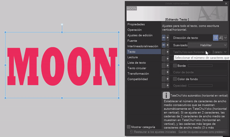
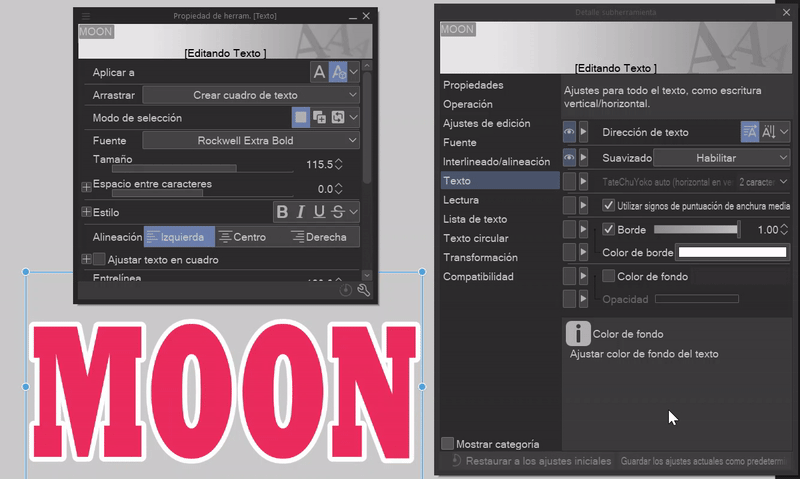
We can find this tool in the tool palette (icon with the letter “A”) or using the keyboard shortcut “T”. In the Tool Properties window we will find all the settings.
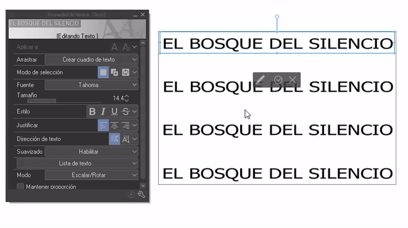
- SIZE AND FONT -
In this section, the different fonts will appear and we can adjust their size. For the size and fonts, we can select a word, letter or the entire phrase, therefore, we can have different size and font configurations within the same text box.
- ADD SOURCES -
When you open the list of fonts, you will find the option: Add font at the end. Here, as its name indicates, new fonts are added. To do this, click on the option. The file search window will open where you will choose the ZIP/RAR/TTF/OTF package that contains your font. Click OK.
A message will appear allowing us to save it to the cloud. If you find it convenient, accept it. If not, just click Close. And that's it, we have a new source.
- STYLE -
As for styles we have: Bold, italics, underline and strikethrough. By selecting a word or the entire text we can apply the effect.
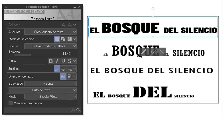
- SPACING -
Spacing refers to the separation between letters or characters. Letters that are too close together or too far apart make reading difficult, but these two characteristics are useful for adding dynamism to the text, giving it a fresh look. To edit these characteristics in CLIP STUDIO PAINT, do the following:
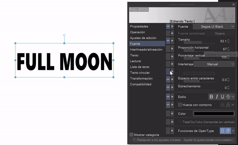
➀ Go to “Subtool Detail”, which will be visible by clicking on the wrench at the bottom right. In this window, you will find more functions that are not visible in the Tool Properties window.
➁ In the “Font” section, you will find two options: Space between characters and narrowing. You can control the degree of separation with the sliders.
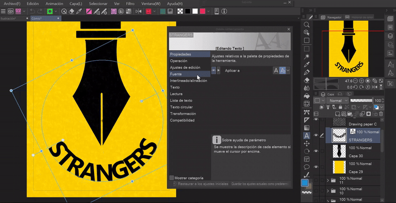
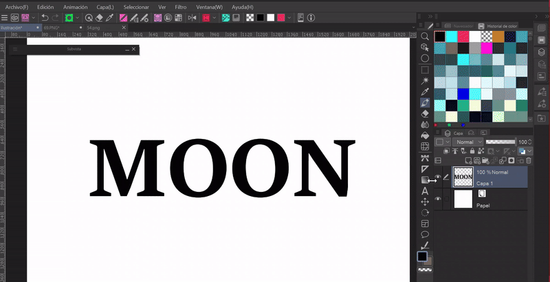
(B) Textures
Different fonts are beautiful on their own, but sometimes they don't fit in quite right when they share space with an illustration, which is why they are often textured to match the theme of the illustration, or simply to make them stand out.
- SPLASH -
➀ We will create a text that we will convert into a raster layer. To do this, right-click on the layer and choose the “Render” option from the menu that appears.
Note: Text layers cannot be edited or drawn.
➁ Using a textured brush and selected transparency, paint over the letters. Done.
Note: This is a destructive method, so it is advisable to create a copy of the original text. This way we can edit it in the future without losing it at all.
The advantage of this is that we can use all the features of the brush and the opacity modulation to create the textures.
In addition, with this method we can create other types of finishes.
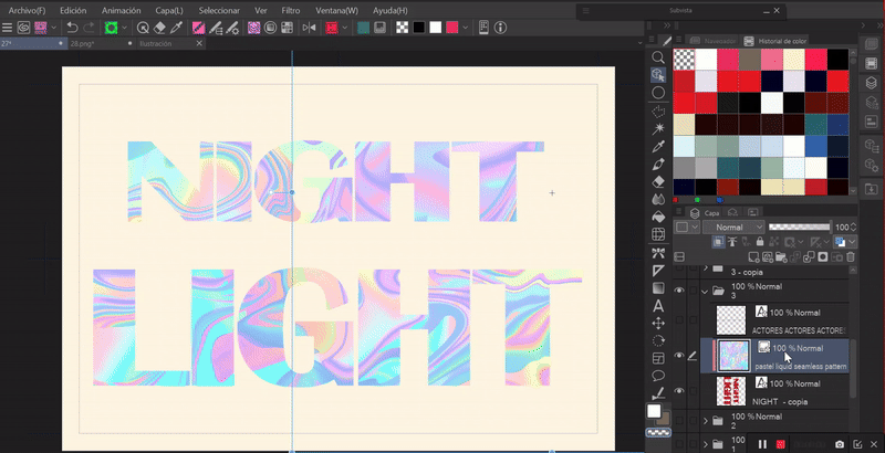
- PATTERNS -
➀ Once again we create a text layer, but this one doesn't need to be rasterized.
➁ We grab a pattern from the materials folder and drag it onto the canvas. This layer has to be above the text.
➂ Click on “Adjust to layer below”, the icon with two boxes found in the layer functions panel. This makes the pattern only visible on what is painted on the layer below.
With the pattern layers being material images, we can modify their size and position by simply clicking on the layer and using the blue frame.
Note: We can do this same thing with any image that we place above the text.
- GENERAL TEXTURE -
To add a general texture to the entire typography, we will do the following:
➀ We will convert the layer to raster.
➁ We mark the layer, set the function “Lock transparent brushes” found in the functions panel of the layer window.
➂ Using the selection tool we will mark the text.
➃ Choosing the white color we will paint the letters using the paint bucket found in the floating menu of the selection tool.
➄ With the letters in white we will paint over it with any textured brush that we like and of course, with a color other than white. Ready.
(C) Degraded
SIMPLE GRADIENTS: These are the ones found in the toolbar. They are easy to edit, you can apply them in any direction, and they don't require a base color.
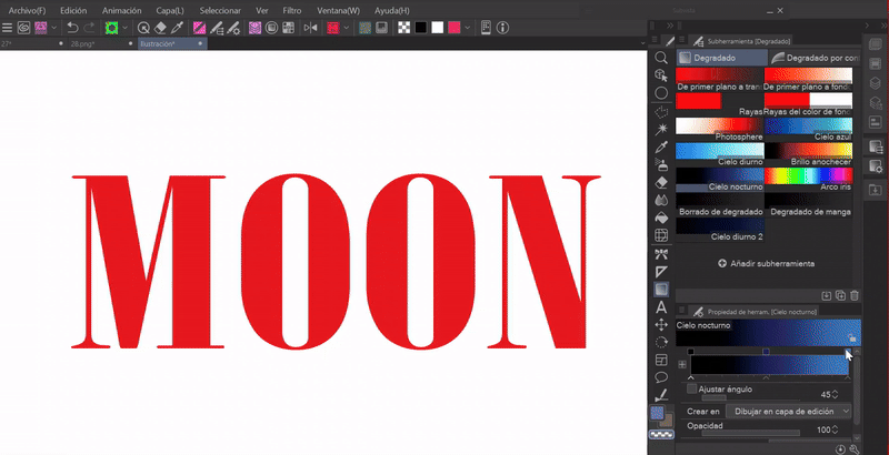
GRADION MAPS: These can be found in the following path: Layer (L) > New correction layer (J) > Gradient map.
They are more complete, and you can also download more combinations from ASSETS, invert colors, etc. The peculiarity they have is that they need a base of several colors, this is because gradient maps replace the existing colors with those of the gradient. For this reason we need to have the letters painted with two or more shades to appreciate their effect.
(D) Should
Previously, to create the border effect we had to do it from the layer properties window, but now, with the new update to 3.0, a border has been added to the text tool. Let's see how to get it.
➀ We must go to “Subtool Detail”, clicking on the wrench located at the bottom right.
➁ Within this new window we will go to the “Text” section.
➂ Here you have to activate the “Border” option. The thickness is modulated with the bar, and the color is modulated with the border color.
Note: If we do not want to be opening this window, we can make this function visible in the tool properties window by clicking on the box on the side, when an eye appears in this box it means that it is already visible.
(E) Transformations
Not all texts have to be in front, we can also fit them in different spaces for different perspectives. Here I will discuss some transformations.
- PERSPECTIVE -
To place a text in perspective, follow these steps:
➀ Convert the layer to raster.
➁ With the layer selected, go to: Edit > Transform > Free transformation, perspective, distort or tilt. Now you have to move the nodes of the box in the direction of the perspective you want to obtain.
There are different transformation tools that allow us to position the text at multiple angles, it is just a matter of trying.
Shortcut: CTRL plus T and right-clicking on the transformation as shown in the GIF.
- MESH TRANSFORMATION -
Bending text or placing it in a strange position is easy. With the layer selected, go to: Edit > Transform > Mesh Transform.
A mesh with a series of nodes will appear; these nodes can be moved to the desired position.
Note: The layer must be rasterized.
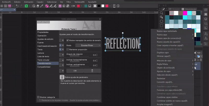
- REFLECTION -
In subtool details, in the “Transformation” section, there are other transformation options apart from those already seen. With these we can invert horizontally or vertically, change the angle of rotation, etc.
To create a reflection, we will duplicate the layer, lower the opacity of this duplication and tilt it to the side we like best using the tools mentioned above. Then we will align this second layer so that the top of the letters touches the bottom of the letters on the first layer. That's it, a reflection.
- CIRCULAR TEXT -
With the update to 3.0, a function was added to place text in a circular shape. A wonderful new effect. To achieve this, do the following:
➀ Go to “Subtool Details”; once in the window, go to the “Circular Text” section.
➁ We activate “Circular text”. With the other settings we can modulate the radius, the direction (clockwise and counterclockwise) and the uniform arrangement.
(F) Effects
Here are some effects that can be applied to text with some of the other tools in the program.
- BLUR -
To create a blur effect, do the following.
➀ Convert the layer to a raster layer.
➁ With the layer selected, go to: Filter > Blur > Gaussian blur.
➂ In the window, we have the intensity adjustment, choose the level that we like the most.
- MOTION BLUR -
Also, within the blur section we find other ones that can be useful, such as: the motion blur that we see below. As its name indicates, it generates the sensation of movement at different angles and with varying intensities.
- CHROMATIC ABERRATION-
The chromatic aberration effect gives the text a futuristic effect. Let's see the steps to follow:
➀ Convert the layer to raster.
➁ Go to the following path: Filter > Effect > Chromatic aberration.
➂ In the window we find the intensity and angle settings. We can switch between two modes, radial and angular. One moves the aberration in a circular way, while the other only in the direction indicated by the angle.

(G) Distortion filters
Distortion filters are a good tool that allows us to modify the composition of the text. Let's see what we can do.
➀ The first thing we will have to do to apply any of these filters is to convert the text layer into a raster layer.
➁ Now we will choose one of the filters that are in the following path: Filter > Effect > Distort.
There are many filters, so I will only show the ones that I consider important, but you can always experiment for yourself. The process is simple; a window will appear with a series of sliders that allow you to modulate the settings.
- PANORAMIC -
With this filter we can achieve a meat effect.
- WAVES -
This is the one I like the most of all because it creates a border of lines that gives the effect of movement and volume.
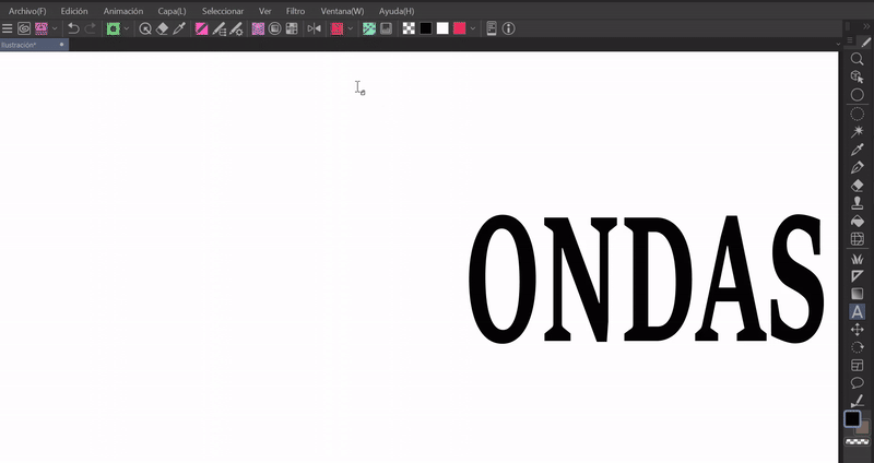
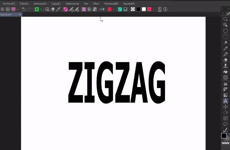
- ZIGZAG -
Finally, a ripple effect.
Note: Both this and the previous filters can be used in specific areas. To do this, select the area with the selection tool in the same layer as the letter and apply the filter.
(H) Combined effects
As a final point, we will address other styles that we can give to the typography by combining the effects and transformations mentioned above.
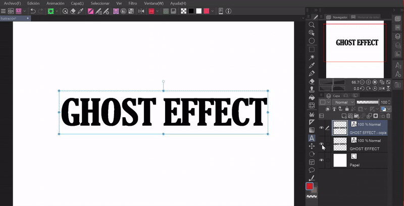
- GHOST EFFECT -
➀ As always, we will start by converting the layer to raster.
➁ Now I apply a small Gaussian blur.
➂ Then a subtle motion blur effect.
➃ I apply a radial blur effect focusing on its presence at the edges.
➄ Then I create a gradient map, which I invert.
➅ Finally, I duplicate the letter layer, to which I apply the wave effect and put the layer in overlay mode.
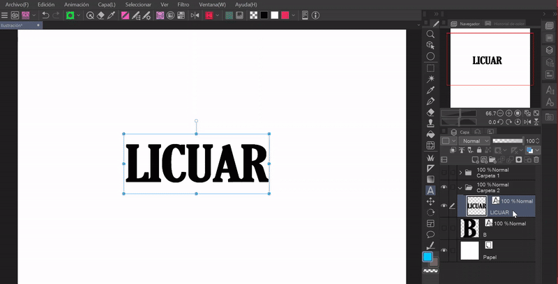
- BLEND -
The liquefy tool allows us to distort an image. It is normally used to correct errors in illustrations, but in this case it will be to give a chaotic effect. This tool is found in the tools window, its icon is that of a mesh.
➀ Convert the layer to raster.
➁ Use the liquefy tool on the text. This tool has different distortion settings, these are found in the layer properties window.
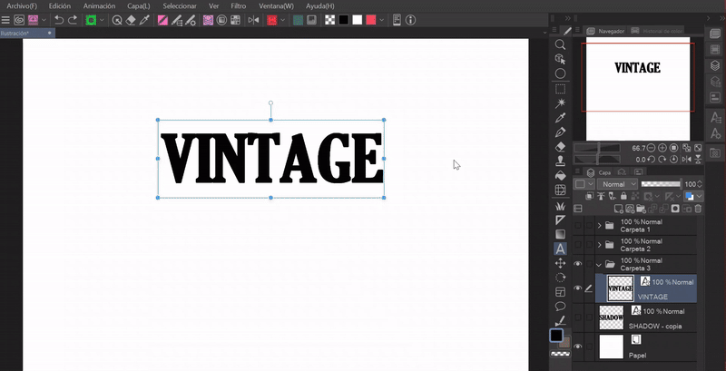
- VINTAGE -
This old effect is simple.
➀ Raster layer.
➁ Gaussian blur filter, at a low level.
➂ Duplicate the layer.
➃ Radial motion filter on the new layer, in this case we will move the cross to the top of the text, so the blur is found more in the lower area.
➄ Merge the two layers
➅ Apply a noise effect. This function is found in: Filter > Effect > Noise.
➆ Finally, apply a texture which I put in overlay mode and lowered the opacity.
- BROKEN GLASS -
For the broken glass effect, do the following:
➀ Convert the layer to raster.
➁ Using the selection tool, with the add mode activated (found in the layer properties window, in the Selection mode section), mark triangular selections.
➂ Cut and paste into a new layer.
➃ Now, section by section, I separate each part of the text.
Note: The smaller the cuts, the better the effect will look.

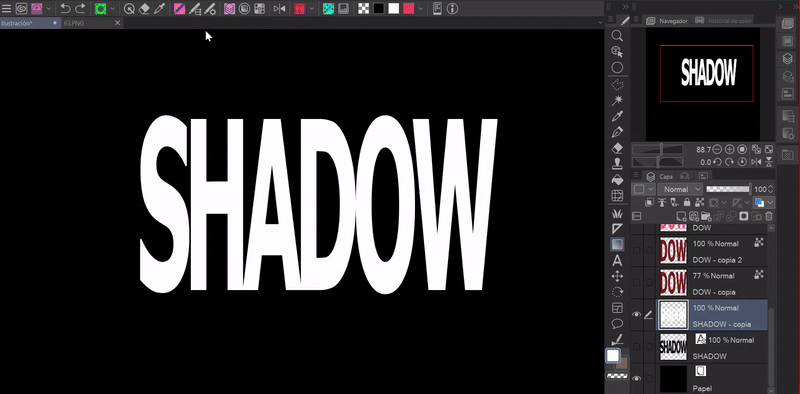
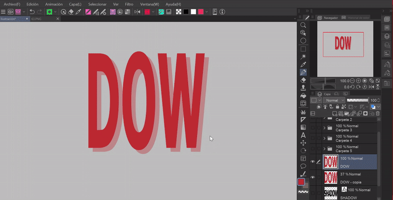
- CUT WITH SHADOW -
➀ Just like in the previous method, I'll cut the layer into three parts. Each section in a separate layer.
➁ I'll move the top and bottom parts a certain amount away from the center. I'll move the top area a little to the right and the bottom to the left.
➂ Now I'll go to the gradient tool and choose: Manga gradient. This mode has two colors, black and transparency, but you can edit the color in the tool's property window.
➃ I'll apply the gradient diagonally in the middle and end section (if it doesn't look right you can always adjust it with the transform tool). I'll try not to completely darken the letters. To limit the gradient to just the letters you'll have to adjust the gradient layer to the bottom layer with respect to the layer of the desired section. Done.
- PLOT -
In the layer properties window we find the option “Raster”. With it we can apply a raster to the letters.
➀ First we will convert the layer to raster.
➁ We will select the raster icon.
➂ To change the color of the raster, which by default becomes grayscale, we must click on the option “Layer color” found in the same section as the raster. There the option to choose the color will be activated.
➃ In the raster settings we determine the frequency of the pattern with the “Frequency” bar, with “Point settings” we can change the shape of the figure (there are many options) and with “Use brightness color” the figures will become transparent, otherwise they would be white.
These rasters can also be applied to letters to which a blur was applied, the result is like the one seen in the letters on the right.
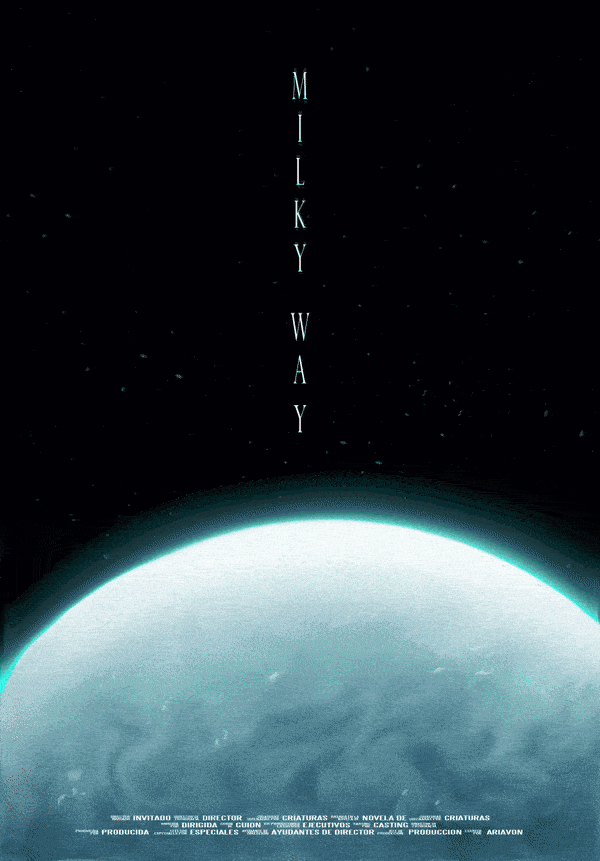
4. Example of an illustration as a film poster
Following the prototype of the science fiction poster I showed earlier and because I really like the integral nature of the infinity of the universe, I decided to make a poster with this theme. The style of the poster is minimalist, with thin text and a chromatic aberration effect; all this resulted in:
Title: Milky Way.
A scientific team embarks on an expedition to the far reaches of the Milky Way. Their mission is to unravel the enigma surrounding a planet, whose flickering glow sends signals to the heart of the galaxy.
I also made other examples with other typographic compositions.
- TIMELAPSE -
Here's another example. I took an old illustration I made of a creature of the deep, which I cropped a bit to fit the dimensions of the canvas better. Then I added the typography. The result is as follows:
Title: Monster of the Deep.
There was talk of a terrifying creature, which struck fear into all who ventured near its domain. With shiny scales that reflected the light of the deep and long tentacles that slithered ominously, the legend of this sea creature had terrified sailors for generations. One day, an expedition decided to investigate the mysteries of the abyss and came face to face with the creature.
Farewell
I hope that what I've seen in this tutorial is helpful to you. I'm still learning, but despite that, I want to be able to share something new with you that will also help you.
It would be very helpful if you share it and give me a like. Thanks for getting here! See you another time!
Learn more about me at:
Users who liked this post


Comment