
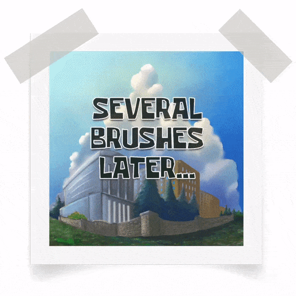
Love to stare up at the sky? Recreate beautiful, realistic clouds with this Clip Studio TIPS by Futopia - as your digital art guide.
This month of August, I'll teach you how to paint fluffy clouds using a mix of quality default brushes from Clip Studio Paint. I'll also explain some of my favorite tools and techniques for creating incredible, realistic effects ranging from simple to intermediate levels.
Without further ado, let's start our lesson back to the basic ones.
[ 1 ] Elements of Art: Space
I think that it's quite obvious that you can have a 2D and 3D "space" in your sky drawing. This means, that you will have different "cloud shapes, movements and deformations possibilities" in your painting. I already wrote a tutorial about making things from the basic shapes (perspectives) so I won't go into that matters here (click tutorial link below if you are interested to know much more about composition and other interesting tips - especially if you're into Fantasy Backgrounds).
Generally, it's quite simple to show the difference between 2D and 3D "space" and how you can possibly make any flat 2D surface drawings into 3D ones. Let me just use a quick example using animated gif below:

[ The versatile Free Transform + Shadow ]
As you can see from my quick guide above. How I make a 2D shape of a happy cloud into 'somewhat 3D' looking cloud with depths and shadows.
I'm going to use this basic editing tool several times through the entire tutorial, so please keep in mind that [ Free Transform ] is a versatile feature to modify flat 2D drawings into somewhat 'perspective' or forming into 3D drawings with a shortcut keys: [ CTRL/CMD + SHIFT + T ] to activate the transformation box like image above.
Then with your [ Left Click ] mouse button, you can point to any of those little boxes surrounding the image and it will automatically turn into 'arrow' so you can drag into any of your desired position.
[ 2 ] Think Outside The Cloudy Box
I'd like to make wallpaper (lock-screen) for my phone, so I will go with a new file and you may see my setting below (if you need a specific resolution, you can simply start with your own preferred setup):
But do remember to change the [ Resolution ], I know that screen resolution supposed to be a standard of pixels: [ 72 ] but I change it to [ 300 ] nonetheless in case I need it for print (for at least A5 paper large).
TIPS: you can start with any standard screen size of yours for ultra HD etc, just be sure to put it on 16 : 9 (for horizontal image) and 9 : 16 (for vertical image) calculation.
You may check from the link below to help determine what's yours:
After you've done determining your screen size, here's my starting point;
1. Gradient Sky
The sky has a subtle gradient, be sure to start every sky and cloud drawings with that in mind and here's the simple steps to do it my way:
(1.) Start with [ Gradient ] tool. Find the [ Blue Sky ] or you may use other gradients, but please consider to follow my guide in order to get the similar result; I am using Blue Sky because I need the darker part of the gradient, or else I will choose [ Midday Sky ].
(2.) You can start to click and hold your [ Left Click ] and hold your mouse outside the canvas. But if you wish to have much more darker color, you can start near the top of canvas. Try experimenting by yourself the differences between start it outside and inside the canvas.
(3.) Drag across the canvas and release it outside. By doing so, I will somehow 'removing' unwanted white color that supposed to be included in the default [ Blue SKy ] gradient. You can have the white color into your gradient if you release the mouse inside the canvas.
2. Lay Out Shapes
When you satisfy with the gradient, now let's move on into the creation of clouds! Here's the example using animated gif to show you my steps to form the clouds from simple basic shapes; mainly boxes - hence the name: cloudy box!
Using [ Design Pencil ] and a bit of gray color, try creating the clouds with stacking cubes and form them without too much overthinking or over plan, let the free imagination roams the canvas and your brush strokes do its job.
Apparently, if you're familiar with my chosen and best brush: [ Design Pencil ] you might've already know how to use it. But in case you're unfamiliar with it, below is a little animated gif to show you how to use it wisely:
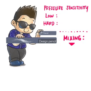
I try to show you how a single default brush can be effective to draw the dynamic clouds even the series of near and far clouds (see the Mixing).
There is no secret, it lies only with its pressure sensitivity, nothing else-!
If you press the brush with low intensity without ever lift your graphic tablet pen, you can have a 'transparent' result. Then, if you try to press your pen harder, the density of brush will increases and it's color becomes bolder each time you give the strokes.
Personally, I like the texture included each time I give a stroke, the grain textures can be seen and applied easily with the lower pressure sensitivity. Now it's your exercise time!
Try something simple from image below:
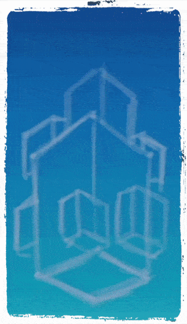
Actually, it's pretty simple to create a dynamic looking cloud form with these tips:
(1.) Create a cube, no need to draw the lines on the inside.
(2.) With or without a new layer (your choice), draw the curves.
(3.) Fill the cloud with [ Design Pencil ] using various pressure sensitivities.
And it's done! Adding more cubes, will giving more curves! So try this method first, then you'll be able to draw any dynamic looking clouds, even my enormous looking clouds like this:
3. Let there be Light!
Define where the light source is coming from and keep it consistent throughout the forms will save you from unnecessary headache later. If you're a fan of 'random lights' when painting the clouds or sky, please at least... Keep it from two different angles that still believable.
For example take a look at the above image of a cone, it has two different light sources rather than those box and sphere objects which only have one. By keeping that in mind, you will be able to create multiple and colorful clouds.
But also do remember to add a combination of cool and warmth colors; a bit of pink and purple for the additional lights can be good and pleasing to look at, if you choose to place an orange all of the sudden; it will be unrealistic.
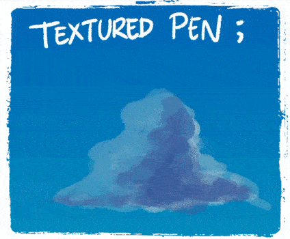
Try these two type of [ Pen ] tools to add some colors which will be useful for this entire tutorial. First one [ Tapered Pen ] and my second best choice [ Textured Pen ]:
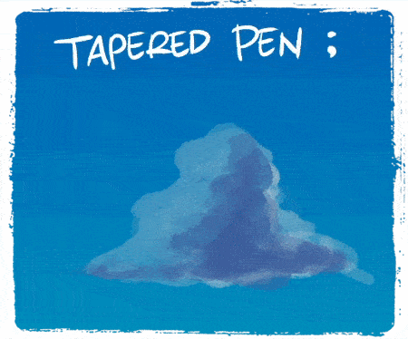
Both of these pens are good to create the 'acrylic' painting look, honestly because later I will guide you through the mixing or blending colors. So these [ Pen ] tools will be your my choices to add sharp edges for my clouds after the blurred ones.
My only suggestion, try to play along with your graphic tablet pen's pressure while using either one of the [ Pen ] tool. It gives you a feel of randomness upon pressing harder or lighter and the outcomes will be vary depending on which area of clouds you need to cover.
From these animated gifs, you can see from both of images the way I create variation of strokes. It can range from tiny to bigger strokes, please try to experiment by yourself-!
4. Mixing Time!
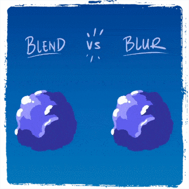
This is the most fun part! But before we begin, take a look at these two identical clouds below! And you can decide which one better to your eyes. Because, I will explain a little bit differences of this default tool: [ Blend ] that will be used over and over again through entire tutorial to achieve fluffy looking cotton clouds!
It depends on you whether the blended cloud on the right or on the left will be actually your choice but it comes with the same color-mixing sub tool: [ Blend ].
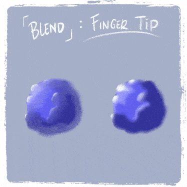
In my opinion, there are only two type of useful brushes inside the sub-tool which is [ Blend ] brush and [ Blur ] brush for smoothing colors. While [ Finger tip ] and [ Copy stamp ] will not be very useful here. Well, it might - just not in the way I wish to explain here.
As the picture below shows, Sub-tool [ Blend ] will be very useful in order to give your sharp edges colors (coming from Tapered or Textured Pen ) smoother looks. With big or small brushes depending on which one you choose to work, try to feel the different from both of them.
Things that I found during experimenting:
(1.) You can definitely try to spin a bit for [ Blend ] brush and see how it will blend/mix entire colors which sometimes I hate it. While [ Blur ] brush will still keeping the white colors which I prefer to use more than the first one.
(2.) Remember that these brushes have no colors, their only function to smudge any colors on the layer that you're working on. Make sure you're in the correct layer! You can start to mix the colors from edge, or even try to blend from many directions; maybe from outside to inside.
(3.) Pressure works differently, when you press harder; the density of color stretch will varies! Please note; bigger size of [ Blend ] brushes will blend everything altogether, on the other hand it will effect a little different with [ Blur ] brushes - although you're going to use bigger size to mix everything.
To give you visual explanation; please take a look at my animated gif below:
[ What about the Finger tip brush? ]
Now that we're done talking about the color mixing with [ Blend ] and [ Blur ] - maybe you like to see how [ Finger tip ] actually works and can even be useful at times needed.
Take a look at my animated gif below:
[ Finger tip ] in my opinion, will be useful for some parts like 'moving' clouds or speedy objects that requires something looks like speed effects applies to it.
You can try to use bigger size of brush to see how it can 'liquefy' the cloud shapes and blend at the same time. Also the smaller size of brush will 'stretch' some colors and make it looks like particles moving.
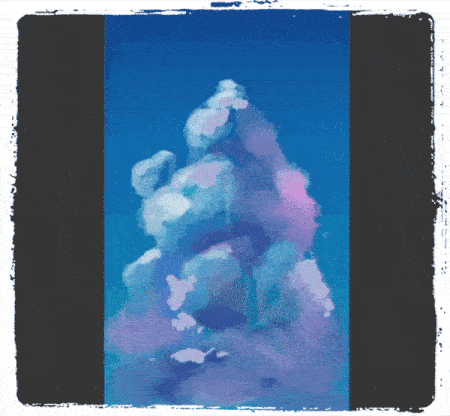
5. Finishing the basic tutorial: Boxes of Clouds!
Yep, let's try to finish this before we go and talk in-depth about other guide. As you can see from the animated gif above: that's how I apply those basic techniques altogether. From sketching, deciding where the light sources, adding colors, until finish it up with color mixing.
Here's the final result done approximately around 1 hour for details:
But wait, you might be asking: "how on earth did you do to all those stars in the skies?"
Well, let me just tell you how to do it on later chapters when we're discussing about night scenes. Also everything that I've been doing so far inside Clip Studio Paint were done by default brushes and tools; even when you notice that I had custom brushes on my animated gifs; truthfully I'm not using them especially for this Sky Drawing tutorial.
[ 3 ] Direct Sunlight
A clear, sunny day has three different systems of illumination:
1. The sun itself
2. The blue sky
3. The reflected light from illuminated objects
The second two sources of light derive entirely from the first, and should be subordinated to it.
[ Sunny Sky Plein Air ]
In this tutorial, I will draw a series of painting studies combined my knowledge of outdoor light with a sense of basic composition (one point perspective or maybe two point perspective) within Clip Studio Paint. I develop a distinctive approach to let you start create your own digital art with dynamic Plein-Air Movements.
Start with a square canvas: 1080 x 1080 pixels, resolution 300 - because I'd like to post it to my social media later for 10 slides or less carousel so my students outside Clip Studio Community can also learn the basics composition and hopefully they can use Clip Studio Paint for their personal taste of digital art journey.
Here's the simple steps:
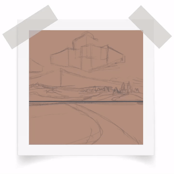
(1.) Create a new layer, using [ Alt + Backspace ] to fill the entire canvas, I pick a bit of medium brown so it looks like a sand paper. Also because drawing with white digital 'paper' easily makes your eyes strain.
(2.) I sketch directly into the 'sand paper' with dark grey color, I use grid to make the straight line with holding down [ Shift ] then drag it to the right and release to make sure it's a good horizontal line.
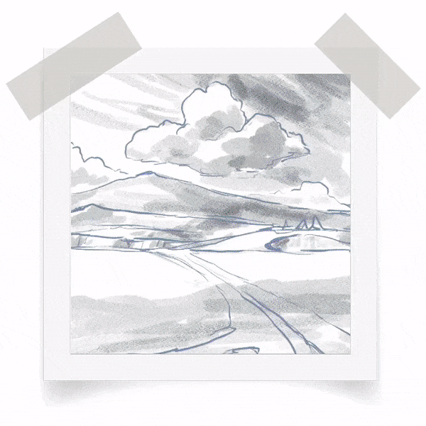
(3.) As usual, [ Design Pencil ] from Pencil brush will be my preferred sub-tool to draw the basic composition landscape, from the road, the hills, the mountains afar and the boxes of clouds. If you wish to learn more about compositing good images, here's my previous tutorial that focus on creating visual hierarchy:
Now let's continue. I did my studies countless time with plein-air countryside pictures, so right now I am not looking to any countryside photos; I just go ahead draw something within my 'flashback' imagination and it shows the fields of rye. In the distance a hills and mountains are dwarfed by the immensity of the clouds above them.
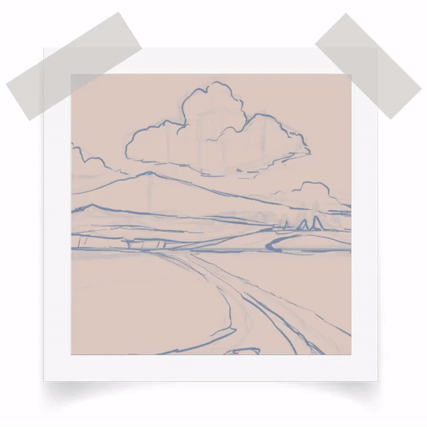
With the sketch layer (that consist within the 'sand paper') opacity lowered to 50%, I create another layer on top of it. It's what I called refined/basic structure drawing.
Notice I give the basic shapes of the clouds, the mountain, the roads (split into 2 sections), as well as the hill rough details with a bit of trees on the right. Everything was done with a grayish blue [ Tapered Pen ] because I like the 'randomize' ink coming from its default feature while pressing hard and light with my graphic tablet's pen.
Yup, if you're already know about my next step (maybe because you're already tired of seeing my tutorials here on Clip Studio Tips - Monthly Challenge - lol! Just kidding); it's all about shading or values if we're talking about one of the elements of art!
And the same method in every other tutorials that I provide, imagine where's the light source, where's the shadows fall. And what tool I usually recommend: it's obviously [ Design Pencil ].
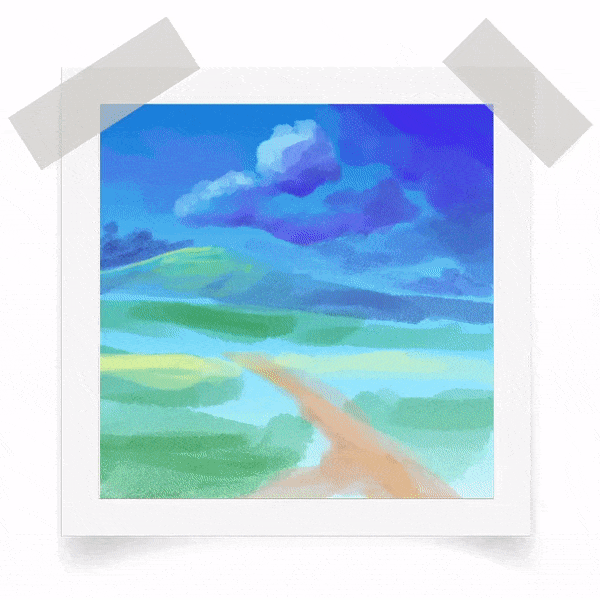
Gif above shows where the shadows fall on the picture. I give a hint of what shadows are they from. It's from the clouds above the sky of course. Because currently, our objective to make a sunny sky as well as implementing Direct Sunlight lesson so here goes: the sun shines from the upper left and the shadows fall upon so many places but also created soft shadows on the fields as well as the hills.
So here we are, let me show you my Layer organization (I apologize if it's too fast to see, you can check about that later after this one):
Assuming that you're already familiar with the way I'm coloring my artworks, I place a new layer (I call it Color) on top of my Sketch and Shadow layer. But sometimes I will reorder them or just turn on and off other layers so that I can easily see what I am doing without distractions.
Lastly, this is your exercise to practice blending sub-tools such as: [ Tapered Pen ] for adding sharp edges, then [ Blend ] brushes such as blur or blend. Sometimes I change the way I mix colors by using other brushes, for example: [ Rough Wash ] from [ Realistic Watercolor ] brush tab and even [ Design Pencil ] to add some textured colors.
You can also reduce the high contrast or vibrancy colors by using [ Ctrl + U ] to bring up dialog box and move the slider to the left a bit to lower its [ Saturation ] and [ Value ] tones.
As promise, here's my default layer order:
1. [ Red ] INFO ONLY layer on top of everything as my place to give any information to show you of anything that supposed to be shown (like gif above with info about shadow from clouds)
2. [ Gray ] Sketch layer with grayish blue [ Tapered Pen ]
3. [ Purple ] Shadow layer with medium gray [ Design Pencil ]
4. [ Green ] Color layer, where I will put everything Sky gradient included to mix everything
So I tell you what, this is only my personal preferences, you don't have to follow me or put a color and everything, mixed them altogether in just one layer. You can create thousands of layers, but here I am giving you a friendly reminder: your life is already complicated, so make it simple. Would it better for you to commit only 4 layers? :D
Okay here goes...
If you're asking me... How much time did I spend to make this artwork? Honestly I don't know, let me just guess it (because I'm not creating a speed painting, I'm not recording anything...) this took several hours, probably two or three hours top.
I apologize for cutting through some boring steps, I realize we're discussing about sky, not the fields, hills, and mountains. But the techniques I show here on the field: [ Decoration: Hatching -> Gauze cloud ] will be useful for later use while creating sky elements.
Especially raining particles, aurora borealis as well as starry night scenes. I will explain more about Decoration Sub-Tools specifically during the creation of those scenes.
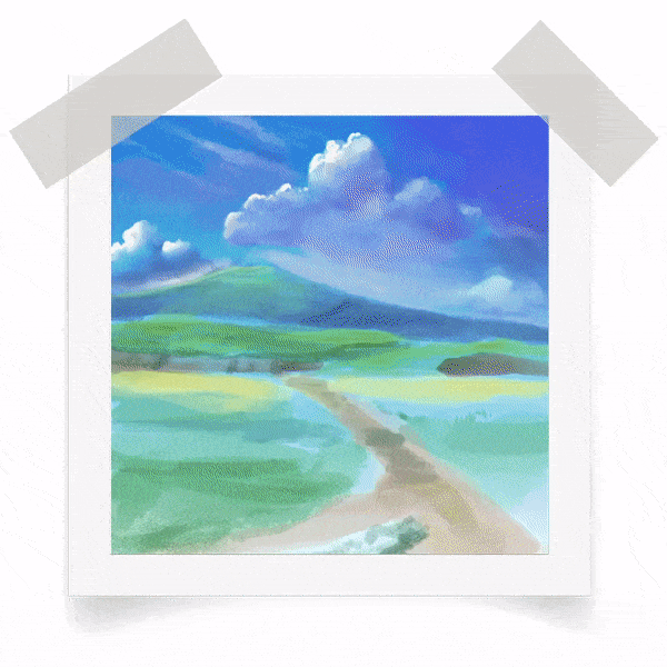
[ Final result of Sunny Sky Plein Air]
And that's it for Sunny Sky Plein Air digital painting-!
For the flower buds and fields, I just use the default sub tools such as: [ Mapping Pen ] and blend them with [ Blur ] also use a few brush strokes with texture from [ Decoration: Hatching -> Gauze cloud ] and a bit of scattering some tiny flowers [ Decoration: Flower -> Cosmos ] to make it looks lively.
Sneak peak of [ Decoration ] sub-tool that can be used to create stunning aurora:
These two 'clips' just an example of what we're going to make later, a night scene with aurora borealis on the starry sky. A sneak peak and teaser - because later, I will give a complete guide step by step. Right now, it's just an experimental brush strokes that I play around and record at the same time.
[ 4 ] Color Corona Sky + Perspective Guide + Gradient Map Function!
No... This is NOT a virus name.
An extremely bright source of light, such as a setting sun or a streetlight, is often surrounded by a region of colorful light called a color corona. The color corona appears both in human vision and in photography, where it is sometimes called a lens flare.
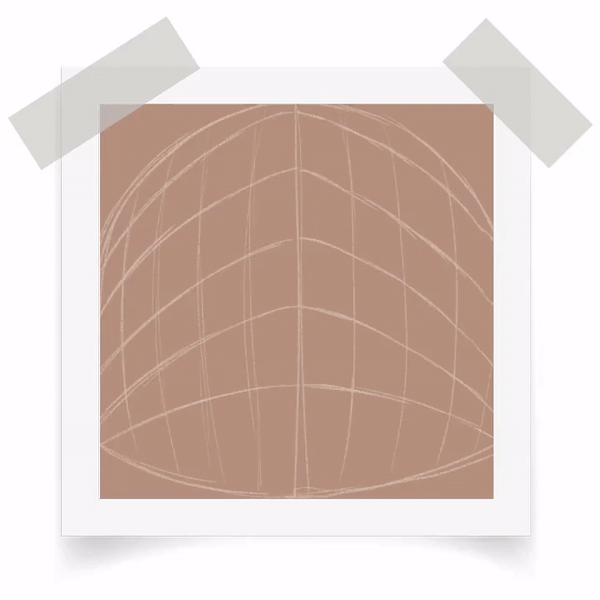
[ Sky Dome + Two Points Perspective Guide ]
This time, let me start the painting with a guide, I know we can use the [ Ruler -> Perspective Ruler ] sub-tool to help achieve the two point perspective. But let me make this one quicker with non-distracting lines and too technical approach.
As you can see from the gif, I create my guide on top of the [ Draft ] layer that filled with brown using [ Alt + Backspace ] to auto fill it with any color that you desire. Using white color, I begin to divide the canvas into 2 then starting my 'ground' with curvy lines!
Why curve?
I'd like you to learn creating a dynamic angle or extreme angle of two point perspective that so many manga artists (especially action manga) have tendency to create this type of perspective and angle into their battle scenes.
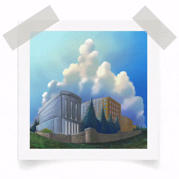
My usual technique to fill out the line drawings based on the guide, you can see that it's pretty simple and easy to draw boxes after boxes, rectangles, and everything even with the towering clouds above the buildings using only [ Design Pencil ] with a new layer.
There's nothing fancy here, just a reminder to always follow the guide lines that you created, however please keep in mind; the line in the middle (which divides the canvas) should be a single straight line, while others can be a bit curvy.
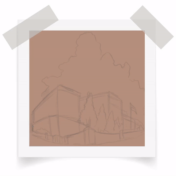
Determine where the light source coming form with [ Design Pencil ]. To make it simple: I put the (imaginary) bright light source to the top left corner, later I will explain to you about cast shadows and over cast colors. Meanwhile, I just put the occlusion shadows from the buildings, walls, trees, even a few shadows on the clouds - so they can be a reminder for 'where's the light and where's the shadow falls'.
I'm using [ Tapered Pen ] to ink, it's not a detailed one, just point out a few necessary details from the rough sketch to more refined sketch. Also open up a [ Grid ] view once in a while will be useful especially for using [ Shift ] strokes to make straight lines.
[ Overcast shadows ]
When a form intercepts a parcel of direct light, it projects or casts a shadow onto whatever lies behind it. The resulting dark shape can be a useful design device to suggest depth or to tie together elements inside and outside your composition.
Notice from the gif, I make my image a bit smaller in order to get better visual composition. With a key combinations such as [ Ctrl + T ] and re-scale it with holding [ Shift + Alt ] and click on the corner.
After finishing with the cast shadows and some details: I give a bit of highlights to the clouds to make the contrast for both objects. Then I create a new layer, after that I choose [ Gradient --> Midday Sky ] from bottom right to the corner left - so the lightest part of blue gradation supposed to be on top left.
[ Modifying Smooth Gradation ]
Like a glissando in music, a color gradation transitions smoothly from one note to another. The shift can occur from one hue to another, or from a light color to a dark color, or from a dull color to a saturated one.
Gif above has several systems of gradations going on for the sky. The colors change from light blue (top left corner) to medium blue (bottom right corner) - also separating clouds from the sky with [ Airbrush --> Running Color Spray ] - Gradations don't just happen (although you might argue with Gradient tool ] but it takes planning where to start and end. This is crucial, because as you already notice, the gradation will determine the light source as well as the mood or atmosphere of your paintings.
[ Separating Colors ]
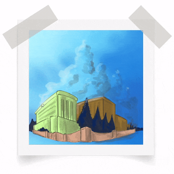
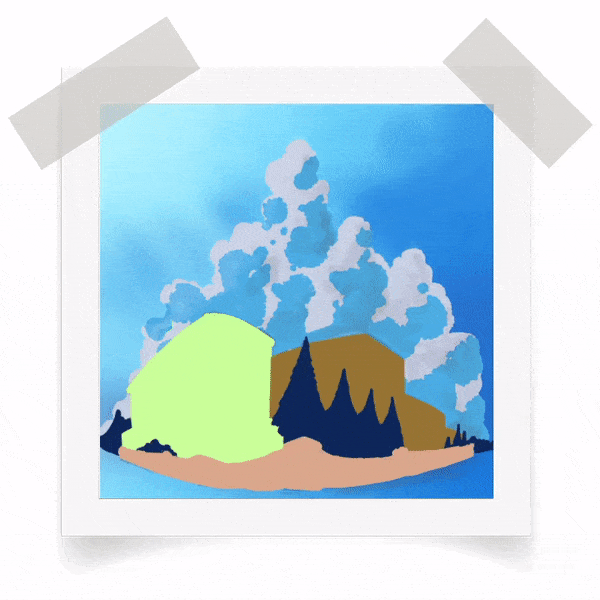
Using [ Turnip Pen ] for the color blocking, here I am separating each elements on the drawing; buildings, trees, and walls only. Picking high contrast colors for better separation because whenever you need to select only the first building (lime green) or maybe the secondary building (light brown) or walls, it can be easily selected using [ Auto Select ] tool (in Photoshop: we call it Magic Wand).
[ Using Selection Area to Create the Clouds ]
Whenever you have the basic shapes already laid out, it's easier for you to make an interesting details of the cloud with [ Selection Area ] tool. I've been doing with this tool quiet a lot, especially to select some area.
The trick would be not letting go the tool before you think it's fine to release it (please see animated gif action above) although there will be a setting you can modify to make the continuity to your selection tool without worry of accidentally release.
Below is my tips to make clouds with [ Selection Area ] tool:
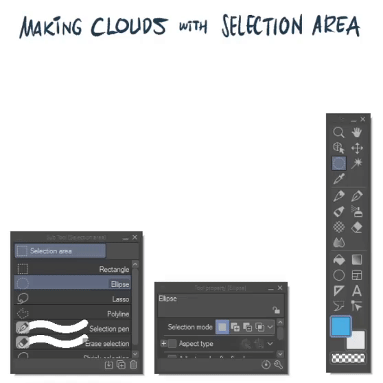
Actually, [ Selection Area ] tool comes with many choices but default one will be Rectangle; from animated gif above, you can see I'm using [ Lasso ] sub-tool and begin my 'clouds-making' progress bit by bit.
Notice on my [ Tool Property ] --> [ Selection Mode ] : I pick second option, which is a command [ Add to Selection ] then I can freely enlarge my selection.
[ Adding Colors & Blending + Blurring ]
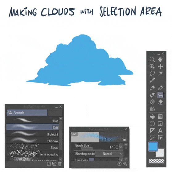
After you've done with the [ Selection Area ] shapes, easily press [ Alt + Backspace ] with your chosen color. Mine is light blue, after that you are free to choose any brushes or any sub tool to color it. I pick [ Airbrush ] --> [ Soft ] and [ Highlight ] to quickly fill some area.
Next step, blurring and blending some parts because it's too sharp for cloud's edge. As you might already guess, it's [ Blend ] time with [ Blur ] and [ Blend ] even adding randomize clouds' movements with [ Finger Tip ] sub tools.
Tips: Please do remember that you need to [ Unlock Layer Selection ] by using [ Ctrl + D ] and check if you [ Lock Layer Transparency ] before blurring the edges. Or else the edges won't be blurred or blended.
[ Back to our Painting ]
With a bit of [ Tapered Pen ] and create more detailed and modified shapes around the towering clouds, using the reference from my shadow layer as my only guide to put my color.
Note: Please consider to [ Lock Layer Transparency ] before dropping the blue colors.
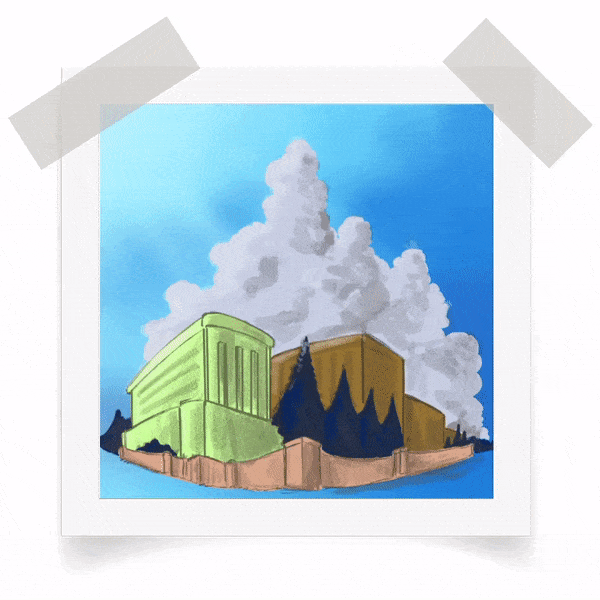
[ Finalizing the Towering Clouds Form ]
Animated gif above shows you the last part of tweaking and modifying my towering clouds, because I'd like to move on to color creation for the skies especially with the lens flare.
It's the same principles with blurring, blending some sharp-edge areas of the clouds.
Adding white with [ Tapered Pen ] as well as blending them with [ Blur]. Also I think, I need to change the color saturation of my clouds so it won't be too much blue using [ Ctrl + U ] and lower its [ Saturation ] around -40%. Then finally adding a little bit of yellow to the top left area of the clouds with [ Airbrush --> Soft ] and [ Brush Opacity around 25% ] so it won't be affecting too much for the entire clouds.
[ Adding Lens Flare or Color Corona ]
I apologize while making this step, I haven't press the record button on my application to screen-record. So it's like I've skipped several steps including how to add simple and quick textures to the buildings (windows) and walls. Even bush, trees and grass on the ground.
But the most important thing is: how to create your own 'lens flare' or color corona. Here's my suggestion to begin:
1. Create a new layer (I name it sky brightness), you need to make it slightly invisible (around 15-20% Opacity) and give a brush stroke with [ Airbrush --> Soft ] starting from the upper and corner left. Try to follow the strokes with Soft Airbrush that looks like a sun beams. (I'm using yellow at first to make you see better - then I change it to white).
2. In order to create those 'lens flare thingy', all you need is create a new layer on top of your 'sky brightness' layer, I rename it with 'lens flare' then go to sub-tool [ Decoration --> Effects --> Soft ] and try to brush it from top left: click once then holding [ Shift ] on your keyboard, click on the bottom left. And you will have bunch of circles with variety of size.
3. Add some 'random pentagonal shape' on your [ Decoration Brush Selection ] and make an interesting refraction with the same way you're doing it with [ Decoration --> Effects --> Soft ] then finalize it with a bit of [ Airbrush --> Soft ] around the bottom right corner - you can try to use [ Blend ] brush to mix any unnecessary parts of your 'Corona'.
[ Bonus Tips: Turn your Midday Image to Sunrise, Sunset, and Night Scene ]
As a bonus tips [ Color Correction inside Clip Studio Paint ] - I suggest to work on a JPG image. Save your image then open it. You can duplicate two layers (which for me it's 'lens flare' and 'corona' layers) to enhance the overall color correction.
Warning: I am showing you this as a quick turnaround trick to get 4 different images in one go. Of course it's better for you to create your own sunset or sunrise and even night scenes without manipulating such Gradient Map. The result will be different. There are many tutorials about sunset and sunrise, my techniques to create those images will be the same with Midday image.
But keep this in mind: you can turn (manipulate) any midday images into a night scene BUT you MAY NOT or DIFFICULT to make darker scenes (night or sunset) to lighter ones.
How do I do it? It relies heavily with saturation and tones, midday image have saturated tones. So just try [ Layer --> New Correction Layer --> Gradient Map ] and work with mid tones. That's why you can make better image adjustment with lighter or mid tones.
Play around Gradient Map --> Gradient Set [ Sky ] filter and also change your opacity around 20 - 30% so it wont be TOTAL RED like animated gif but will be OK if you change the opacity to 20%. And also play around with the 'Corona' layer, change its blending mode to Add Glow and you can have a nice looking sunset flare from the middle or lower composition if you rotate that.
How about quick nice scenes? Just turn off the flare and the brightness layers. Change the color of building's windows with Add Glow blending mode and there you go!
And there you go, a single image with only [ Correction Layer --> Gradient Map ] will make 4 different timeline images ranging from early in the morning till night scenes.
Happy trying-!
[ 5 ] Starry Night with Galaxy
When thinking about night scenes, there's something that I longing for: starry night. Honestly I can't see those glimmering beauties from my place. First, because of living in the city; you cant even see stars - whether you blame it on air pollution or just cloudy sky. Secondly, because I mostly stay inside my room; playing online games or making tutorials then forget how beautiful night with its natural objects: million stars.
So I'm bringing my memories back when I was traveling through the forest (as a boy-scout) and saw glimmering stars and even something that similar to galaxy.
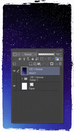
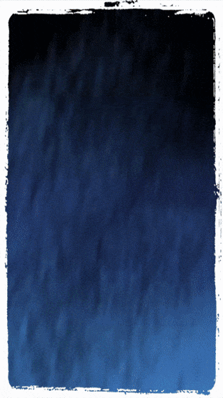
[ The Night Sky Gradient ]
Now, with the same dimension for HD phone lock-screen or wallpaper (1920 x 1080) document, 300 resolution size: I begin to create the background color with Gradient [ Night sky ] and drag it from top right to bottom left corner. After that I use [ Airbrush --> Running Color Spray ] to enhance the smooth gradient with better visual texture and light.
Tips: adding a bit of sky blue to the bottom and a bit of purple to the side will affect later rendering of the night sky.
Then to mix everything easily, I go to Filter --> Gaussian Blur and set the slider around 20.
[ Adding Millions of Stars with simple Airbrush ]
As you can see from animated gif above (although it's a bit fast to see): I use the same layer as my choice to drop those tiny particles of [ Airbrush --> Spray ] and also [ Airbrush --> Tone Scrapping ] to fill the entire layer with white or light blue.
Tips: Just maintain the small [ Particle Size ] around 5 - 10. For better result, also adjust the brush size while give the strokes. And for bigger stars, I will stick to 10 particle size. For shape of the glimmering stars, I use [ Decoration --> Effect ] and scroll until I find [ Sparkle A ] to give some randomization star shapes.
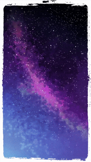
[ The 'Galaxy' Default Brush & Tricks ]
In order to make the 'galaxy', I create a new layer so that I can try to have different blending mode to try and see which one is the best. Actually this is the FIRST TIME (from long time ago I did galaxy themed drawing) with new technique that I experimented with.
I choose [ Airbrush --> Running Color Spray ] and choose to brush it with different of brush size and color but stick to purple, red purple, and light blue a bit of light green as well but only experiment it a little in the middle (so it's NOT white).
The most important thing: try to change layer's blending mode to [ Vivid Light ] because I change it from [ Add ] to [ Overlay ] even to [ Hard Light ] but only [ Vivid Light ] brings the best interest for my eyes.
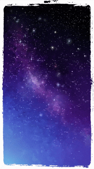
[ Sparkling Stars ]
I duplicate the first background of my starry stars, and I don't know why am I doing this but it will be an interesting experiment to make a blur duplicated one and change it to [ Soft Light ] and drop its layer [ Opacity to 30% ] because I'd like to give some stars highlighted than others!
I go back to the first layer of stars, using the same technique with [ Airbrush --> Soft and brush mode change to Overlay ] then start to bring out the sparkles like in the fantasy or space movies!
Tips: the colors you choose to highlight some stars will be effective if you choose non-white ones, but close to light blue or cyan, then yellow orange, or even pink.
[ Galaxy Shines + Pine Trees Silhouette ]
First, I'd like to make a scene that consist of galaxy and mountains, but I think it's better to add other natural elements such as trees: pine trees to be exact. So I go to [ Decoration --> Vegetation --> Foliage ] anyway it's the best default one I prefer, but you can find better silhouette of trees or any other brushes out there from Clip Studio Assets.
After that, I modify some trees with [ Tapered Pen ] so they will be having better visual look of their heights and also I remove some detailed leaves of default foliage. Also I carefully brush those areas that still look too empty in the bottom.
Next, I give the 'smoky cold' or 'foggy night' to the image by using a new layer [ Airbrush --> Running Color Spray ] and pick a light green color to be put in the middle part of the digital canvas. Make those brushes look like a 'ray' with [ Motion Blur, 20, Forward ] and finally transform it with [ Ctrl + Shift + T ] to suit the angle then change its layer mode to [ Overlay ] to make it slightly revealing.
[ Silhouette Shadows ]
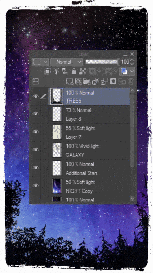
Final adjustment to the trees, I create the effect of shadows by duplicating the 'TREES' layer and change it to 'SHADOWS' and change the blending mode to [ Overlay ]. After that, I go to Filter then pick [ Blur --> Gaussian Blur: 20 ] click OK. You can also try [ Motion Blur: 20 ] and change the [ Direction: Forward ] of blur around 90 and see which one will suit you better.
And here's my result:
Now that my latest lock-screen design with starry night already finished, I can use it to my phone's wallpaper to remind myself how small we are if we compare ourselves to the big and vast universe with millions of stars and galaxies above us.
You, with whatever beliefs that you had: must thank God for everything. Our world that we're living in were beautiful and still is. We're the one who responsible to protect our environment, our world - together.
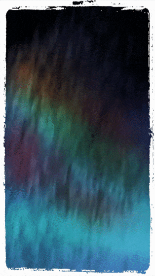
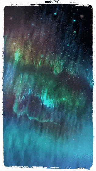
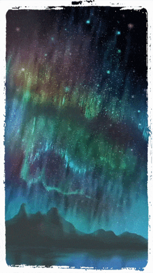
[ 6 ] Aurora / Northern Light in the Sky
Yap, after starry skies, here comes the northern sky with its famous Northern Light! We called it Aurora Borealis. I've never seen one with my bare eyes but I was hoping to see it once with my family when everything is over: you know... This pandemic won't allow us to go travel within countries - hence our own cities.
[ Cold and Windy Night ]
I've been making the Aurora to show you how simple to work on it, right? Now, some of the steps might be repetitive so I'll just skip to explain because it comes with the same principle. For example how to work with [ Gradient: Night Sky ] and also [ Airbrush: Running Color Spray ] to achieve similar result as gif above.
Lastly, using [ Filter --> Blur --> Motion Blur: 10 ] with [ Angle: 120 ] and [ Direction: Forward ] to make a difference in motion or wind blows.
[ Working with Overlay & Add Glow Airbrush Blending Mode ]
To continue adding different colors, I'm using [ Airbrush --> Soft ] and change its Blending mode to Overlay and even sometimes [ Add Glow ] to achieve different result of light blue and also green blue, with a little bit of magenta (purple) to make it looks like a rainbow-like aurora. But that's only my preference, it's not mandatory for you to follow my chosen color schemes.
[ Drop of Shining Stars ]
For Shining Stars: I'm creating them on the same layer as the sky and using both of this default [ Airbrush --> Spray or Tone Scrapping ] and change its blending mode between: Add Glow and oftentimes Overlay. Depends on what I wish to be seen on the screen (canvas). The more contrast will be good with Add Glow, the more mixed ones supposed to be Overlay.
To make some of them highlights even more, I focus on using [ Airbrush --> Highlight ] with Add Glow blending mode for some of the bigger stars.
[ Enter Aurora ]
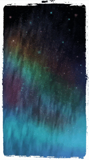
For Aurora: I'm creating a new layer and using [ Airbrush --> Droplet ] with different of choice for its blending mode (with the same principle from above step): Add Glow and oftentimes Overlay interchangeable.
Tips: Please vary the colors with yellow, green, light blue, and sometimes pink - by doing so, you'll have color variation throughout the drawing.
[ Aurora 'Dynamic Movements' ]
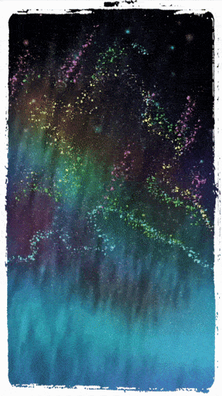
I know that aurora appearances supposed to be blurry and these steps will be so much tricky and satisfying! Please try them carefully and patiently.
1. Use the Filter --> Blur --> Motion Blur, slide the [ Strength: around 20 ] with [ Angle: 100 ] and Direction [ Forward ] - leave the Mode: Box as default.
2. Copy 3 times from the motion-blurred particles with holding [ Alt ] and drag it around the canvas, it's automatically 'copy or duplicate' the aurora.
3. Apply more motion blur to the other duplicated auroras. But change its blending mode to [ Glow Dodge ] or any other type of 'lighting modes' such as [ Linear Light ] or [ Vivid Light ] - you need to try by yourself, which one is better.
4. Mix some 'cropped' aurora that looks weird (especially on the top of it) with [ Blend ] tool.
[ Aurora Light Rays Details ]
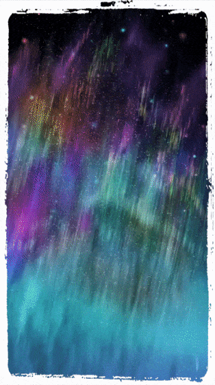
I'm duplicating and also moving several times and change its layer's mode differently from Linear Light to Add Glow and try Overlay to see what will it become. Still not satisfied with the result, I use [ Tapered Pen ] and draw a bit of details myself with the major help from [ Special Ruler ] tool, a versatile tool to draw lines without worry of any bend and wrong directional drawing (haha! My 'cheating' tools) when it comes to detailing aurora because I pick [ Parallel Line ] then start adding colored lines to add some highlights.
Tips: you can drag the ruler so it will not affect the current layers that you're editing. Also you can try [ Airbrush --> Droplet ] with the Ruler ON. And see it's amazing droplets go into the same lines with the ruler.
[ Sometimes it's okay to be exaggerated but... ]
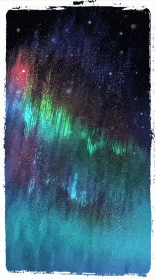
Making a highlights sometimes feel so much fun and you might overdo it somehow... It's okay to be a little bit exaggerated with your colors, it's a digital art anyway, But keep the balance look and feel for your artwork, too much colors in one place will draw people's eyes too much and make them dizzy (well at least for me), so adding bit of [ Add Glow ] and balance with [ Airbrush --> Shadow ] to make your aurora a bit darker on the top would be better than it appears to be fully highlighted to the point of 'eye distracting' not 'eye candy' anymore.
Tips: Learn to control your canvas by zoom in and out several times. Don't draw things on BIG zoom around 500%, try to make your canvas further away or just press [ Ctrl + 0 ] to make it automatically reset your zoom state to it's default.
[ Mountain Elements to Enhance Overall Painting ]
After you've done with the aurora, it's time to put another element to complete the painting. The easiest part that I could see reference from the picture on the internet (and I would not share it here, because it will be against the rules) supposed to be icy mountains reflected onto arctic ocean.
In order to do that, I begin to create the mountain with a new layer and using [ Textured Pen ] to lay out the mountain's structure and shape only with dark brown color. Soon after that, I'm using [ Airbrush --> Soft ] and pick bluish color from the sky and slightly color on the edge of the mountains with different size of brushes.
I duplicate the colored mountain's layer and transform it (flip vertically) with [ Ctrl + T ] then click OK. After that using [ Ctrl + Shift + T ] to free transform the duplicated layer and adjust the position. With the help of [ Filter --> Motion Blur ] to make the duplicated mountains reflected on the water not too sharp, then I adjust a bit of empty space between the mountain and the reflected ones with brush and gives a bit of watery look. Final tweak will be the mountain's fog with a white and blend it with [ Blend --> Blur ] and it's done!
[ Tweaking the final look of entire aurora drawing ]
Last but not least, I modified some aurora belt to give more texture with [ Design Pencil ] in order to give more visual entertaining and pleasing to the eyes. Also you can choose to add some shiny and glow by using [ Airbrush --> Highlight ] and do the magic by yourself.
And here you go:
Finally, here's the actual result of my quick 40 mins speed-drawing for Aurora Sky!
One thing that I wouldn't forget of creating this piece of artwork- I almost lost my original file due to something unknown happened to my external HDD and the it's said format invalid or can't be accessed-!
PRO TIPS: Please always [ Save ] your Clip Studio Paint .lip file somewhere within your own internal SSD or Hard Drive. Save a backup files when you're working on any projects (big or small) to 'Cloud' using Clip Studio Cloud service-! It saves you from a painful headache.
[ BONUS ] Intermediate Color Wheel Combination
First, I apologize for the wrong misspelled word of Intermediate with my animated gif below.
If the [ Intermediate Color ] window is not showing up, actually you can find it through click on the Menu, then go to Window --> Intermediate Color and also the other windows that can be toggled on and off depending on your preferences will be there.
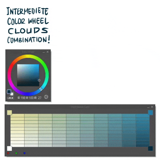
Now that I'm using [ Color Wheel ] and [ Intermediate Color ] to begin this little bonus tips, a combination of versatile options that I used often times to produce color balance for my digital drawings so far. I pick my base color which is dark blue, put it on the bottom right, then pick medium blue, a bit of pale yellow (grayish yellow) and finally a 100% white for each respective corners of [ Intermediate Color ] so you will have a nice gradation of colors you'll be focusing on. After that, pick the darker one to begin your cloud formation. I'm using [ Tapered Pen ] to establish the base of my cloud design.
The rest will be: [ Lock Layer Transparency ] after drop the dark blue with [ Fill ] tool. Then using standard [ Airbrush --> Soft ] technique to fill in chosen colors from the [ Intermediate Color ] pallet then [ Design Pencil ] to add textures. Finally, [ Unlock Layer Transparency ] and use [ Blend ] tools: [ Blur ] and [ Finger Tip ] will be my top choices.
Tip: Change any colors that you want for each 4 corners, but please maintain the cool colors and warmth colors. Happy trying!
[ BONUS ] India Ink x Blend x Airbrush Combo
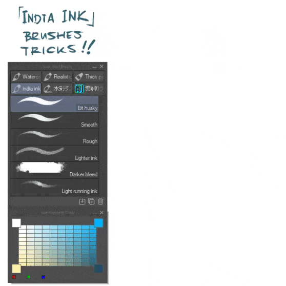
You can try this bonus tips, using India Ink Brushes (and blend with Blend & Blur and finalize the color with Airbrush --> Soft & Highlight) to have a different feel of creating cloud formation.
1. Start the basic shape with [ Bit Husky ] and fill it with [ Fill ] tool.
2. You can try another brushes such as [ Smooth ] for some colorization as well as [ Rough ] to have an interchangeable tool with [ Tapered Pen ]
3. While using [ Lighter Ink ] it blends a little, so in order to bring variety of shapes, I will try to utilize [ Darker Bleed ] brush for its randomness of edge.
4. [ Light Running Ink ] good to show a bit of fading clouds as it works like a dried acrylic if you're using a traditional media brush. After you think everything is good, start to mix those hard-edge shapes with [ Blend --> Blur ] and a bit of [ Finger Tip ] to give a movement of clouds.
5. Last but not least... Adding some [ Airbrush --> Soft with Overlay Brush Mode ] would be a nice addition to the final look of your cloud. Especially if you add a bit of warmth color or another lighting source for both of the sides.
[ + ] Author's Messages
Now that we've come to the final scroll of our tour through simple (that I admit it's not too simple) guide through sky drawings, let's look at the main themes that have woven through all the separate topics.
Keep these ten points (not ten commandments) in your mind as you continue your journey of drawing skies and beyond:
- 1. Drawing skies are not separate topics, but rather closely related -
We started by looking at light and shadow separately. But as we progressed, they became more and more intertwine. Painting water, rainbows, color coronas, and sunsets involves the close interactions of lights and shadows before dropping colors.
- 2. Viewers will see the 2D subject, but feel the 3D clouds -
We've seen how differently clouds in various lighting arrangements. We've also seen how color schemes can create different moods. Illumination can transform any subject. The response to these effects is largely unconscious.
- 3. Choose a lighting plan and stick to it -
Before you begin painting skies, clearly establish the source of light. Keep it simple. If you're painting an imaginary subject, make sure your lighting reference is consistent.
- 4. Know your wheel -
You might use either the Munsell color system, the Yurmby color pallete, or the RGB color wheel provided by Clip Studio Paint. Regardless, know the space and where your pigments are within it.
- 5. Know your gamut -
Whether you prefer premixing, free mixing, or limited palettes to your digital drawing, be sure of the boundaries of your gamut (saturation and values). Good color schemes come from knowing what colors to leave out of the gamut.
- 6. Vision is an active process -
We don;t see as a camera does. Our visual brain assembles the world for us, second by second, sifting and sorting and organizing the chaos that swirls around us.
- 7. There is not a single brand of realism -
Your paintings can be true to nature but emphasize different aspects of visual truth compared to another artists. The way you paint clouds are a record of how you see. It will still be accepted as realism. Each one of us, artists are attentive to different facts of nature. Those who describe realism as slavish imitation miss this point.
- 8. Compare, Compare, Compare -
In a given scene, colors and values are known by their relationship rather than by absolute values. The color we see depends on a lot of factors other than the local color. As you paint skies and clouds, you must constantly make comparisons from one area to another. The color you mix in the cloud form (almost) always shifted away from the sky color.
- 9. The outer eye fuels the inner eyes -
Study the principles in this tutorial. Look for them in nature around you. Capture them in observational sketches. Use those observations in your imaginative digital paintings.
- 10. We are fortunate to be living today! -
The digital pigments available today are relatively cheap and light-fast (you bought Clip Studio Paint, you have millions of colors to play with), something that the old masters of traditional paintings could only have dreamed about. We have access to millions of reference images on the internet. The digital revolutions has deepened our understanding and given us powerful new tools.
Let's learn from each other and go out and do our best work.
- Futopia -
Users who liked this post


Comment