
My previous post about characters design was all about the basic ideas that yours truly tends to use when it comes to fantasy races. As mentioned, they are not definitive and many would probably contest them, but they work just as well to defend their fantastical homeland.
However, all transforming characters whether it's the beast or the bots follow one essential thought pattern most of the time; from inhuman shape to humanoid shape. This shape can be whatever. Cars, planes, guns, dinosaurs, trains... Pretty much everything has been turned into a robot. Also, there used to be a saying on image-boards that the Japanese can transform anything into a mecha if they just want to.
Of course, there are those that simply change utility shape between modes and never become humanoid. These are relatively rarer in scale of things, but the overall discussion follows the same pattern overall. You have a shape that you want to force into another.
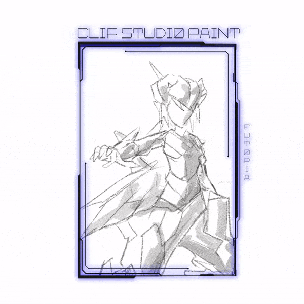
This month's tutorial is all about Mecha design; From cube to humanoid. If you're looking forward to start designing your 'HRD' Humanoid robot design, you have come into the right place, time, and author: Futopia.
〘 Simple Geometric Thinking 〙
The title of this section might seems a little bit misleading. The term that I should be using is cubic. However, I am going to break any and all good language practices and keep mixing cube and cuboid to label any cuboid shapes.
As with any matter like this, there is no one correct way to do anything. The examples here are simply just for the sake of examples and being as simple as possible. Expanding on basics and building on them is really the only way to get around.
The core idea is to take a cube and "spread" it to the similar breakdown as human would be, if we'd draw human with simple geometric shapes.
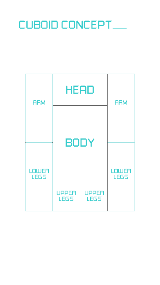
As previously discussed on my other tutorial about basic shapes, 'boxiness' is sometimes the most basic shape we use to define structures for drawing characters - not just a robot.
Since this breakdown is very boxy, basic, and doesn't really look all that attractive: I suggest you to understand the concept but not starting to doodle from that idea. The above is just a 2D repositioning of the box's areas for you to have a basic knowledge of humanoid centered design with shapes of boxes put together.
This is barely just the first step, as we need depth and sense how the transformation happens.
However, a man doesn't really look like this. As mentioned, a mecha really is an exaggerated geometrically portrayed humanoid.
The head for example is far too wide, the arms are stocky without hands and legs don't have feet. The torso is also just one block. So, let's disregard the box for a moment and adapt humanoid elements to 'Boxtron'. Let's disregard the base standing position too.
Instead of arguing the basic human anatomy from sketch, let me use one of many versatile Clip Studio Paint features that can be attained from [ Window -> Material -> Body Type ]
It will be crucial for break-down the most basic and simple basic structure and save you a lot of time! You can try to find it easily with my steps below:
Go to Window, then [ 3D -> 3Dデッサン人形-Ver.2(男性)] select [ Pose -> Entire Body ] to begin my 3D mannequin tracing:
You can try to manipulate the basic 3D mannequin later. As for me, I just choose basic standing position: [ Stand Firm ] pose and rotate it to the left a bit so you could simply see the side of mannequin better. I create another raster layer on top of my 3D mannequin layer, then with [ Design Pencil ] or you can use [ Real Pencil ] too, I sketch out structural joints.
I decided to keep the wide head. Giving it a wide visor and slightly mess with other dimensions give Boxtron slightly more balance.
Our robot looks a bit more pleasing now with more humanoid proportions, but due to lack of design details and everything else, Boxtron is still the most applicable name.
It also lacks joints and cohesive transformation scheme. Of course, using a car or something more applicable would be a better target, but let's try a stupid simple transformation outline for our Boxtron.
We've now turned a box into a robot. The joints that I didn't care to separately draw in are the same simple joints we've discussed earlier with simple rolls, pivots and double joints.
While Boxtron is still a box, it's now a box with some definition to it. This transformation would be 'Toyetic' (looks like a toy) on the scale I use. It would work on both paper and in a toy, but in reality there would be issues with the legs twisting from the side, and arms and torso popping out like that. Boxtron of course lacks any and all detailing, what it really is when it's a box, but that could be anything from a boxes to something like a spare pocket power battery.
The head of course could see some work done to it, with section of it turned into a backpack or something with smaller visor, but for the sake of simplicity let's keep it big and blocky.
〘 Artificial Intelligence & Personality Through Design 〙
Character's personality is a crucial part of creating engaging, believable and likable designs - even for a humanoid or android.
It is not enough to have beautifully drafted character, but your audience should be able to relate to it and "connect". Since the dawn of humanity, people memorize things by storytelling – we just love stories! So it is no wonder that we also look for the personality and the story behind characters as well.
Designers are more and more concerned of how to convey the personalities and the tale of the characters. And we don't blame them, since it's proven, that designs with a story and "character" get far more positive responses and engagement from the audience.
[ Conveying Character's Personality with a Square ]
The square shape is often found in nature as solid shape of rocks, mountains and it is usually perceived as something stable and heavy. You can often see in the physical appearance of strong and masculine characters and warrior square or rectangular shapes.
There are cases too, where the character is not a macho/hero, but the designer are using square shapes in his body too, to project his solid, stable and may be stubborn personality. Another qualities often assigned to a character's personality, because of their square shape are dependability and confidence.
[ Conveying Character's Personality with an Oval ]
Think of the sense of touch, something instinctive and natural. We inherited the perception of oval shapes as safe and soft, on the contrary, angular shapes are warning for possible danger. Let's focus on the ovals for now, and in the next section will talk about the triangle primary shape.
Most of the well-known protagonists are designed around oval shapes, as this shape is perceived as friendly, safe and harmless. The oval shapes are often present in baby’s characters – children and animals, in chubby adults and so on.
Have a look at Remy's brother from Ratatouille – both of them mice, but the first is much more rounder to convey his soft and bit naive nature of character. Next is Russel from Up – his whole body is made of soft, round shapes and it is used as a contrast to the square body of Carl. This is yet another technique to underline someone's personality, by putting him next to another character.
〘 Rust / Corroded Metal Texturing 〙
Since this tutorial is a humanoid design representation, I don't need to worry about the complexities of space, mood, or even background detailing. I'm just concerned with material, color, and light as well as convey design principles in the 'bot-making' guide.
I have steps broken down into 4 separated GIF images to show you (that most of the time) I only depend on 'digitally traditional' way of texturing with brushes provided by Clip Studio Paint rather than having tons of textures to be applied like most of the artists either using multiply or overlay blending mode.
YOU DON'T NEED IMAGES FOR OVERLAYING TEXTURE (if you have no internet connection to find it online); you only need Clip Studio Paint default brushes & some tricks.
So let's check this out:
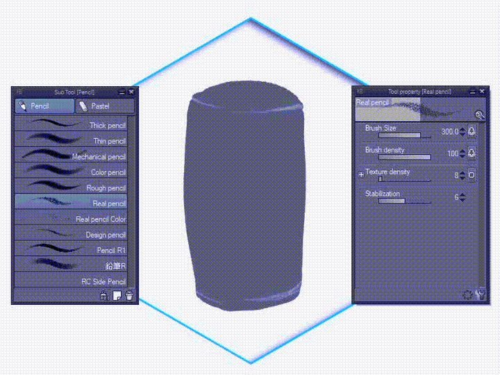
[ Real Pencil ] to block some of the shadows, the reason: it has details of texture that I need. So I don't bother to find another brushes or modify ones. Just using pressure while drawing and changing brush size to achieve different results.
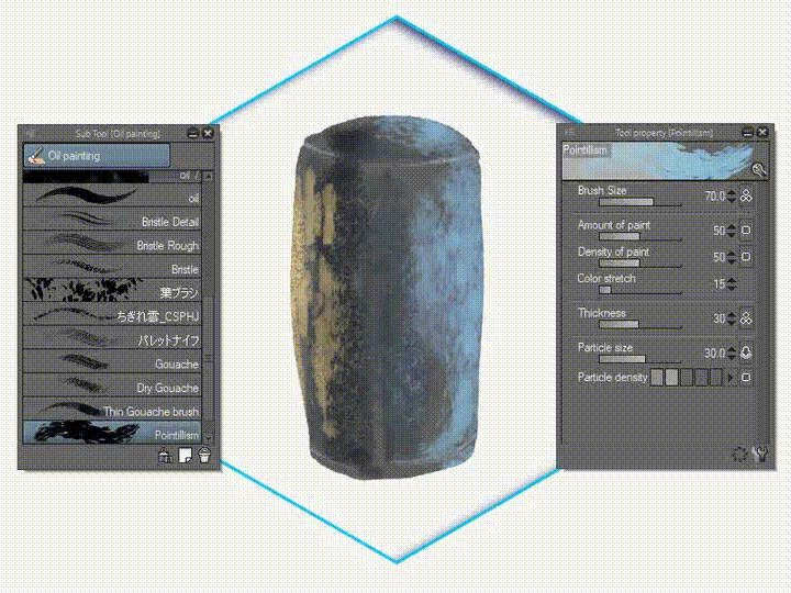
[ Pointillism ] from [ Oil Painting ] to emphasize and blending textures. The metal looks like rusted ones if you apply precise colors, playing with brush size will make the dynamic of rough metal details.
Detailing some blurred areas with [ Real Pencil ] while mixing with [ Running Color on Fiber ] will also add some matte version of the metal.
Using [ Finger Tip ] to blend it altogether will also had a feel of polished metal.
To achieve a good result, I just need to follow some simple rules. This shot is low lit, so a fairly uniform top-down lighting model works best. Surfaces facing up receive the most light from whatever lighting the machine. So these will appear brightest of their given local color (the color of the material under neutral light).
In this step, I also need to show you how to render brushed metals for the Mechanoid P0L-1CE (for the next section).
With unconventional method, I found that having an ability to know which unusual Sub Tool such as [ Decoration ] can also help me to discover the exact brushed metal effects. But be sure to change or modify its [ Blending Mode ] from Normal to Overlay or Soft Light, depending on your need.
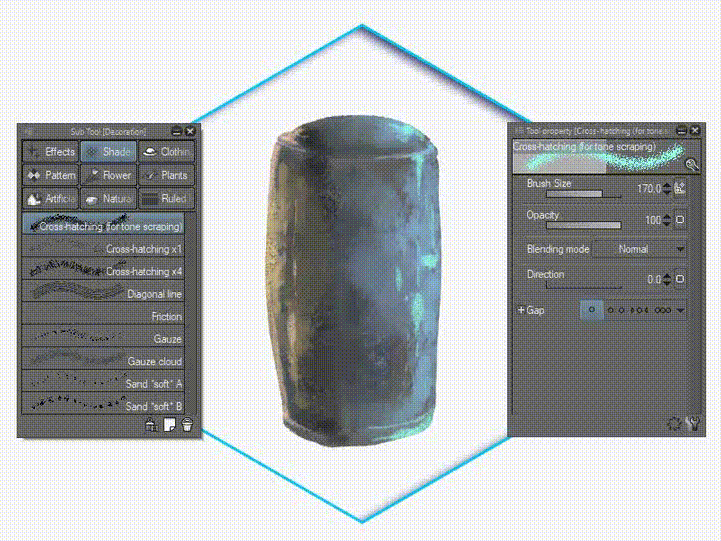
Tips: I'll never know before I tried it by myself that, by using [ Crosshatching For Tone Scrapping ] and its Blending mode; will allow me to achieve multitude of unique scratchy effects of metal. Especially with Multiply mode and darker tones, I use dark green to apply greenish look for metallic body. Adding Soft light to get softer and richer color.
At this point I'm looking at the painting and thinking that the material specularity is off; it lacks the signature hard-edged shine of polished aluminum and that's easy to fix. I just harden up the lower edge of the highlighted area of the surface and we're there.
The basic rule is this - the more reflective the object, the harder the highlight. The less reflective the object, the softer the highlight.
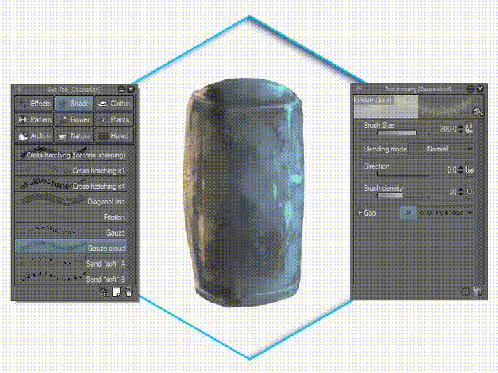
I used to paint over the whole area first with [ Gauze Cloud ] and pick [ Multiply ] for its blending mode to define the darkest parts of the object and also more saturated for their given local color. We also need to consider shadows cast across the object and some cracks with broken parts.
After you try to understand the concept. Below is how I achieve cracked metals as I paint on some areas of Mechanical body. You could do it with any other way, such as using Pen brush; but in my opinion; it's too sharp. Try to add some darker area for the surfaces with either one of these brushes: [ Real Pencil ] or [ Design Pencil ] brush and add lighter parts as well with color picking near colors with the layer you're on.
Happy metal texturing-!
〘 Mechanoid P0L-1CY | Example for Texturing Study 〙
Simplicity isn't exactly a bad thing. Overly complex transformation tends to make fragile objects and awkward design of Humanoid or Mechanoid, both in and out of fiction (unless you're a Giant Mecha or Robot lover that doesn't care about that 'out-of-nowhere' transformations).
Nevertheless, whatever sort of transformation this would be, it needs to be exciting. That's the whole point of it all, really. You can have a bland transformation like this example below - a humanoid police woman design, but when you put something 'to transform' - it could be just her arm or fingers - that would be considered to be cool as well.
⬢ Humanoid Police Department Unit: P0L-1CY ⬢
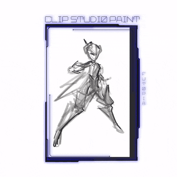
A simple sketch, a very rough one was deployed with [ Design Pencil ]
My suggestion: do NOT try to over-complex your design. Try to think it with simple form and even you can use the 3D mannequin from Clip Studio Paint to position your character (humanoid).

Refine with [ Real Pencil ] although some of the elements of humanoid will be detailed for later.
I focus on creating the 'mechanical arm beam' and 'steam-punk armor' with references from various places: internet and real books. I have books that show me how to properly draw guns, turrets, even bazooka - real and fantasy weaponized gadget references.
Reference is the key here. But since I'm unable to give those images (because of the rules) - let me just remind you: collect few references that related to your subject only: between 5 references. Select the best ones, narrow it down to 3 major inspirations. Do NOT get too many, because in the end, it will only confuse you.
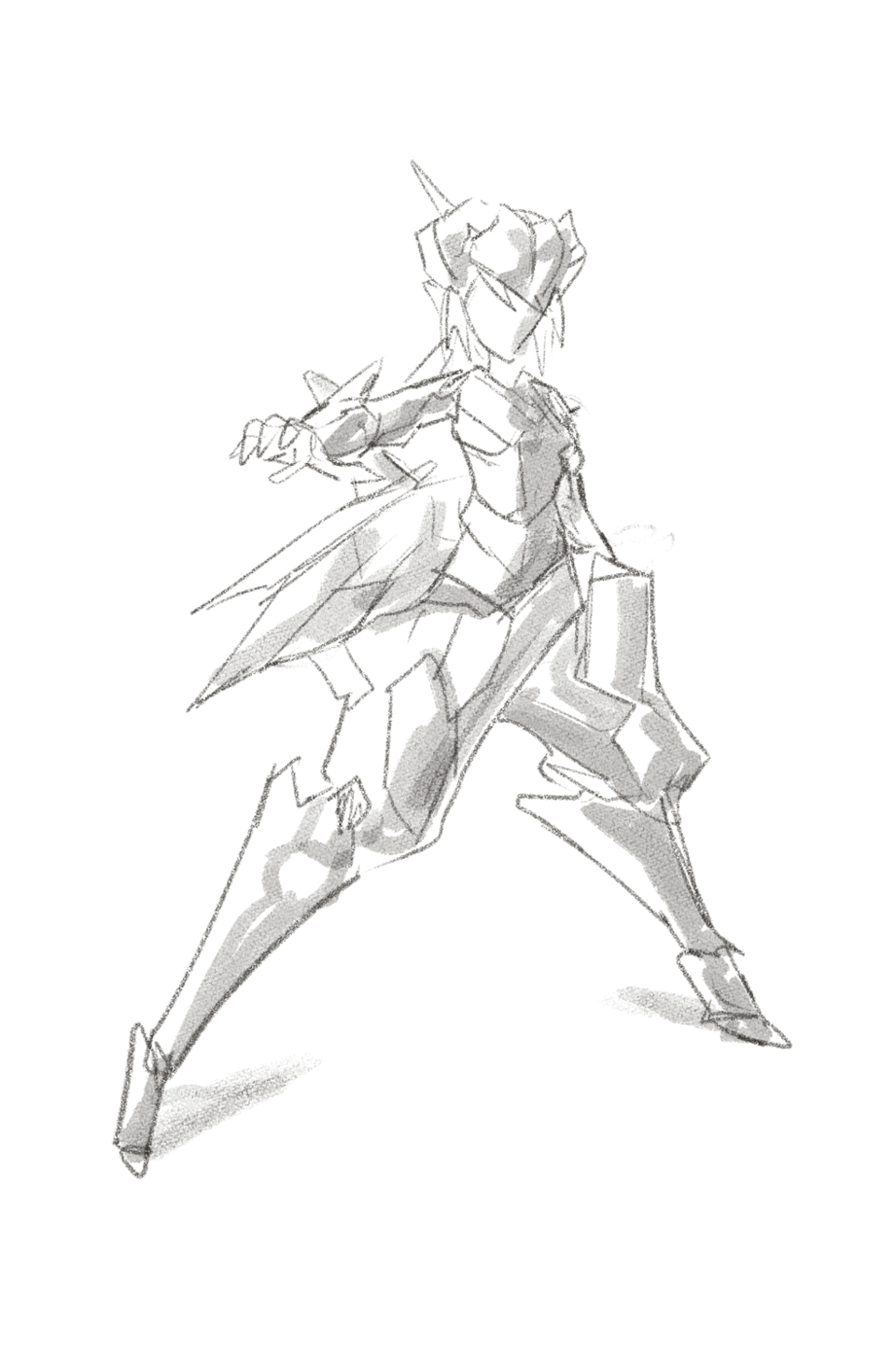
⬢ Final Rough Sketch ⬢
Looking good so far although it's just a rough sketch - but it's clear enough for you to see where this humanoid design going further more, the only thing I do is creating a new layer and start defining the sketch into line art with [ Mapping Pen ] or [ Textured Pen ].
⬢ Final Digital Inking ⬢
As you know, every-time I create character designs (whether it's humanoid or fantasy creatures): I always do the color blocking to make things easier to color and separate between the character as well as the background. So, I did apply the same techniques over and over again and it's self explanatory.
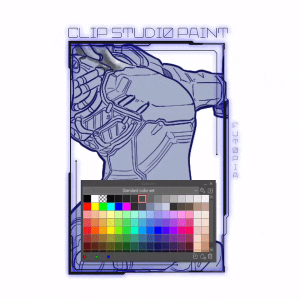
⬢ Design Pencil to add Shadows & Highlights ⬢
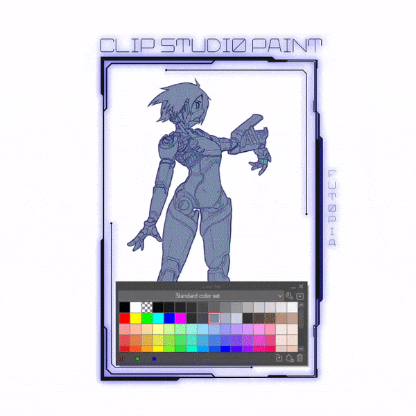
I'm pointing out [ Color Set ] in order to make things clearer for you to see - the way I use to apply my color techniques always starts from [ Standard Color Set ] and use the first line which has dark to light (black to white) values.
With [ Clip to Layer Below ] method, then I'm using those color selections and [ Design Pencil ] to achieve shadows and highlights. This method is necessary to create if you wish to make your coloring faster in the future.
⬢ Applying [ Decoration ] Brushes to Add Metal Textures ⬢
There are many types of textures that will be displayed using [ Decoration ] brush. A few of 'metal-look-alike' textures which I think close to what I want is on the [ Hatching ] tab:
[ Gauze Cloud ] for creating a 'dust' textures.
[ Friction ] as its name suggests to add some corroded textures.
[ Diagonal Line ] to add interesting scratched metal textures.
As you can see from the PNG file above, if you wish to see more details: you can try to right click with your mouse [ Save Image As... ] from your browser or [ View Image ] and there you go. You can anything to create onto the layer but make sure it's not too uniform - a randomize, overlapping two or more textures will create a sense of 'humanoid' feel. A good way to practice above techniques (rust & corroded metal textures) which I mentioned before especially for the armor of your humanoid design (if any) so it's not going to be flat like colored version of my own image below:
⬢ Applying Colors on Other Layer ⬢
You can try to give some colors on your Humanoid character design, but my suggestion: try to stick with somewhat dull color selections. Because it's what I learned so far from any games or movies with 'cyberpunk' or engineered human theme.
I'm using [ Pen ] brush to give 'hard-surface' and selections of flat colors with slightly smudge them with [ Blend ] brush. Two of super useful design tools you probably haven't heard of for finding good color choices to your design:
After you've done with the texturing part, you're always welcome to experiment on the layer's [ Blending Mode ] from [ Multiply ] to any other modes.
Also you can try to create a copy of the values layer (the one with black and white only) and set its layer blending mode to [ Add Glow ] to initiate the highlight phase.
Actually for the [ Highlight Phase ] - I'm using a duplicated layer from values layer and change its parameter to this:
[ Blending mode: Add Glow ] to increase the textures' brightness
[ Opacity: 70% ] to make the overall highlights not too bright.
You can try to make a distinctive features over the armor's scratches by erasing some and highlight the others. It's just a matter of practice and experiment, don't stress yourself if you're not getting what I had over there. Happy trying!
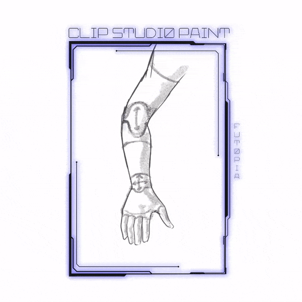
〘 Cybernatic Arm Study | Using 3D Figure 〙
Here's the basic form design of cybernatic arm, you can see these type of arms from various cyberpunk-themed games and movies. Actually it's a man-made or mod (modification or modified) arm which 'installed and built' with science-fiction technology - either in real situation for disabled people or just a sci-fi movies in general.
Let's not beat around the bush, almost all modern mechas have been designed to be toys or at least toys in mind. Robot toys are nothing new in itself, but the modern level of robot toy design can be attributed to Takar and Banda, mostly because they wanted their toys to sell. While you may not like Transfrmers or Gundms all that much, both of them are good examples how even a simple joint can be effective in a toy when done right.
You can always try to design one using default one of [ 3D ] assets from Clip Studio Paint awesome pre-installed feature!
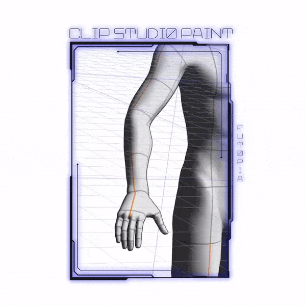
If you hit google or library and look for mechanical joints, you'll get a large amount of referential materials how joints are designed and for what purpose. Thanks to 3D figures or mannequins that Clip Studio Paint made! You no longer have to worry about the awkward and weird positions because those mannequins already had the limitation to rotate!
Pivots are another essential piece when it comes to joints you to use, so add it to your list of things to look up. At its core, how your mecha or humanoid design can move is all about joints and pivots. Outside the reality how much stress they can take, what's powering them and all the stuff you'd need to take into account in real life, in fictional robots it's enough to just have them seemingly work in a plausible manner.
We'll go over two basic types of joints this time and their limits and possible uses, there's no real use to get into more elaborate designs now.
Joints' themselves are not just limited to their own directions, they are naturally affected whatever design your mecha or humanoid has, and it's not uncommon to see e.g. a Gundm's movement limited by its armour design. Gundm Unicorn is a good example of a design that can't make the best of its knee-joint due to large portions in the back of the leg. Similarly, Transf*rmers' design in itself limits their motion at times.
So you must keep those in mind while designing the mechanical arm or feet of your humanoid design: the first is a basic joint, a hinge joint, henceforth called a single joint.
〘 3 Approaches to Design Humanoid / Mechanoid 〙
The three approaches to mechanoid design this tutorial uses is based on their role and function within fiction rather than in-fiction.
The first archetype is the Protagonist, a mechanoid that functions or acts like any human character and is treated as such within the narrative.
The Protagonist mecha as a humanoid character serves an integral role within the narrative. Initially they may seem like simple machines, like the eponymous Maznger Z, yet they exhibit clear-cut human characteristics in actions and behavior. Maznger Z sunbathing in the original series Maz*nger Z-series is this exact human-like behavior the mechas are written with.
These type of mecha can also be explicit characters unto themselves, as it is with the The Transf*rmers and Brave-series. These mecha are only separated from their human co-characters is their nature as giant mechanical beings. In cases like Beast Wars, there is no distinction between characters as such, all of them simply are the characters, but share the main characteristics of being human equivalent in different form.
///〘 Protagonist Humanoid | Mechanoid Type #01 〙
For this chapter, I will put into practice some of the tools and techniques discussed on earlier section and apply these with the aim of creating a finished Protagonist Humanoid Design. For this artwork, it will be broken down into three sections that will cover different stages of the process starting with sketching, blocking in, composition and perspective.
We shall follow with a look into building on the established structure and how to transform shapes into tangible forms and volumes as well as increasing the detail.
The third installment will run through incorporating some textural realism using Clip Studio Paint default [ Decorative ] brushes and generally refining the final image to a conclusion.
Section I /// ⬢ Basic Structures of Mecha + Humanoid ⬢
Describing a mecha as boxy might be a good start when describing some robot's looks. After all, famous bots like Optims Prim# and RX-78-2 Gundm have a body build that's mostly built on boxes.
Boxy does not mean that the body parts build is made of square shapes, but sometimes on the overall silhouette of the mecha or humanoid. However, boxiness itself doesn't describe the design direction of the mechanoid, just the shapes of it.
To go into crunchy detail, design does not only mean visual flavor or how something looks. Design has to take use and intention into account: otherwise you're ending up with sculptures.
Mechanoid, by vastly large degree, is designed in and out of universe to serve a certain role and its outer appearance has to reflect this. As such, a boxy design doesn't really describe the design of the mecha nor humanoid but rather the geometry of it.
The term works in everyday use where we don't give a damn about the finer detail, but once we start to talk about design, the term really needs to be thrown out.
Section II /// ⬢ Action Lines + 3D Pose Check ⬢
Section III /// ⬢ Details of Mecha + Humanoid ⬢
Describing a mecha as boxy might be a good start when describing some robot's looks. After all, famous bots like Optims Prim# and RX-78-2 Gundm have a body build that's mostly built on boxes.
Boxy does not mean that the body parts build is made of square shapes, but sometimes on the overall silhouette of the mecha or humanoid. However, boxiness itself doesn't describe the design direction of the mechanoid, just the shapes of it.
Thanks to 3D mannequin from Clip Studio Paint; it gives you an easy way out for difficult battle position for your Humanoid character - whether it's a standing firm or combat stance, for me; to be able create the Protagonist Humanoid correct perspective with one of the arm pointing out to the viewer's side is a blast for me (because I always struggle to do it before I know this feature). Honestly, I start my sketch without 3D, I try not too much depend on using figures to help - but I just try to check whether my line of action align with 3D position, that's all.
Details with [ Mapping Pen ] and shadows with [ Design Pencil ] just as usual.

///〘 Non Humanoid - Humanoid Bots | Mechanoid Type #02 〙
It must be mentioned that most Protagonist mechas are found in media aimed at younger audiences with healthy amounts of toys, and tend to have connections to the Super Robot side of mecha. This is not to degrade from the fiction itself, only an observation.
Naturally, the opposite of human-like characters would be the lack of humanity, as it tends to be the with the second archetype, the Machines, the Drones, or the Droids.
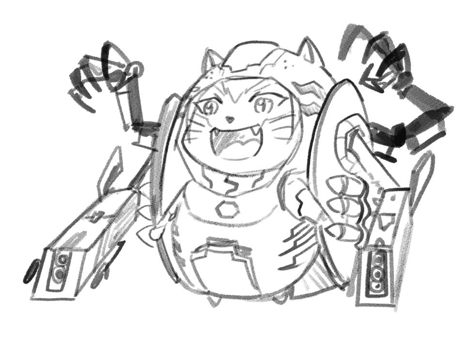
Below is my simple approach to draw the 'anatomy' of a non-human but still mechanoid with an egg. I called it Eggnodrone.
Unlike with the Protagonists, a Machine has no nature to speak of. To make a blunt comparison, they are toasters. Their use is largely utilitarian. The form is made and designed for a purpose first and foremost, following the necessities over flavor.
The Machine comes in many varieties, all of which share multiple characteristics. Mass production is one, where the mecha can be or is mass produced. I try to create this second type of Humanoid just to describe where mechas are mostly being used as tools, even if they had a face like human or a cat. They can be a destroyer or serve as... The labor bots.

Since I don't have enough time to record my process (but still I want you to see my validity of making this Eggnodrone) here's the simple steps using JPEG images and GIF.
1. Initial sketch with [ Design Pencil ] as my trusted companion to draft my ideas!
After done with the sketch (with a bit wire-frame) now, let me continue making the details of Eggnodrone with values or you could simply call it shadows...
2. Now using [ Design Pencil ] for adding values/shadows.
This might be a mini-speed paint project, because I think I finish Eggnodrone around 30-40 minutes... Well, maybe more? Because I forget to record this time. :(
3. Inking with [ Textured Pen ]
Now into the inking part. Usually I begin with lowering the opacity of my sketch and values layers, then go with a new layer on top of those two and using the [ Textured Pen ] to get the feel of doing outline (inking) like traditional media.
4. Blocking [ Turnip Pen ] --> [ Fill Tool ]
Just as usual, I'm using [ Turnip Pen ] to give the outline then fill the inside with [ Fill ] tool with dark grey, in order to clearly see my drawing and able to give the highlights better as well.
5. Pencil + Pen + Brush techniques
I use these following type of brushes interchangeably to make the overall painting process not too tedious. First: [ Design Pencil ] to give some easy textures to apply (and ofcourse you can try with other type like [ Decoration ] --> [ Hatching -> Gauze Cloud ] after that, secondly: I used to apply [ Watercolor Brush ] to give blending strokes. Lastly, add some [ Turnip Pen ] for highlights on some parts before I blend everything together with only [ Watercolor Brush ].
5. Sub-surface Scattering effects
Adding a little bit of [ Airbrush --> Soft ] to some darker areas (claws on the back) will give a visual highlights similar to sub-surface scattering (sss) method. Can be a combination of warmth and cool colors such as yellowish orange or cyan blue.
For the top of helm, I use a combination of yellow as well as creamy orange color. Then using a little bit addition with [ Airbrush --> Soft ] for the back of blue shields (armor) and other creamy colors for the right railing gun.
6. Normal to Overlay layer [ Blending Mode]
Finalize with adding more highlights colors into the outline with [ Airbrush --> Soft ] and sometimes with a bit of [ Design Pencil ] for the textures too.
Set my values layer's Blending Mode from [ Normal ] to [ Overlay ] and as you can see the 'textured' shadows become subtle-! Oh yeah, the logo of CSP was being colored with [ Turnip Pen ] for the bright white then use a bit of bluish green and [ Color Dodge ] for the brightness around it to make the core somewhat glowing.
Step by step GIF - Eggnodrone deployed:
My Eggnodrone simply made out of an egg shape. If I can turn an egg into a humanoid form. You can try to make anything out of it - and not only a box! Many optional shapes can be found from something around your place. For example even a box of tissue can be transformed into Autob*ts beaming lasers.
You can try to create your own humanoid bots to help you lift things from heavy ones to... Just about anything even a tea!
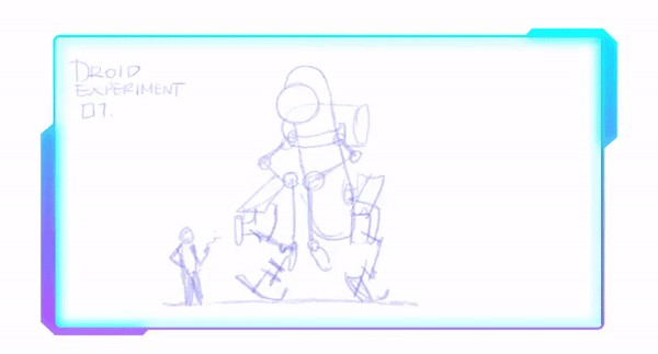
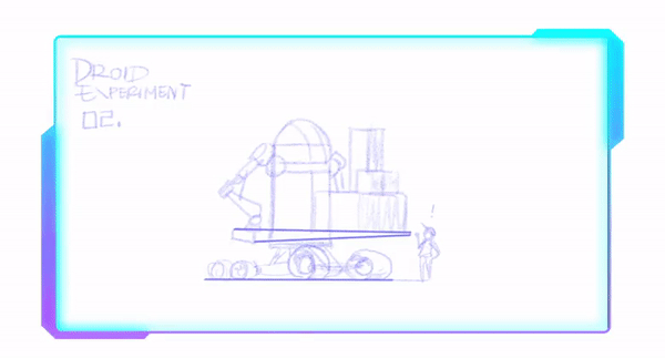
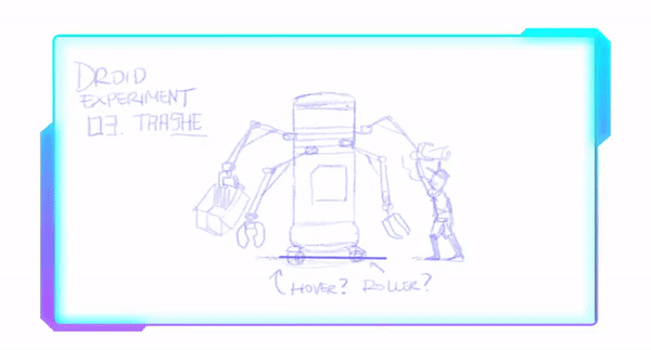
------- initializing old database -------
Take a look for a few of animated gifs below. I took them from my old archive when experimenting them with Galaxy themed tutorial. :D
///〘 Transportationoid | Mechanoid Type #03 〙
Vehicles technically fulfill this last spot of categorization of Humanoid Design.
However, it's not uncommon to see the the aforementioned archetypes mixed either.
The Hybrid approach takes characteristics from both sides of the fence in a happy mid-ground.
Perhaps the most well-known examples of this would be the Evangelin units of Nen Genesis Evangeli*n. While treated as equipment and something that can be mass-produced, each EVA-unit exhibits overt human-like characteristics from in-universe and in their role.
EVA-01 is effectively one of the main characters while still serving the role of a toaster. Its design goes for utilitarian, but only in terms how the EVA-unit itself allows this in-fiction. The base design idea was, after all, a monster barely controlled by humanity.
Another method to give mecha character is by keeping the core mechanics itself intact in terms of its role though the use of Artificial Intelligence.
Droid itself has no conscience or awareness within fiction, no character to speak of. Its actions and behavior are determined by its pilot and support AI, A.D.A. In principle, A.D.A. could be embed into whatever Orbital Frame would support the addition.

These three approaches are more or less starting points, more or less. While at first it may seem arbitrary to make a category of three, one of which is effectively just combining the first two, they serve their role in setting the proper mindset for design work. That is, the nature of the mecha or humanoid rather than the end-visual the designer ends up making.
That is up to you, as you will have your own design style and research into the subject materials of creating your own Humanoid / Mechanoid Design.
〘 End Transmission 〙
Nevertheless, whatever sort of transformation of your Mecha or Humanoid Design - this would be, it needs to be exciting.
That's the whole point of it all, really. You can have a bland transformation like the first 'Boxtron', but when you put something into it - better mechanism - it will be much more delightful to see. For toys, something like a battery effect that lights the eyes for a moment when the head is pulled up or something simple as ratchet joints that click pleasantly to the ears while giving satisfying tactile feedback to the hands does the trick.
For animation and comics there needs to be the cool factor in there, with music, posing and situation, the while "man's romance" thrown in there in one scene. Even a simple transformation from a box to a robot can make an impact when made right. It's all about how the design and surrounding work works.
Thanks for scrolling until this far. Hope you and your Humanoid Creation will be having a good and safe days! Please #stayhome and #staysafe during this pandemic time. Hope our Future of mankind still survive until we had the Nano Technologies to eliminate them.
Users who liked this post


Comment