
This tutorial will teach you to make something fresh and unique for nightmarish creatures that lurk in the shadows.
Suppose you think that every idea has been done before, such as demons, ghouls, ghosts, goblins, reapers, etc. Like the image above, those are the typical 'uniform' and stereotype kin of dark creatures (except for my logo over that which hugging a tomato!).
As I stated before in my other tutorial about Fantasy Creatures above, taking something physiological or psychological is a great starting point if you don't know where to start.
Using the usual form of combining humans, nature, and animals will be what we will learn again. But I will add the extra lessons to introduce you to use lightings, brush strokes, atmospheric environment design to shape the terror when our creatures emerge from the abyss.
Before we slip into the nightmare realm of the dark creatures, we must admit that real animals have always played an essential part in shaping history's most famous mythological creatures. The philosophy behind mixing discernible animal anatomies to create dark creatures is always unfathomable!
Introduction
When illustrating a dark character or creature, the approach I take will vary depending on many factors, such as what I'm trying to communicate, the time I need to do it, what effect I'm going for, and even what story I'm in a mood to tell.
These create a difference in my approach because all of those factors will make my final image feels different. Suppose I'm given the freedom to design a dark character without the constraints of a speedy turnaround and the need for many variations. In that case, I'll treat the concept more like an illustration for RPG games or epic graphic novels.
The video below will be the complete series, combined from 3 separated tutorials I've been uploaded to YouTube. Feel free to pick which ones you like, but I suggest you watch from The Dark Lady Knight first and scroll down to learn more quick techniques along the way.
The Dark Lady Knight
YouTube video above will show you how to create The Dark Lady Knight with Clip Studio Paint Time-lapse drawing feature, but you can also read the following written tutorials composed with GIF and JPEG images to guide you along the way:
One of many aspects I found pretty interesting will be creating a hero who turned himself or herself into the demon he/she killed but still able to control the dark power within.
[ The Dark Lady Knight - Initial Sketch + Refined Sketch ]
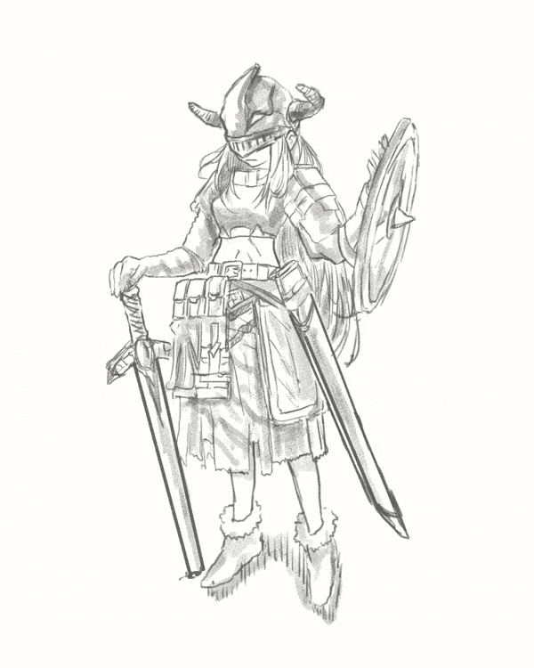
I start building my Dark Lady Knight character by thinking about her gesture, dynamic shapes, weight, and proportion as a hero. It's essential when designing any character to keep it looking loose and relaxed rather than appears as a villainous pose.
Try using [Design Pencil] to explore block shapes because you don't want to start with a stiff or rigid gesture; a relaxed pose will have more life and show more personality to the viewer. However, after I got the desired position, I refined my sketch with [Tapered Pencil] to visualize the overall design.
[ The Dark Lady Knight - Inking ]
[ The Dark Lady Knight - Values Shading / Dark to Light Gradient ]

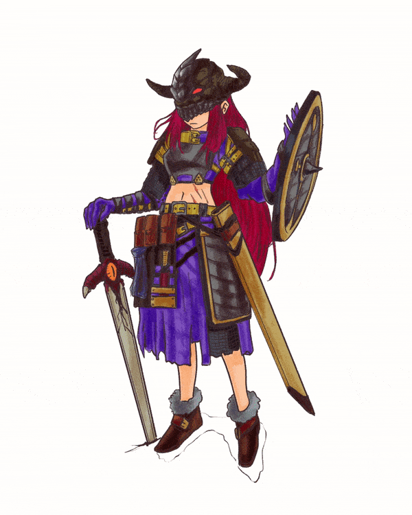
As I'm finalizing after inking with [Tapered Pen], I'm thinking of her body proportions and fashion in general. She's a petite warrior but with overpowering strength and agility. But I still find plenty of opportunities to vary her form - giving her an apron as her primary article of light armour.
Thin armour helps reinforce her tiny body and mass; adding delicate costume details wouldn't make much sense - look at that demon sword! I was initially going to give her a big axe as a weapon, but I decided to go with a blade and shield instead.
All in all, I ended up rendered the entire image with [Design Pencil] to sketch with a dark brown color choice [ HEX: 56493D ], so it feels dynamic to add value to her overall design.
[ The Dark Lady Knight - Masking & Base Coloring ]
Here is my 7th Layers Breakdown:
1. INK layer. Where I put my clean ink outline [Tapered Pen]
2. VALUES layer. Where I put the 'shadows' for the character
3. COLOR layer. Where I put colors later with [Clip to Layer Below]
4. BLOCKING layer. Where I need to give the whole character base color simply best to work
5. REFINED layer. Just a refined sketch after drafting [Real Pencil]
6. DRAFT layer. Idea & initial very rough sketch here [Design Pencil]
7. PAPER layer. Where I can change the color of my 'background' or make it transparent
Please note that I turned off some of the layer's 'eyes' so you can see the neat outline with its color blocking.

'Masking' is another word that I use with Clip Studio Paint [Clip to Layer Below] feature that has already been implemented so far throughout many artist's workflows.
If you see from Timelapse GIF above, I use very bright green with [Turnip Pen] to give outlines on top of the INK and then fill it inside; after that, I change its colour to grey before reorganizing the layers' structure - I move it to the bottom of COLOR: please refer to my Layer's Breakdown.
The 3rd Layer (COLOR) has the red-striped sign beside it. That means I've been using the [Clip to Layer Below] feature to make every colour neatly done without worry if my colours go beyond the blocking.
And here's the result of my flat colour:
Whenever you're ready with base colours, it's time for you to change the Blending Mode of VALUES layer from [50% - 100% Opacity of Normal] to [ 50% Opacity of Overlay], and you'll be getting this result below with less visible shade:
Please note, it depends mainly on the pressure of paint strokes. I will make it around 50% Opacity because I want to have a subtle gradient to my artwork.
Between [Multiply] or [Overlay] Blending Mode, you'll need to decide for yourself; I'm fine working with either one of these two Blending Mode for my series of character design artworks, and I did interchangeably.
More practice will make you more understand for which one to fit the artwork, and it could be a subtle gradient that works best with Overlay or darker tones for Multiply.
You can see the work in progress of my Dark Lady Knight through my speedup YouTube video but let me breakdown some of the processes through GIF images below:
1. Below will be the example of using [Multiply Blending Mode] for the VALUES layer:
2. Adding lightings + Changing the Color Mood with darkened Background
3. How to make the Demon Sword + Finalize with Frame
[Multiply] and [Overlay] will be my two primary Blending Mode option when creating an epic looking character design colour scheme.
1. Multiply will be better for the Dark theme
2. Overlay will be suitable for the Classic or Retro character design
My drawing had too much dark contrast, but I will tone it down later. I'm using high contrast colour to be able to add highlights on top of the COLOR layer.
From GIF above, you might see the progress on the bone helm first. They are using a combination of slightly white and yellow to create warmth colour for specular texture. And another white mix with a blue to add minor 'cold colour' contrast.
[ Lighting & Mood on Dark Background ]

Now it's my favourite part aside from designing the character! Adding backlight to make my character design stands out! Also, creating the sword and turn it into the demonic one!
This approach will make my Dark Lady Knight unique and capture the essence of darkness power into the drawing without many cliche elements or accessories such as skull or teeth necklace, devil wings, or even unusual gigantic claws hanging about.
[ Rendering Metal & Framing the Dark Background ]
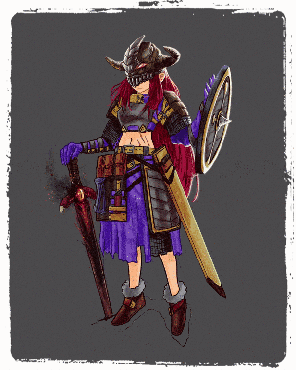
I have to admit my colors seem too vibrant for a dark warrior, so I desaturate the whole image with [ Hue/Saturation/Luminosity ] by pressing [ CTRL + U ] and let the [ Saturation ] slider goes to the left quite a bit.
You can see better when I add a bit of white to her armor and other areas reflected by backlighting. It's shinier now! Last but not least, only for fun, I give a random white to the flat grey background.
Now another thing to be remembered: background matters to make your character design presentation stands out.
Take a look at the below comparison between white and dark gray background then you'll be the one to judge whether it's true or false with my method:
Finally, it will be easy to create her if you already know human anatomy and render weapons, metal, and lighting effects. As a final image below, I'll finalize the whole illustration using background colors that appear as she's inside a dungeon or something from a game.
[ Bonus ]
A PNG version of The Dark Lady.
(Now, your browser's history will be guarded by her!)
You can experiment with the difference between the light or dark background of your choice! Happy creating your personal Dark Lady, folks!
The Demon Canines
You probably should have heard about demon dogs and their stories from grandparents. Though they belong to myths, they are believed with different beliefs and aspects in other countries.
Dogs appear to be ghostly in myths in almost every culture of the world. As lovable as our dogs to us, they are also perfectly fit for paranormal stories and beliefs. Here are some of the demon dogs from myths and beliefs of different parts of the world.
For those who love dogs (canines), this chapter might not be for you because I will turn the cute, harmless man's best friends into dark creatures from the realm of abyss.
/// GIF above was made during my free time using the Timelapse feature and Mapping Pen.
On a side note, this chapter is fully dedicated to India Ink Brush!
From this chapter onward, you'll be using lots of India Ink to level up your creature design, and I will give you some of my best tricks to provide you with insight into each brush relevant to the making of dark creatures ranging from demons shaped dogs, wraiths, to Cthulhu.
Please be informed that all creatures below will be created using the default brushes and monochromatic approach (black and white) only.
So let's start with the newest favorite brush of mine:
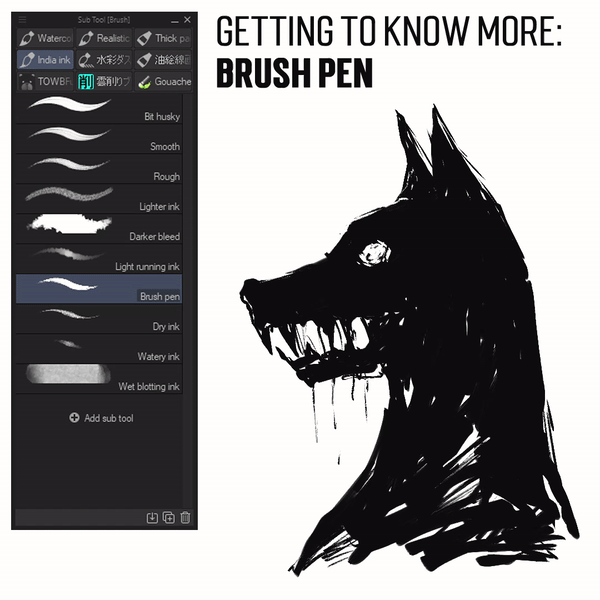
[ Brush Pen ] is the new addition to Clip Studio Paint and instantly becomes one of my favorite from this 'family' of India Ink.
You probably need to adjust your pen pressure if you're using a smartphone or a tab. As for me, I'm using Graphic Tablet (can't mention the brand) with high sensitivity and directly draw on the surface/monitor screen. Every stroke feels different, and speed will be your key to shape the demonic dog's head.
After you've done with the Brush Pen, I'll be using the 'old ones' from India Ink because it's an excellent combination to remove some pixels smoothly:
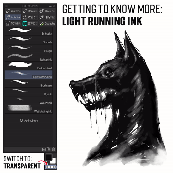
[ Switch to Transparent ] will be one of many techniques I'm using throughout my illustrations since I'm using Clip Studio Paint for everyday digital painting.
The shortcut will be effortless. Just press [ C ] on your keyboard!
Again, the pen pressure will be the key, and if you're using too much strength when giving a stroke, [ Light Running Ink ] will remove the pixel too much. My only suggestion, you need to try it out by yourself by switching back to color by using another [ C ] on your keyboard to fill areas that have already been removed.
The Cadejo of Central American culture is a similar demon dog as the Okuri-Inu that either helps or eats you. According to the beliefs, this dog is of two types; Black Cadejo and White Cadejo.
From this Cadejo, let's move out to another infamous dark creature that is probably well-known to everyone: the Werewolf. And I'll introduce you to another new brush:
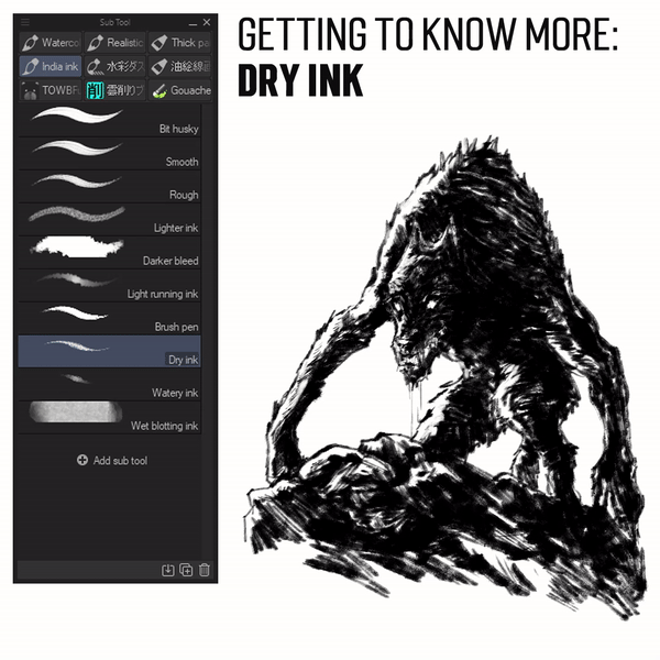
[ Dry Ink ] is my second best to use after [ Brush Pen ] for this new brush set because it gives you a 'dry' media effect while stroking the brush with speed.
It's best to use for many things, and this Werewolf will be just one of many examples I'm going to share. Later you can even have a jaw-dropping moment on what this brush capable of doing! Using a bigger size of brush will fill the area. When it comes to medium size brush, you'll be having a slightly cool 'dry' effect.
Don't forget to [ Switch to Transparent ] mode between adding dark and removing some of the pixels, especially the areas in the nose, head, and other highlights parts!
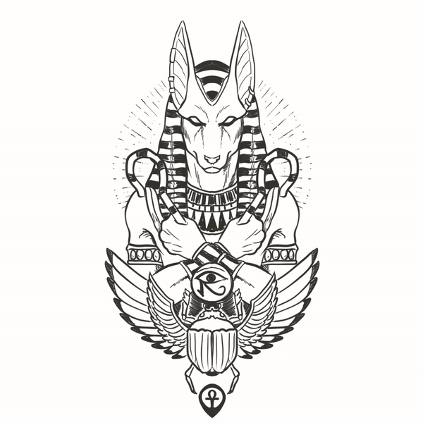
Up next, for the great Anubis, I'm going to introduce you to another versatile new brush:
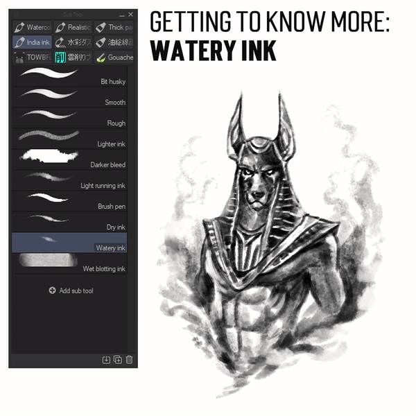
[ Watery Ink ] is the best yet compatible brush for many things to form; contrary to its name, I will use this 'watery' brush for other elements such as smoke, fire, and dust.
All in all, you can see that using [ Watery Ink ] completely to create Lord Anubis kind of fun to do! Starting on the lighter parts of the body, then using different pressure, I can define the 'darkness' level or aura shrouding him!
Last but not least, to create Hellhound spirit, I'd like to introduce you the most difficult to handle brush on India Ink:
[ Wet Blotting Ink ] is a tricky brush. It will be a put into my more minor Sub Tool selection, but somehow it works like a charm to create a fast randomize image block if you're running out of ideas which Sub Tool will use to make quick thumbnails.
Don't forget to try different sizes, pressure and switch to transparent colors when using this brush. It's what you can see on my GIF above.
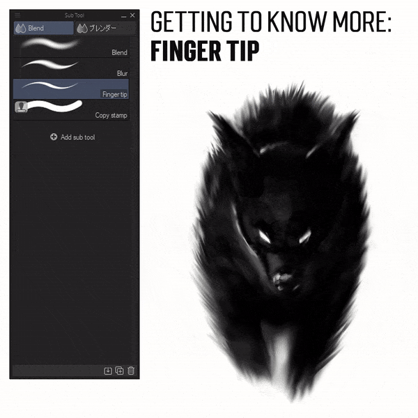
And I give you another brush to know more about its versatile function regarding messy output, just like using a 'digital comb,' I pick [ Blend ] then [ Finger Tip ] brush then with various brush sizes then start to do the magic.
I'm giving a stroke back and forth to the pixels and make it looks like the Hellhound is running after you. If you want to make it a fake motion blur, use a bigger brush!
But if you're going to make details of its furs, you can use a small one!
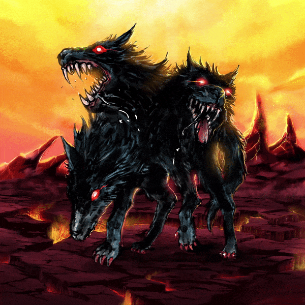
The Guardian of Hades: Cerberus
Now that you've got to know the strength and weaknesses of each brush, it's time to try and combine them in one picture! It's a good experiment as well for me to use limited brushes that I do not normally do.
And I am proudly present to you, The Guardian of Hades: Cerberus!
YouTube video above will show you how to implement those old & new India Ink brushes with Clip Studio Paint Time-lapse drawing feature.
[ Cerberus - Initial Sketch until Color in 60 seconds GIF ]
For those who feel lazy to see my YouTube video, here's a GIF I made just for you based on the Clip Studio Paint timelapse feature (but I can only have 60 seconds of speed to upload it here).
The difference between timelapse with GIF and video, you are unable to see which brushes or tools I use. So I give a quick explanation of my video for those brushes, but other means will be self-explanatory, such as gradient or blur tools.
After I took less than one hour, the artwork done and here's the final result:
Of course, you'll need to learn about rim-lighting by yourself. The Dark Lady and Cerberus shape and textures will be different from being reflected by the lighting.
Below is my PNG version of Cerberus to see it better for the rim-lighting technique.
The Poltergeist
The term poltergeist comes from combining two German words: poltern (crash) and geist (spirit or ghost). So, in other words, a noisy or unruly ghost or spirit.
Although less common than traditional hauntings, reports of poltergeist activity date back to the first century. In modern times the phenomenon has generated several major films and television programs.
So let me teach you a quick tutorial to make a wraith, spirits, and everything else you need to try with default brushes:

[ India Ink Brushes ]
Wraiths are soulless creatures and only feel devastating emotions like hatred and despair. They are a type of ghost but can also be considered to be a type of demon.
Though there are instances that wraiths can be considered 'good' (a specific kind of wraith), most apparitions are inherently evil.
Knowing that as a background, you'll need to use either these two brushes to start:
[ Dry Ink ] for the sketchy figure.
[ Lighter Ink] for the smoky figure.
Making a wraith might be simple at first because it depends on which one you'll need to render. Let's say it has a smoky appearance; those two brushes will be your main sub-tools.
Now we're going to create another type of poltergeist with solid shading using another default brushes from [ Watercolor ]:
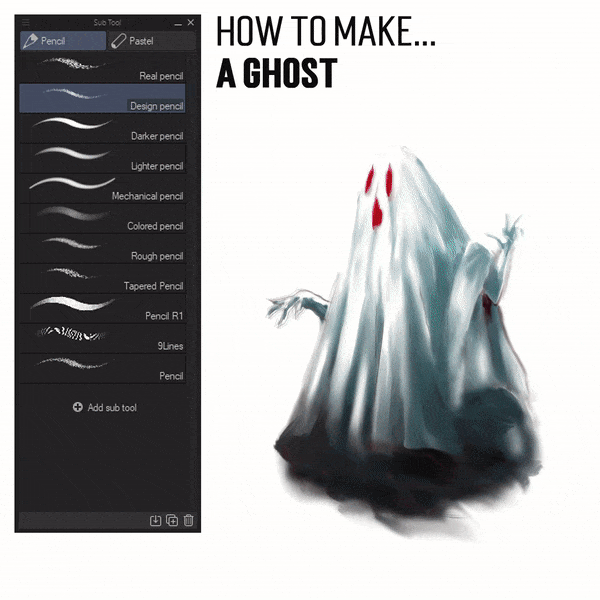
[ Design Pencil ] the only sub-tool I ever used to carry out my design mainly.
[ Watercolor brush ] will be needed to fill the colors and adding small textures surrounding it whenever you give a stroke. It also blends nicely as well.
[ Smooth watercolor ] precisely what we need to make the rough textures smoother, hence the name. But maintain the pen pressure is the main point here. If you press harder, it shows the color more. I love how it turns out to make my ghost looks silky smooth! Hahaha!
The image above is my PNG version of the ghost without the background. Because I filled the inside of it, you probably want to play around with your design background. Feel free to give your interpretation of the scary Halloween image with this bit of ghost!
The image above is my 'fake PNG' to show you the result of transparency.
I'm using some of the tools to remove inside parts of the ghost and make it transparent with a switch to transparency mode while brushing:
[ Lighter Ink ] easy to apply, but you can also use some brushes if you need to see the different result and experiments, for example;
[ Smooth watercolor ] brush but with careful implementation.
[ Watercolor brush ] probably better than smooth watercolor, easy to handle too.
If you notice from the image above, I use some tools to make the darker area below the ghost seem a bit 'moving' by applying [ Finger Tip ] from the [ Blend ] sub-tool.
It's an effective tool to make any image slightly moving its parts! I love how it turns out! And you can also check the difference between the PNG image above with the other one.
The Cthulhu Rising (Public Domain —Copyright FREE)
Is Cthulhu royalty-free?
Yes. Most of Lovecraft's work never had the copyright renewed, so it fell into the public domain.
Please see the links below before anyone rise a question:
It's not a complete Dark Creatures if we're missing out on these ancient ones, Cthulhu.
Actually, you might learn about using those new brushes from the India Ink set based on two tutorials before. But in addition to those brushes, I'm using [ Watercolor Splash ] brush inside the [ Watercolor ] set to render the splashes of water!
Pressing your graphic tablet's pen will create variation between each stroke. Not only the size of brushes but also the scattered values within [ Watercolor Splash ] brush. This particular brush will also render a nice and interesting texture while you're using it.
Don't forget to [ Switch to Transparency ] mode if you're looking to have another variation from its size and shape.
You got to have the strength to apply those values of black and white to your painting, especially when it comes to rendering dark creatures.
The image above is done within four hours to balance darker values to lighter ones, then complete the specific form just from the 'white' or canvas.
After Word
I have a sketch of this 'Guardian Angel of War,' above. Still, I'd like to end this tutorial here since I'm preparing for my wedding and giving the angel's outline image as a token of my appreciation to everyone who read this. Far!
Our wedding will be on the 3rd of July 2021, so I apologize if I've done pretty simply and not much to cover with the tutorial; it might be grammatical errors or such wrong phrases. Please bless my fiance and me so we can have a safe and healthy marriage, although we may proceed during the pandemic time.
And this might be my last tutorial here to the community. So, see you when I see you. Thank you for everything, Celcys and Clip Studio Paint.
Users who liked this post


![[GaChiDa]](https://s3-ap-northeast-1.amazonaws.com/celclipcommonprod/accounts/profile-image/42/9b28e4ced95a4b0308e33f149bcc804ba90f652f1e93c334f6c4a7aea611093e.png)


Comment