
Hello, welcome to this tutorial for beginners in which you can learn step by step from the most basic to the most advanced how to make night skies.
I hope you find it useful M seaw◔M
The bases
In this tutorial, we are going to deal with two key concepts: "The objects that originate the light" and "the objects that receive the light".
The objects that originate the light, there are "Natural" and "Artificial"
The light that is produced by light-generating objects, which falls on the objects that surround it. It is necessary to generate a union between both objects, so that they are not seen out of tune with each other.
Based on the above, throughout the tutorial the following bases will be applied, where as layers in CSP we will place the objects by hierarchies.
1. The night sky | Basic
To start we have to put the background, DO NOT use a pure black color. Instead, I suggest you select a dark blue or deep purple color.
You can also use the gradient tool for the background. I personally like to use a single base shade and then add more colors instead of using a gradient.
The next step is to add a moon, you can download it in "Assets" or you can do it yourself.
From this, create a layer of brightness (above or below the moon, in this case I did it below), with the one you like the most.
Then with the brush of your choice of clouds that you can download from "Assets" follow the following order of colors, to generate depth in them.
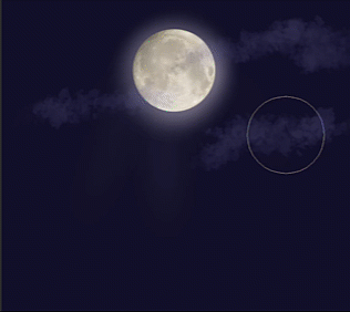
TIP: Use the tools to blend in the contours of the objects, to unite them more with the background, but do not abuse, just a little!
To finish I like to add the second light-generating object, which in this case are the stars, with the "pen" tool you can make some shooting stars.
And as last details he used a black gradient on the edges of the canvas to generate depth in the background.
And finally as a trick, couple all the layers that you just made into a layer group and duplicate the group, so you will achieve more intensity if you wish.
2. Galaxy
To make a galaxy, we will use a cloud brush, whichever you prefer. Then you will select the colors of the galaxy. I chose blue and purple (they must be dark tones).
And you will proceed to give the galaxy the shape you want. Remembering to leave the center of the galaxy empty.
NOTE: don't forget to use the Blend and Blend tool on the contours.
Then I generated a multiply layer that is above the background color and below the shape of the galaxy and intensifies the dark color on the scepter and on the outer edges of the galaxy.
Later with lighter colors I generated a layer of light above the shape of the galaxy and intensified the colors.
Finally we add the second light generating object which are the stars.
You can download a wide variety of star brushes in "Assets" I recommend that you translate what you want into English and / or Japanese to find more results for your searches.
Finally, create another layer of glow that goes over everything, with which you will make the edges of the galaxy more intense.
And again, join all the layers in a group of layers and if you wish, duplicate it to make the colors more powerful, that is to your liking, I no longer did it in this case.
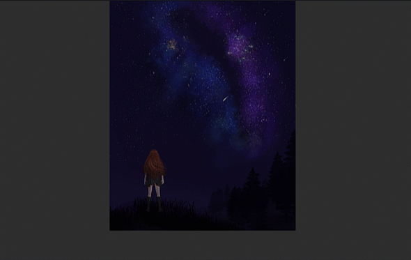
The following illustration was made by implementing the theme seen (See section 4 "Uniting the background with the objects").
3. How to make constellations
Create a VECTOR layer and look for references.
With the line tool, shape the constellations, doing line by line.
By pressing Ctrl they can modify each line
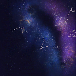
Create a new layer and add points at each junction of the lines, which will be the stars.
Finally duplicate this last layer to a light mode and with the blur and / or blend tool go through the outline of the stars.
With Edit-transform- "Mesh editing" you can modify the shape of the constellations (NOTE: it also works for the galaxy, northern lights, etc.) to flatten them more to the background and give it the perspective of it.
This is an illustration that I did, which incorporates the concepts discussed above.
(See section 4 "Connecting the background with the objects")
4. Matching the background with the objects
In this section we will briefly talk about how to incorporate the objects that receive the light into the background; a character, a city, forest, etc.
For this it is very important that you ask yourself what is the object that you want to receive more attention. For example, if it is the character, the background goes to the background and vice versa.
To add an object that receives the light and that is not tuned to the background, we must add the object, the closer the object is, the sharper it will be, the further away the color saturation is lost. In this case, the objects that I used were black, so that the contrast between the light-producing object and the one that received it could be noticed. After that a clipping mask is generated or the opacity is blocked and with the eyedropper you select the color of the background and the color of the light and color over the object that receives the light.
To add a character all you have to do is create a multiply clipping mask layer (adjust the opacity of the layer to your liking), select the background color and paint over the entire character, then with the soft eraser it passes over where the light falls.
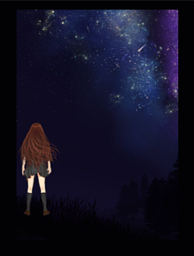
Similarly, you can create a layer of light and add small highlights in selected areas, for example: in the hair and in the contours of the character.
Finally, we will talk about how to make a city at night, which, although it is an object on which light falls, also produces it. The steps seen above continue to be applied and also those of the light object are added, which in this example is artificial light.
(In this case the main object I want to focus on is the galaxy)
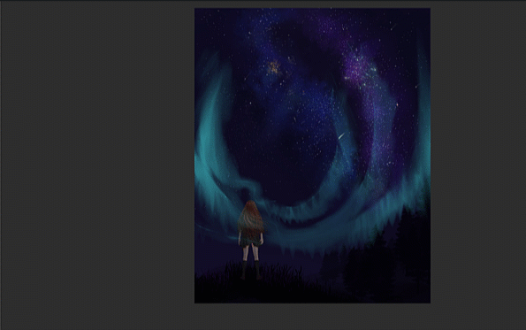
5. Northern lights
We can do this exercise in two ways with a tool such as a pencil or pen or with a northern lights brush that you can download from "Assets".
In whatever case, you must first trace the direction of the aurora borealis and with the blur and blend brushes that we saw in the previous sections, you will decrease the intensity of the color of the auroras and blend it with the background.
As an important and main tool you will use the "finger", with which you will pull the color making small lines, vertically, in the northern lights.
This is the example I did with the pen tool:
And this is the example with the northern lights brush (which was my favorite).
Finally add a layer of light over the auroras and intensify the light.
The next step was to perform color adjustment in: Edit-Tone correction.
After adding more details, this was the result I got.
You can incorporate more details. For example:
I hope you have been helpful! If so, they would make me very happy if you could follow me on my social networks.
If you have a question or comment, do not hesitate to leave it below: D
Don't forget to watch the video for a more dynamic and detailed explanation.
Greetings and thank you very much.
Users who liked this post


Comment