
Introduction
Hi everyone, this is Figmenter again, with another longform Clip Studio Paint tutorial on how to paint a vampire-looking girl sporting gothic fashion in a room that has gothic architectural elements.
In this tutorial, I will be describing my workflow when doing painterly pieces like the one you see here. Starting from:
1. composition and concept
2. preliminary problem solving using linework
3. painting and applying brushstrokes to the piece,
4. and finally adding post-processing to finalize the piece
If you want to check out the actual recorded process, check out the video!
Workflow
My workflow is not a standard pipeline. Much of it is adapted from one of Dave Rapoza's recent style when doing his painterly pieces. I just added things here and there to help beginners who have yet to master anatomy, perspective, composition, and color theory.
The reason why I am working this way is because I want to tackle each aspect of the portrait one by one instead of doing it one go.
Part 1- Research and Studies
The first thing I start doing whenever I am about to begin creating a piece is to take a look at what the subject is, and try to break it down into my understanding.
It's very difficult to start out with nothing in mind and a blank white canvas. So, I suggest to do some research using free tools like Google, Pinterest, and Wikipedia to broaden your knowledge and visual library for your theme and subject.
Organize the visuals and notes in a free tool like PureRef. PureRef is a very neat tool for organizing visual reference and I highly recommend it. You could alternatively just store them in a separate Clip Studio file for review too.
As an example, on this piece, I was aiming to paint a vampire-esque lady, and add all the Gothic elements I can cram into the piece.
In my research, I've found out that Gothic elements can actually be either of two things!
Gothic Architecture or Gothic Fashion.
For Gothic Architecture, I took some time to identify the elements that define the Gothic style. Then I break them down to structures that I can understand. So I can use them as compositional elements in the piece.
Gothic Architecture Interiors have the following elements:
1. Pointed archways and arches
2. Stained glass windows (big stained glass windows)
3. High ceilings
4. Ornate designs
Gothic Exteriors have:
1. Flying buttresses
2. Gargoyles
3. Pointed Structures
4. Ornate Designs
We're only interested in the interior parts though, so I took notes and references of what I think will be useful to create our composition. Which are the pointed arcs, high ceilings, ornate designs/columns, and stained glass windows.
For gothic fashion. This research process actually made me realize that Gothic Fashion has nothing to do with Gothic architecture or the time period where Gothic architecture was prominent. Gothic fashion is actually a culmination of antiquated Victorian or Elizabethan style of wardrobe marked with dark and mysterious features.
Most Victorian style clothing consist of corsets, low shoulder neck lines called Bertha collar, elegant dresses, and frilly skirts to name a few.
Part 2 - Ideation, Thumbnailing and Sketching
In my process of thumbnailing, I'm just sweeping away with a soft airbrush to create big sweeping shapes in grayscale first. After studying the elements I wanted to incorporate, I had already a composition in mind. I had the idea of framing the girl wearing Gothic style clothing in an up shot showcasing a gothic-style interior, using the stained glass windows as framing elements to draw the viewer's eyes towards her face.
And using the value and color temperature contrast to draw your eye towards her face and upper torso.
Here I'm trying to use a circular stained glass window to frame the character, and using a soft air brush, and only grayscale, I start trying to shape out the general ambience and look of the background elements. At this point, I don't really add details all that much.
Just simple hints of elements that comprise of the gothic architecture in the background is enough. That's why I tend to zoom out a lot to check the thumbnail of the piece in general. A good thumbnail can go a long way in terms of composition.

At this stage, I also go ahead and apply a color balance and tone correction layer to adjust layer's general color and values. I'm just experimenting with the colors at this point. And Clip Studio Paint's correction layers help a lot in that regard.


I can keep on working on grayscale, and apply colors, change colors and levels, very liberally with these tools.
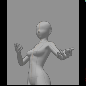
Once I'm happy with the rough colored thumbnail background, I can freely use Clip Studio Paint's model to create the pose of the character for framing.
Although, I know my fair share of anatomy. And I can sketch the subject free-hand, I'm using Clip's 3D model to make it so that I have less to worry about in terms of composition, proportion, perspective, and hand positioning. Since I will also have to focus on her clothes, her facial expressions, and the linework.
With the anatomy and general pose in place, I can use a test out the character silhouette by applying a black clipping layer on top. Constantly checking whether your character's silhouette has a good read, will ensure that you get a good readable pose for your character. That's why I spend a lot of time with that poseable 3D model.


You'll get better and better at drawing general silhouettes and posing over time as you keep on doing it, but for your first few tries, it's very helpful to be able to go in and have a quick way to do trial and error. Clip Studio Paint's 3d mannequin let's you focus on one thing at a time.
You can focus on designing your character's silhouette by painting black details that change the overall shape on a different layer to experiment.
And what's neat about using the 3D model is that it's completely non destructive. You can go in and modify the proportions at any time and retain the pose you've already established.
Part 3 - Iterating and Clarifying the Forms
And I repeat the process of clarifying the forms as many times as I need to, even as to go and do a very rough painting of values to help me better understand the direction of the piece later on.

Although I have a picture of the final piece in my head, it's still muddy, and I really need to use linework here to keep on iterating on the forms that I need to see in order to start adding the lighting and base color. And as you can see here, I change her face, dress, and hair quite a few times before I was thoroughly satisfied that I had solved all the problems in the forms for the piece to make sense for me.
And I repeat the process of clarifying the forms as many times as I need to, even as to go and do a very rough painting of values to help me better understand the direction of the piece later on.
Once I'm thoroughly satisfied that I've already understood all the forms based on what I have on screen, I move on to doing the final linework.
Part 4 - Finalizing the Linework
After I am thoroughly satisfied with the forms I've established, I lay in the linework that will be the basis of the painting.
Some would argue that doing linework is not needed anymore when doing a painterly piece. And they'd be right to some degree.
However, I do this part to address 2 things.
1. I use the lines to create edges for the base colors.
2. I use a multiply layer blending option which will help in color picking shadows for the final brushwork later on.
3. Plus, it just helps me understand the piece better, as I paint later on.
At this stage, I already have plans to add more ornate designs and texture into the fabric of the clothes to make it look more gothic and victorian, and here is where I feel that linework isn't needed because they do not define the form, and will be too small to use as basis for Fill Tool. It's also possible that it could muddy up the rest of the piece as well when I start blending later on.
Part 5 - Blocking out the Flats and Lighting
Once the linework is done, I begin laying down the color flats on separate layers underneath the final lineart layer. I normally set the lineart layer to multiply.
There is no hard and fast rule here. Just make sure that the layering stack makes sense to you and makes it easy to paint in lighting and shadow later on.
I for one am particular with the order of the actual stuff in real life.
I tend to layer clothes on top of skin, and other elements like the corset, laces, etc of the clothes on top.
After I do the initial flat colored layers, I go back and tweak the background in preparation to light the scene.
I will need to make the background and subject look like they are in one scene in order to start adding in the illusion of form via the lighting.
I also, made sure that the glass she's holding has a semi translucent base color, so that painting on it via a clipping mask, will be easier.
After all the base colors have been filled, I start adding layers with clipping masks using the built-in macro. One clipping folder for each base color layer.
I then start to select colors with hue and value shifts to define the shadows and highlights of each of the elements on her. I also take some colors from the background.
For the lighting. I plan to hit her with light from all sides. A warm color from the top, some cool colors behind her, and on her sides.
I'll keep the forms and lighting in mind when adding shadow and highlights all across each base color layer until I am satisfied that the forms have been defined. Not worrying so much about the color/values at this stage.
I will then unify and make adjustments using various methods, such as adding a soft light layer overpainting, adding color balance correction layers, and adding tone correction.
As I am painting and blending the lighting and shadow elements. I keep in mind the light sources that I've already established earlier. Keeping in mind that there will be cast shadows, form shadows, as well as various highlights along the edges where there's rim lighting.
I also paint some flesh tones over the sleeves to create the illusion of it being semi-transparent.
And adding in warm tones where I think they should be.
I also use the soft brush with soft light layers to lightly add some hue variation across each surface. Like on some parts of her exposed skin, I'll add more warm colors while adding some cooler colors in some areas.
I also tend to go from the most prominent features to the more nuanced less noticeable features. This ensures that if I should miss lighting any element, it would be something that's less likely to be noticed.
Part 6 - Painting & Brushwork
Once I am totally happy with the colors I am seeing on the girl in the piece. I will copy everything into a flat new layer, and start color picking and using this water color brush to add the brushwork in areas that need it. My main priority at this point are two things:
1. Add more details where necessary, and adding in the ornaments/ornate designs to her clothing.
2. Try and remove anything remotely indicative of the linework done.
What I do here is simply color pick, brush, and blend. Sometimes, I tend to add in another color, if necessary.
Whenever I am adding in some detail that's a different material from where it is placed, , such as the details on the sleeves and skirt, I would add it in another layer as it would benefit from being in a new layer since light will behave differently when hitting these surfaces.
The process of doing the painting is quite tedious, but I find it satisfying and rewarding. And since the colors have almost all already been established, you can do the painting while listening to other tutorials or ted talks while painting without having much worry.
The brush I am using to do the painting process is the エッジ鉛筆 pen from the set on the link below.
Part 7 - Painting the Background
Much like the character, I use linework to clarify the forms for the background. Using the symmetry ruler down the center, I start using shift tapping to create straight lines to sketch out the shapes, keeping in mind the original gothic design.

And since we already established the colors and values of the general walls and windows of the background, I use the sketch as a simple guide as I paint and define the elements of the background even more. Just color picking and painting with the hard / soft brush, with the symmetry still in place at first, then dropping the symmetry later when I'm going in to do more details.
At this point, I'm only using hard and soft airbrushes, because I know I want the audience to focus more on the character. and that the background is only here to reinforce the theme and setting. I don't want it to detract from the character. Hence I won't be adding in any more details that I think it needs.

I add in the warm interior lighting via the soft brush. It's a hint of the very same lighting that affects our character. But it affects the background less because we're establishing that the light is further away from the walls and is closer to our character.

The gothic stained glass windows can be by hand, but we'll be using Clip Studio Paint's rulers and transform tools to help us create them faster.
I start with the symmetry tool right down the center. Then setup a special rulers (Parallel lines from the dropdown), for vertical lines first, then create the pointed arch, followed by a special parallel lines ruler for horizontal components.

I then hit Ctrl+T for a free transform tool and hold down Ctrl to move the handles to create perspective

The stained glass window is made using ellipse tool and drawing on a symmetrical ruler with 8 radials. Then, adding a round border using the very same ellipse tool without the 8-way radial symmetry. Then, applying the same perspective transformation technique as with the other windows.

Part 8 - Adding Post Effects and Correction Layers to Great Effect
Using correction layers, soft light layers with opacity, I will try and make the piece pop out with some contrast, but also add more consistency to the overall color and values of the piece.
This is where you'll see me start zooming out of the piece more, and pay attention to the piece overall.
I typically use the following correction layers in this phase.
1. Color Balance to the entire piece add more coherence to the entire piece
2. Hue Saturation Value, Tone and Level adjustment to various layers to help sell the piece.
Users who liked this post


Comment