
Introduction
Hi there, it's Figmenter again, and this time I'll be talking about concept design as it applies to humanoid robots using Clip Studio Paint's awesome features.
Humanoid Robot Concept art starts much like other character concept art. The most important thing comes first. We first focus on the biggest details of the character, the basic shapes, the shape language, the hierarchy of big medium small, incorporating complex and simple shapes to contrast each other, but going through it from the biggest details first going to the smaller finer ones.
What dictates the shapes, details, and forms of our character? The Big idea of course. This is where Concept art becomes a matter of problem solving, and less of art. This is where you answer the questions, "What would a hero character look like if he were agile, from a specific background, maybe an unwitting repurposed hero?"
Answering these questions while thinking of shape design guidelines, is what I believe concept art is all about.
And it all starts with the idea and identifying what we want.
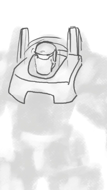
Then, we go ahead and do the biggest of all the details. The thumbnail or silhouette of the character.
Then, we fill in the blanks with the answers we have for the questions we posed earlier. This is where the structure of the character comes into form.
Lastly, we just add flourishes to our character to sell the concept even more!
THUMBNAILING THE SILHOUETTES
In thumbnailing the silhouettes, we're thinking less about the details of the character, but rather how the character reads at first glance. And to do that, I typically zoom the way out of the canvas from time to time and do a small little doodle that I think would read well for me, based on the description I have above. All the while keeping the shape design in mind.

SHAPE DESIGN
Shape design is a broad topic, and can be discussed in a chapter of a book, altogether. But basically speaking, when we see images or pictures. Our brains process shapes and have natural tendencies and predispositions towards certain shapes, and angles.
Almost all characters in pop culture has undergone the shape design process. And this is evident even in characters like Mario (round, soft-looking) and Bowser (sharp horns, bulky shape).
In posing, we typically associate brave characters with a more stable pose with two feet on the ground forming a stable triangle. Agile characters typically are posed off balance at times to convey motion.
In designing protagonists, we typically avoid sharp pointy shapes, as this raises some alarms in our natural brain. And thus most protagonists have more rounder, less pointy features as compared to antiheroes and villains.
POSING
Posing agile characters off balance that with a clear read is very important. This gives the viewer an assumption from first glance. Posing a character from a worms eye view will also make the character look bigger and more menacing as well. A strong line of action can also really help to sell your character's personality.
THUMBNAILING GUIDELINES
1. Just spitball your ideas, without much care for details at this stage .
2. Don't be afraid to experiment, since these doodles are quite cheap and fast to create.
3. Don't be afraid to throw out ideas that you don't think work.
4. And don't be afraid to alter shapes, copy paste designs, etc.
5. Clip Studio Paint allows you to toggle transparent brushes by pressing 'C' while using a brush. A very useful feature.
WORKING IN PASSES
I've decided on the two characters I prefer to work on for this tutorial, and will be taking them to the next level of polish to further cement their concept art
Using lineart that you can understand, you can slowly but surely add more rough details to your thumbnail. Some people don't need lineart and prefer using brushing and painting values directly.
While this is an option for some, most people are more comfortable defining the forms using lines first, with guide lines following the contour of the forms.
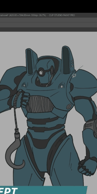
Here, I am simply defining the forms as I go. Just sketching away using any reliable line making tool. Not worrying too much about it being rough at this stage. It's a stage that most likely only I, the art director, or the client will ever get to see.
USING CLIP STUDIO PAINT TOOLS FOR THE FINAL LINEART
VECTOR Layers are a god send, especially for mechanical design concepts, where there are a lot of details that go across and overlap each other, like panels, wires, cylinders, etc.
Here I use a hotkey for VECTOR erase in combination of freely using the G-Pen to create clean lineart at a pace I have never been able to beat using any other painting software.
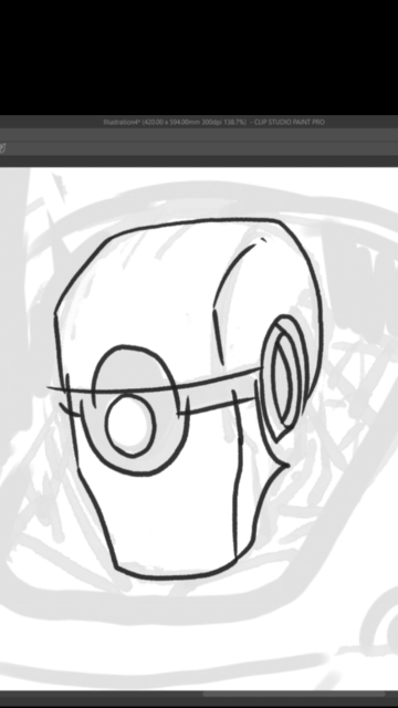
SHORT NOTE ON USE OF PAREDOLIA

Pareidolia is the tendency for incorrect perception of a stimulus as an object, pattern or meaning known to the observer, such as seeing shapes in clouds, seeing faces in inanimate objects or abstract patterns. And when designing characters, especially humanoid robots, this can definitely play a huge part.
This is why I designed the heads of these mechs the way I did.
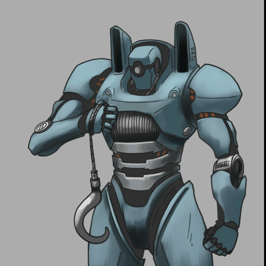
Regarding Design, remember to always use both complex and simple shapes and edges opposite of each other like this leg design. This makes for a more interesting shape and it happens in nature quite often.
LIGHTING THE SUBJECT
When lighting the subject, you don't need to light it in a complex lighting setup with multi colored light sources. You only need to light the subject for it to make sense in the concept art, to define form. Usually 1-2 light sources are enough for this. And in this case, I only even used one from the top to describe the form of the humanoid robots I designed.
To convey or imply what material the surface is, You can also paint and control use how much light bounces off the surface . Here we see a sharp specular highlight on the metallic silvery surfaces makes the material look like metal just with lighting alone
CLIP STUDIO PAINT COLORING AND VECTOR LAYER BEST PRACTICES
VECTOR Layers are also very easy to clean even after you're done with them. to close holes while filling You can easily connect disjointed lines and adjust the line weight to imply depth as well.
A clean layer for lineart Makes it super easy to add color layers later on using Clip Studio Paint's fill tools.
Arrange the layers and group base colors of objects logically. Example, armor going on top of underlying tubes, etc.
This makes is easy to go back and add details, change colors, and so on and so forth, later on in the process. Not to mention, applying correction layers to certain types of materials (e.g. metallic or rubber areas).
And it also makes inserting layers in between layers to do experiments a lot easier too as you can see below.
Final NOTES
Keep in mind the purpose of your concept art. If it's not meant to be a finished illustration. You don't need to add any more polish than it needs.
Concept art take significantly less time to do as complete illustrations. And they tend to be changed a lot in the production process. So keep that in mind when creating concepts for clients.
VideoTutorial
Users who liked this post


Comment