
Inking your social profile as an illustration after your photo portrait. How to ink a portrait after a photo to use as an illustration for your social media profiles?
While inking, check the thumbnail in the browse window to see if your small portrait is working.
Before even starting, remember to adapt this future portrait to yourself, since it is your profile, both in terms of form of course (your tools such as pencil or ink, or watercolor etc. and your style), but also on the substance: having a style is good, but what do you mean? What is your message ? The goal of your art?
Personally, my style is often quite black for the shape. Basically, I want to reconnect humans to magic, that is to say to natural spirituality, to the elements, to diverse and varied spirits, to your inner child, etc. This must absolutely appear in your profile, if only by a small element (glasses, book, spirit…).
Also, adapt YOUR style and YOUR "background" well in order to have a speaking profile!
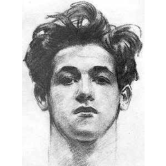
1. Draw a portrait! Portrait in shoulders, light from the side, background in the distance, head turned slightly, in order to have contrast and therefore volume. Think about round profiles
2. Open a new file, possibly square if you are only using this portrait for square social profiles (but this can be managed later)
3. Import it into Clip Studio Paint by [menu]> [File]> [Import]> [Image] (or [photo library] etc) and adjust the size of the image
4. Change the photo to a black color layer, then add using [menu]> [new layer]> [correction layer]> [Brightness / contrast]. Unlike video, now adjust the contrast brightness to have true solid black, true solid white and only 1 or 2 grayscale.
5. Decrease the opacity of the layer to see enough but not to be hampered by the photo for the inking step.
6. First ink the eyes: very black, with a small tool (press well and have deep blacks): draw the reflection (on the same side! The 2 reflections on the left or on the right, except drawing exceptions. with several lights), then the pupil, then the circle of the iris, then the concentric muscles of the iris while darkening the top of the iris (the bottom must remain clear)
7. TIPS: without the portrait as an example, we start with the eye circumference, then place the pupil to direct the gaze, then the reflection and finally the iris
8. Ink: understand where the light comes from and the shadows it casts: drop shadow, reflected light… Make the solid areas of black then the little tongues of gray, or first the outlines and then fill in the blacks. For the tongues of gray, orient them in relation to the light or in relation to the surface of your volume (see the nose, the cheeks etc. in 3D)
9. TIPS: To add white over black, use normal white, or choose transparent with a smaller tool. Suddenly you press more and with the sensitivity to the pressure, your lines are very white (transparent)
10. TIPS: do not hesitate to simplify your line, especially if you made this drawing only for your social media profile), or even use a fairly small file
11. Inking: use full and hairlines by varying the pressure of the realistic pencil or the pen (check for this in the settings of your secondary tool that the pressure sensitivity option is activated)
12. For textures, vary your line (size, support, length, curve and approximation) according to the texture you draw: skin, beard, hair, clothing. Become a hair, a beard, a wrinkle and let your wrist more or less flexible depending on the texture
13. TIPS: is your hair blonde? Make as few strokes as possible. If they are black, place the highlights, fill the solid areas with black, then add the languages of gray
14. Once the essential elements have been drawn (eyes, the majority of the face), do not waste time on the rest, such as the beard, the hair, and even less the clothes that you can draw with a larger tool and so less press and have grayed out effects: indeed, once you have captured the gaze with well-defined and very black eyes (small realistic pencil with which you press well), it is better to have non-important elements such as clothing a little fuzzy and drawn quickly because they should not focus the attention (with some exceptions: for example you draw clothes)
15. TIPS: to save time in the dark, alternately use the shortcuts P (pen) and G (paint bucket): outline your area with P, then fill it with G. Personally I like to keep
16. For the end, stand out from your original portrait by masking it and correcting any errors (more or less black, white, gray, size of the eyes, location of the irises, texture, etc.)
17. Go wild: duplicate your inked portrait and lock it. On the duplicated layer, modify the reality of your portrait as much as you want: adding a moray eel (or your favorite pet), a pen (or any other specific tool that you personally use), in the same style as your inked portrait. Keep a little freedom of inking compared to your sketch.
18. TIPS: Use curves for animals and anything organic. Use straight lines for anything that is not alive (furniture, robot)
19. TIPS: always draw what is closest to you, then continue with the distant elements behind.
20. For the eyes to stand out well, you need a strong contrast, and therefore less gray, more blacks and more white.
21. Add your nickname, logo, slogan, clearly visible in small format
22. Export to PNG:
Hide the [paper] layer and add a white layer only on the circle (Optional).
Check that your drawing is correctly positioned in relation to: move / adjust the size of the layer group as needed, then modify the cut lines if necessary in [menu]> [View]> [Adjust cut lines / Border by default]
Then go to [menu]> [File]> [Export (single layer)]> [PNG] and export your file by checking the square format (600px * 600px, or less for some social networks) and make sure you have chosen [up to the inside of the crop line]
23. Import your new profile, framing / adjusting it on social networks
A variant, Japanese
Users who liked this post


Comment