
Layers are one of the most useful tools of a digital artist’s toolkit, however, it can be confusing for new artists, as the number of options can be daunting. This guide is meant to help those who are beginning their digital journey and need a quick rundown of all that layers have to offer!
What are layers and how do I use them?
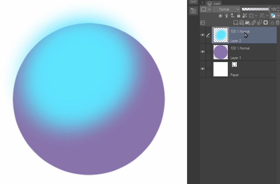
Each layer is like a sheet of glass. Layers can be edited independently, so you can draw on each layer without affecting the layers above and below it. Like glass, you can see through the parts of the layer that are not colored in. However, the parts that are colored in cannot be seen through.
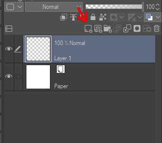
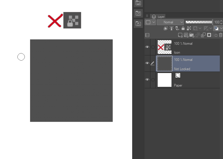
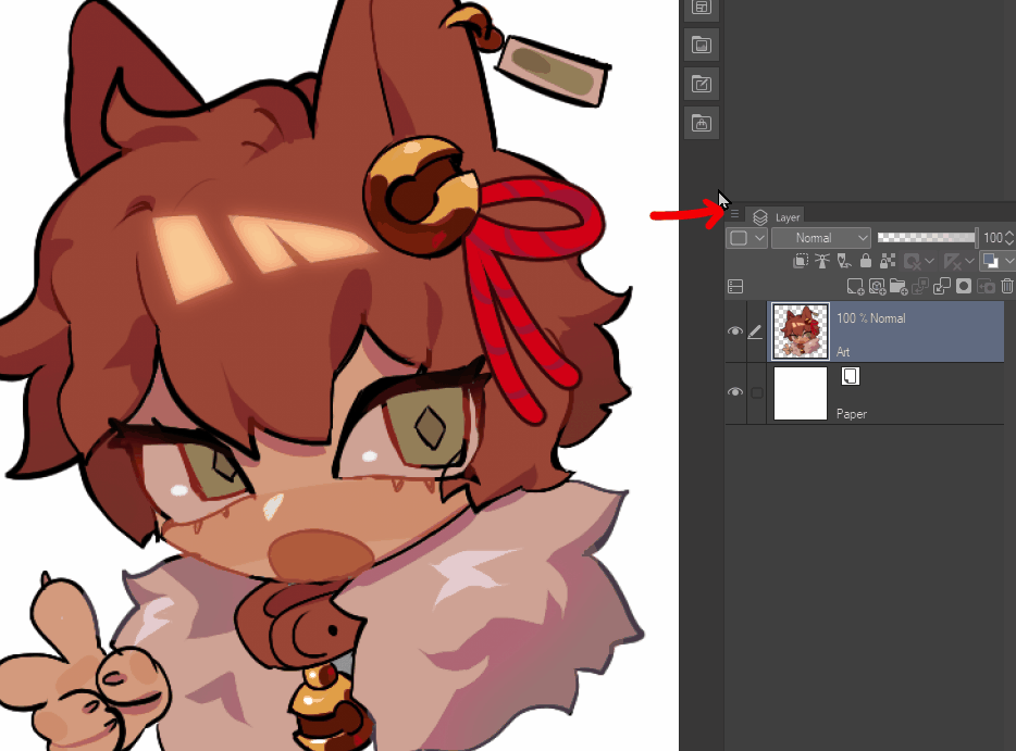
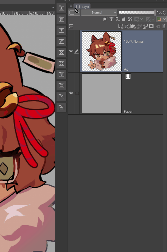
When creating a new illustration, you start with a paper layer and a raster layer, as shown above. To add a new raster layer, click the [New Raster Layer] button (highlighted above).
Layers can be deleted by clicking the trash can icon, or by clicking and dragging a layer to the trash.
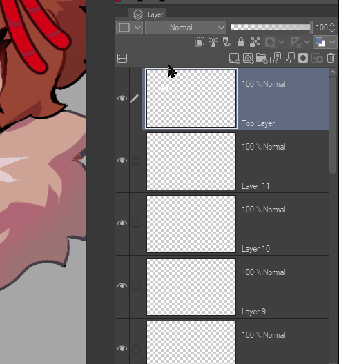
The order of the layers determine which layers display first. The layers on the top of the stack will block out parts of the layers below. The order can be changed by holding the layer and dragging up and down. Multiple layers can be selected by holding [Ctrl] while clicking on multiple layers, or by holding [Shift] and clicking, which selects all the layers in between your selection.
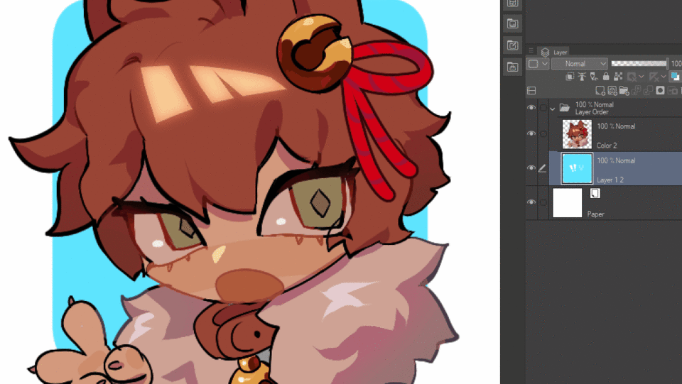
Layers can also be grouped into folders, which helps organize layers. Groups can also be minimized, which helps reduce visual clutter. These groups can also be transformed as a whole, which makes it easier to edit large portions of your illustration.
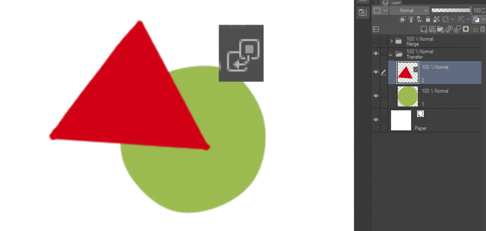
Layers can also be merged in two different ways. [Transfer to Lower Layer] transfers the image on the selected layer to the one below, which retains the selected layer. [Merge with Layer Below] merges the selected layer to the one below, but deletes the selected layer that is merged. In both instances, layers are merged in accordance with the order they are stacked in the layer palette.
I like to organize my layers with my sketch first, then my colors, shading, and finally my lineart layer on top. I make multiple layers, and merge as I go- this keeps my workspace organized so I can easily find each layer!
Alpha lock, Clipping layers, and Layer Masks
[Alpha lock], [Clipping layers], and [Layer Masks] are various ways of adding a boundary to your layers.
[Alpha locks] are the most simple. This feature can be toggled with the “lock transparent pixel” button. This makes it so you can’t color outside of the things already drawn on the layer.
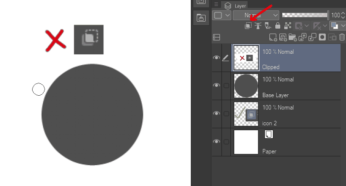
[Clipping layers] work similarly to [Alpha lock], as it applies layers, as well as layer groups, onto the image area present in the layer it is clipped to. However, unlike [Alpha lock], this allows these layers to be edited independently of the main layer, which can be more flexible. This is toggled with the button [Clip to Layer Below].
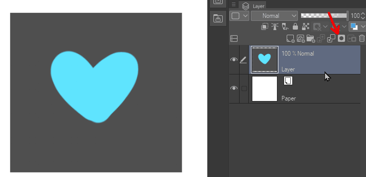
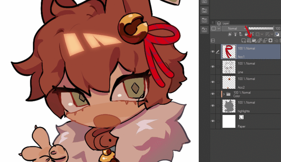
[Layer Masks] are a non-destructive type of erasing that hides pixels, rather than deleting them. To make a [Layer Mask], click the add layer mask button while having an existing layer selected.
These layer masks can be temporarily hidden by [Shift+Clicking] on the layer mask. Layer masks can be merged to the layer as well, which applies the effect onto the base layer.
Layer masks can also be applied to groups, which is effective for coloring in a specific selection.
Using a combination of these three allows for a very flexible workflow!
Opacity, Hidden Layers, and Blending modes
All layers start off as opaque. This means if colored in, it will block the layers underneath it. However, there are multiple ways to allow layers to show what is underneath.
Layers can be hidden, which means they cannot be seen or edited until unhidden. By default, layers are unhidden, but they can be hidden by clicking this eye icon. Layers, while hidden, cannot be edited.
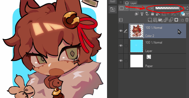
[Opacity] means the transparency of a layer. The lower % of opacity a layer is, the more transparent it is. You can edit transparency with this bar, either by dragging the slider, or double-clicking the number on the right and editing the value. At 0% opacity, it is completely transparent, which is the same as if you were to hide a layer.
[Blending Modes] are settings that change how a layer’s colors interact with colors on the layers below. Groups can also have blending modes applied to them. These can be selected by clicking the box next to the [Opacity] slider. There is a variety of blending modes, however, the effect of each blending mode differs. Experiment to see which ones you like the most!
I like to use a variety of blending modes in my illustration, which makes it easier for me to quickly edit layers.
Correction layers
A [Correction Layer] is used to adjust the colors of the layers below, without editing each layer individually. [Correction Layers] are a great way to quickly edit the entire illustration, and to try out many different versions of an image quickly. A new [Correction Layer] can be created by going to the [Layer] menu, and clicking [New Correction Layer].
Like other layers, the opacity and blending mode can be adjusted on these, which gives users more freedom to adjust the appearance of their layers. All correction layers are created with a [Clipping Mask], which makes it easy for users to edit the appearance of correction layers.

[Brightness/Contrast] edits the brightness and contrast of the layers underneath. This is very effective for quickly changing how dark or light an image appears.
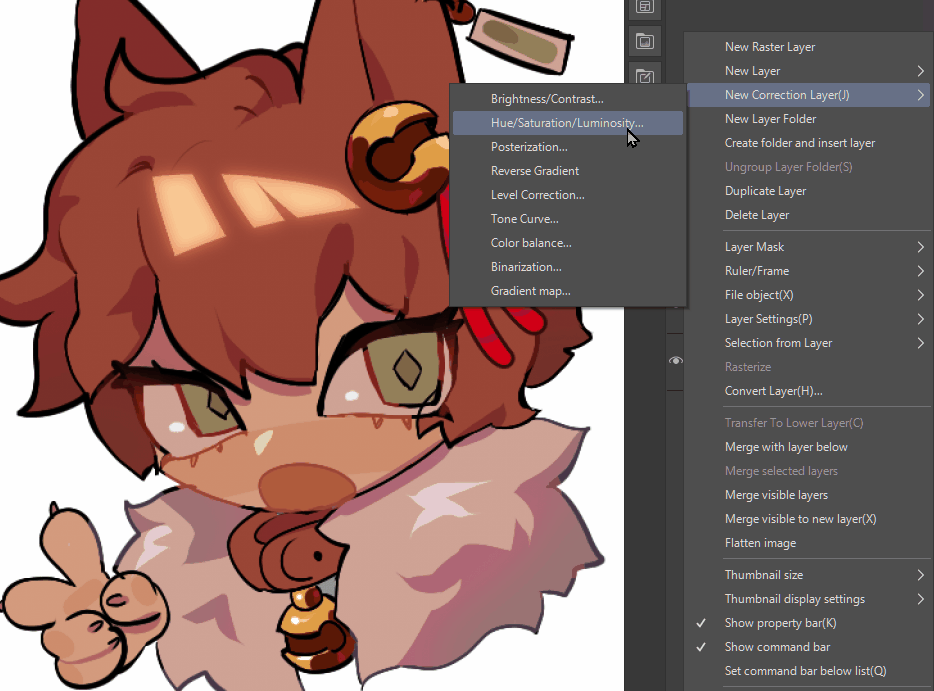
[Hue/Saturation/Luminosity] changes the color, value, and saturation of the layers underneath. Since this has the ability to quickly change hue and saturation, this option is great for making an image seem more colorful, and editing the colors within the image.
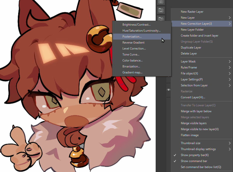
[Posterization] reduces the amount of colors that are present in the layers below. This correction layer makes your image appear more retro- and can simplify the appearance of your image.
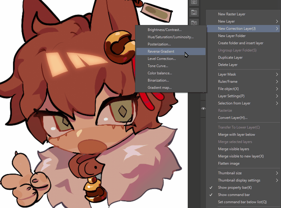
[Reverse Gradient] inverts the colors of the layers underneath. Good for if you need to invert an image, which adds a lot of drama.

[Level Correction] adjusts the values of the layers underneath using a histogram. This is a great way to add post-processing adjustments to the color of your final piece.

[Tone Curve] is similar to [Level Correction], except it uses a graph and curve to adjust the values of the layers underneath. This also is good for adding final adjustments to a piece. Personally, i use this one a lot as it's easy for me to understand. This can also help 'tone' your image, which makes everything seem more unified, which is very effective for pieces with moody lighting and backgrounds.
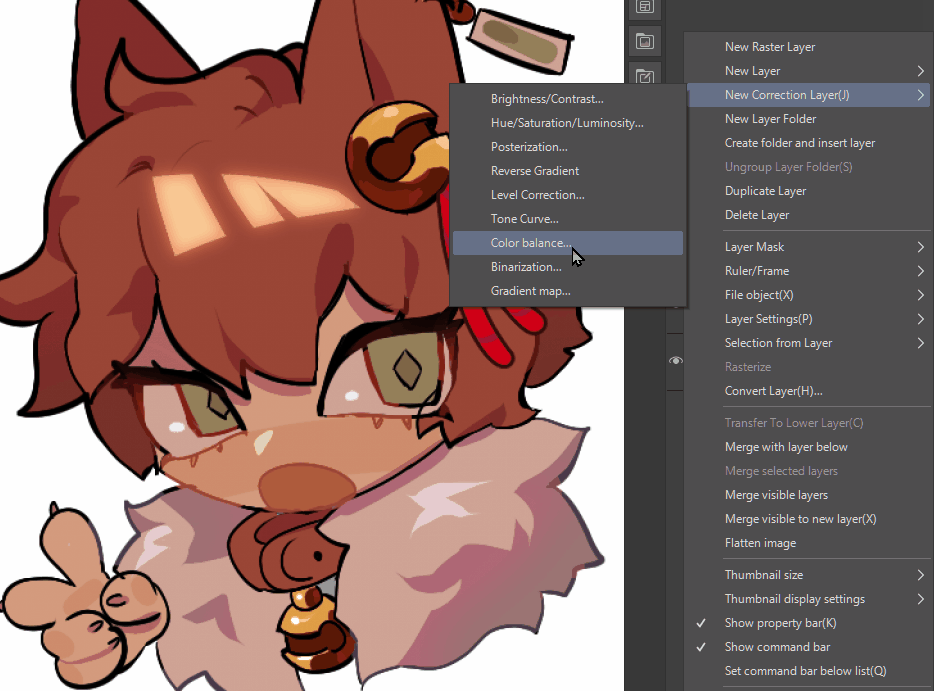
[Color Balance] can adjust the color of balance of colors within each value type (highlights, midtones, shadows). This is also a good way to unify a finished piece.
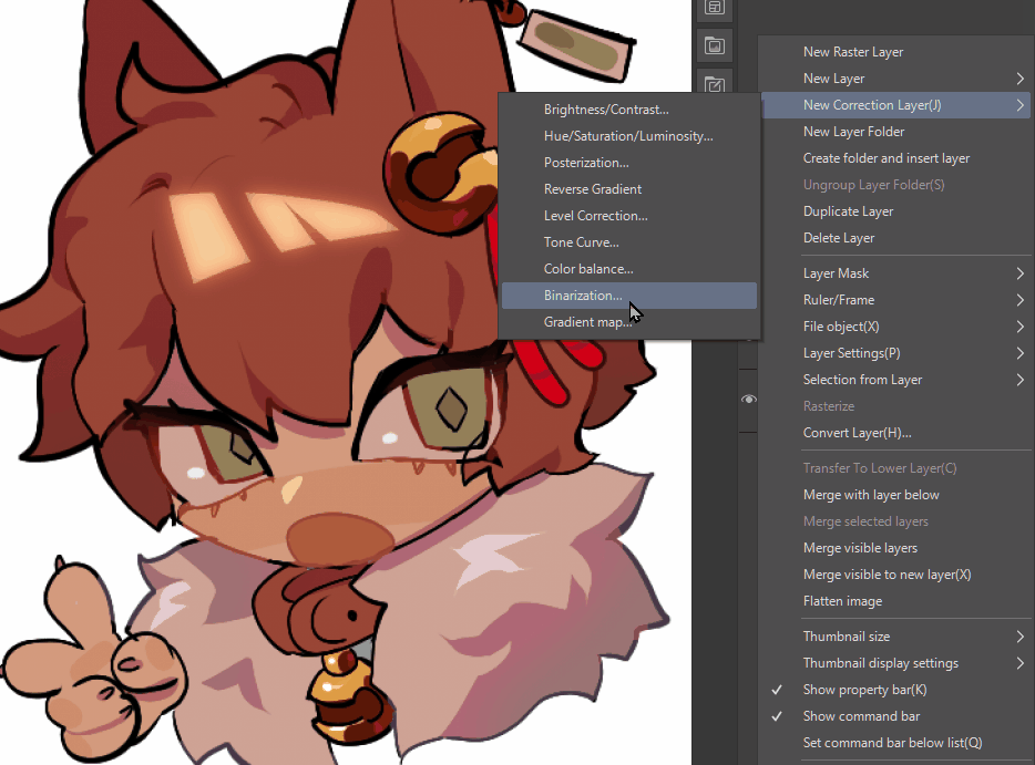
[Binarization] turns the layer into black and white, and can adjust the amount that is black or white depending on the threshold it is set to. If you scanned an image and want to make clean lineart from it, this is an effective way to do so.
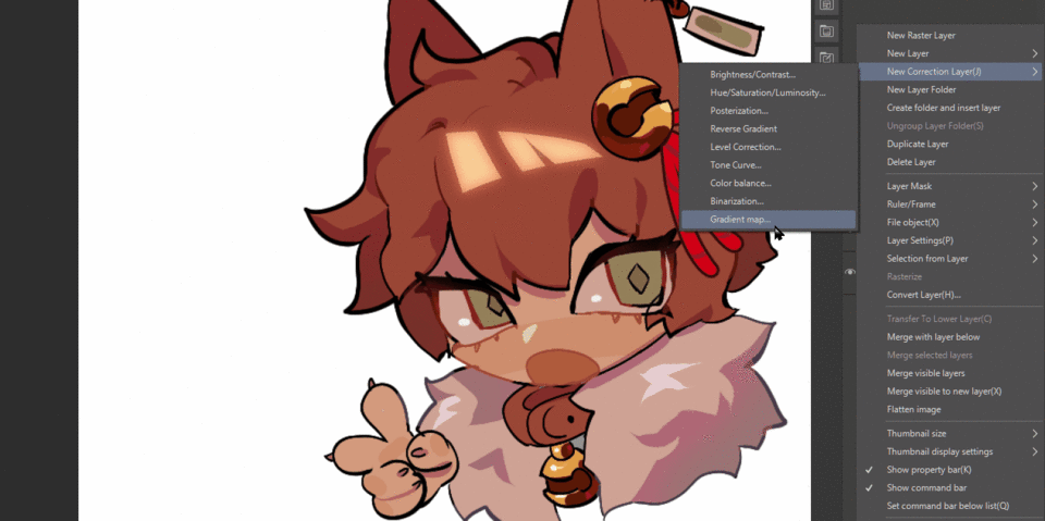
[Gradient Map] converts each value in the layers below to a color. Since you can add [Gradient Map] presets, you can quickly adjust the appearance of an image to fit a background or mood lighting very quickly and effectively, instead of changing every color. I think is a very useful correction layer, and definitely is good for beginners to know.
As shown above, Correction Layers are great for editing finished illustrations! They can also be added on top of older illustrations in case you wanted to give them an update, without reworking the whole image. Give each Correction layer a test to see which ones work best for you! :)
Layer Properties
[Layer Properties] gives users more non-destructive ways to work with layers in a variety of ways. Multiple layer properties can be used at once, to combine their effects.
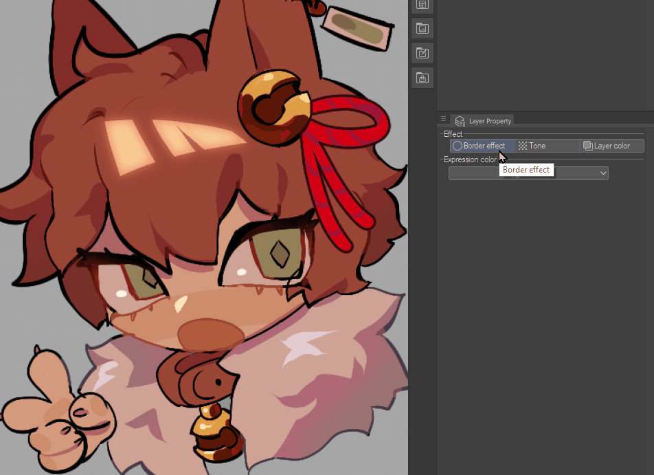
The first layer property is [Border Effect]. This adds a border to the area drawn in the layer.
The first border, called [Edge], adds a solid border around the layer. This is good for adding an edge for a sticker or creating ribbon or string effects quickly. The color, as well as the thickness of the border, can be edited. You can make the border pixelated by unchecking the [Anti-aliasing on border effect].
The second option, called [Watercolor Edge], adds a softened blur around the edge of the layer. This is good for softening the image or lineart. The range, opacity, darkness, and blur radius can all be customized to your preference.
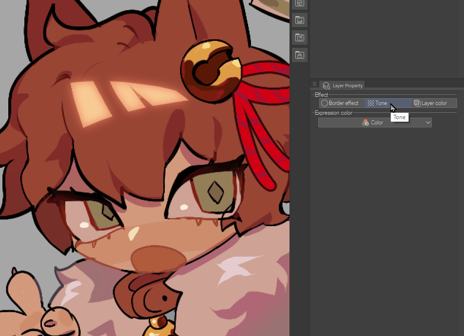
The second layer property is [Tone], which changes each value in the layer to a size of screentone. This is good for manga-style shading, especially in black and white, and can easily be applied or removed. The [Frequency] changes how finely the screentone is applied. The higher the frequency, the smoother the screentone. The [Density] changes what the screentone is applied to. It can be applied to the [color of image], or the [brightness of image], which changes the effect the screentone has on the layer. The type of screentone applied can also be edited with [Dot settings], changing the shape that is within the screentone.
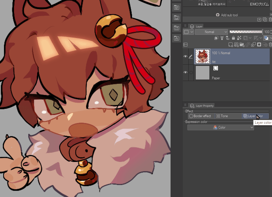
The third layer property is [Layer Color], which makes the layer monochromatic. This acts similarly to how a [Gradient Map] correction layer is applied, however, it is done all in a single layer. The darker the color, the more the [Layer Color] is applied, while the lighter the color, the more the [Sub Color] is applied(the default [Sub Color] is white). Both the Layer Color and Sub Color can be changed to what you prefer. These colors can also be accessed in the regular layer palette, or in the “Layer Properties” panel.
The shortcut for this property is [Ctrl+B]. I use this to quickly change the color of my sketch layer, so I can easily draw over the top of it.
Layer Properties are a great way to finish individual elements in your canvas. I especially like to use the [Border Effect], [Edge] to add quick details and doodles onto my piece. Since they are all reversible and preserve the original layer's details, it's great to use these as temporary changes to help you with finishing the rest of your illustration!
Thumbnail settings and Easier Viewing
The following tips are not for layers themselves, but rather are helpful for people to customize layers to their viewing preference.
In the layers palette, it shows thumbnails of the image. The size of these thumbnails can be adjusted for better viewing by selecting the top left bars, and at the bottom, there are options for adjusting [Thumbnail Size] as well as [Thumbnail display settings].
[Thumbnail Size] changes the size which the thumbnail appears in. It ranges from None to Large. I personally have it set to medium ( #3) , but change it to what is most comfortable to you!
[Thumbnail display settings] adjusts how much is present within the thumbnail. It can either show the entire layer, or just the areas that are colored in the layer. The transparent effect can also be toggled in the layer options, unchecking makes the layer have a white background instead. This can be helpful if you have a large canvas, and setting it to "show only layer area" can help you identify layers more easily.
The [Show layer in 2 panes] allows users to split the view of their Layer Palette. This is useful if you are working with many layers, and you need to access another layer that is farther away at the same time. Essentially, this gives you more freedom to view your layer palette.
Conclusion
Layers are so important to a digital artist- and there's a lot to explore! Learning the basics of layers and their function is an important step to becoming a better digital artist, so it's very important to be able to utilize them to their fullest. Now that you're familiar with the use of layers, it's time to experiment on your own and learn what works for you the most.
Good luck, and thanks for reading!
Users who liked this post


Comment