
Presentation and Materials:
Hello everyone, welcome. I hope everyone is having a great time, I am Arondoly(nunFalco) and in this tutorial I will share my process of creating a character that I am developing for one of my stories, I hope this tutorial will be useful to you.
This is my Basic Brush Set that I used for this piece:
About the character: Who is he?
Her name is Neffka Loran and she's a character in one of the stories I'm writing. When I name a character I feel that something of their personality is reflected in it. When I try to create something from scratch I try to put a title so that this title encourages my imagination since creating from scratch can be an infinite world so we try to define some points to be able to shape our idea.
This character is someone with a lot of "grace" who moves perhaps like a ballerina while in combat. I created a song some time ago called "Dancer" with the idea of one of his combat scenes trying to narrate a little story musically... maybe listening to it can help you perceive my idea a little more.
Neffka is a human who, together with her partner, become interstellar travelers and with her magical and technological abilities they protect other beings from invasions. This is only a brief summary of who he is, we could try to go deeper but for this occasion we will leave it here.
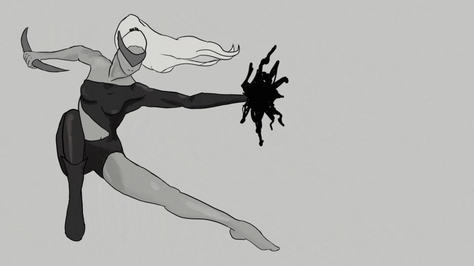
Line art
To start we will use a Vector layer, the difference between a "raster layer" and a "vector layer" is that when drawing with the pen we can modify the lines as if it were a vector, this means that we can modify whatever it is that Let's draw without losing quality and in an easier way.
As a brush I am using the Pen: G Real.
To modify the line we can go to line correction, so we can modify the location of each point and we also have access to several functions that can help us perfect our line but I will not go too deep into this topic since there was no need to use it but I think which is a function we need to know about. In my case I am just getting used to its use and therefore I use it rarely.
I must say that if you want to become a true character creator, I recommend you study human anatomy a lot, since under its principles the creation of fantasy is governed, deforming our reality to the point that we want, but if we do not know the bases, it is difficult we can exploit this area. I also recommend drawing based on many references, photos, images of your favorite artists, etc. before trying to do it from the imagination since I consider that we first need references in our memory to be able to create a posture from nothing.
To create a combat character, I consider that we must create a dynamic posture that tells us about movement and that ability that a combat character would have is noted.
This was my process thinking about that idea:

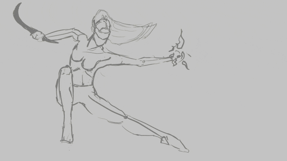
This was my first sketch where I think our pose follows this direction of movement.
When following a curve like this, I feel that the body causes an energy of movement to be perceived that perhaps is not entirely clear, if it is moving in a jump or if it is standing on the ground in this position but helping it with the arms I try that we can make out a bit of movement, however we'll try to make this clearer by adding some details later.
My idea is that it is jumping to our left.
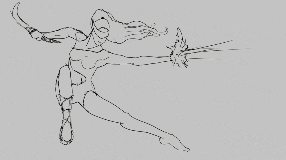
Following my first sketch I create a layer on top and draw with a more intense color, remember that you can lower the opacity of the layer you are using as a reference to be able to differentiate one stroke from the other.
In this next sketch I'll try to give it a little more shape, so this time I'll try to place the suit and a little more detail.
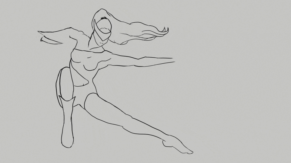
I repeated this process until I had a slightly better detailed base, I wasn't sure if I wanted to have a perfect line art because I had in mind that at the end of it all I didn't want a line art, but just for reference.
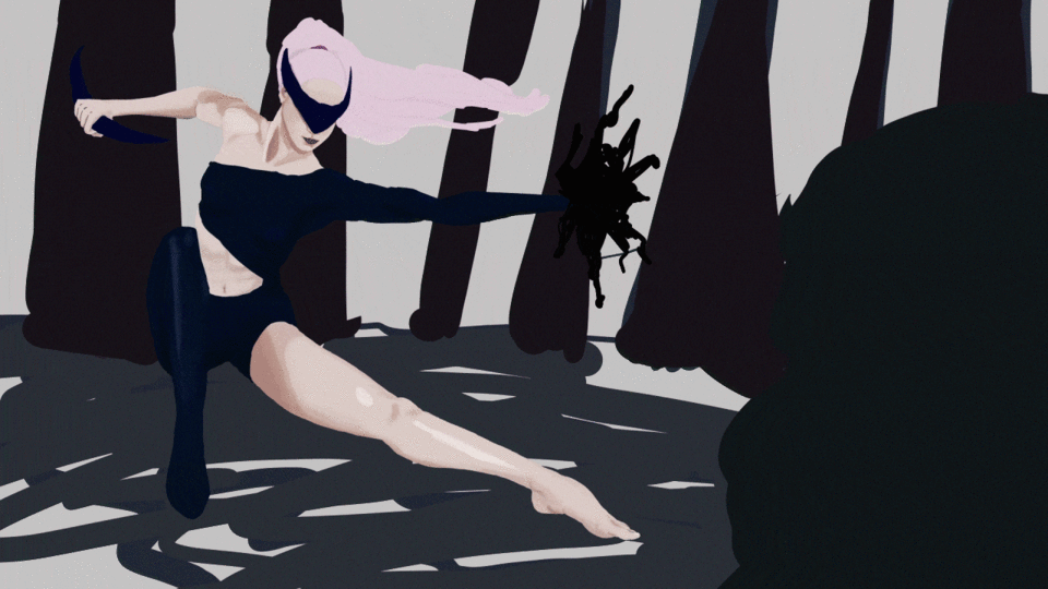
padding
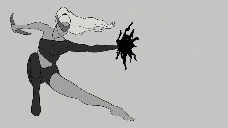
The next thing was to fill color with raster layers, creating a layer for each part that I felt needed a color of its own. I started doing it in grayscale and then colored it with the color balance tool.
I used my "Hard Round" brush so I don't have color changes in each stroke and just fill.
First it was the skin
after the clothes
And the next thing was the hair, the objects and the "magic" in his hand.
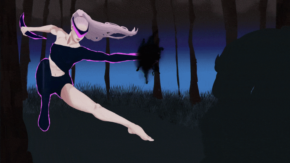
Light and shadow
The next thing would be to add shadows and lights to give it a greater sense of volume. Unfortunately I haven't mastered this subject yet, so throughout the painting I am modifying the details that seem necessary to me. I see many artists being very successful when it comes to doing this step by step but I think this is a matter of experience so many times the steps are combined... in the end we try to eliminate the line art so we create the details that seem most important to us to shape what we seek.
We'll create raster layers one layer above our color/fill layers and set it to "Clip Layer Below". This in order not to get out of the pixels that we have already placed, we could also use pixel lock, but in this case I preferred to use it that way because I still had to make some modifications to our basic path, in addition to that we can modify the type of layer and the opacity of this , giving us more options.
The study of Light and shadow to give volume can help us a lot to understand what part to shade and what not, in this case we use only some simple shadows to give the sensation that our body has volume. If you have difficulties with this, I recommend doing studies with basic figures such as cubes, spheres, etc.
In the next step deactivate the line art and with the guide we have we focus on making all these details have the correct shape and see the volume we are looking for, when we remove the line art we realize more details so we can go polishing to our liking.
Before:
After:
By coloring
We will merge the layers to affect our lights and shadows as well. From here, if we need to continue modifying, we will use the "Block pixels" tool for all the details that we want to add.
Now section my "SKIN" layer to color the skin using the "Color Balance" tonal correction tool. I recommend experimenting to find the result you're looking for. I want a color palette somewhere between Pinks and Blues, so go for a slightly pinkish skin tone.
I also used the Hue/Saturation tool to slightly adjust either our lightness and saturation as if you color it directly the Hue might feel too saturated and you might want it with a bit more white(lightness).
I did this with all the layers until I got to this result
Since I needed the levels that I used to be very dim and I was looking for a little more contrast between the shadows and the highlights, I used the "Levels Correction" tonal correction tool. This tool helps us to create more contrast between our lighter or darker tone. Dark.
Bottom
The truth is that a great background can make our character stand out but with the idea of using blur for our background I didn't want to detail our background too much. So I started to sketch some ideas.
This is a small detail that makes our character stand out from the background, place a pink outline around the suit with this idea and also thinking that we can think of the suit expelling some kind of light or energy. This suit is a nano-tech type thing that can be rebuilt and molded depending on what we want. So I thought this little detail would come in handy. His weapon on his right arm is something like a boomerang of the same type of technology, it can be modified while throwing it and maybe even burn like a lightsaber from "starwars". In his right hand there is something that is like a kind of spell that opens something like the void... which is as dark as the immensity that we see in space where we see "nothing" I like to say that it is as dark as the " nothing or everything".
This battle takes place in a forest, so I put in some trees, leaves, grass and a blue sky, but the skies light up in a different hue on this planet so they ended up being pinkish in color to have cohesion with the palette. color we use so far. So later we will modify it.
ambient light
Ambient light is all that light that comes from around us, in this example the sky ended up being a little pink so our light and shadow will go a little bit in those tones, but we also have the grass around us, so use a little bit of that tone for the shadows that is the little light that would bounce from our environment. This is something I have learned lately so I am looking for a way to apply it in my pieces but there is still a long way to go to master the subject.
We create some layers above our character and adjust them to create this shadow, so we can change the layer mode that in this case we use in "darken" mode and lower the opacity to taste. This is how we dim the light we receive on our character. For all this we use the "Soft Round" brush so that it looks slightly blurred.
We dimmed the opacity of the layer and tweaked the color a bit with the "hue saturation" tonal correction tool and achieved this result:
Blur in the background
For the background, as I mentioned, I decided from the beginning that I would use the "Gaussian blur" filter, so we applied this filter to our background at about 86.39. This can vary depending on what you are looking for, the more out of focus, the more your character will stand out, but the background can also be completely lost and here we still want to maintain the idea that we are in a forest.
Result
blur on character
We will duplicate our character layers and then combine them into a single layer and apply the same blur but in a more subdued way, maybe at 35-40 you can also try the different types of filters to achieve other types of interesting results. We will delete this layer in the part that we want to focus so that the layer below shows the element completely normal (focused). In this case we will see Neffka completely focused on her face and part of her torso.
Completely out of focus:
We erase with our "Soft Round" brush, if you want you can use a clipping mask so as not to lose anything and you can eliminate or add what you need. For this we only select our layer and press the "Create clipping mask" button and we will see a layer in front of our layer, this is where we must "paint" to remove or add what we want.
First we'll duplicate our character layer that we use to blur here we won't need the clipping mask so you can delete it. We put it at the bottom. and we will add with the "Smudge" brush some lights to accentuate the movement in our character. This brush drags the paint of the color where we are placed so with the duplication I only had to drag the color of the edges to the right a little so that the color that we have in each part seemed a bit distorted and blurred, that effect that is created when our eyes see something moving very fast.
You can use Paint Amount to 0 to just drag paint or add paint to be something blending between the brush paint you chose and the background paint you brush on.
In this case I added a bit of darkness to the corners, that effect that we sometimes see in the movies that makes us look as if we were seeing through someone else's eyes, as if we were the ones who really see the character, this so that the focus is even more directed towards the character.
This is our final piece.
I made an alternate piece adding a texture we use it in multiply mode and lower the opacity:
We zoom in to see our texture and this is the difference:
Gratitude:
It is an honor if you stayed until this point, I hope it helps you to continue learning. I believe that in this art it is necessary to see many points of view to create our own creative process. I still have a lot to learn but I am very excited to share everything I learn with you. Thanks to all the readers of this article, I hope to see you in the next one.
Users who liked this post


Comment