
Introduction
Winter is one of the most difficult forms of weather to depict. Winter can be beautiful, and there are many ways to show it.
This is a guide to those who want to make their winter scenes look as convincing as possible!
For transparancy, the gradient map and drawing was done in Procreate, while the arrangment of panels and text are done in Clip Studio. But all of this can be easily replicated in Clip Studio Paint, which has a lot of features to make the process easier.
Getting the Right Atmosphere
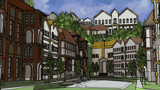
Take this example comic
Dialogue: "Jeez, it's so cold in this town!" "It's the dead of winter!"
But what is wrong with this image? On the surface, it has everything that indicates cold weather: Snow on the ground, a character's remarking how cold it is... but what's missing?
It Doesn't Look like the "Dead of Winter"
The first panel is passable, but the second panel is contradictory. The winter landscape looks like spring is near, not the dead of winter like the dialogue suggests.
The grass is too green and the color palette is too warm, making it look like it is hot outside! The sun is blazing down, it almost looks like the sun is melting the snow.
So why does this happen?
Many artists use 3D models, and by default most of them take place during the warmer months of the year, hence why you have green grass and bright blue skies. So it's usually up to artist's themselves to add weather elements like snow and rain to change the mood.
This image is no different. I modeled this in blender with the default setting being a hot summer or spring day. This means I have to make adjustments after rendering the image to make it look how I want it to.
Take a look at the image below. I took off the snow layer in my digital art program, and suddenly it looks like summer!
So How do We Fix It?
Color Correction is the best method. Here is a guide to what stays green in winter
1)
Green grass isn't impossible in winter, but only when the ground is warm or when there has been a sudden snowstorm before the ground can cool.
Some things in nature do actually stay green no matter how cold, such as pine trees. They are a a dark, muted green color, and can be covered in snow.
2)
In the wintertime, grass is usually dead. The green is desatuated and becomes similar in color to straw or hay. Dark yellows, and browns are the way to go! Snow on top of dead grass really conveys a wintery atmosphere.
3D Models and 2D Hand Drawn Trees
1) With premade models, green trees are the most common.
2) Any tree already pre-inserted into the scene can be changed in your preferred art program using the HUE layer option, and going over them with a soft brush.
3) If you have an option to use hand drawn bare branches with snow, do so! And as a tip, always use blue for shadows in winter. Never warm colors!
Changing Tree Colors in Clip Studio
This image below is the default model. The trees are image planes in a 3D model, and cannot be replaced in a short amount of time.
However, using the "Hue" option in the layer filter, you can go over and make the once green trees dead.
Extra Tip:
-When the scene calls for winter, always go with blues, purples, and pinks. Muted greens can also be good too!
My Process and Corrections
Above is a gif on my process.
Let's explain how I did it!
The image below is what happens when I add some snow to the buildings and give them shadows. I added a white haze on the side to convey that it's early in the morning, where snow is whisping around in the air.
While this looks nice, I want take it further.
1) I combine all of my layers into one.
2) I duplicate it twice.I use GUASSIAN BLUR on the top two layers. I change both their layer types to SCREEN, while the original is kept as is (NORMAL).
3) Using a GRADIENT MAP, one of the top layers is blue, and the second top layer is a pale cold green color with blue accents. I erased what I needed to using a soft brush. (example of my layer setup below)
Text Below: "Layer 1 (SCREEN)" "Layer 2 (SCREEN)" "Layer 3 (NORMAL)"
After I used a soft brush and played around the the opacity, I added some snowflakes and used guassian blur on the particles.
Why This Version Works
One of the reasons this version works is the color scheme.
The colors in the first pass looked nice in terms of color palette, but they didn't fit what I wanted to go for. Notice how warm the palette is, and how it's improved in the colder palette redo.
Final Comic (Color Corrected)
And done! I adjusted both panels and color corrected them.
Thank you for reading this tutorial, hopefully it is helpful!
Users who liked this post


Comment