
"If you use only one color for multiplication, it will become monotonous."
"But it's troublesome to change the shadow color for each base color..."
“I wonder if you can get a nice shadow color with just one color!!!!”
It's been a few years since I've been embracing the ultra-hyper lazy desire.
The coloring method introduced this time is a method that a pathetic person who has made efforts in a direction that is not completely lazy, such as working hard to have fun without acquiring basic drawing skills. .
First, let me give you a quick overview of how we do this.
① Added "Tone curve" of color correction layer.
(2) Once the color is appropriately dark, use a “mask” to add shadows.
③ After painting, adjust the color.
end.
Technical terms such as "tone curve" and "mask" came out, but I will try to explain the functions as easily as possible, so I hope that even those who do not like this method can read the explanations of the functions. .
Also, since the method introduced this time uses a special use of the tone curve, I will also introduce general usage at the end.
Let's get started.
I also made a video with the same content as this article.
The video is in Japanese, but please take a look.
▼Video
What is a tone curve?
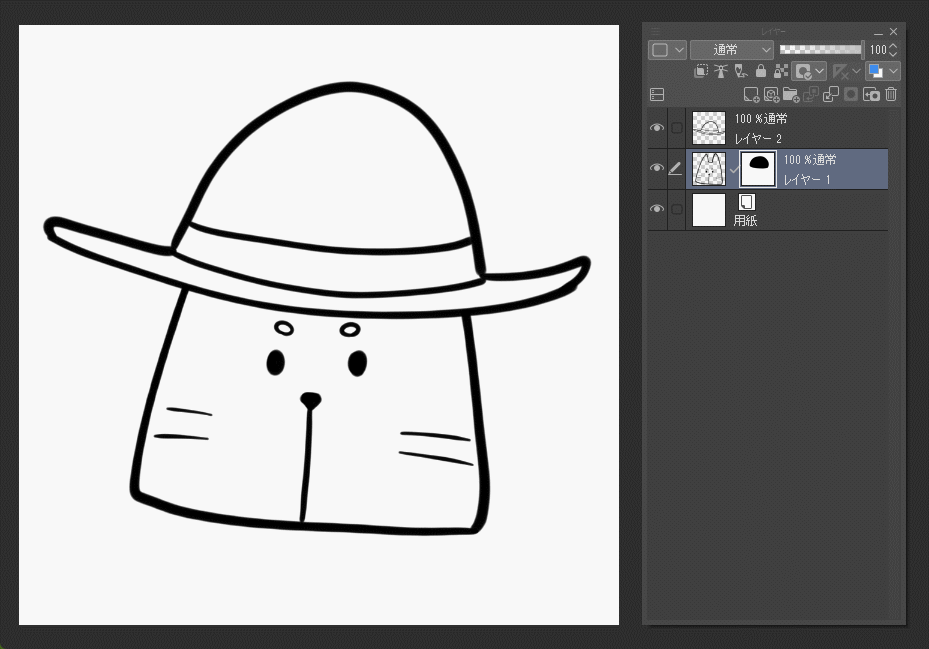
First, prepare a picture that has been undercoated.
Next, we will create a new shadow layer, but we will draw all the shadows in one layer, so select the folder that summarizes the base or the top layer of all layers. . I want the line art to have shadows, so I select the top layer.
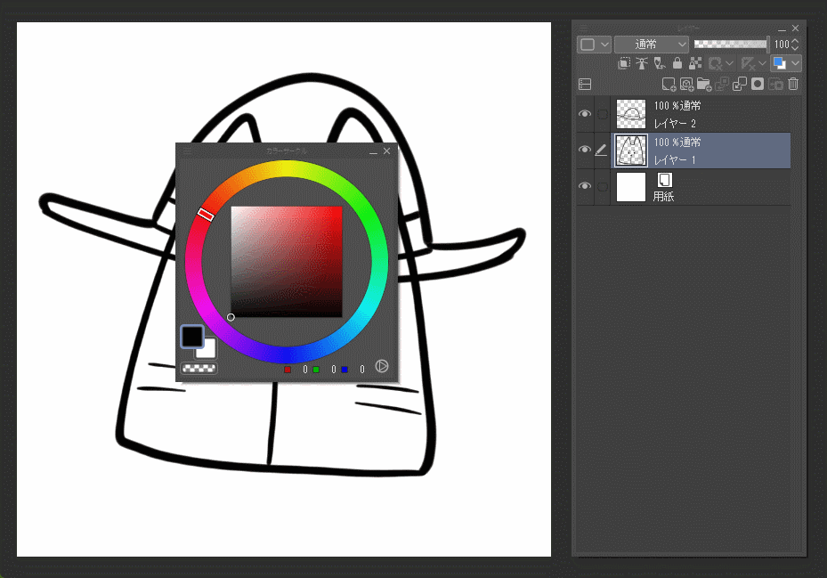
Then, click "New Tonal Correction Layer" and "Tone Curve" from "Layer" in the upper tab.
Go to Menu section [Layer]→[New Correction Layer]→[Tone Curve]
Then a window like below will appear.
This "tone curve" that I just added. This time, I will use this to draw shadows, but what exactly is this function? This feature allows you to brighten or darken the image.
Adjust the brightness by moving the diagonal white line.
By the way, points created by clicking can be deleted by moving them outside the graph, so if you create extra points, delete them. I don't know how to remove this first.
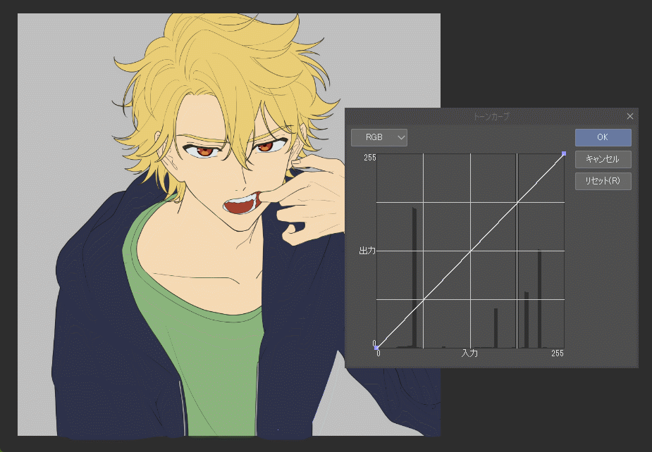
I'll explain how to use it in detail later, so let's darken it appropriately so that it's easy to see that the tone curve is applied, then press OK and close this window.
The current tone curve has been added as a layer, and if you double-click the square (thumbnail) on the left side of the layer, the previous window will appear and you can edit it, so please feel free to close it.
Preparing to paint
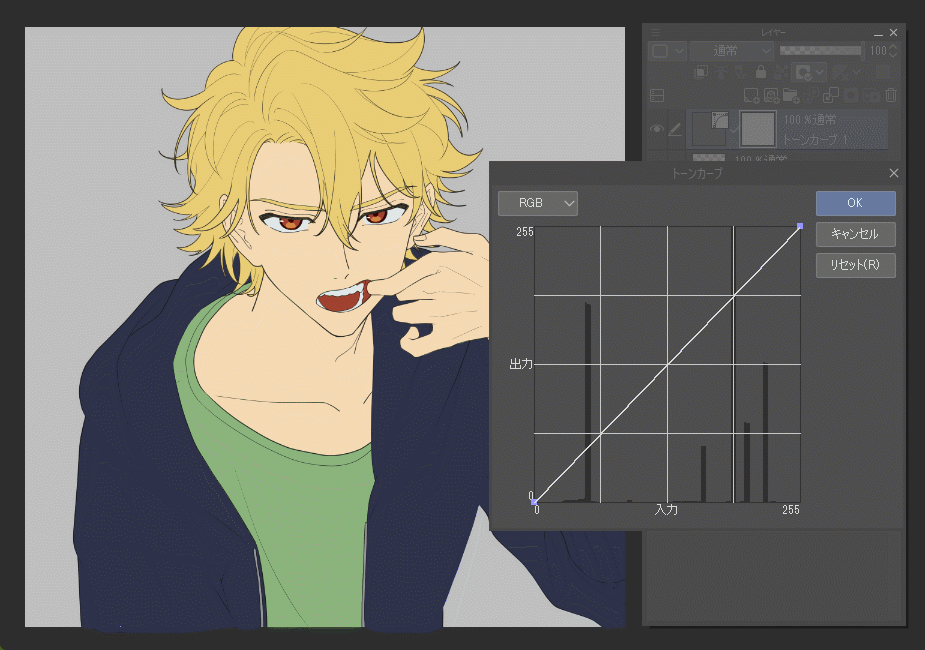
Right now, the tone curve is applied to the entire picture, but I want to apply it only to the person, so I will make a simple preparation. Well, I think a lot of people do this often when painting shadows.
I will introduce some methods, so the explanation may be a little long, but please bear with me.
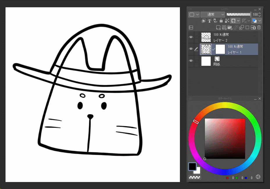
After closing the tone curve window, if you added a tone curve layer between the line drawing and the base, clip it to the base. It is OK if only the person is dark.
If it is only on the hair or only on some parts, I think that the base is probably not organized in a folder, so put all the bases in one folder and put the tone curve layer on top of that folder. Please bring the clipping.
…… Well, I could do it for each part, but at the end, it would be difficult to understand when adjusting the colors, so please do it all at once this time.
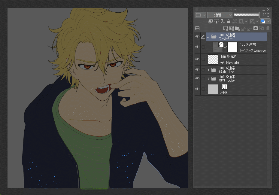
Next, if you add a tone curve layer on top of the line drawing, it will be a little more work, so please do your best to keep up.
First, grab the tone curve layer and bring it to the position where the folder icon is on the top (bottom for some people) and release it.
Then the tone curve layer will be in the folder.
However, since the tone curve is not applied to the picture now, let's set the blending mode of the folder to "Through".

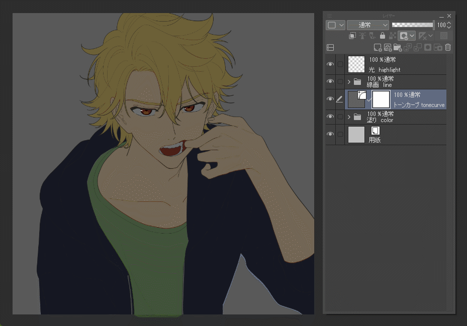
Then, in any method, create a state in which only the person is selected.
The recommended method is to Ctrl-click the underlying folder icon (or thumbnail).
While holding down the Ctrl key and the Shift key at the same time, click the line drawing folder icon or thumbnail.
Now I am in a state where I am selecting the area of the character's fill and line drawing.
When this state is created, select the folder containing the tone curve and click the □ and 〇 icon "Create layer mask" above. Then, the tone curve will be applied only to the person.
What is a layer mask?
Well, everyone. With this, I think that the tone curve is applied only to the person, but I would like to explain the "layer mask" here.
If you know, feel free to skip here.
Earlier, I added a layer mask to the folder, but did you notice that the tone curve layer also has a layer mask from the beginning?
The white square to the right of this is the layer mask.
This mask means "cover" or "hide" in Japanese.
In other words, a layer mask is a function that hides a layer.
For example, when you're drawing a picture, do you ever think, "I want to erase this line because it's in the way, but I want to keep it in case something happens"? This layer mask is useful in such cases.
You can erase it by adding a layer mask, selecting "transparent color", and painting where you want to hide or hide.
Of course, it is only "hidden" with a mask, so if you uncheck "Enable mask" from the mask tab at the top of the layer window, the original picture will appear.
You can also remove the mask by clicking the thumbnail while pressing the Shift key.
By the way, if you want to know where the mask is currently hiding, you can see the hidden place by checking "Show mask range" in the same place.
Also, in the thumbnail of this mask, it is displayed in such a way that "the white parts are visible and the black parts are hidden", so I think you can make a judgment here as well.
It might be a good idea to think that the visible areas are white because they are illuminated, and the invisible areas are black because they are not illuminated.
However, this layer mask is very convenient, but there is one thing I want you to be careful about.
This time I will use the tone curve layer, so this accident will not occur, but when using it with a normal raster layer or vector layer.
If you paint a transparent color while the thumbnail of the picture is selected instead of the thumbnail of the mask, you will end up with something like "I intended to hide it with the mask, but the picture itself was erased!" So please be careful. (I have done it many times)
Since the tone curve layer used this time is a layer that cannot be drawn in the first place, this accident will not occur.
On the other hand, if you think, "Huh? I can't draw?"
Let's paint!
Now let's get back to it.
With the tone curve layer mask selected, click the "Erase" icon on the command bar.
Then, of course, everything will disappear, but when you look at the thumbnail of the mask, what was pure white is now black.
In other words, it is now "all hidden".
From this state, let's make only the shadow part visible.
You can use red, white, black, blue, or any other color as long as it is not transparent.
It's okay to use the brush you always use. Let's draw the shadow as it is.
You can use the eraser tool and bucket tool as usual, so let's draw as it is.
Maybe the color looks bad now, but I'll adjust it later.
While painting, you may think, "I want to paint so that it doesn't protrude from the part!" or "I want to clip with the part!" If you hold down and click to select the range and then paint, you will be able to do pseudo clipping.
If the above method creates a selection that covers other parts, hold down the Ctrl and Alt keys and click on the thumbnail of the extra part to select only that part. can be released.
An automatic icon selection tool like a magic stick is also useful.
(▼ video, start from the corresponding part)
Please use this "selection area" when painting all the shadow colors on one layer.
Adjust brightness and saturation
Then, when the shadow is almost finished, it's finally time to play around with the tone curve.
Sorry I made you wait.
Double-click the thumbnail of the tone curve layer to bring up this window.
Adjust the shadow to your desired color.
When adjusting, just keep the following three points in mind.
・Change the brightness up and down
・Curve when you want to increase saturation, straight line when you want to decrease saturation
・Move the right side for brighter backgrounds and the left side for darker backgrounds
Now let's do it.
First of all, regarding the first "change brightness up and down", the lower the diagonal line goes, the darker the color becomes, and the higher it goes, the brighter it becomes. This time it's a shadow painting, so lower the line to make it darker.
Next, if you bend the diagonal lines in a bow, the saturation and contrast will be higher.
Conversely, if you weaken the degree of distortion or lower the upper right point to make it closer to a straight line, the color will have low saturation and contrast. Let's adjust while looking at the balance between brightness and saturation.
As I played around with it, I somehow felt that the bright colors of the skin and hair were fine, but the shadows in the dark areas of the hoodie could be a little brighter. (well this is my opinion)
Lastly, "Move the right side for bright areas and the left side for dark areas". In the first place, this graph shows the bright color of the background on the right side and the dark color on the left side.
Now I want to lighten the shadow color in the darker areas of the base, so I add a dot on the left side to lift the line up a bit.
I was able to lighten the dark areas a bit.
However, adding one point changed the shape of the slightly brighter line, so I will adjust it again.
You can add up to 30 points by clicking, but the more points you add, the more difficult it will be to handle, so I think 2 or 3 points for bright and dark areas will be enough.
By the way, while adjusting, there may be some colors that are difficult to darken as expected. Especially... on the skin?
This has to do with the "brightness" of the colors you are using.
The color at the top edge of the color circle is the brightest color with a value of 100.
Brightness 100 is the far right end in the tone curve graph.
So, please note that only the color here can be adjusted only with the upper right point.
color adjustment
That's why I've adjusted the brightness and saturation, but finally I'll also adjust the hue and color tone.
If you click the "RGB" in the upper left corner of the tone curve window, three channels of Red, Green, and Blue will appear in addition to RGB.
For now, select the top Red channel.
Try moving the line. First, when I moved it up, the shadow turned red. On the other hand, if you move it downward, the shadow becomes bluish green.
Reset and set the channel to Green. Move it up to make it green, and move it down to make it purple.
I reset it again and set the channel to blue. Move it up to make it blue, and move it down to make it yellow.
These are adding and subtracting colors. Adding a line up is addition, and moving it down is subtraction.
For example, if you raise the line on the Red channel, it turns red.
This is adding red. It turned red because it added a lot of red.
Conversely, lowering it is subtracting red. Since the red color is removed, the remaining two colors, blue and green, are mixed to create blue-green.
Similarly for the other Green and Blue channels.
By the way, the first RGB channel I was working on was moving all three colors, red, green, and blue, at the same time.
Red, green, and blue are called the "three primary colors of light," and the more light you add, the brighter it gets, right? Conversely, the more you pull it, the darker it becomes.
So if you raise the line, it will become brighter, and if you lower it, it will become darker.
Shadow painting method using this tone curve. It looks like a way to apply functions, but in fact there are things that are quite close to real thinking. A shadow is a part that is not illuminated by light.
However, for now, just think about "color".
There are various reasons, but it is generally said that the shadow color should be closer to blue.
Set the channel to Blue and raise the line, or set the channel to Green and lower it slightly to make it bluish purple.
If you move the red, green, and blue channels, the brightness will change rapidly, so if you want to make it brighter or darker with this color, go back to the RGB channel and adjust the brightness. Let.
When you're satisfied with the color, press OK and you're done! ! Thank you for your hard work! !
You can also draw light this way by reversing the brightness.
General usage
Finally, I would like to finish by introducing how to use tone curves in general.
Tone curve is a function included in the genre of "color correction". The point is that it will be used a little in the final processing.
It is mainly used when you want to increase the contrast of illustrations and photos.
Add a tone curve to the top of all layers to make an S curve like this
Let's review what this graph represents.
The line on the right side of the graph is raised and the left side is lowered. Does that mean...?
It means that the bright parts of the illustration are made brighter and the dark parts are made darker.
This increases the contrast (difference in brightness).
There is also a function that can adjust the contrast such as "Brightness / Contrast" in other color correction functions.
However, the tone curve is more detailed than that, and you can make adjustments such as "brighten the bright areas by this amount and darken the dark areas by this amount".
Furthermore, by using the "mask" function explained together this time, you can also "increase the contrast only here". (I think that's what it's intended for)
It can also be used to adjust color with the three channels Red, Green, and Blue.
If it's a simple color adjustment, it's better to use another color correction, "Color balance", but with the tone curve, you can make pinpoint adjustments such as "change the color of" this "brightness".
So, I think you can see how I introduced the wicked way this time (lol)
However, when shadow painting using the blending mode, I was conscious of "overlapping colors", and the task of selecting colors was quite difficult, but the tone curve was "the color of the ground (about this). I adjusted it with the idea of making it darker and ``making the background color bluer (to this extent)'', so I felt that this was more suitable.
Also, once you create a tone curve layer, you can register it as a material, and copy and paste the layer to reuse the same settings.
The tone curve is a very useful function even in its original usage, so please try using it! !
Bonus and for users of other software
Please refer to the tone curve used in the thumbnail.
(From top: RGB > Red > Green > Blue)
[For users of other software]
This time, I explained using CLIP STUDIO PAINT's "color tone correction layer" function, but in other software such as Ibis Paint and MediBang Paint, even if there is a function called "tone curve", it can be used as a layer There may be no function to add as.
That's not to say it can't be done, but it does make the process a bit cumbersome.
As a method,
(1) Merge the copies of the undercoat into one
(2) Apply a tone curve directly to the undercoat of the combined copy
(3) Display necessary areas with masks
However, if you try to adjust the color later, you will have to start over from ①, so it is more troublesome than Crysta. Multiplication might be better.
▼ I introduced this method on Twitter before, so if you want to see the video, please click here. (Although the software I am using is Crysta)
Users who liked this post


Comment