
When telling a story, more specifically a webtoon, the scenery may not be the priority, but it can be essential to the general atmosphere and must know how to be present but discreet to highlight the essential: the character .
Different types of decors can be considered depending on the situation:
simple colored backgrounds for more comic moments for example. A simple solid color or a gradient or even a pattern will do.
But most often, for a satisfactory and quick result, webtoon authors use 3D backgrounds.
You can use them as is, but maybe it lacks a bit of pep and personality, right?
We will see how to give a little more character to this base.
1- Light Atmosphere:
Unless you have already set the lighting mood in your 3D model, you will have a neutrally lit image.
You can quite easily change that with blend layers!
Day
add light in windows for example, or in the sky!
Add a layer in overlay mode for highlights, or in glow density mode to add a stronger light. Lower the opacity if the effect is too pronounced.
Do not hesitate to add rays of light, especially for dawn or dusk atmospheres. All this will give more life to your decor without complicating your life.
here is an example
Here, I added light in the windows with a simple glow density layer.
Night
for the night, add large dark blue airbrushed areas as well as sharper areas for the drop shadows on a layer in product mode.
Enhance the bright areas on another layer in glow density mode for example (or another of these blending layers, see what works best for you)
here are several examples:
Scenery without "daytime" retouching
and with a layer with large blue areas in product mode
Then I enhance the lights with a layer in glow density mode (or another blending mode that lightens)
Here is the same process on another image
I add the blue atmosphere on a layer in product mode
then the lighting atmosphere, this time in "harsh light" mode
I raise the origin of the light
To make it work even better, I'm going to add some shadow on the character, I add a layer in "product" mode (no longer on the scenery but on the character)
additional lights
Don't hesitate to add light elements: colored neon lights, screen lights, illuminated windows in buildings...
A layer in one of these modes:
"sparkle density"
"Raw light"
"bright light"
does the job very well. But do not hesitate to test for yourself what will be the best rendering.
Here are some simple examples:
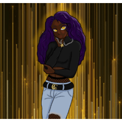
don't forget the character
I mentioned it above: your character is now in a particular light environment. And if it's not necessary to do touch-ups for scenes in neutral light (daytime, in a fairly well-lit room), it can be a good thing to add a little shadow, bright light or grazing to accentuate the atmosphere set by your scenery and insert your character more credibly into his environment.
2-Contrast:
Playing with contrast will allow you to highlight your character to make it stand out. Indeed, it will tend to disappear without the decorations if it is too present.
A simple and effective way to bring out your character is the contrast between him and the scenery.
In broad daylight, in a well-lit decor, you can light up the decor.
There are several very simple ways to do this:
1- by adjusting the contrasts/brightness of the scenery.
2- by adding a colored layer in low opacity.
3-by decreasing the opacity of the decorations (I recommend less, because we have less control over the whole)
This technique also works the other way around: darker backgrounds will make the character stand out. It works especially for night scenes.
You can even opt for a colorful decor, but we are moving away from realism.
3- Blur
To further reduce the presence of the scenery and give an impression of depth of field.
You can even do it with multiple planes. But usually one will suffice.
Note that this technique works very well with the previous one! A clear and blurred scenery leaves a nice impression of a well-lit daytime scenery without overwhelming the character.
Here is an example where I cumulate the last two points:
A blurred and cleared decorations
4-Optional: color consistency.
I talk about it in this article about the characters:
But giving your webtoon a colorful tone will make it instantly recognizable!
For my part, I add a light purple/pink filter which gives this same soft look to all my decorations.
Of course you can vary according to the atmospheres (day/night/flashback / etc...) but always keep a certain continuity. Whether it's in your backgrounds or your characters!
Users who liked this post


Comment