
This tutorial will cover the Text tool in Clip Studio Paint, starting with the basics and going all the way through some advanced features later on.
It’s a big enough subject that I made it into three separate videos! Or, if you prefer to read tutorials in text format, that’s down below the YouTube videos. Be sure to use the index at the top of the page to jump to specific sections if you need to!
Part 1: Text Basics
Adding Text
To start with, simply select the Text tool icon. Click anywhere on your art canvas to bring up a cursor and the Text Launcher menu, and begin typing.
Hint: By default, the color you have chosen will be your text color.
Depending on your settings and the size of your canvas, your text might be bigger or smaller than you expect.
You may be tempted to change the text size in the tool properties panel, but at first it looks like nothing happens.
However, if you type now, your added text is the new size.
So the first thing to realize is you can have different text properties, including size, style, and color, within the same text block!
As long as you're still in text editing mode, you can highlight specific text and make changes to it.
You can also highlight all the text in this object at once by hitting Ctrl-A (⌘-A on a Mac).
Hint: If you're using a version of Clip Studio Paint earlier than 2.0, this is the only way to make edits to the text size and style.
The little menu that appears under text while you’re editing is called the Text Launcher menu. It contains three buttons:
Shortcut to the Sub Tool Detail palette (I’ll talk about this more later)
Checkbox to finalize your edits
X button to cancel your edits
Hint: Clicking anywhere outside of the text object will also finalize your edit.
Moving and Resizing the Text Object
Notice that adding text has created a new text layer, which has a unique icon.
IMPORTANT: You won't be able to draw on this layer.
While you still have the text tool and this layer selected, the text will have a selection box around it. You can hide it by selecting a different layer or a different tool.
The selection box allows you to move, resize, or rotate your text. Pay close attention to the shape of your cursor!
Rotate Cursor - Hover outside the text box to get this curved arrow, which allows you to click and drag to rotate your text object.
Move Cursor - Hover right over the border (away from any of the handles). When your cursor looks like this arrow, you can click and drag to move the text object.
Resize Cursor - Hover over any of the handles (the dots on each side and corner of the box) to get this straight arrow, which lets you resize your text.
Hint: Resizing a text object also changes the font’s size property.

You may notice your text getting taller or wider as you resize.
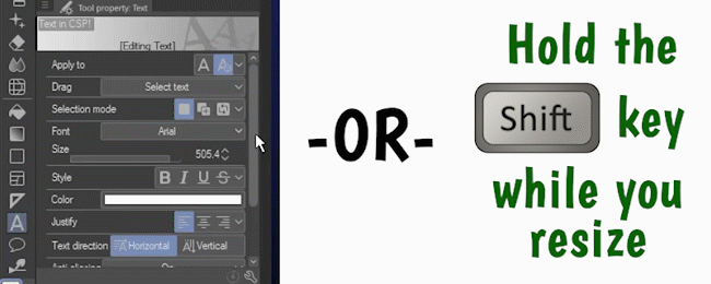
To maintain its aspect ratio, you can either check the Keep Aspect Ratio option in the Text tool properties, or hold down the Shift key while you resize.
I like to leave Keep Aspect Ratio unchecked so I have the option to stretch my text at will!

If you hold down the Alt key while you resize your text block, it will grow and shrink around its center point.
Edit Existing Text
To get back into edit mode, hover your cursor over the text until it changes to an I-beam, then click once. You’ll see the typing cursor and the Text Launcher menu re-appear. Now you can edit or add new text.
Changing Text Properties
I’m going to run through some basic text properties in this section. If I skip anything, don’t worry - it will be covered in the Advanced section of the tutorial later!
If you're on Clip Studio Paint 2.0 or higher, the first thing you'll see is "Apply To". With the option "New Only" selected, any changes you make to the Text properties will only affect new text objects, or, if you are in editing mode, any text you have highlighted.
Note: You will not see “Apply To” on versions prior to 2.0, and text editing works the same way it does with the “New Only” option.
The second option, "Selected Text", was added with version 2.0, and I much prefer it! It means changes you make in the Text properties will affect the whole text object (or objects) you have selected.
And yes, that means you can now select and change multiple text objects at once in version 2.0! I’ll get to that later.
Here are some of the most common ways to adjust your text:
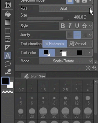
Font: The overall look of your text. Fonts are sets of carefully crafted matching characters (also called “glyphs”). Your computer probably has dozens of fonts already installed, and you can download more from the internet.
Size: Just like it sounds, size controls how big or small your text is.
Style: Here, you can make text bold, italicized, underlined, or with a line through it (called a strikethrough).
Color: Again, just like it sounds! Change your text to different colors.
Justify: Also called “alignment” or “justification”, this controls whether multiple lines of text align to the left, center, or right.
The Font dropdown will give you a list of every font installed on your computer, plus some other great features I'll dive into in the Advanced section of this tutorial. Your list of fonts will look different than mine.
If you’re looking for more to add to your computer, Google Fonts is a great resource to download free fonts safely online!
Sub Tool Detail Palette
To find a bunch more text options, go into the Sub Tool Detail palette by clicking the wrench button on the Text Tool properties.
For example, in the Font section, you can change the horizontal and vertical ratio, another way to stretch and squash your text.
Character spacing and Condense text are two ways to control how much space is between letters. Character spacing allows more versatility, stretching out the space between glyphs or overlapping them entirely, while Condense text simply removes the space between them.
Note: Other settings like outlines, ligatures, and tate-chu-yoko will be covered later in the tutorial.
In the Line Space/Alignment section, you can adjust the width between lines of multi-line text.
One more I'd like to quickly point out is in the Text section, called Anti-aliasing. If your canvas is big, you may have to zoom way in to see the effect!
With it on, the edges of your font are blurred just a little to appear smooth. With it off, the edges are jagged.
Multi-line Text Boxes with Wrapping
Your text can have multiple lines by hitting the Enter key between each one, but you can also add text boxes with automatic line wrapping. The feature existed in earlier versions, but it’s been improved as of Clip Studio Paint version 2.0.
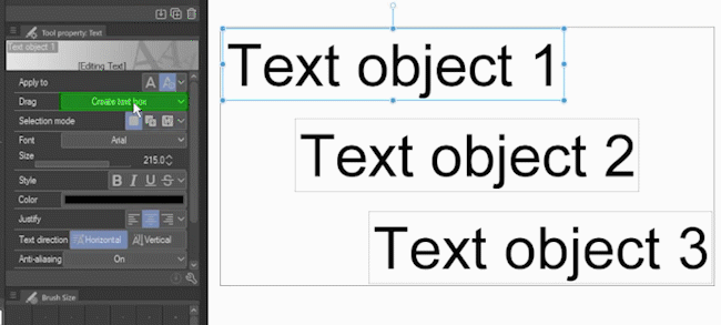
Set the Drag option to “Create text box.”

Drag out a box somewhere on your canvas. When you type, your text will wrap!
To convert a wrapping text box into a normal text object, open the Sub Tool Detail palette, go to the Text section, and uncheck "Wrap text at frame."
You can also check this box on a normal text object to convert it to a wrapping text box. This even works in CSP versions earlier than 2.0. You may have to manipulate the size of the box to get your text to wrap the way you'd like.
Hint: If your text box is too small, some text may be hidden!
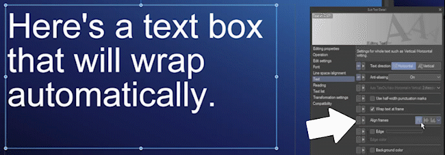
The "Align frames" option is only available with wrapped text. This simply aligns your text to the top, middle, or bottom of the box.
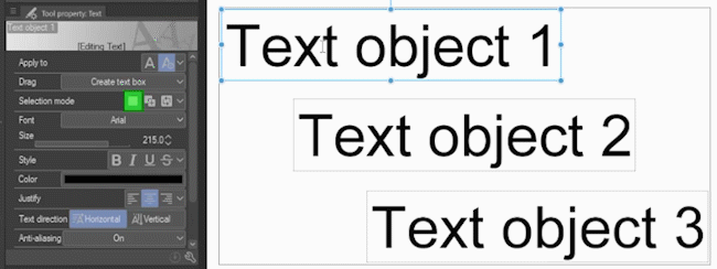
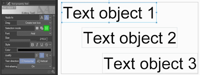
Multiple Text Objects on a Single Layer
In Clip Studio Paint, you can have multiple text objects on a single layer! To enable this, go to "Edit Settings" and take a look at the settings under the "How to add" dropdown.
Create layer always: This option creates a new text layer for every text object.
Add to selected text: With this option, if you already have a text layer selected, you’ll add additional text objects on to the same layer.
Detect Position: This adds a layer based on proximity to existing text. (For the sake of precision, I prefer to use one of the other two options depending on what I need.)
Change the dropdown to “Add to selected text”.
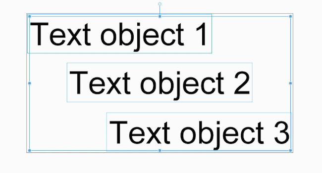
As you add new text objects, you’ll see a box appear around all of them, letting you know they’re all part of the same layer.
You’ll also see just a single text layer on the Layer palette, automatically named after the contents of the first text object. You can, of course, rename this to whatever you want.
Selecting Multiple Text Objects
There are a couple ways to select multiple text objects.
The default for Selection mode (marked in green) is “New selection” and it only selects one at a time. Each click replaces the previous selection.
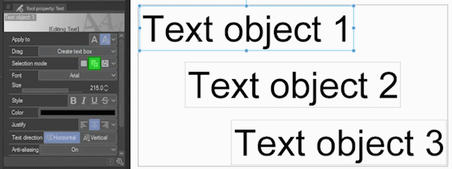
The second option is “Add to selection”. As the name implies, each object you click is added to your current selection. If you click an already-selected object, all others will be deselected, leaving only that one.
The third option is “Toggle selection”, and it’s similar to the last one. Each object you click is added to your current selection.
The difference is, if you click an already selected text object, it will be toggled back to deselected, while all others remain selected.
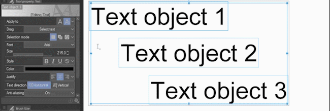
The other way is to change the Drag option to "Select text." Then, clicking and dragging across your canvas will select all text objects you touch!
Important Note: This changes the behavior when you click and drag a blank space on your canvas. You’ll need to switch it back to “Create text box” to drag out automatically line-wrapping text boxes like I showed you earlier.
You can now move, rotate, and resize them all together.
If you're in Clip Studio Paint 2.0 or higher, you can also change all their text properties at once!
Part 2: 10 Advanced Tips and Tricks
Tip 1: Organize Fonts with Font Lists
I'll start with one of my favorites! Click on the Text tool, then open up the Font list and click the gear icon at the bottom.
In the new window that appears, first click "Create new font list", and then give your list a name.
Select as many fonts as you want by clicking on the font name, so that a checkmark appears next to them. Click OK when you’re done.
Hint: I find it’s really helpful to click the option to display the font name in that font, for a visual reminder of what it looks like!
Now, open the Font list and select your custom group from this dropdown to only see the ones you chose.
It's a great way to organize your fonts!
Tip 2: Adding a Font ONLY to CSP
Speaking of fonts, do you have a font you don't want to install on your system, but just want to use for maybe one project in CSP?
Open the Font dropdown and click Add Font from Files.
Choose any font file in TTF or OTF format.
(As I mentioned above, you can download new fonts online, and Google Fonts is a great free resource!)
You may get this message - be sure to read it, as you might want to turn off the cloud settings - but for now, I'll just click Close.
Now the font appears in your font list and you can use it, but only in this program.
If you want to remove it, go to the File menu, choose "Manage fonts", select the font, and click the trash can icon.
Hint: This is another place you can add fonts to Clip Studio Paint as well.
Any text still using a removed font will remain, but the name will be in red. If you edit it, it'll switch to a default font instead.
Tip 3: Ligatures
Support for font ligatures was added in Clip Studio Paint version 2.0.
Ligatures are combined glyphs that replace certain combinations of characters, mostly to make them look better together. Not all fonts have them!
Most ligatures are two characters, but some fonts may have them for three or more characters.
Here's an example of some common ones in the font Calibri, with ligatures disabled on the left, and enabled on the right. Ligatures are enabled by default.
To turn them on and off, open the Sub Tool Detail palette and go to Font. The Ligatures setting is a checkbox at the bottom.
Note: Ligatures are treated as a single character for the purpose of font spacing.
If you just want to turn them off for a specific set of letters, go into edit mode, select that glyph, and disable ligatures.
Tip 4: Skewed, Rotated, and Mirrored Text (Add a Quick Shadow!)
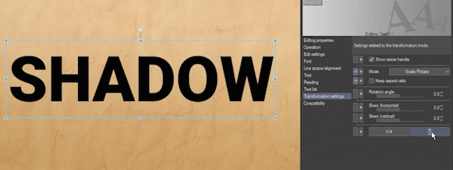
In the Sub Tool Detail palette, click Transformation settings. Here, you'll find options to rotate your text, skew it horizontally, or vertically, and even mirror it.
(Those last two say “Mirror Horizontal” and “Mirror Vertical”, in case it wasn’t clear. 😁 )
Here’s a quick example of a trick you can do with these features! I’ll start with some text on its own layer.
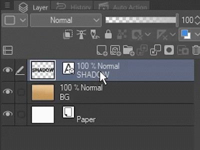
First, I copy the layer by clicking it and dragging it onto the New Raster Layer button. (You can also right-click the layer and select “Duplicate Layer”)
Then, I turn the layer’s opacity down to 30%.
For this example, it’s important that the shadow be its own layer, because you can only control the opacity of a whole layer at a time.
Now I'll flip it vertically, add some horizontal skew, and move it into place. It's that easy to get a quick shadowed effect!
Tip 5: Outlined Text
You may have noticed the option in the Sub Tool Detail palette under Font called "Outline".
This is fine if you're on a small canvas, but even the bolder option is pretty faint on larger art. Fortunately, it's not the only option!
In the Sub Tool Detail palette, go to Text and enable "Edge". You can adjust the size of this outline, as well as the color.
Hint: Just underneath the Edge setting, you can also choose a background color for your whole text object!
You can also add an outline effect to your whole layer at once. This works for any layer, not just text.
In the Layer Property palette (Hint: Go to Window -> Layer Property if you don’t see it), enable Border Effect to outline everything on the layer. Again, you can adjust the thickness and color.
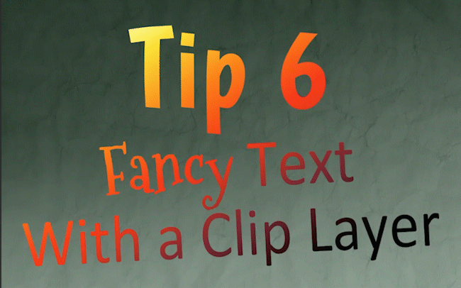
Tip 6: Fancy Text With a Clip Layer
This text could be more exciting, couldn’t it? I’ll show you how to add colors, gradients, and patterns to your text using a clip layer!
I’ve created a new layer by clicking the “New Raster Layer” button, and clipped it to my text layer by clicking the button labeled “Clip to Layer Below”.
Hint: Notice the red bar that appears beside the layer, indicating it is now a clip layer.
Anything on a clip layer only shows where the layer directly below it is visible.
For example, I'll go to the Gradient tool and pick Sunset, one of the default gradients that comes with Clip Studio Paint.
I'll apply the gradient to my clip layer - and it only shows where my text is!
You can put anything on this layer and it'll show up on your text.
And the best part is, your text can still be edited! Whatever’s on the clip layer will show no matter how you edit, move, or resize your text.
Bonus trick: Copy the layer and move it a few pixels down and to the right. Because one of the layers is no longer directly beneath the clip layer, it will be black like the original text was - which makes a great shadow.
It's a quick way to make patterned text look less chaotic!
Tip 7: Opacity With a Layer Mask
Likewise, you can make parts of your text transparent with a layer mask.
Select your text layer and click “Create layer mask”.
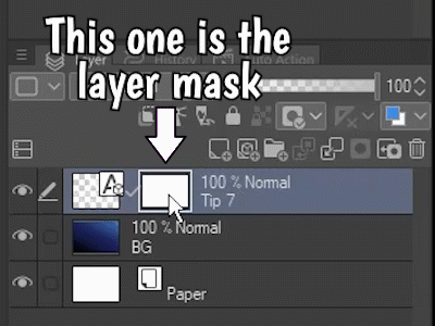
See how the selection changes when I click on each thumbnail? Make sure you have the layer mask selected, the blank one on the right.
Select any brush. I’m just using one that comes with Clip Studio Paint - the Watercolor Splash sub tool, found in the Watercolor section of the Brush tool - but you can use any brush you’d like!
Instead of painting with a color, I’ll switch my brush over to paint with transparency by clicking the checkered box below the main and sub color, as shown in the screenshot above.
Painting with transparency is just like erasing, except you can do it with any brush!
Hint: Don’t forget to switch back to the main color when you’re done. You can also use the shortcut (the C key) to switch between painting with color or transparency.
Paint the transparency onto the layer mask and watch parts of your text fade!
Hint: Just like with the clip layer, you can still edit your masked text too.
Tip 8: Custom Text Sub Tools
Do you find you're re-using the same text settings over and over? Just like with brushes, you can create text sub tools your own custom settings!
With the Text sub tool selected, click “Create copy of currently selected sub tool”.
Give your new sub tool a name, and press OK.
Customize the settings however you want.
Hint: When you’re done making changes, you can lock your sub tool to prevent any later changes from being remembered. It will always reset back to the state it was when you locked it.
When you’re done setting up your custom sub tool, click the wrench to open the Sub Tool Detail palette.
At the bottom of the Sub Tool Detail palette, click "Save all settings as default", and then click OK to confirm.
Once it’s saved, you’ll always be able to hit the “Reset all settings to default” to get back to your saved settings.
Important note: It won't work if you click on existing text and try to apply your sub tool's settings. But it will work for any new text object you create with this sub tool selected.
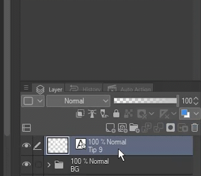
Tip 9: Rasterizing and Warping Text
I talked about skewing text earlier, but if you really want to warp it, you'll need to rasterize it.
Right click the text layer and select "Rasterize".
Rasterizing changes the layer to pixel data, like a drawing. You will no longer be able to edit it as text.
Here are three fun ways to warp your text:
Method 1: Mesh Transformation
Go to Edit -> Transform -> Mesh Transformation.
Move these handles around however you like, and press OK.
Method 2: Distort Filters
Under the Filter menu, try out some Distort options!
This is ZigZag, for example.
Method 3: Liquefy Tool
Select the Liquefy tool and try out its different modes.
The animation demonstrates the push, twirl, and pinch modes of the Liquefy tool - and that’s just a few of them!
Tip 10: Speech Bubbles (Balloon Tool)
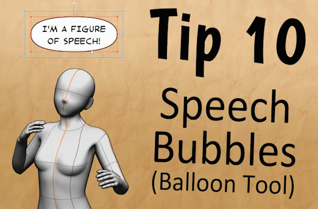
Clip Studio Paint has some features that make it easy to create comic speech bubbles for your text.
Go to the Balloon Tool. For this example, I'll stick to the default subtool, "Rounded Balloon".
Drag a balloon around your text. Notice that the balloon has appeared behind your text.
The layer with your text has now been converted to a Balloon Layer. Balloon Layers contain both text and speech bubbles.
Go to the Operation tool and select the Object sub tool. With this tool, you can select and adjust both the balloons and the text.
If you select the balloon, your text is now linked and moves with it! You can also select and move the text by itself.
To make a tail for the speech bubble, go back to the Balloon tool and choose the Balloon Tail sub tool.
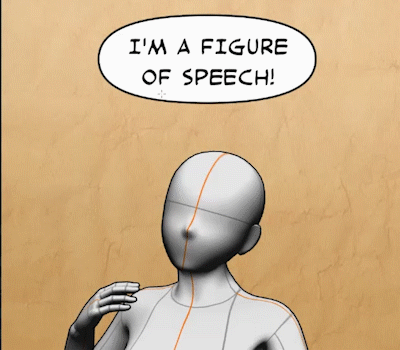
With the default settings, you can click and drag to make a quick, straight tail.
There's a lot more to the Balloon tool, but I'm going to save that for a separate tutorial of its own!
Part 3: Japanese Text and More
This third section is a supplemental to talk about some additional text features of Clip Studio Paint. Because the program is a product of Japan, many of them are most useful for non-Latin alphabets, especially Japanese.
However, they’re good to know regardless of which language you’re using!
Please bear with me - 日本語をあまり話せません。(I don't speak much Japanese.) 😅
Text List (Font Character Map)
First, let's talk about the Text List. It's a map of all characters (glyphs) in the currently selected font.
The Text List becomes available when you're in text edit mode, and can be found in the Text Tool’s Property panel, as well as its own section of the Text Sub Tool Detail palette.
It may look blank initially, but as you scroll, you'll see the glyphs. You can use the first dropdown to jump to the section you're interested in. Basic Latin glyphs are found at the beginning of the list, but your font may contain symbols, and characters in any number of alphabets.
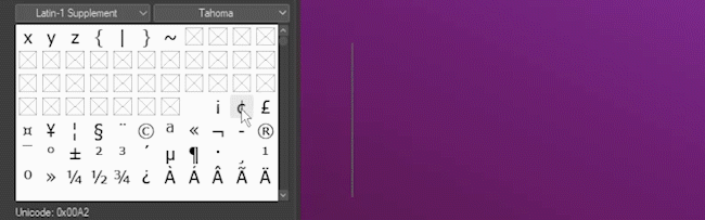
Simply click a character once to add it. This makes it easy to add characters not found on your keyboard!
Fonts won't contain all or even most of the available character slots, so you'll see a lot of blanks. By default, your computer will have fonts installed in the same language your operating system is set to. If you need letters from a different alphabet, you may have to download a different font.
For example, if I go to the hiragana character set, the font Tacoma doesn't contain these glyphs - but they appear when I switch to another of my fonts, Yu Mincho.
Mixing Fonts
Here's some text in a pretty script style, but I want to include some Japanese characters not available in this font. I could go in and change the font manually, but there's an easier way: Mixing fonts!
In the Sub Tool Detail palette, go to Font. Make sure you don't currently have any text selected, and you'll see the Mixing Font option is available.
Click New.
The current font (my script font, Allura, in this case) is set as the default, but you can choose any from the list.
Check the boxes beside “Hiragana/Katakana” and “Chinese character” to add a font for all Japanese characters, including kanji. Choose a font for each that contains these characters.
The box beside them is the size in comparison to the default font. With these two fonts, I found 90% works best.
Give the mixing font a name, and then click OK.
Mixing fonts appear at the bottom of the font list. When selected, you'll see the options to change or delete them.
Hint: To see the “Change” and “Delete” options, make sure all other text is deselected.
Now when I type, my Latin symbols appear in my script font, but when I add Japanese characters, they automatically change to the font that supports them!
(Translation note: こんにちは is pronounced “konnichiwa” and means “hello”.)
Readings (Furigana / Ruby Characters)
You'll sometimes see smaller letters alongside Japanese kanji (and sometimes characters in Chinese and Korean) as a pronunciation guide.
These are called ruby characters, and they’re easy to add in Clip Studio Paint using the Reading option.
Note: In Japanese, this is called furigana. You may also see them referred to as yomigana or rubi.
(Translation note: 日本語 is pronounced “Nihongo” and is the word for the Japanese language.)
Go into text edit mode.
In the Sub Tool Detail palette, go to Reading.
Furigana can be added to each letter individually or to the whole word at once. Select the text you wish to add the reading to, then click “Reading setting”.
Type the reading, and hit the enter key.
The rest of the settings on this panel control the font, size, position, and spacing of the readings.
Hint: To remove a reading, select the text, click “Reading setting”, and click the Delete button.
The readings appear above horizontal text, and to the right of vertical text.
Vertical Text
Speaking of vertical text, the Text direction option controls whether your text is horizontal or vertical. You may have noticed, however, it doesn't work as you might expect for the Latin alphabet, just turning the characters 90 degrees to the side.
Vertical text in Clip Studio Paint is very much set up for Japanese full-width glyphs and top-to-bottom, right-to-left writing.
Long story short, the standard glyphs used in the Latin alphabet are half-width characters, and standard glyphs for Japanese are full-width characters.
Half-width: Usually more rectangular, but not always!
Full-width: More squared in shape.
Note: It actually has to do with how many bytes it takes to store the character, but that’s more detail than this tutorial is going to go into. 😁
In Clip Studio Paint, full-width characters set to vertical act the way you'd expect, but most half-width characters are turned sideways. The ones that aren't are because of the tate-chu-yoko settings, which I'll talk about in a moment.
The bad news is, it's not really set up to make standard Latin glyphs vertical easily.
However, there are a couple workarounds. For now, the quickest and easiest is just to leave your text horizontal and add a new line between each letter with the enter key.
I'll talk about another way in the next section on tate-chu-yoko.
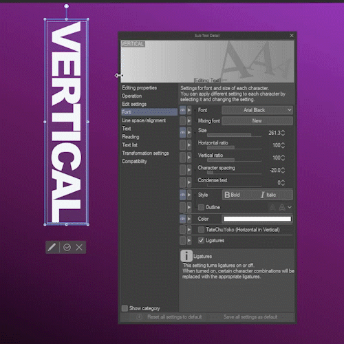
TateChuYoko - Horizontal in Vertical
Another setting you might be curious about is called tate-chu-yoko. This means that consecutive half-width characters can appear horizontal even when the text is vertical.
You often see this with numbers in Japanese, like the date shown on the right in the image above.
There are actually two TateChuYoko settings - auto and manual. Both settings are often greyed out. Here’s how to make each one active:
Auto TateChuYoko is found in the Text section and will become active when:
Your text direction is set to Vertical, and
You are in text edit mode
The manual TateChuYoko setting is found in the Font section, and will become active when:
Your text direction is set to Vertical, and
Auto TateChuYoko is set to “None”, and
You are in text edit mode and have something selected
Auto TateChuYoko is set to 2 characters by default.
Hint: This is why short words in the Latin alphabet (like “Hi” in the “Hi there” example above) are still horizontal when you set the text to vertical..
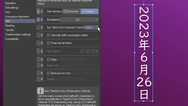
In the dropdown, you can change the number of consecutive half-width characters affected. You can see in the animation, when I change it to 4, the four-digit date becomes horizontal.
You can also change it to “None”, which removes all horizontal text, but is also necessary to enable the manual tate-chu-yoko setting.
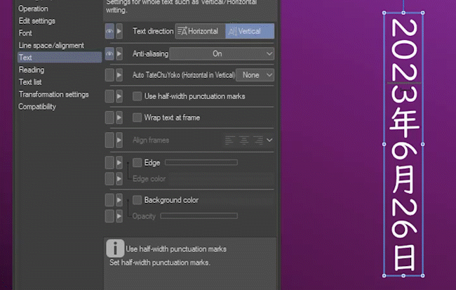
Select part of the text. Go to the Font section, and enable the TateChuYoko option.
Everything you selected, no matter how long, will now appear horizontal in your vertical text.
This is also the other way I mentioned of making Latin characters (and other half-width characters) vertical. You can select them one by one and enable TateChuYoko.
Conclusion
Whew, that was a lot! If you stuck with me through the whole tutorial, congratulations. I hope you learned lots of useful things about using the Text tool in Clip Studio Paint!
For more of my tutorials, please feel free to follow me here or subscribe to my YouTube channel. Tag me @MsRedNebula on Twitter or Instagram if there’s anything I missed or if you’ve come up with some creative uses of text in your art.
Bye for now!
Users who liked this post


Comment