
Video
Intro
Hello there, this is Tamil. Today I wanted to go over color mixing tool in Clip Studio Paint 2.0! New update brought us new way to get juicy colors. So make sure to update. It became essential part of my workflow when painting.
Watch my video if you prefer visual learning over reading ~(˘▾˘~)
In my old tutorial, you can find how to tweak mixing to your liking.
Today I will mainly focus on the new color mixing method. Also on how to make a very basic color mixing brush without anything fancy.
This is the painting I made for this tutorial :>
I had a lot of fun mixing colors and getting it to look more painterly. There will be a timelapse at the end of the youtube video. Hope it will inspire you to paint something cute as well.
Activate Color Mix
Let’s make sure it’s turned on for the brush you are using! ( I suggest starting with testing default CSP brushes, it’s a lot easier to see the effect )
Window -> Tool Property
Make sure you have a brush open
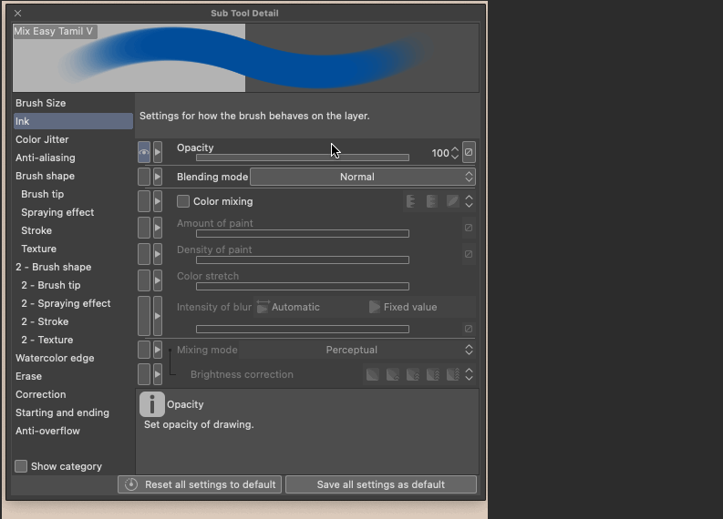
Tool Property - Wrench tool
Sub Tool Detail -> Ink -> Color Mixing ON + Mixing mode -> Perceptual
Done! The main thing to watch out for is make sure that Mixing Mode is On and it is set to Perceptual. Good news is that most brushes come with perceptual if you just downloaded Clip Studio Paint. It’s good to double check tho!
Compare color mixing
Yay! Now it works. Let’s check out the contrast of how the old way looks compared to the new way.
It might not feel like a lot, but honestly it’s so hard to mix bright colors sometimes. It’s so much fun not thinking about fixing it later. This new tool makes me more happy with my work.
Another extra function is brightness correction.
Some color are “darker” than others. For example, blue and purple! If you are mixing those colors with anything, it’s good to use brightness correction. It will keep your colors more pastel and less muddy.
I usually just put “low” when using that function. It’s good to have it just a little bit.
Color Mix Brush
There are many cool brushes people use for painting. I try to keep it as simple as possible, so I will share how to make a really quick color mix brush.
Duplicate any brush to start out. After that we need go to wrench icon again and go to “Brush Shape”.
In brush shape, you can find many brush presets if you looking for something basic. You can start with round mixing brush. After selected, just click “apply brush shape”.
First thing that I like to do is to turn off size pressure. So in Brush size I remove the check mark for that.
Then I will go to Ink to adjust to the color mixing.
This is the part that you can tweak and change to your liking! Totally up to you on how to approach this. The main thing to change is switch to color mixing and make sure you set amount of paint and density to pressure. This will allow us to mix our colors based on how hard we press our stylus.
Once you happy, you can always just click save all settings as default at the right bottom corner to keep the brush as is forever.
You can add more texture and other small things if you want to. Let me know if you have a way to improve the brush. I am super into learning as well :>
Yes of course. If you feel too lazy, the brush is available for free on my gumroad :D
Blur and layers
Don’t forget that when using blur tools, you can also use normal vs perceptual color mixing! It’s a great way to make gradients and beautiful color variation.
A small trick that helps me to mix and match my colors are layers. Keep in mind that mixing only works when you use the same exact layer!
If you want to mix less, then just make a new layer. If you want to keep mixing, then keep the same layer. Sometimes it’s good to keep in mind what you want to feel painterly and what part of the image should be more hard and defined. I merge and create new layers all the time during my painting process :)
Don’t forget that you can also get new color palettes through this way as well. Keeping your colors consistent and closer together.
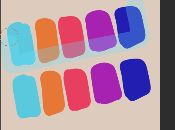
You can pick a lot of random colors you like, then paint over it with a low opacity layer. In this case I put only 25% layer on top.
In this simple example you can see that warm and cool tones make up a nice color combination. One could be used as a sunny scene, and the other as a night scene :)
Very simple example, but it’s fun to experiment. I did not even start using the color mix tool to build this sketch. The more you do it, the better you will get at it. Trust me.
The end
Thank you for reading! I really appreciate you spending time with me. Hopefully you learned something.
I tried keeping the tutorial short and to the point this time, to make sure it’s easy to follow and does not get too technical. Let me know how you feel on it!
As usual, you can check out more video for more hands on experience. Comment in case you have any specific questions. I try to help people when I can ^-^
P.S.
New tools for Clip Studio Paint article writing are amazing! I am really happy this website is improving for the best. I hope it will encourage me to make more tutorials here.
My Linktree in case you want to see more of my work :>
Users who liked this post


Comment