
Hello I’m Sunnysora, today I’ll show you how to draw a romantic scene using a variety of Illuminations to help you create a beautiful illustration!
Introduction
What are Illuminations? What are they used for?
Illumination = lightning or light
Illuminations are the use of light or a light source to brighten your illustrations,
by using either artifical light(e.g. lamps) or a natural light source (e.g. daylight) and therefore adding depth to your artwork.
Set the scene!
Before we jump into using the art of Illuminations let us prepare first!
Depending on different factors your use of colors will change too so make sure you think about where and when(time) your illustration is set before starting!
Examples for the various uses of Illuminations!
*All artwork belongs to me*
You can usually use orange/red/yellow tones for a more natural effect!
And blue/purple/pink tones to create a artifical light effect.
But again, keep in mind that colors can adapt to your need and artistic style so it’s not set in stone what each color can represent.
Difference of the same illustration, the first image is whithout any Illumination effects and the second is after I added a few layers using Illuminations.
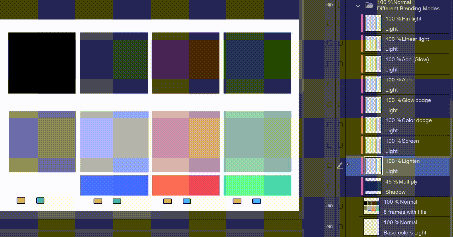
Choosing colors and Blending Modes
You can use the various Blending modes in Clip Studio Paint to brighten or darken your illustrations.
By using Blending Modes you can change how a layer affects (blends in) the layers below it.
You can change the look of your illustration simply by changing the blending modes.
► Pin light : combines Darken and Lighten blend simultaneously
► Linear light : brightens depending on grayscale value of blending layer
► Add (Glow) : increases the brightness (stronger than Add)
► Add : increases the brightness
► Glow dodge : brightens the base layer depending on the value of the blending layer (stonger than Color dodge)
► Color dodge : brightens the base layer depending on the value of the blending layer
► Screen : brightens depending on the values of the blending layer, the lighter it is the the brighter the effect
► Lighten : compares base and blend colors, and keeps the lightest color
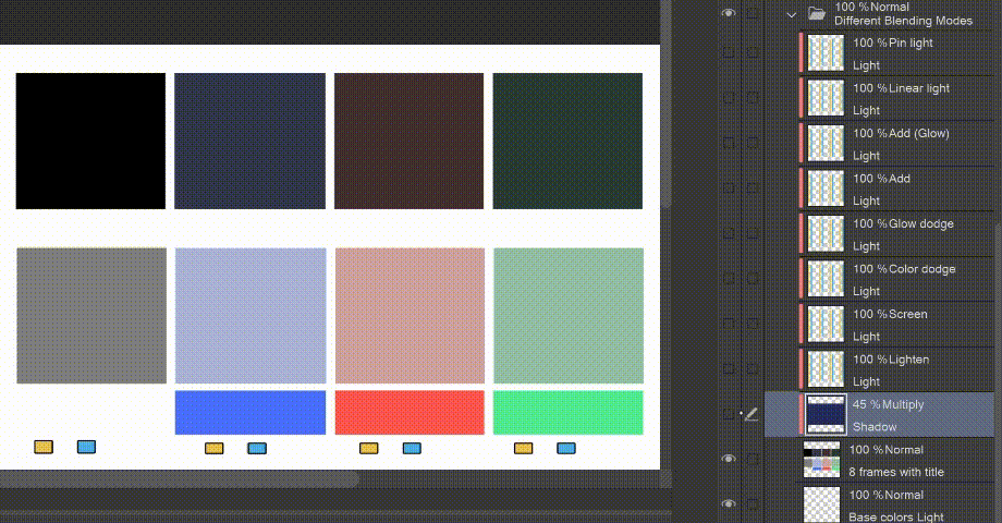
► Multiply : multiplies colors of the blending layer and base layers, resulting in a darker color
Here is a very simple raster I prepared to show you how light adapts to different colors using Clip Studio Paints Blending modes.
I wanted to show you the difference of the same colors but with different tones.
I used two of the more common tones when it comes to adding light to your Illustrations, yellow and blue.
First I present you how these two colors adapt to each base color without adding a Multiply layer underneath.
Here is how these two colors adapt to each base color with a Multiply layer underneath.
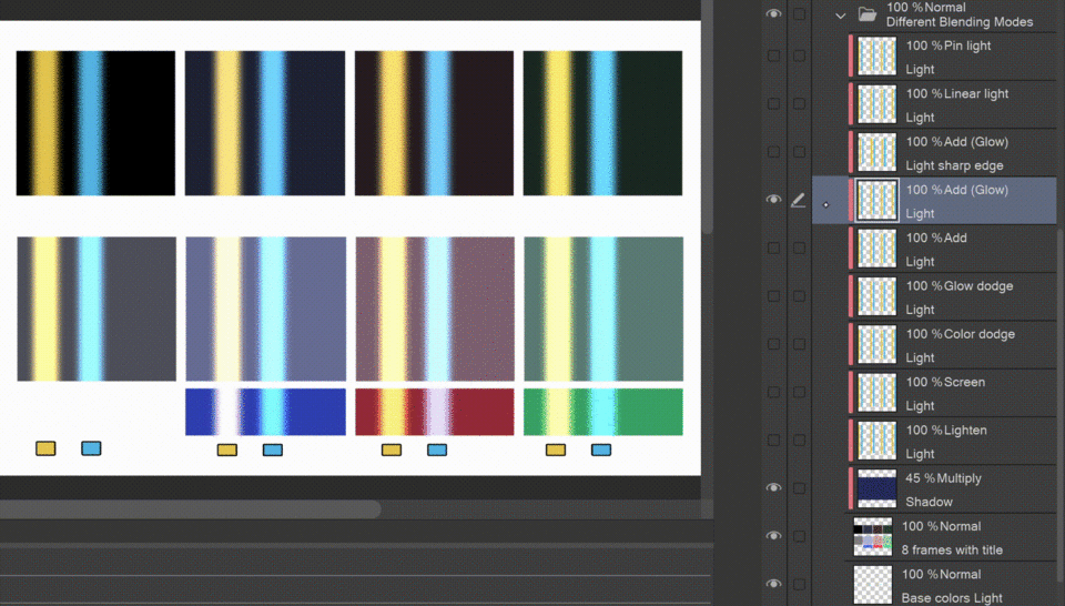
Lastly I just wanted to show you the difference of a sharp and smooth edge.
A sharp edge creates a stronger effect, while a smooth edge looks more soft and natural.
Make a Sketch
On this step you can either make a sketch for your whole drawing or just the details you can’t add later by using Clip Studio Assets.
Since I will be using a 3D background from the Asset Store I just prepared this sketch of my own Characters with the help of 3D models.
For the clothes I tried to use similar colors to the ones we used earlier when I showed you the different Blending Modes.
Here are some Assets I used for the details :
Create a Background using Assets
The Clip Studio Asserts Store has a huge selection to help you create a fitting background for your artwork.
You can choose from offical Clip Studio Materials or various other Materials from talented creators.
I will be using the following 3D material for my illustration.
Adding it to my canvas and using the Light Source Tool to adjust the light and shadows.
[ Operation tool → Object → Tool Property → Light Source ]
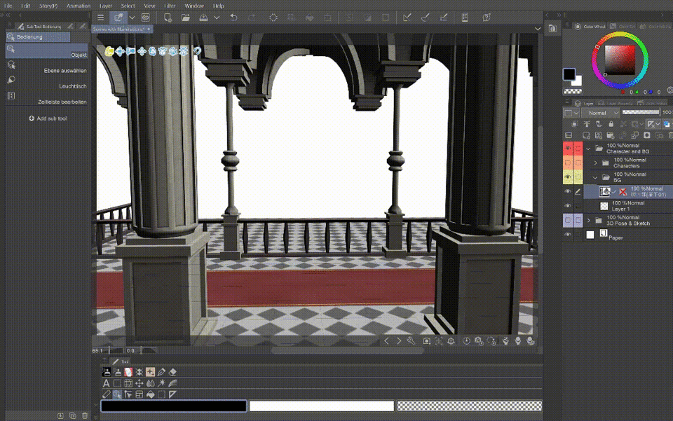
Make sure the background is in a seperate folder then the characters.
I made dark blue base layer using the Gradient Tool.
Now I’m going to add some stars on a seperate layer above the base color using a sprinkle Airbrush.
You can use the Watercolor edge effect to make the stars looks more shiny and smooth.
[ Layer Property → Border effect → Watercolor edge ]
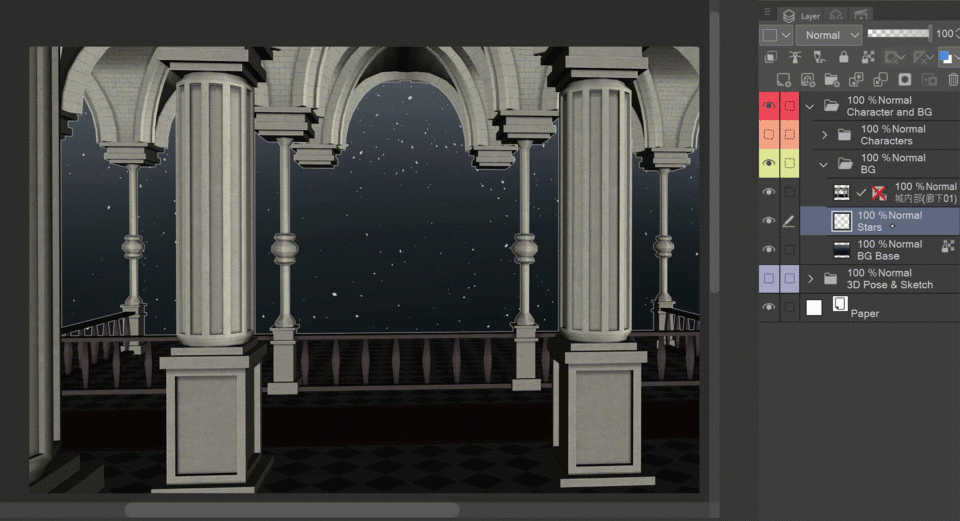
Adding Lanterns from Assets
To create a more festive feeling you can add different kinds of Lanterns from the Assets Store. There is a variety of Materials which fit many different occasions and settings.
For this illustration I will be using this Material.
➤ Creating Illuminations!
Now let’s finally start working on the Illuminations!
Illuminations on the background
The most common way to help brighten your artwork is by using a Multiply layer in a dark blue shade, to create a shadow first and add a lighter color on top to help your light shine even more!
Step 1 : After adding the Material on a seperate layer I’m now going to add a Multiply layer and clip it to the Lanterns.
And lower the opacity to 55% to create a more subtle shadow.
Step 2 : Using a simple Airbrush I’m now going to add a orange hue on top of the Lanterns and Multiply layer.
Setting this layer on Add(Glow) and lowering the opacity to 55% so it’s not too garish.
Use of Illuminations on the background
Another method to help brighten your artwork is by using a Correction layer.
Using a correction layer helps you to adjust your colors after all layers and colors have been set.
Correction layers can help you adjust your light, shadows or colors in general after your done with your work and ‘correct‘ your illustration to your liking.
Step 1 : On a seperate layer I’m now going to add a Multiply layer and clip it to the 3D Material.
And lower the opacity to 70% to create a more subtle shadow.
You can see a close up of some areas I erased, these sections will be important for the next step.
Step 2 : Adding a new layer I’m again using a simple Airbrush to add a orange hue on top of the sections we erased earlier.
Putting the layer on Add (Glow), this time I’m not lowering the opacity so it has a stronger effect.
Doing this helps us set apart the brightened areas of our background from the areas that are set in the shadows.
Step 3 : Now I’m adding a correction layer on top of all.
I’ll just be adjusting the tone curve a little, then lowering to opacity to 60%.
Illuminations on the characters
Now let’s start using the Illumintations on the characters.
Changing the color of your lineart might help the Illuminations stick out more, as I showed you in the beginning most blending modes don’t work on the color black.
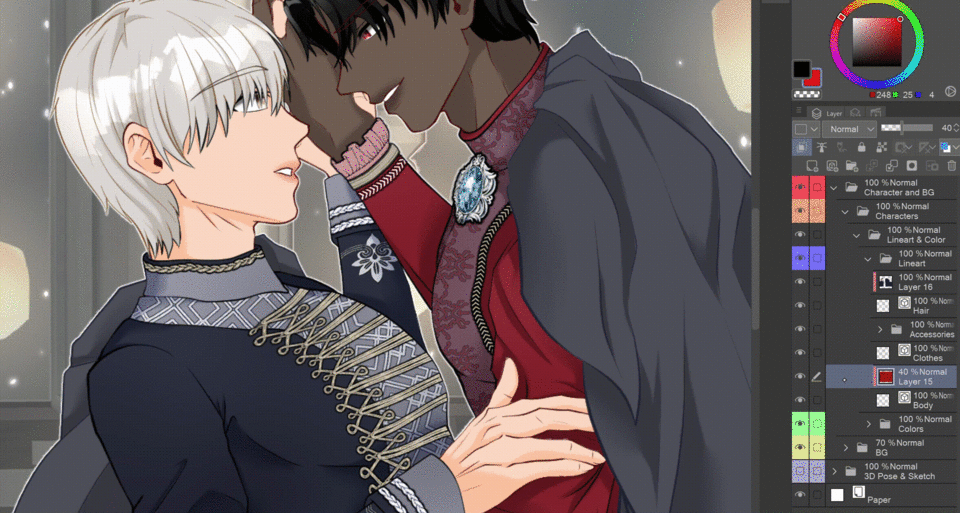
For the next steps to work it’s important the characters’ layers(Lineart and Colors) are all inside a single folder or merged together.
Since I’ll be solely adding effects on my characters.
For this tutorial I put all my characters’ layers inside a single folder.
Step 1 : On a seperate layer I’m now going to add a Multiply layer and clip it to the characters.
And lower the opacity to 45% to create a more subtle shadow.
Step 2 : Adding a new layer I’m again using a simple Airbrush to add a orange hue on top of the sections we erased earlier and clip it to the characters.
Then setting the layer on Screen and lowering the opacity(65%) to help it harmonize with the rest.
Step 3 : Adding a new layer I’m adding orange hued details on the corners where the brightes sections are and clip it to the characters.
And a comparison before and after I set the Blending mode on Add (Glow) (35%).
Illuminations on the foreground
I put all my previous layers inside another folder(Characters) again so it stays organized, but since we won’t be using any clipping layer anymore you don’t have to do this.
Step 1 : Now I’m adding another correction layer on top of the characters folder.
I’ll just be adjusting the luminosity down to -40.
Doing this will help the following illumination effects to stick out even more.
Step 2 : Using the normal Airbrush again I’m adding a orange hue on top of the corners, to furthur brighten up the image and help the charcters blend in more.
And a comparison before and after I set the layer on Glow Dodge(75%).
Step 3 : Using a beautiful sparkling brush from the Clip Studio Assets store I’m adding a line of sparks on top.
And a comparison before and after I set the layer on Color dodge.
I’m not lowering the opacity so the brushes effect sticks out beautifully.
Lastly I wanted to show you the difference of using these various effects.
On the left side you can see all the effects we used and added, on the right side I hid all of those layers.
Using these effects, different brushes and various Blending Modes really help creating depth on your artwork, help you blend together character and background smoothly and create a beautiful, shiny and glowing scene.
Result!
Heres the finished illustation!
Thank you for reading and I wish you all a happy new year!
Users who liked this post


Comment