
Intro
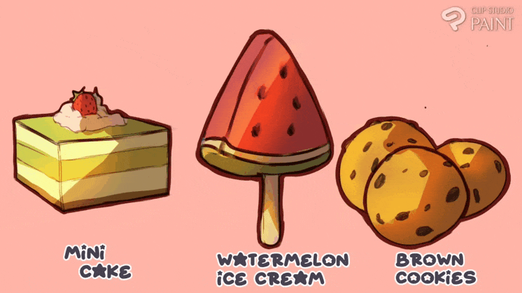
Hi everyone, ado_draw here again. I am a digital artist which have been using the CSP for years now, so I will be sharing what I have learnt over the years. Thus, today's tutorial we will be looking on the Title:: Ways to render [11] sets of sweets using CSP.
............................................,,,,,,,,,,
So if you are reading through this article I strongly advise reading carefully through the entire thing. also I will like to be brief, so with out further Ado I will like to point out the CSP features I will be using.
:::::::::::::::::::::::::::::::::::::::::::::::::::::::;;;;;;;;;
1) Names of use CSP Sub tools and selection features
On this seen, I will be using a CSP app on my smartphone for this tutorial which tends to come with different sets of features but I will just be showing the sets of (Sub tool brushes and selection features used). So,
▪️ Sub tool brushes features used:
They are multiple sets of sub tool in CSP but I will be making use of the following below for today's tutorial::
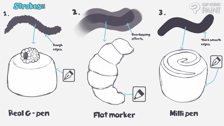
1) G-pen - Flat marker - Milli pen (for line art work)
• The G-pen (which is located in the pen select sub tool ) is the brush tool I use if I want the out line of my art piece to have a hard and rough appearance.
• The Flat marker (which is located in the maker select sub tool) is the brush tool I use when I want the out line of my art piece to have a soft and overlapping or splicing appearance.
• The milli marker pen (which is located in the maker select sub tool) is the brush tool I use when I am to draw a thick hard out lines with smooth appearance.
............................................,,,,,,,,,,
2) Pencil 2 - soft airbrush - multiple layer eraser (for rough sketch work)
• The pencil (which is located in the pencil select sub tool) is the brush tool I use if I am to sketch subject any kind be it concept character, background scene, object and more.
............................................,,,,,,,,,,
3) Soft - Droplets & Glitter - Sparkle (for adding of effect to work)
• The soft (which is located in the airbrush select sub tool) is the brush tool I use to add softening effect on to edges to show a fade in effect.
• The Droplets & Glitter (which is located in the effect select sub tool) is the brush tool I use to add sprinkling dots onto my subject.
• The Sparkle (which is located in the effect select sub tool) is the brush tool I use when I want to add shimmering effect onto my subject.
............................................,,,,,,,,,,
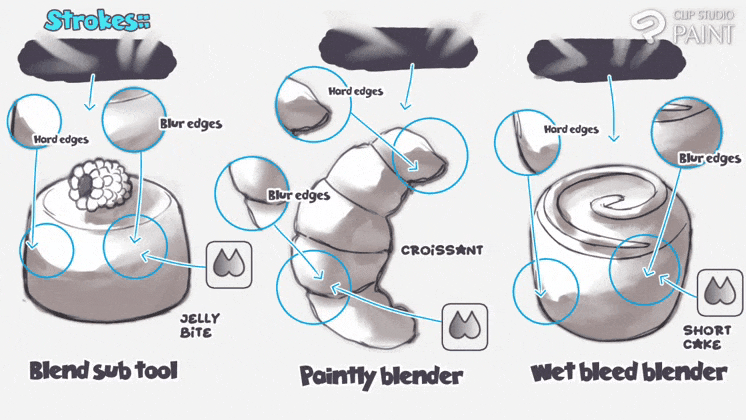
4) Blend - Paintly blender - Wet bleed blender - Finger tip (for bending of work)
• The blend (which is located in the blend select sub tool) is the brush tool I use when I want to smooth out any edges with the bottom colour.
• The Paintly blender (which is located in the blend select sub tool) is the brush tool I use when I want to blur out any edges with a suit of scratch-like appearance.
• The Wet bleed blender (which is located in the blend select sub tool) is the brush tool I use to smooth areas with texturing effect.
• The Finger tip (which is located in the blend select sub tool) is the brush tool I use to smudge area I want to have a kind of mould-like appearance.
............................................,,,,,,,,,,
5) Lasso fill - Eclipse - Polyline frame too (for filling and direct drawing of work)
• The Lasso fill (which is located in the selection select sub tool) is the brush tool I use to select a area that will be fill with colour.
• The Eclipse (which is located in the selection select sub tool) is the brush tool I use to add regular circle or eclipse lines.
• The Polyline frame tool (which is located in the selection select sub tool) allows one to create more complicated and irregularly shaped frames which when the frame is created one can then add in some shadow or leave it blank.
............................................,,,,,,,,,,
6) Wand refer to editing layer only & refer all layer (for filling of work)
• The Wand refer to editing layer only & refer all layer (which is located in the bucket fill select sub tool) is the brush tool I use to add colours or quick filling of colours to enclosed area.
............................................,,,,,,,,,,
7) Foreground to transparent - Redraw vector line with (for adding of gradient & adjustment of work)
• The Foreground to transparent (which is located in the gradient select sub tool) is the brush tool I use to add quick gradient colour onto areas.
• The Redraw vector line with (which is located in the correct line select sub tool) is the brush tool I use to add weight to my vector lines ( and this is a line advantage only to vector layer).
............................................,,,,,,,,,,
8) Shrink Selection - Wand refer to editing & refer all layer (for selecting of area of the work)
• The Shrinking Selection (which is located in the selection area select sub tool) is the brush tool I use when I want to select an entire enclosed area.
• The Wand refer to editing layer only & refer all layer (which is located in the selection area select sub tool) is the brush tool I use to manually select portion of an enclosed area.
............................................,,,,,,,,,,
TIP🔸 To those who need more light on the above mentioned features, I will advise further study, hence you get article which are solely based on those above features in CSP site.
:::::::::::::::::::::::::::::::::::::::::::::::::::::::;;;;;;;;;
▪️▪️ Setting features used:
In this aspect, I will be showing the CSP selection features for the rendering processes is as follows;
1) Layer selection used::
There are several settings of layer on the CSP but I will be use be using raster and vector layer, where as,
▪️ For Raster layer,
Raster layers are composed of individual pixels which can be seen as squares of color when magnified. Raster layers let you display subtle changes in tones and colors which I will be using basically for sketching colouring process and most time Line art.
............................................,,,,,,,,,,
▪️▪️ For Vector layer,
Vector layers have only vector objects such as lines and shapes, vector text or vector groups, which are composed of geometric characteristics which I tend to use for line art.
............................................,,,,,,,,,,
Note🔹 it is advisable when ever you want to draw your art work line and you come to the cross paths between choosing either of both above mentioned, first you should know that vector is the good and smart choice of layer when creating image you are plan to shrink or magnify such as props causes it retain it's pixels; whereas if you don't plan on do an of the above mentioned make use of raster layer.
▪️▪️▪️ Canvas size,
Thus, tend to be neglected by most artists, but the shapes or ratio of your art work tend to tell it own story and have their on purpose;
............................................,,,,,,,,,,
Whereas, for today's tutorial because I am planning on making sure my expression is formally receive, I will be making use of the social media format or the default canvas sizing have it's [width:: 1000pixel - height:: 1000pixel].
............................................,,,,,,,,,,
2) Transformation features::
This aspect I used to adjust and change my subject shape to give it the shape that suit a particular scene. There different sets of transformation features but for this tutorial I will be using Free transform and Mesh transformation features, which I will be using for the following purposes;
1) Free transform,
This transformation features allows you adjust the subject by dragging the corresponding lattice upward, doward and sideways.
............................................,,,,,,,,,,
2) Mesh transformation,
It allows you to create guides and handles by dividing a selected area with a lattice to transform an image by portions by dragging the corresponding lattice with infinite possible changes.
............................................,,,,,,,,,,
Also with this feature, I can select multiple lattice and move them in the same position.
............................................,,,,,,,,,,
2) Know what my subject appear like and make use of reference
This aspect my seem funny in a sense, causes most may say “I know was how sweet looks like, the may even say is it not coloured like this or like this”… yes those all are true, you may even know was the are, how the look like but I tell you when it comes down to implementing or putting them down it takes those little things we may neglected such as rendering of droplets dot as flakes of fry flours or splicing of lighter color as highlights for molding liquid, hence to add beauty onto the subject.
............................................,,,,,,,,,,
So I will like to point out that as we render our subject be it sweet or anything for that matter try getting a suitable reference image or design a good template that can help direction your strength to bring out the best.
3) Understanding the foundation of shapes, light, shadow and colour rendering
Understanding something from the base foundation help give the person the upper hand to freely create the subject without putting must thought to it.
Thus, we will be briefly looking at some base foundation such as usefulness of shapes, lighting and adding of shadows, and lastly the various colour combination. So,
▪️ Usefulness of shapes,
Shapes are vastly use in artwork cause of what the introduce or what the make the art work express to the viewers. The shape of the food can create mental associations that affect our taste perception, like take the square, circle and triangle shaped for example;
• Square or angular food are perceived as saltier.
............................................,,,,,,,,,,
• Meanwhile, Round or circular shapes are more strongly associated with sweet taste subject.
............................................,,,,,,,,,,
• Whereas Triangles tends have two meanings depending on their position. When pointing up it represent stability and balance, but if the position of the triangle is reversed it transmits risky feelings and instability.
............................................,,,,,,,,,,
▪️▪️ Various colour combination,
This are sets colour theory involves how array of colours are arrange together to create schemes.
1) Monochromatic Color Palette,
A monochromatic color palette uses only one hue for its color scheme. It's a relatively safe choice,
............................................,,,,,,,,,,
which may most times make the result in a design that appears dull.
2) Analogous Color Palette,
Analogous colors are a group of colors that sit next to each other on the color wheel. This palette is a stable choice that offers a range of suitable hues for your design.
............................................,,,,,,,,,,
However, the contrast between analogous colors is weaker than in other types of palettes.
3) Complementary Color Palette,
A complementary color palette uses colors that are directly opposite each other on the color wheel, providing a strong contrast that can draw the user's attention.
............................................,,,,,,,,,,
4. Triadic Color Palette,
Triadic colors are three colors evenly spaced on the color wheel, forming an equilateral triangle. Triadic color schemes are richer and create better visual effects.
............................................,,,,,,,,,,
When creating a triadic palette, ensure a balance between colors by first establishing a dominant color that occupies 60% of the palette, then choose two accent colors that make up 30% and 10%, maintaining balance in your design.
5) Split-Complementary Color Palette,
The split-complementary color scheme is a variant of the complementary color palette. It uses a base color and two adjacent colors to its complement on the color wheel, forming an isosceles triangle.
............................................,,,,,,,,,,
The split-complementary palette has a weaker contrast than the complementary color scheme, making it a popular choice for beginners aiming for a simple yet outstanding design.
6) Tetradic Color Palette,
Tetradic, or rectangular, color scheme involves four colors arranged into two complementary pairs. Since it's composed of two pairs of complementary colors, this scheme can bring a sense of vitality to your design.
............................................,,,,,,,,,,
When creating a tetradic color scheme, it's best to determine a dominant color first, with the other three colors serving as accents. The balance between warm and cool tones should be maintained for optimal effect.
7. Square Color Palette,
The square color scheme is a variation of the tetradic palette. The main difference is that the four colors in a square palette are evenly spaced on the color wheel, forming a perfect square.
............................................,,,,,,,,,,
Just like the tetradic palette, try using one color as the dominant color and control the proportion of the other colors.
❗Things to Do (or practice) and things Not to Do ( or avoid),
Some colors individually look pleasant, but when combined, they can produce undesired results, potentially reducing readability or creating discomfort, and thus impacting the user experience and those colours combination are known as Negative Colour Combinations.
............................................,,,,,,,,,,
▪️▪️▪️ Lighting and adding of shadows,
This is the expression on how light ray reflects on a subject creating a sense of lighter and shadow areas. For any art to do a painting he/she has to requires good knowledge between light and shadow concept.
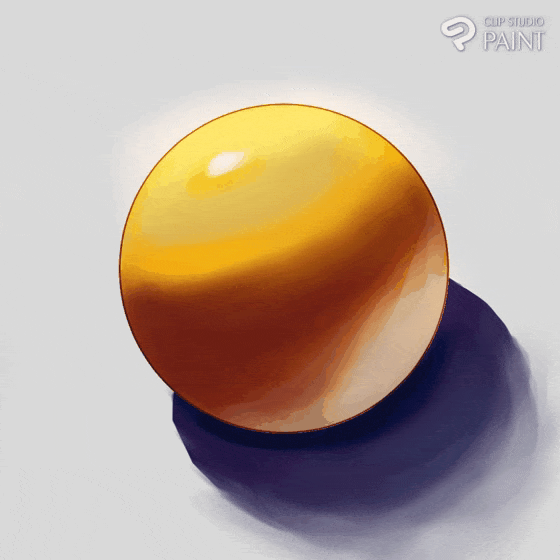
• Start by creating a base colour (or the direct light) of the sphere, Create circles or partial circles of equal value darkness as the (cast shadow).
............................................,,,,,,,,,,
• Add dark colour opposite to the light source and curve inwards, this area is known as the (form shadow).
............................................,,,,,,,,,,
• The The darkest area of the form shadow which is furthest from the light source is all the way to the other edge, in the middle of the form shadow of the sphere is known as the (core shadows), while the lighter more saturated that located in-between the direct light and the form shadow is the (halftone).
............................................,,,,,,,,,,
• Also below the form shadow is the (reflected light) and the area where light do not reflect on is the (occlusion shadow also known as ambient occlusion) which is located where the subject and the platform meet,
............................................,,,,,,,,,,
Note🔹 for beginners this aspect is a complex and one of the major concept in art word, so I do advise more study.
3) Identifing the perception or focal point of my subject
It is a very important aspect in drawing and paint, for it help the artist know where to place his/ her light and shadow areas.
............................................,,,,,,,,,,
Hence, as this tutorial is to explain various ways of drawing sweet I will not be choosing a particular position cause I will be drawing all the subject having different view points.
4) Determining what the line weights and size of the object will be
With the position or focal of the subject desired gotten, we then have come to need of decision making on what the line weight and size of the subject should be.
............................................,,,,,,,,,,
Tip🔸 Draw biger and avoid drawing them smaller unless you do not have a choice!!!
Draw subject bigger give you the space add details and feel free doing so, also if we want the image to be small later on, one can do so on a bigger image but when we magnify s small image it's details will be lost by become blurry.
5) Doodle process of sweets,
What Is Doodling you may ask?
It's a prospect that is common to aimlessly draw when your mind is otherwise occupied, such as during a phone call, meeting, or lecture, or when you want to meditate or relax. This is the art of doodling—the act of drawing, sketching, or scribbling without a final goal or product in mind.
Now when we are to doodle sweets, all we need do is to keep everything simple and bold using what we have learnt above to do so.
Note:: To place all the layer in a folder
............................................,,,,,,,,,,
Now with the line. Work out of the way, we can then create a new layer, add some base colours,
............................................,,,,,,,,,,
Afterwards, we can then create another layer, set it to [multiply] and shade in some simple shadows.
............................................,,,,,,,,,,
Next, set to overlay blending and add in some light hot orange to give it a glow effect.
............................................,,,,,,,,,,
With that out of the way, we can now create a vector layer, draw in the line art and use the redraw of vector line with Sub tools to thicken the lines and make it bold.
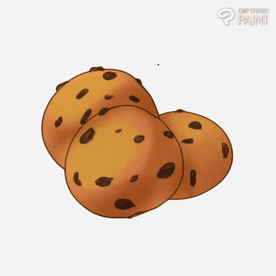
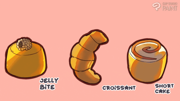
Here is the finish piece.
............................................,,,,,,,,,,
Bonus::
The way multiply and overlay blending mode work together perfectly , they make painting faster and easier.
............................................,,,,,,,,,,
Thanks for reading ☺️. See you at the series two [2].
Users who liked this post


Comment