Let's personalize the workspace!!
Presentation
Hello!! Welcome, once again. For this TIPS we will see how to modify the workspace; one that adapts to our needs, and finally, how to save it for future use on other devices or to share with the community in CLIP STUDIO ASSETS.
When drawing, the environment in which we do it plays an important role. Because? Well, if we customize the workspace to our most common use by removing windows that we do not use, we will have extra space and a better workflow.
I hope it is useful to you, without further ado, let's get started!!
0. Video
1. (Desktop) Workspace
Having an organized workspace with shortcuts not only for tools, but also for windows is certainly a way to save a lot of time. With CLIP STUDIO PAINT we have an interface that has the wonderful advantage of being editable. Let's see how:
► Let's get to know the workspace
The window has this appearance by default; It is divided into six regions, which we can hide, close or modify in some way. We can have a better workflow by having only the windows that we use the most active. A clean workspace is an optimal workspace.
Now let's see what these sections are called and what they contain:
(A) Toolbar: Here we find all the basic tools (brush, eraser, ruler, selection, shape, etc.)
(B) In this section we have several windows (palettes), by default we have:
(B.1) Sub tool.
(B.2) Tool property.
(B.3) Brush size.
(B.4) Color circle.
(C) Animation timeline: The timeline is hidden, it must be displayed, but we will see that later.
(D) Here we also have a series of windows grouped into different tabs:
(D.1) Information windows, such as: Navigator.
(D.2) Layer properties.
(D.3) Layers, and other animation editing.
(E) Here we find two important sections: 1. Quick access (the first icon), 2. The rest of the icons after quick access are access to the different materials and folders (images, brushes, patterns, textures, etc.) that are included in the program or those downloaded from CLIP STUDIO ASSETS.
(F) Command bar: In this section we find quick access to tools, sub-tools, colors and functions.
(G) Menu bar: Here we find the file, edit, filter, layer, window, animation and help menus that allow us to access other functions that are not visible.
► Move windows
We can move them across the screen and dock them somewhere on the right, left or bottom peripheries of the screen. You simply have to drag the window from the top (where the name is) to the desired location.
A red section will appear when the window can be docked to other palettes.
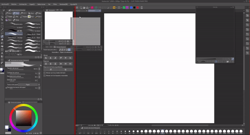
Several palettes can be grouped to the same module.
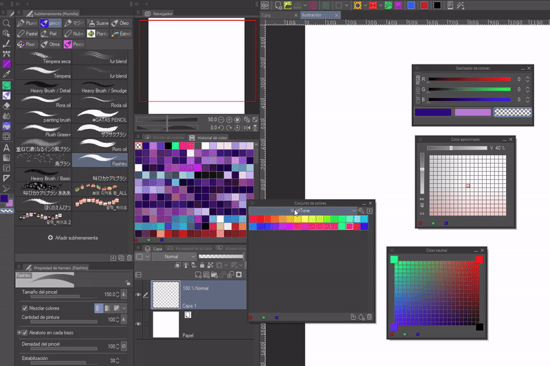
Windows can be left alone, floating on the screen. One more thing we can do is resize the windows by adjusting their edges.
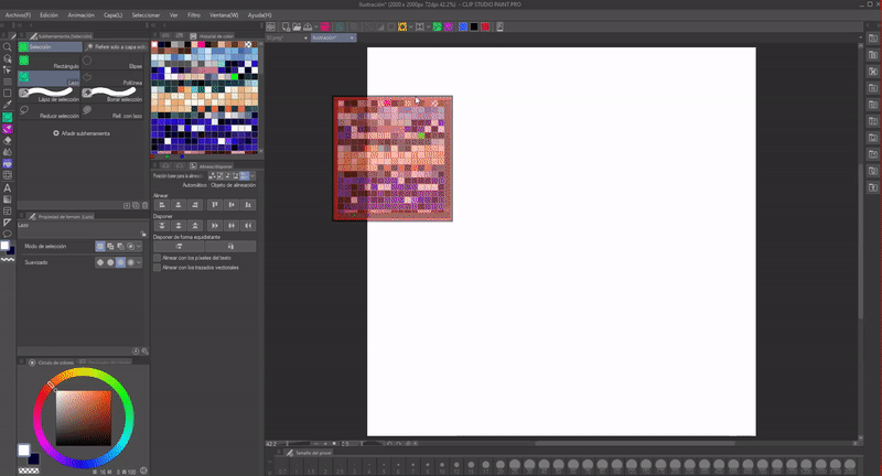
► Hide/unfold windows
To hide them we will use the arrows that each column has in the upper left part. You only need to click on them to hide or display. This way we manage to collapse the windows, freeing up valuable space by keeping only the access icons in view or without any of them.
NOTE: This only works with windows that are docked together in a column.
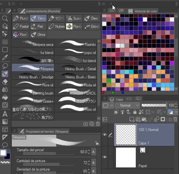
There is a way to hide them all in an instant. To do this you have to go to: Window > Hide all palettes.
Shortcut: Using the Tab key we can leave the workspace completely free; hides all the palettes, to reappear them we use the key once again.
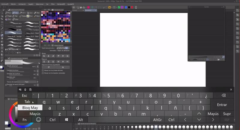
► Close/open windows
To close any window there are two ways. The first; You have to click on the three lines that are in each window in the upper left part. When you click, a series of options will appear that vary depending on the window, but in all of them there is the “Hide” option at the bottom.
NOTE: This method is only efficient when windows are docked with others.
Method two: To close a floating window we will have to click on the cross at the top right, in each palette that is undocked, they can also be minimized.
Open windows: On the other hand, in the title bar there is the option “Window”, here are all the palettes, if we close any, in this menu we can open it again.
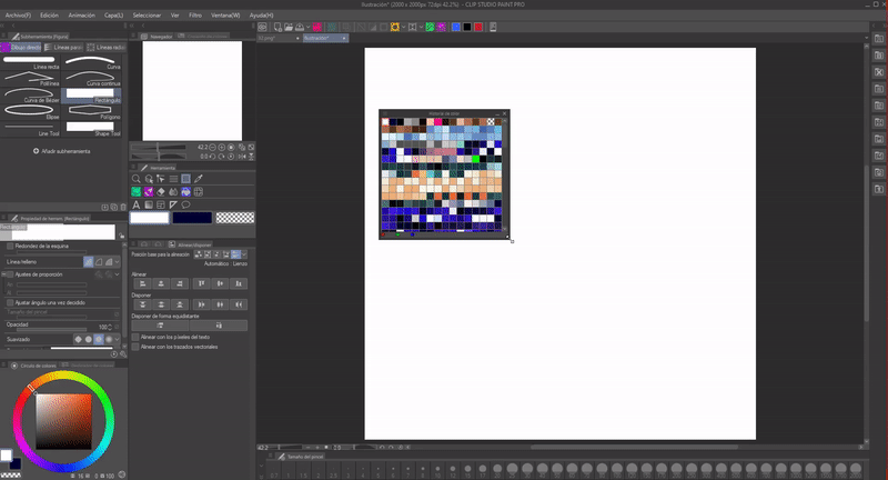
►Block window editing
If we go to: Window > Palette Bar. Here we will find three important options:
1. Set width of the palette bar.
2. Lock pallet height.
3. Lock paddle position.
As the name of each one indicates, these options block the editing of width, height and position, so if all three are activated they will completely block editing, their physical characteristics cannot be edited.
NOTE: These locks only affect docked windows, those that float on the screen lack these restrictions.
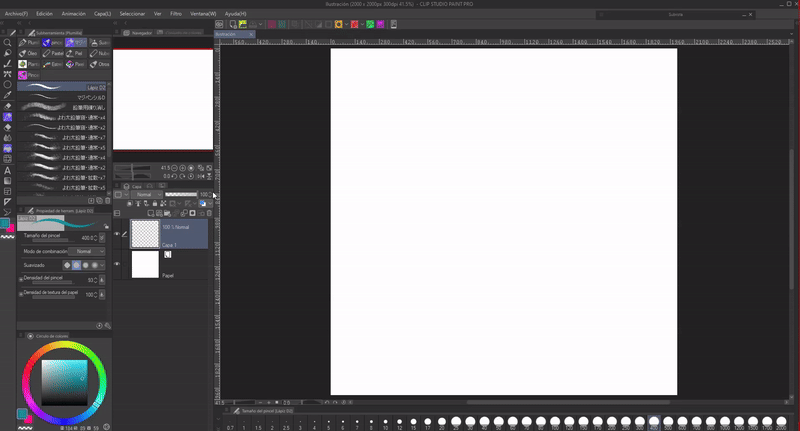
► Modify tools and subtools
Move icons: We can also move the window icons and the brushes. In this case I placed the icons in order of priority, in the central part the tools that I use most frequently and in the periphery those that I use less frequently.
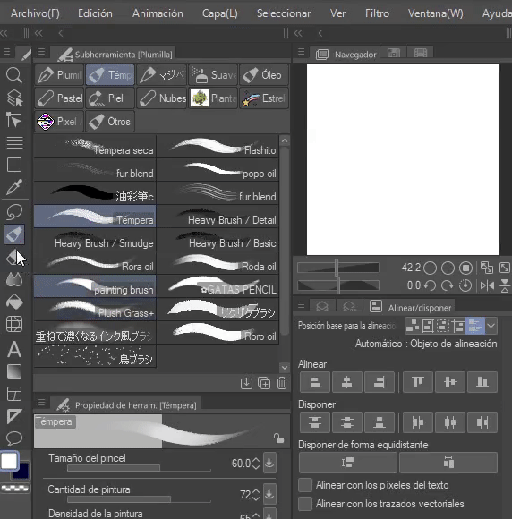
- ADJUST TOOL ICON VIEW -
If we click on the three stripes in the upper left, a menu will be displayed where we will find other editing options and adjustments. All windows have them, it's just a matter of inspecting. Among the things we can find we have the same functions that that palette has and a change of view.
For example, we can change the size of the thumbnail so that they look very small or very large; while, with the brush window you can modify the view of the brushes so that they show their shape, stroke or simply the name.
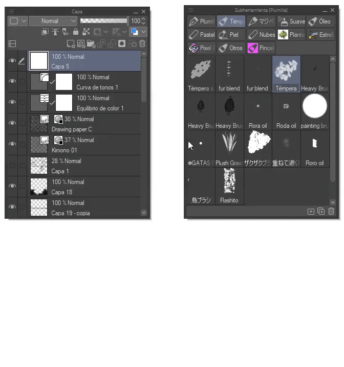
Another example is the layer palette where choosing the “Fit command bar under list” option divides the functions into two sections. And regarding the brush size palette we can activate a slider that modulates the size at the top.
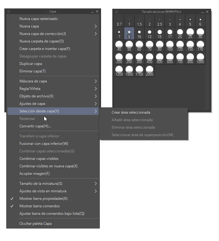
- ADD COLOR TO ICONS -
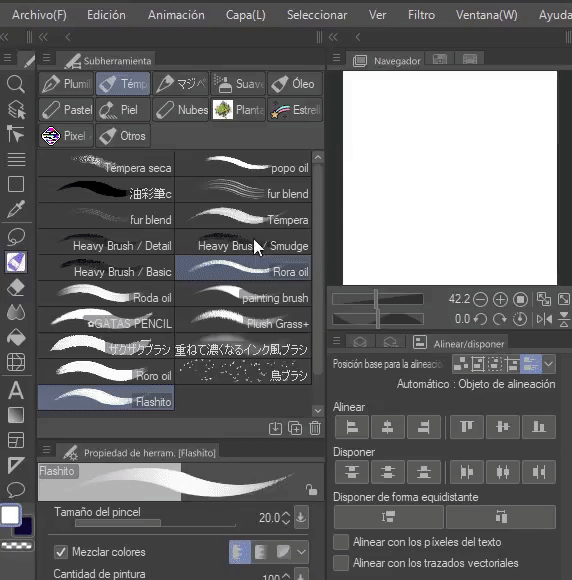
Sometimes it is confusing or overwhelming to find the tools among so many others, color is undoubtedly a good help to identify them. To do this, we right click on the icon; In the menu that appears we will go to: Sub-tool configuration. There you will find “Icon background color”, we activate it and choose the color.
Those whose color we change will appear with the same color within the entire application. The process is the same to add color to all program icons, only if this option is allowed.
- ICONS FROM AN IMAGE -
By default, the application comes with a series of icons, but if you wish you can load the image you like and use it for the icons. Let's see that to do this we must check the “User settings” box. The file search engine will open where we will choose the image. Ready; This icon will appear both in the tool window and in other areas where the tool is attached, such as the quick access window, the tool window, and the command bar.
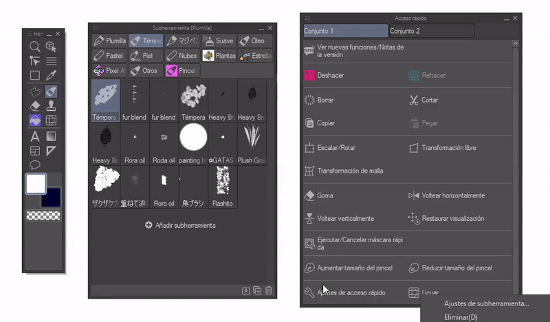
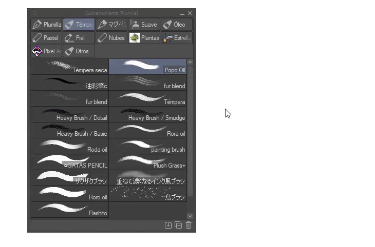
- NAME BRUSHES -
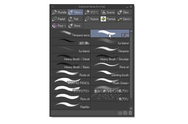
To name the brushes you have to right click on it and choose the option: “Sub tool settings”. Here we can edit the name, icon, category and color. Changing the name helps us in cases where we have many brushes or if these were downloaded from CLIP STUDIO ASSETS, some may have a name in an unknown language.
- SORT BRUSHES -
To organize the brushes into folders we simply have to drag the icon to the top edge, and a folder will automatically be created, to add more you just have to drag them to this one. Finally, to name this new folder, we right click and select the configuration option.
► Command bar
The command bar is located at the top, we can also modify this; add features, tools or colors. Personalizing it allows you to access the tools more closely, reducing unnecessary mobility around the screen.
The bar you see below is already modified, but don't worry, now, let's see how we can customize it for our comfort.
- ADD -
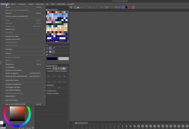
To add a function we will go to: File > Command Bar Settings. The following window will be displayed where we will find the program's tools and functions.
Once the tool is chosen; We will click add. In my case, I use the Gaussian blur tool a lot, the fisheye effect, among others, so I will add them to the bar and then group them so that it is easier for me to access them.
- ELIMINATE -
To delete a tool we have to right click on it, a menu will be displayed where we will find the delete option.
- GROUP -
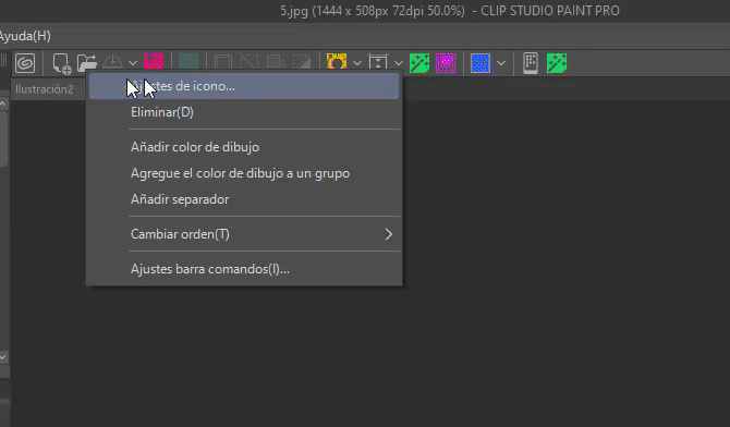
By default, to move the bar icons you have to press the CTRL plus drag key; This is as a security way to avoid moving them carelessly. To move them simply with the cursor, first we will have to right click on the bar, a menu will appear where we will find the option “Change order (T)” there we will change the option to “Drag (D)”.
Now, to group the functions, we drag the icons one over the other, consecutively with as many as desired.
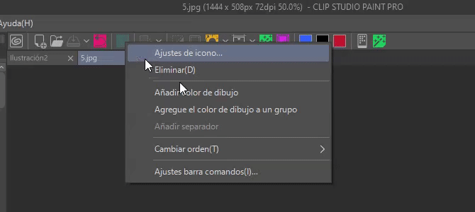
- ICON COLOR -
To locate the tools easier to see and not lose them amidst the gray icon, we can change their color. To achieve this we will have to right click on the icon to modify, once the drop-down menu appears we choose the option “Icon adjustment”, we enable the box at the end. The process is the same to put color on all the application icons.
- HIDE BAR -
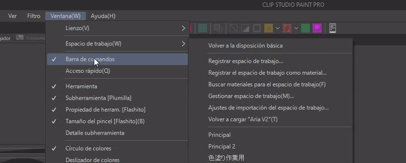
To hide the command bar you have to go to: Window > Hide command bar.
► Preferences
Here we find other settings that allow you to customize the use of CLIP STUDIO PAINT. Among what you can do we have: Change the interface color, modify the cursor, color settings, etc.
To access the preferences we must go to the following path: File > Preferences.
- INTERFACE COLOR -
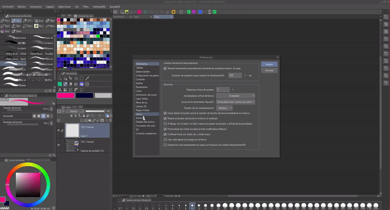
Within the window section we find the option: “Interface”. In the “color” section we find two settings: “Interface color”, this allows us to change the color between light and dark, in addition “Adjust density” that allows you to modulate the level of lightness and darkness in each of the modes.
The color change is good to minimize the discomfort of light colors late at night, when our eyes are tired.
- TABLET MODE -
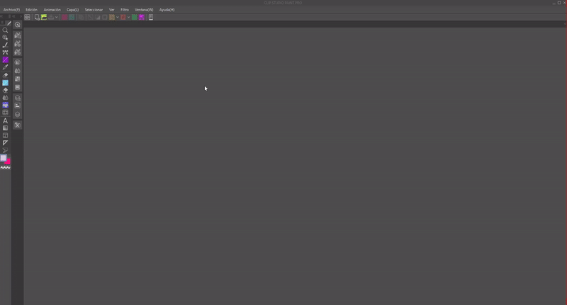
Tablet mode changes the layout of the windows to how they would be seen in the tablet version. Within this path we will find it: File > Preferences > Interface > Distribution. You just have to mark the “Change the distribution of the palettes to tablet mode” icon at the end of the options and click on accept.
This mode is ideal for those with a small screen, as this layout condenses the tools into groups on the left side. To return to the normal distribution you just have to repeat the process as seen at the end of the GIF.
Also recommended for computers that have desktop mode and a touch screen, thus obtaining the benefits of the ergonomic organization of the windows of the tablet version.
► Slider bar and ruler
Within the “View” menu we can find options to hide and display certain settings such as the scroll bar (1) and the ruler (2) that are located on the periphery of the canvas. If you do without them, you can hide them here. In addition to having other modification options, but those correspond to specific functions. I advise reading and experimenting with them to better understand how they work.
► Popup windows/configure shortcuts
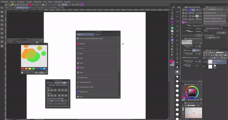
The popup window feature allows you to invoke windows anywhere on the canvas where the pointer is located; This is certainly useful. This way we can hide all the windows to have more space and when we need to invoke it, or if, on the contrary, we do not want to scroll across the entire screen to reach another window, we can simply call it and it will come to where the cursor is.
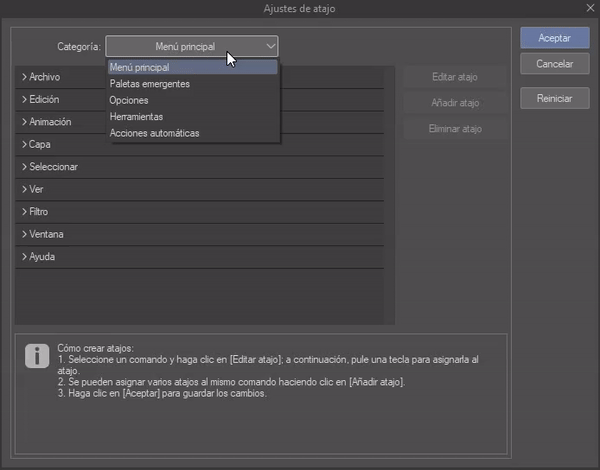
To set the pop-up mode window commands, we will open: File > Shortcut Settings > Category: Pop-Up Windows.
The way to establish the shortcut is to click on the desired command, the edit shortcut option will be activated, we will click, then on the keyboard we will indicate which key we want to establish for this window.
If I hide the palettes I can still access them when needed using the commands, very useful, don't you think?
- KEYBOARD SHORTCUTS -
Shortcuts help us summon tools to where the cursor is with a simple key configuration. For our workspace we can translate it as more space; For example, this way we can hide some tabs, but access their functions or tools with the keyboard.
The program comes with predefined shortcuts, shortcuts that can be modified so that they are accessible to your preference. Editing is carried out within the previous window and follows the same sequence of steps mentioned above.
► Quick access palette
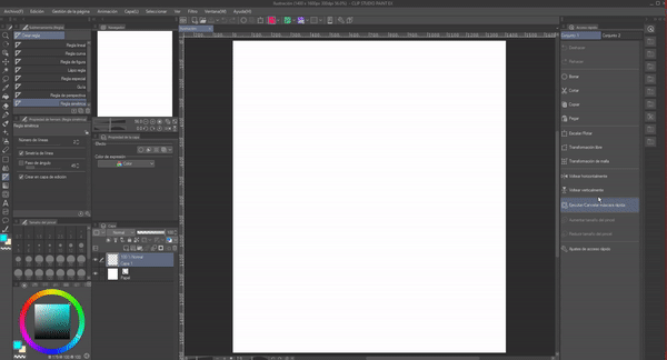
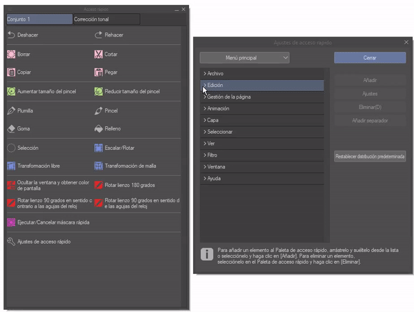
Another super important tool that can help save space due to its practicality by housing the functions we need most is the quick access palette. This palette is located in the drop-down bar on the right, its icon is a circle crossed by an arrow. We can also access it through the following path: Window > Quick Access.
By default, some tools are established within the first set, but we can eliminate them or create a new set to our liking.
- ELIMINATE -
To eliminate a tool from this window we only need to right click on it, a menu will appear where we will find the delete option. To add we will only have to drag the tool to the quick access.
- CREATE A NEW SET -
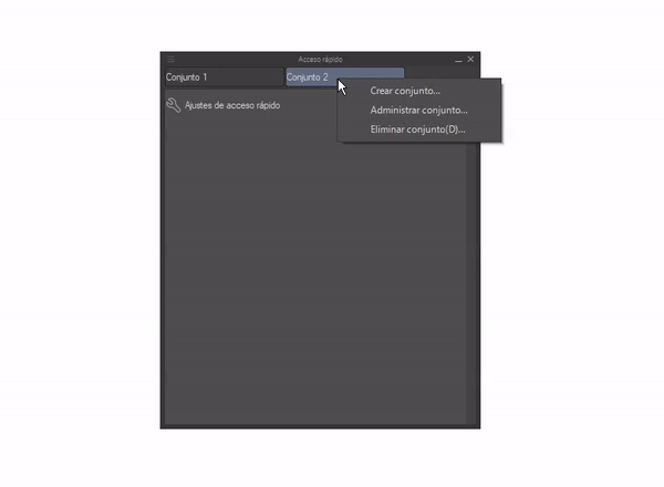
We can generate as many sets as we want. By default, “Set 2” is empty. To create a new set you have to right click on the top bar, a menu will appear where you will find the option “Create set”, we can also delete complete sets in this menu.
- ADD TOOLS -
(1) Simply select a tool or brush icon and drag it into the window.
(2) The “Quick access settings” option allows you to add and delete, but above all here we can add tools that cannot be added by simply dragging them, such as colors or border functions ; I am a person who changes the dimensions of the canvas a lot while drawing, this is why it is an essential function for me, but it is not a function that I can simply drag to the quick access window, that is why I need to find it and add it through the “ Quick Access Settings”. Additionally, just like in the command bar, we can set a color for the icons, the procedure for this and the options are the same.
I recommend using this window when our screen is small like that of a tablet, so we can see all the tools we use frequently. Also, we can use the pop-up window commands to call it and not have it open all the time.
► Save workspace
Once we have our workspace adjusted to our needs, we can save it in the cloud to use on other devices or to share with other users.
To do this we will go to: Window > Workspace > Register the workspace as material. A window will appear where you can choose the name, the cover and determine in which folder to save the material (within the program).
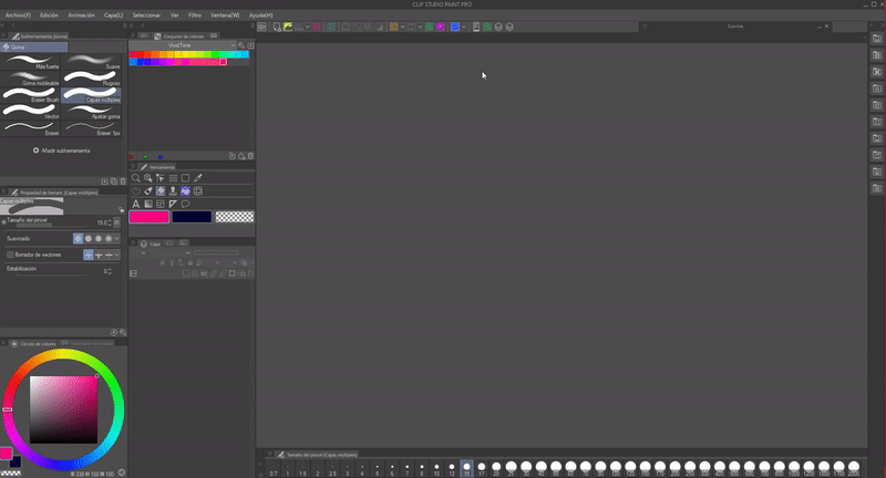
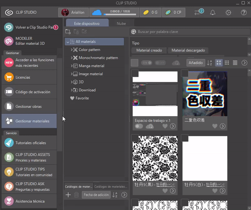
To upload the material to the cloud we will go to CLIP STUDIO (icon at the top).
To start we must have a CLIP STUDIO account. Within the window we will go to: Manage materials. There we will click on the slider located at the bottom of the material; When it turns blue it means that the climb to the cloud has begun. Once finished it will appear in the Cloud section. This way we manage to have this space on any computer where we implement our account.
- WORK SPACES -
Inside: Window > Workspace; (1) we will find the list of the registered and applied workspaces, (2) Also a window where we can edit the name of the registered spaces and in some cases delete them.
NOTE: The program comes with three pre-registered workspaces by default: Illustration, comic and by category.
- DOWNLOAD WORKSPACE -
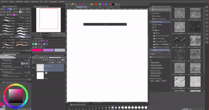
If we access the CLIP STUDIO ASSETS download category we can search for workspaces uploaded by other users (remember to access from your account). To search you can use the keyword: “Workspace”.
Here we can find spaces aimed at tablets, left-handed people, animation, comics, illustration or imitating the configuration of other programs such as Photoshop.
A shortcut to go directly to the category is to use the following route within the interface: “Search materials for the workspace.” By doing so we will immediately go to the tab in the previous image.
- APPLY WORKSPACE -
Downloaded space: We go to the downloads folder, where we will look for the material, once located we will drag it to the center of the interface. A window will appear where we can indicate which important settings we want to change. For example, if we do not want the keyboard shortcuts we have to be replaced by those in the new workspace, we just have to uncheck the option.
Ready, the change will be applied.
- RESET WORKSPACE -
Finally, a message will appear indicating if we want to restore the previous space, go to: Window > Workspace > “Here we choose the name of the space that we registered previously.” This is what we will do to restore the workspace.
2. Let's imagine some workspaces
- EXPERIENCE -
One tip I can offer is to experiment with the workspace, move the windows, change the sizes; view window options and experiment with them; If something goes wrong you can always reset the workspace. You can do this in the following path: Window > Workspace > Return to the basic layout.
Or register the workspace as explained above.
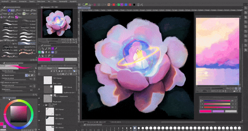
- MY WORKSPACE -
This is my workspace. I adapted it to my needs, since I dedicate myself to making illustrations. Since the dimensions of the computer monitor are 22 inches, it allows me to have enough screen space.
First, to save space I started closing all the windows that I don't use, one of the first was the timeline.
As a second step, I moved all the windows I would use to the left, this is because for some reason it is more natural for me to focus my view on the right side. I ordered the windows according to the frequency of use, those in the right column (browser, tool (I use this a lot to change to transparency that allows me to convert the brush into an eraser), layer (property of the layer and align/arrange)) are the ones I use the most. I use the ones in the left column less frequently except for the color circle.
On the other hand, I moved the window that contains the brush size to the lower part of the canvas, so that this window is not so obtrusive. The materials window, I keep it hidden, is an important section for me, because I'm someone who likes to place textures, but it would be in the way to have it open unnecessarily when I'm not using it.
As a last touch, customize the command bar by removing functions and adding others such as: Canvas resizing, resizing, subview, timelapse, the Gaussian blur tool, saving and access to CLIP STUDIO. In addition, several of the program's icons have color to differentiate them from the rest and make it easy for me to locate them.
When I'm working on an illustration I move the canvas to the left and in the empty space on the right I open the subview window for the references and the color slider. I keep the subview window floating on the canvas because I resize it a lot to see the reference better.
If I feel like I need more space, I undock the color circle and hide the column where it was located. Another thing I hide are the material icons. Finally, if I need a hidden tool I call it using pop-up commands or keyboard shortcuts for a specific tool.
- SMALL SCREENS -
For small screens we will have to hide more tabs and/or reduce their size.
In this first example, it is a workspace with no docked columns, they are all floating. In this version I have the same windows open as in the previous version, but they are now smaller and divided into the two sections of the screen.
Also, with the applications menu we can hide the title bar and the menu bar. This would give us a little more space, and would also simulate the tablet design. To exit this mode you just have to select the first menu option “Open title bar and menu bar”.
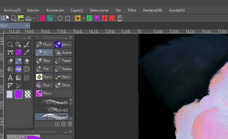
To pin the bar menu as an option in the command bar we must follow the following path: Right click on the command bar > Command bar settings > Help > Show menu.
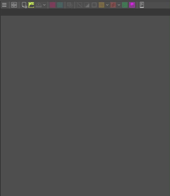
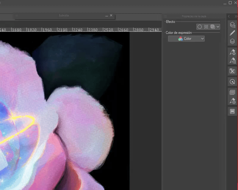
SECOND EXAMPLE: This other organization strategy increases the workspace to 100%. To achieve this we have two important sections; the command bar and a column hidden to the level that only the icons are visible. This distribution is based on the tablet mode explained above.
In the command bar you have to place some essential functions, in my case the same as in the first workspace.
In the right column we have all the necessary windows. To dock them in this way, you only need to open them and drag them under the icons of other windows, as seen in the GIF.
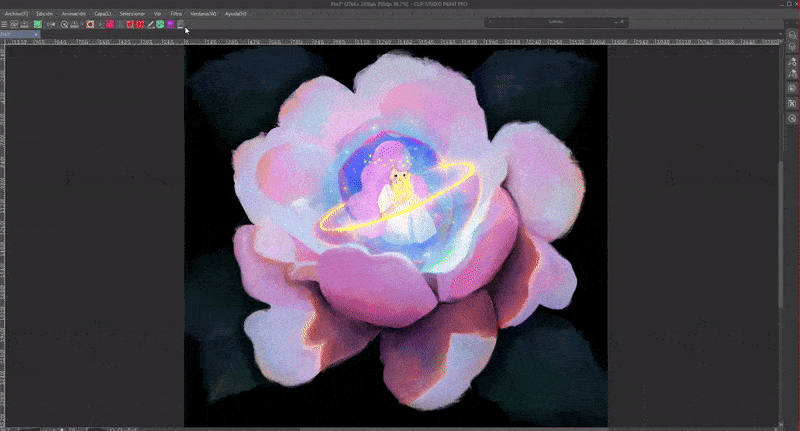
We can group several pallets to form a module.
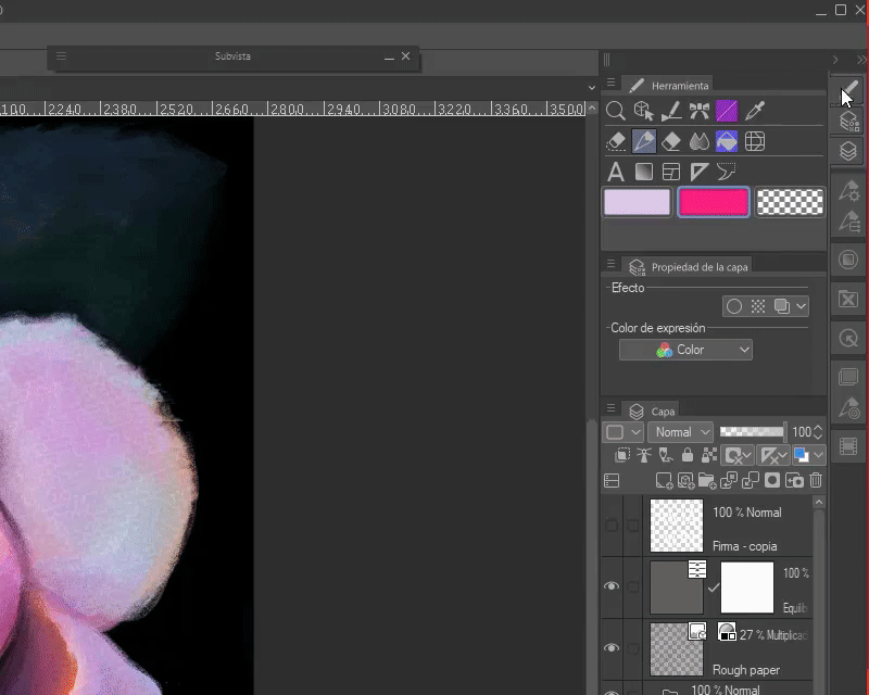
If we right click on the icons, two options will appear with which we can show the windows in groups (show the palette as a tab) as seen in the previous GIF or have each window appear separately (show as a pop-up palette).
THIRD EXAMPLE: Like the previous structure, but using the quick access palette to save all the important tools.
This is all. These are some ideas for spaces focused on illustration, if your requirements are for comics or animation you can look for ideas in CLIP STUDIO ASSETS. Unfortunately, these are not my specialty so I can't give advice.
3. (Smartphone) Workspace
The CLIP STUDIO PAINT app has two models for the drawing interface: the study mode (left) which has all the functions of the program and the simple mode (right) which is a simplified interface with the most essential functions for illustration.
- STUDY MODE -
The modification of the workspace in this mode is limited, we can only add or remove icons on the main screen, tool icons. With the windows we can close them with the three stripes as explained in the desktop section, pin (1) and modify the size (2).
- SINGLE MODE -
This mode, on the other hand, has no customization, it is already simplified for optimal operation. The designs are simple and organized. The layers are small and clear. It has everything we need to make illustrations, and what cannot be used with this mode can be added by changing to studio mode.
It is easy to switch between both modes, so we can have a calm and pleasant workflow in simple mode and finish the process with advanced functions in studio mode.
If you want to know how to make the small possible modifications in the study mode and learn how to use these two modes, below is this TIPS where I explain all of this:
4. (Tablet) Workspace
Customizing the workspace on a tablet follows the same principle as on the desktop version. All the explanations given above apply here as well.
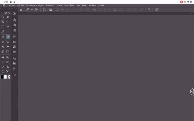
We can modify the space on our own, download a space from another user or download the workspace that we previously saved in the cloud. To apply it you have to arrest it from the downloads folder.
So we can move on from this...
To this. As you can see, the style of this workspace is the same as in example three, but with the windows on the left side.
Or this other one with a blank interface and the windows displayed on the right side.
Finally we have this one with the floating windows on both sides of the screen.
As you can see, we can add tools to the command bar, color the icons, group them, name brushes and the window options are the same. Only in this case, unless you have a keyboard, you cannot right-click, therefore we will have to hold down a click on the icon to access the options that normally appear with the right click.
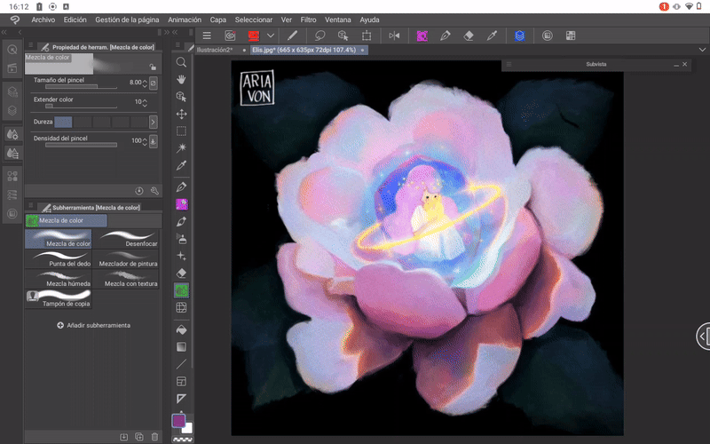
- PREFERENCES -
Unlike the desktop version, on the tablet the preference options and shortcuts can be found by clicking on the CLIP STUDIO icon in the upper left.
- SHORTCUTS -
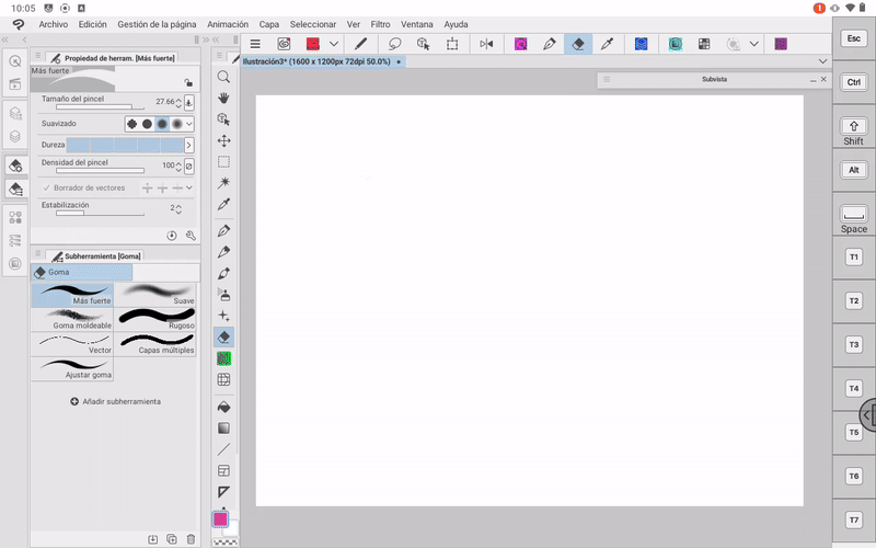
We edit the shortcuts and pop-ups as explained before; In the absence of a physical keyboard we can use the side keyboard. To display/hide it you just have to take it from the tab and slide it towards the canvas or towards the edge of the screen.
Here we have an example where I set a shortcut to the tool “G Pen” and “Strong Eraser”.
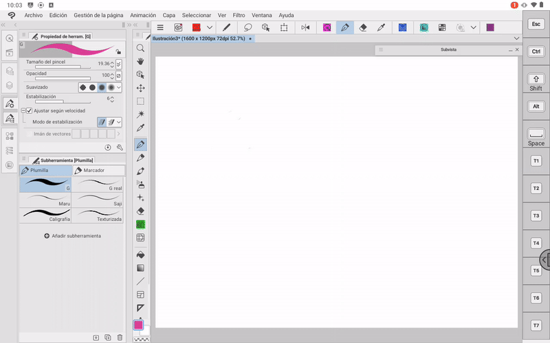
- SINGLE MODE -
As in the smartphone version, on the tablet we have the simple mode. To access you have to go to: CLIP STUDIO icon > Switch to Simple mode.
The Easy Mode layout has the tools you need to create illustrations. It is easy to use this interface because the icons are grouped in tabs that are hidden once you click on the canvas, this undoubtedly leaves the entire screen free to draw.
To exit this mode we must go to the three points found in the upper right. There you will find the option “Switch to study mode”.
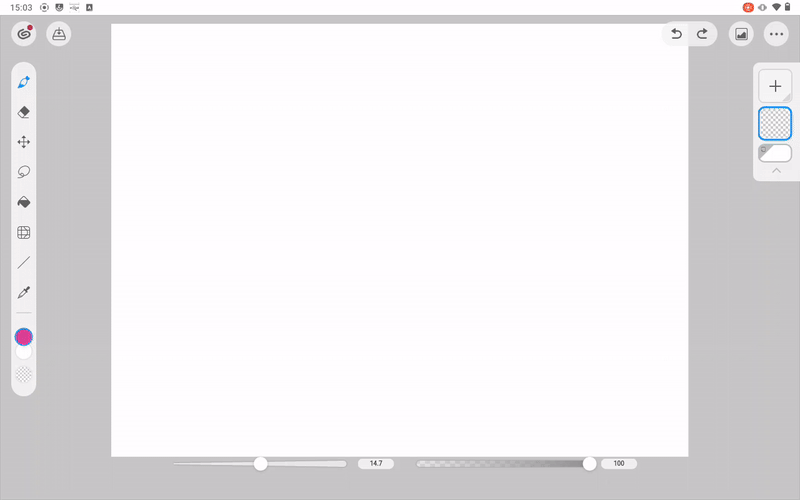
To learn more about how simple mode works, I recommend reading the Tip “Use simple mode on a Smartphone” that I recommended at the end of the section in the previous section.
Farewell
The workspace is of vital importance, which is why organizing it to our needs becomes a primary task. For my part this is all. I hope that what you see in this tutorial is to your liking. I hope you find it useful. Well, without anything to say, thank you for coming this far! ପ(๑•̀ुᴗ•̀ु) ॣ৳৸ᵃᵑᵏ Ꮍ৹੫ᵎ ॣ
We won't see you another time ( •⌄• ू ) ✧


Comment