
Introduction.
Hello!
I’d to welcome you to this tutorial on using the filters in Clip Studio to enhance your illustrations!
Filters are powerful tools that add depth, texture, and visual interest to your artwork with just a few clicks.
These tips apply for users who utilize Tablets as well as personal computers/ laptops.
In this tutorial, I'll cover everything you need to know to get started, from understanding the basics of filters to putting in the finishing touches to your illustrations to take them to the next level!
So, let's dive in and unlock the endless possibilities that filters offer to elevate your artwork!
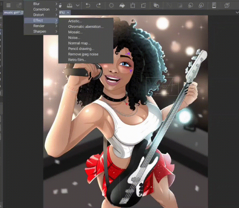
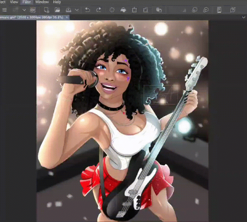
Here is how you can use filters for your illustrations!
Clip Studio Paint Version 3 comes with some new updated features that are very useful especially when finalizing your illustrations!
Here are a few great options for you to choose from regarding the new filters!
The Artistic Filter.
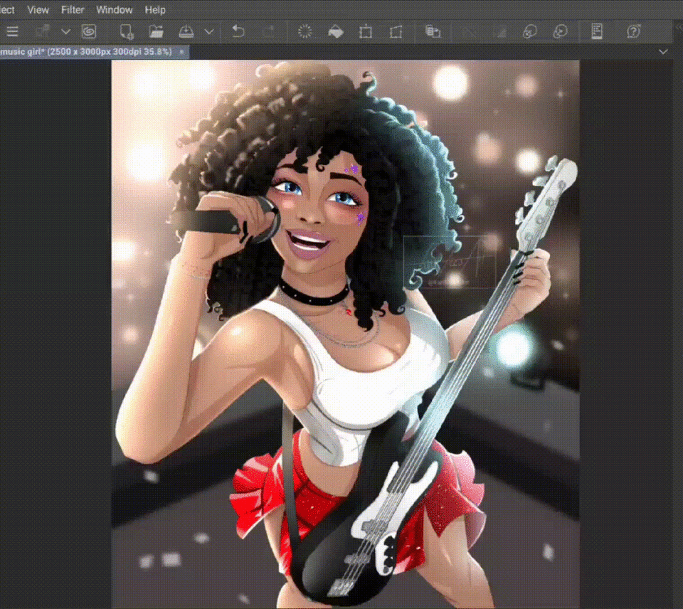
I commonly use the Artistic Filter when ever I need to enhance my lines or make my colors pop or stand out more. This filter gives illustrations more of an artistic or manga-like look to it.
You are more than welcome to use the sliders to adjust the filter according to your preferences!
The Chromatic Aberration Filter.
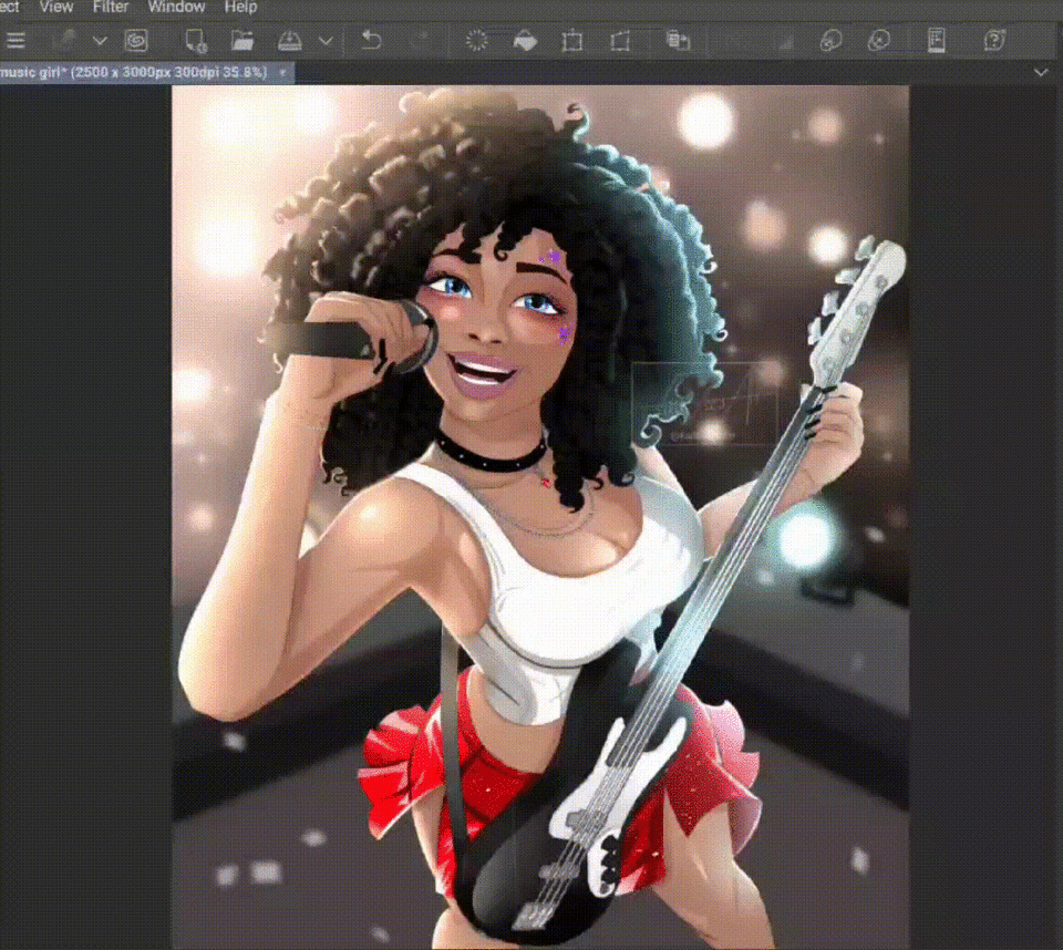
The chromatic aberration filter creates a color distortion that creates an outline of majestic color along the edges of objects in a photograph.
I like using this filter to illustrate emotions or movement and usually it makes the image pop out very beautifully!
The Mosaic Filter.
The mosaic filter helps to make your illustrations look more pixelated, so if you like pixel art this would be the best filter to use.
Furthermore, I usually make use of this filter whenever I make thumbnails for my YouTube videos and so forth!
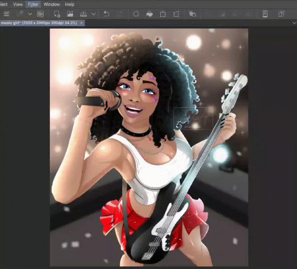
The Noise Filter.
I like to think of the noise filter as adding ‘static’ to an illustration, giving it more of a textured look and making the image look a lot more interesting!
I recommend keeping the noise at a minimum level so as not to take away detail from your illustrations!
The Pencil Drawing Filter.
Much like the name suggests, the pencil filter gives your illustrations more of a traditional drawing look.
You can play with the settings and make sure that the preview option is clicked so that you can see the changes you make on the sliders in real time, before you apply them!
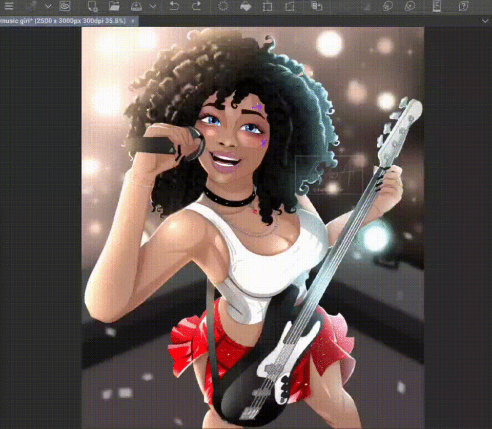
The Retro Film Filter.
Now to my favorite filter, the retro film filter, it adds noise, a bit of a chromatic aberration, and also a lovely glowing color making your images look like a retro film!
You have a few options to choose from when it comes to the intensity or the type of film you’d like, simply click the drop-down and choose between the warm, modern, and vintage options available.
You can always move the focal point by dragging the ‘X’ to where you’d like your focal point to be!
Conclusion.
Thank you for reading this tutorial, I will attach a youtube video down below if you need any further explanation for any of the points discussed above.
I hope you learned something valuable from these tips, please let me know if you have any questions, I promise to answer them to the best of my knowledge!
Thanks again!
Users who liked this post


Comment