
Introduction
Hello, everyone. Ayda Fork here~
This tutorial will teach you the simplest approach to design a colorful illustration with CSP. Even if you just have basic skills, I will assist you with this easy approach that I learnt after years of attempting to draw an enjoyable digital artwork.
I'll even teach you how to shade the color you used in your illustration, as well as a recent update tool from CSP that was designed to ease our life, so let's learn how to effectively use it properly! All of these are simple methods I used for creating my own illustrations, and I hope you find them useful as well.
Thanks for taking the time to read this!
1. Sketch is important
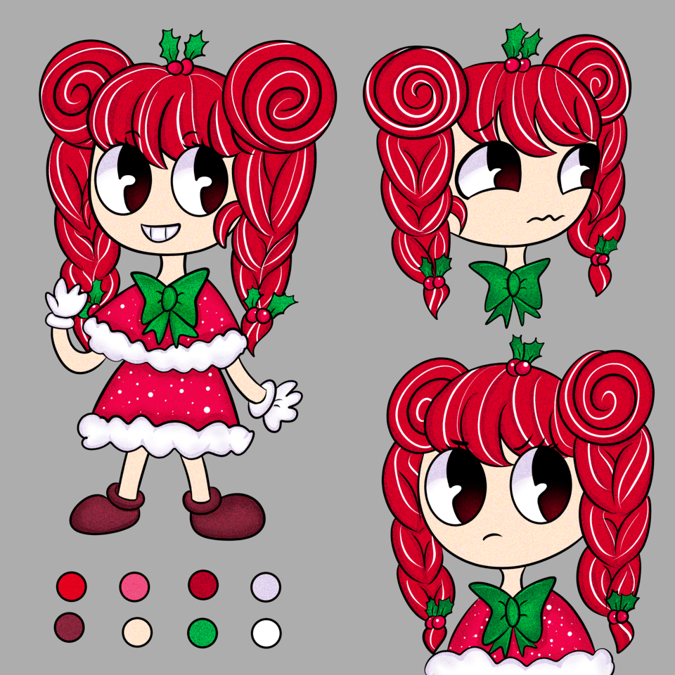
When creating your own illustration, you should have a concept for what you will draw and how your character will look in the piece. This is the first step that you should never neglect if you want to make anything imaginative.
Even if it is odd and bland, as long as you understand what you want to draw, it will serve as a basic sketch and source of inspiration.
Use Assets to your advantage
If you're having problems with anatomy, apply a 3D model then draft your character on top of it on a separate layer. You may use either a female or a male body, which is often provided with your download. Not only that, but the assets include additional sorts of 3D models in a range of shapes and sizes! If you want to learn more about this, check my previous tips, they will be quite beneficial to your illustration process.
As you can see, I also sought assistance from CLIP STUDIO ASSETS in adding a wing and a bird cage for my character. If you need anything, I highly recommend searching on CLIP STUDIO ASSETS. It has everything you would need, and most of the assets are free!
Now that you've got your 3D model positioned the way you want them to, you can start sketching up the image you want. This is the easiest step, so I'm confident you'll nail it!
Base Idea
Coloring Your Draft
When designing a colorful picture, it's vital to include a base color in your sketch to get a rough concept of how the image will look. This is merely a basis for raw coloring, so don't get stressed out just coloring it. Simply use whatever color you like and watch how it complements the other colors in the overall image. This stage will assist you in providing ideas on the color that you choose for your illustration.
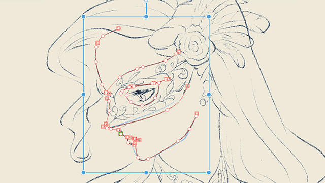
Next, sketch your line art to finish the illustration base before beginning to color. I suggest that you use a G-Pen to draw the line art. The tool is already in the download package so it easy for you to find and use it for your art.
2. Let's start Coloring!
When coloring a colorful artwork, I want to apply a bright color that I have never used in any of my previous artworks. I challenged myself to create a colorful artwork using just strong and vibrant colors with this trick.
When coloring a colorful artwork, I want to apply a bright color that I have never used in any of my previous artworks. I pushed myself to create a colorful artwork using just strong and vibrant colors. This time, I took advantage of CLIP STUDIO ASSET color palette called [Candy Pop]. It offers a vibrant color palette that corresponds to my goal of coloring.
I also applied a vibrant-colored rose from CLIP STUDIO ASSETS for the flower on the character's outfit.
Make more color flat options!
Using the same method, you may select a vivid color that you like and is appropriate for your character. You may use a variety of basic flat color options to aid with the coloring and atmosphere that is most suited for your character in a circumstance that you have previously imagined.
3. Coloring Elements
Hue
Hue refers to the basis of the colors that we see. Hues include primary and secondary colors (yellow, orange, red, violet, blue, and green), as well as tertiary colors (mixed colors in which neither color is dominant).
Value
Value refers to how bright or dark a color is. Values will be on the triangle's left side, as determined by the color wheel which you can find when you click on [Window] and then [Color Wheel]. The color will lighten as you move along the upper side which has more higher value of the triangle's left side and down below are darker which is a lower value.
For example, in this illustration, I wanted the place where the light didn’t reach to look darker, so I used low values. The main character is lighter and has higher values. With this trick, I can determine which object I want, to be the focal point and highlight of this illustration. This way also allows me to see the high contrast of the main character's colors standing out against the side objects and dark background.
Saturation
Saturation indicates how vivid the color is. The further to the left of the triangle when you pick a color, the less saturated it will be. High-saturated colors are on the right, towards the triangle point. This easy trick can show us just how strong or faded the color is when it is included in our artwork. This way, you can pick how and where all the colors will be in the artwork easily.
Easy trick for a perfect shading!
When adding shadow to your chosen colors, it is easier if you know the color's value and saturation. However, I will demonstrate the simplest method of shading with a shading element. If you're having difficulties with how the light source and shadows on your artwork operate, try this simple step:
1. Light (Where the light can reach)
2. Separation (The separation line between light and shadow)
3. Midtone (The blending between light and shadow (separation) to give smooth look of the shading)
4. Core Shadow (The place where the light can’t reach)
5. Cast Shadow (The shadow for the overall object)
How to use this trick
If you're having problems figuring out where the light casts a shadow, simply apply the 3D model on the layer above the coloring layer and open the [sub tool detail] of the 3D model to alter the [Light Source], and then click on [Cast Shadow] to choose whether or not to show a shadow for the selected model. This will help you and save time a lot.
With this, just simply follow the light source and the cast shadow of the 3D model as shown in the image above. You can determine the line color as I do and choose where to use the shading element I just taught you. You can draw on a new layer above the 3D model layer and determine where the light will reach and not reach, where the separation happens, the mid-tone, and cast shadow of the object in your artwork.
For the coloring, I recommend you to do this:
For example, I wanted to color her hair blonde, so the color I chose is:
1. Light = (Bright and vivid Yellow)
2. Separation = (The medium color of Yellow which contrasts with the light color but not too dark)
3. Midtone = (Same color with separation but was set on a [Blending Mode] = [Saturation])
4. Core Shadow = (The dark shade of Yellow)
5. Cast Shadow = (The most darkest shade of Yellow)
Just pick from the darkest shade of a Color to the brightest shade and follow the order from 5 to 1.
4. Details for a Perfect Illustration!
Adding detail may breathe life into your artwork. It is a vital step in making your artwork look more attractive and flawless.
For detail, I added several strands of hair to make the character's hair appear more natural and lifelike. Then I apply some highlight to her eyes to give her a more vivid appearance.
Then, to spice it up, I used some CLIP STUDIO ASSETS assets that immensely aided me in creating a [Diamond Effect] on the wing, dress, and bird cage. You may smooth out the diamond effect on the character by adjusting the layer's [Blending Mode]. This has aided me in creating a colorful wing and adding a sparkling effect to the dress.
If you are unable to sketch anything or want to save time, I recommend using the CLIP STUDIO ASSEST, as I did with the pigeon in the artwork. To color it, I just place a [Gradient layer] above the pigeon layer and clip the layer to it. Then, alter the [Blending Mode] of the gradient layer to mix the object (pigeon in our example) with the main character
I also downloaded a diamond brush to add detail to her dress and colored the line art to make the character appear smooth and mix in with the scene.
5. Update on CSP
Clip Studio Paint August 2024 update
Clip Studio Paint never ceased to impress me with all of the updates they have made to assist us, artists, in our quest to create a wonderful illustration. The most recent upgrade has made me enjoy CSP even more, and I am confident that they will continue to improve in the future.
Clip Studio Paint August 2024 update is now released, and it includes many new features. You may now cast shadows from one 3D substance onto another 3D material. On 3D layers, you may configure shadows of 3D materials to cast on other 3D elements. You can decide where the shadow is thrown in the [Sub Tool Detail] panel under [Light source], then [Shadow]. This feature helped me a lot when I was struggling with the shading and I know it will help you too.
There are more new features than this one so I highly recommend you explore it because it was interesting to play around while creating your artwork!
Clip Studio Paint Ver. 3. 0 update
It was a 2023 update, but I'll show you how it helped me with the artwork's coloring.\
Simply select the [Edit] button, then [Tonal Correction(D)] and [Colour Match] palette, which allows you to color correct your artwork depending on a reference image of your choice. You may also use any image you choose to alter the color of your artwork by just changing the intensity and maintaining the brightness.
In this artwork, I selected the most suited gradient from the gradient set downloaded from CLIP STUDIO ASSETS. The gradient set had [20 Light Set] of gradients to pick from. So, simply click on it and select many options to get the best fit for your artwork. Don't forget to modify the intensity while keeping the original brightness of your artwork.
These are some of the options I tried when playing about with the [Colour Match] palette, and I hope you love them as much as I do.
Don't forget to check out other CSP updates, they can benefit you a lot because CSP is determined to make our lives easier as artists!
6. Time-Lapse of the illustration
Here is a time-lapse of the artwork to assist you in understanding the process I used to create my illustration. I hope it can help you~
Conclusion
When you are entirely content with the work you do, you will be extremely happy! This is the final outcome of my drawing; I hope you like it!~
The recent version and numerous features that CSP has enhanced have aided me in the creation of my artwork, and I am quite grateful and content with the outcome.
I chose to draw this one because I wanted to challenge myself by portraying an angel with diamond wings and sparkling attire. This is a fantasy creature, therefore I wanted to do something different with the coloring, which is why I picked a vibrant and bold color to portray it.
Unfortunately, this concludes my guidance. I hope you find these tips as useful as I did with my illustrations. I'm not sure whether the instructions are clear... but do leave a like if it helps you even a little!
Thank you very much for reading!!
Users who liked this post


Comment