
Video version:
Text version:
Hello!
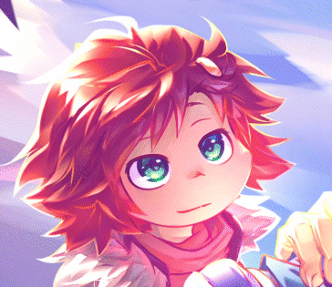
I’m .avi. I work as a professional game illustrator and creating comics and webtoons is my hobby.
🟠 Do you want to paint interesting colorful pictures, but aren’t sure how to go about it?
🟠 Do you find color theory intimidating?
🟠 Or do you just want to add something extra to your art that makes it come alive?
Don’t be afraid, painting with colors is not about using magic, it’s creating magic!
I’m not going to dive into color theory, because that can be found anywhere, and, to be honest, I never found it actually applicable.
Instead, I’d like to show you how to understand the magic of colors and use it in practice!
This tutorial is structured for both beginners and advanced users.
We will start with the basic tips for shading with colors, then advance to relativity in color interactions and hints on how to build your color intuition, and lastly, I’ll show you some tricks to easily make your art come alive.
🟪 BASICS
🟧 Shading with colors
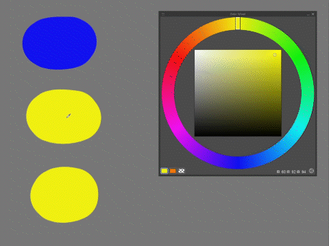
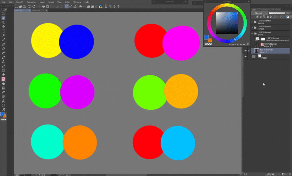
How does this color strip look?
Pretty generic, right?
That’s because all the colors were shaded with black, meaning that only their brightness was lowered.
How about these? They’re much better to look at, right?
That’s because not black, but other colors were used for shading.
🟠 But how do I know which color to shade with?
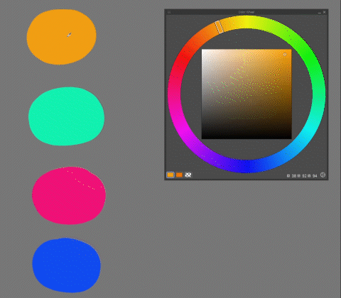
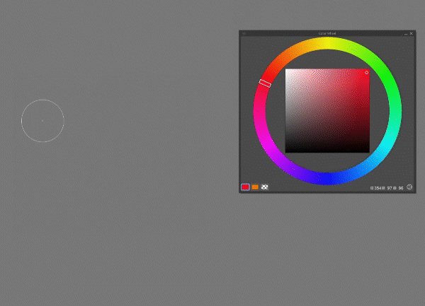
🟧 Color wheel palette trick #1
CSP’s color wheel palette isn’t just for picking colors, it’s designed to help you decide which colors to use even without color theory!
Thanks to it, it’s very easy to find the right color for shading depending on your base color.
1. Find where your base color is on the wheel
2. Darken it by dragging the slider in the square towards black as you would normally
3. Move the slider on the wheel slightly down, no matter which side of the wheel you are at.
The darker you make the color, the more turn the wheel slider down.
As for the yellow, if you want to make it look warm, go towards red, if you want it to give a fresh feeling, like a lemon, go towards green.
As for blue at the bottom of the wheel, well, you can either use only a darker version of it or shift it towards purple. We’ll talk about this more in color interactions.
The color wheel works in the opposite direction for lighting as well!
In addition to brightening a color, move the circular slider a little up.
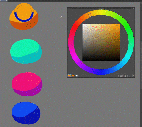
Of course, this is a basic trick to help you decide the shading color, but depending on the mood you want to convey and your general color palette, you can use about any color to express shading or lighting!
🟧 Color wheel palette trick #2
Another advantage of the color wheel is that it clearly shows which colors are contrasting and which are harmonious.
Complementary colors, which create contrast, are opposites on the wheel.
Analogous colors, which create harmony, are next to each other.
🟧 Light and colors
Light is what defines colors, but since it was covered in my previous tutorial, I’ll skip it for now :)
🟪 ADVANCED
🟧 Color interactions
Have you tried painting without the use of black and white?
You don’t actually need those two colors at all to express light and shadow!
I’ll show you how to take advantage of how colors work in relation to other colors.
It’s the magic of creating an optical illusion, because more often than not, a color may not be what it appears to be due to the colors surrounding it!
🟨 Brightness
Any color can appear dark or light when put next to another color.
The most apparent example is the color wheel itself – even though technically the circle consists of colors of the same brightness and saturation, nobody would deny that yellow looks lighter than blue.
This basically tells us we can create a strong contrast between light and shadow just by using blue as the shadow and yellow (of the same brightness and saturation) as the light.
Try putting different colors next to each other to see how their relative brightness changes depending on the surrounding color.
Some are as you would expect, but some feel surprisingly darker or lighter than their partner:
If you desaturate the colors, you’ll see they are all the same brightness, but if you use the Layer property to change Expression color to Gray, which takes the relative brightness into account, you’ll see how strong the perceived contrast in brightness can be!
In short, we can make use of the relative brightness of hues to express light and shadow and much more!
🟨 Hue
Let’s take a look at this vegetation here, it’s green, right?
Wait, it’s actually greyish purple?
It only appears green because it’s surrounded by stronger purple colors. These saturated purples make the less saturated purple look as if it was its complimentary color on the other side of the color wheel – green, which it isn’t.
You can take advantage of these relative properties of colors when you want to hint on a color but you know it would stand out too much in your painting.
Use the surrounding colors to help you express it without actually using the color it should have, like the green vegetation.
🟨 Temperature
You have probably heard about warm and cool colors – generally, the top half of the color wheel is made of warm colors while the bottom half of cool colors.
But just like with the relative brightness and hue, even the perceived temperature of a color can change depending on the surrounding colors.
This is another color phenomenon that we can use for our optical illusion!
🟧 Tips to build color intuition
Now that we have explored how colors interact with one another, look around yourself and try to uncover these illusions in the real world!
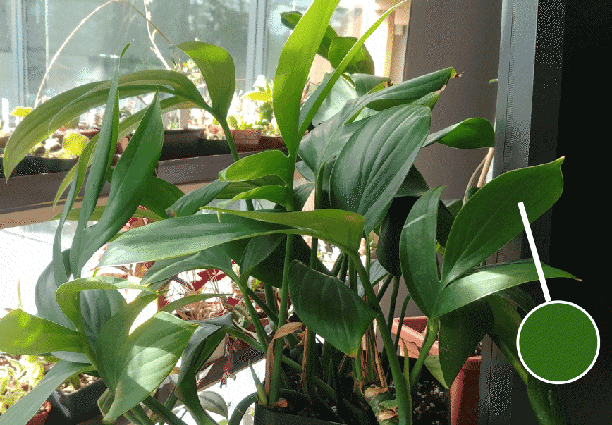
In this picture of our office plant you can see how light plays with the green of the leaves. Spots where sunlight reflects are almost warm white, places in the shadows are lit by the reflected light from the room into blue, and the leaves where the sun shines through are neon green.
Analyze works you like and try to figure out why the colors give the impression you feel.
Study how colors work together from reference photos of places and objects you can’t access personally, but avoid picking colors from them – cameras have a very limited color range and tend to group similar colors together. You have probably noticed that certain colors, especially those on flowers, are impossible to capture on camera, not to mention it makes shadows black and sky white while we can clearly see many colors and details in the shadows and sky in reality.
The funny thing is that we digital artists work with the same limited number of colors as the camera. Traditional painters can more or less mix any possible color they see, while we are limited by the number of colors our screens can display...
But that’s the fun of the challenge! We aren’t caged in the algorithms cameras use, no matter how sophisticated they are!
Let’s make the most of what we learned about color interactions and by observing these phenomena in reality or others’ works creatively convey lights, shadows, temperature, feeling, atmosphere, etc. in our art!
Note:
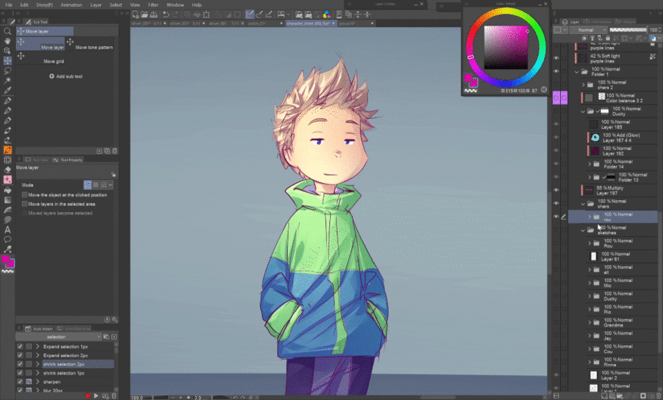
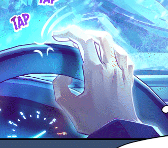
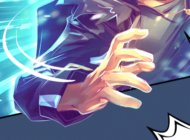
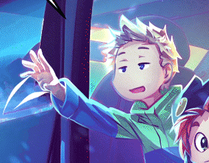
I take no responsibility for any damage caused by observing colors in the real world… Be careful, don’t be like me who gets entranced by a pink moon above city lights while driving to work in the early morning!
(Don’t worry, I didn’t paint it behind the wheel, I painted it from memory later :D )
🟧 Main colors and accent colors
When painting a picture that you want people to immerse in, it’s good to pick one color (or a set of neighboring colors) as the main color of your artwork.
That doesn’t mean monochromatic, but that a set of similar colors covers most of your canvas and contrasting colors to them are used only for accents.
For example, most of this picture is made up of darker purplish and tealish blue colors, and covers practically half of the color wheel. Opposite to these colors are orange, yellow and yellow green, which are added to the picture sparingly, making up about 10-20% of the canvas. These are called accent colors because they add interesting elements to your image.
Using a set of colors that covers the majority of the canvas and sprinkling it with their respective accent colors helps keep your painting interesting while maintaining its clarity and harmony.
🟨 Even distribution of colors
In a picture where all colors occupy the same portion of the canvas the eye keeps getting distracted and gets tired of it quickly.
But actually, you can still take advantage of it in some cases!
Especially in quick advertisement – pop art is a perfect example of that just like many similar advertising styles, because keeping the viewers’ attention isn’t their purpose. Their aim is to catch the eye with an attack of colors for a moment long enough for the viewer to click the banner or subconsciously remember the product.
🟪 PRACTICAL TIPS AND TRICKS
These are easy tips and tricks on how to make your art more interesting with colors! Most people don’t notice these little things, but they add a rich and unique feeling to your art that will make it memorable!
🟧 Color outlines
Just by clipping a new layer on your outlines and painting different colors in places like edges of elements, facial features, hair, etc., you can add a completely new feel to your comic or illustration! Don’t be afraid of using bold colors, like purple, orange or teal, by using them on small areas like line art you make them the accent colors.
For example, I usually like turning my line art into dark purple or red or even cyan, depending on the light conditions and mood of the picture. Then I pick the skin color and lightly paint over the facial features and hands.
For lighted areas I use orange, pink, yellow and even white, just make sure the background behind is darker, otherwise the silhouette would disappear.
For shadows I like to add saturated purple or teal.
See how much the feeling of the picture changed just by coloring the outlines?
🟧 Backlight
Giving a character or object a backlight of different color than your main light not only helps pop them against background, but also boosts the richness of your artwork.
🟨 The easiest way to add backlight:
1. Ctrl-Click the icon of the layer or folder of your character to make a selection of their silhouette
2. With the marquee or lasso tool selected move it a few pixels to the direction of your intended backlight
3. Invert it
4. Clip a new layer in some addition mode to your character folder
5. Fill the selection with the color of your backlight.
By erasing it in some parts and adjusting the shape with liquify, the rim of the backlight gets easily incorporated into your painting.
🟧 Colored skin
Even if you draw in anime or comic style, there are a few tricks that don’t cost much time but add unexpected liveliness to your art!
You probably know about the color zones of the face, where the forehead is tinted with gold, the middle from eyebrows to the tip of the nose is reddish and slightly greenish or bluish around the mouth. It’s mostly used in more realistic paintings but you can use it to a slight degree even with stylized characters.
Just be extra careful not to overdo it, especially with the blue in children and women, or they’ll end up looking like an unshaved drunk! :D
But apart from the often mentioned facial zones, there are color zones in the rest of the human body too!
The back of the hand and fingers are slightly golden, while fingertips, knuckles, joints and pads of the palm of the hand are reddish. The underside of the wrist and the root of the thumb is bluish:
Similarly, other joints, such as elbows, shoulders and knees are reddish.
With these color zones you don’t have to be as careful as with the face; and they may look unimportant since people mostly focus on the face, but try coloring the fingertips and knuckles of a character’s hand reddish and you’ll be amazed how they come alive!
This is the perfect example of small details that nobody notices but the amount of life and magic they give the artwork is worth the little time spent on them!
🟧 Subsurface scattering
This abstract term refers to how light lights up thin translucent materials – yes, it’s the well-known orange rim that appears when you hold your hand against strong light.
Just like the color zones, it’s often used in realistic painting but by adding it even to your stylized artwork you can take it to another level!
In my comic, I like using this effect, for example, on hands or inside ears that are strongly backlit.
Hair is also a translucent material, so adding glow into parts that light shines through makes the image even more interesting.
🟧 Using brushes with random color change
To add more variety to your painting, make the most of the brush settings!
Try turning on Color mixing in Ink or setting Color jitter to Randomize per stroke – these functions are great for painting textured surfaces like ground, rocks or snow!
🟧 Saturated colors used to make a vibrant painting
This trick makes the most of the relationship between colors we explored earlier to further enhance the mood, composition, light and space we want to convey.
Without changing brightness, use a different hue of the shadow color along its edge to add contrast.
Try adding spots of saturated colors to enrich textures.
This takes some trial and error to get right, but I’m sure you’ll find yourself doing it subconsciously soon.
For example, the purple and orange lines on the palm tree are in contrast to the green of the leaves and the freshness of the sky, telling the viewer the sun is warm and there’s a sand beach below the palm, even if the beach isn’t visible.
🟧 Adjusting colors
If you still aren’t satisfied with the colors of your artwork, you can use adjustment layers or blending modes of layers to further modify them.
I often use Tone Curve to raise or lower contrast between lights and shadows, Color balance to slightly shift the colors…
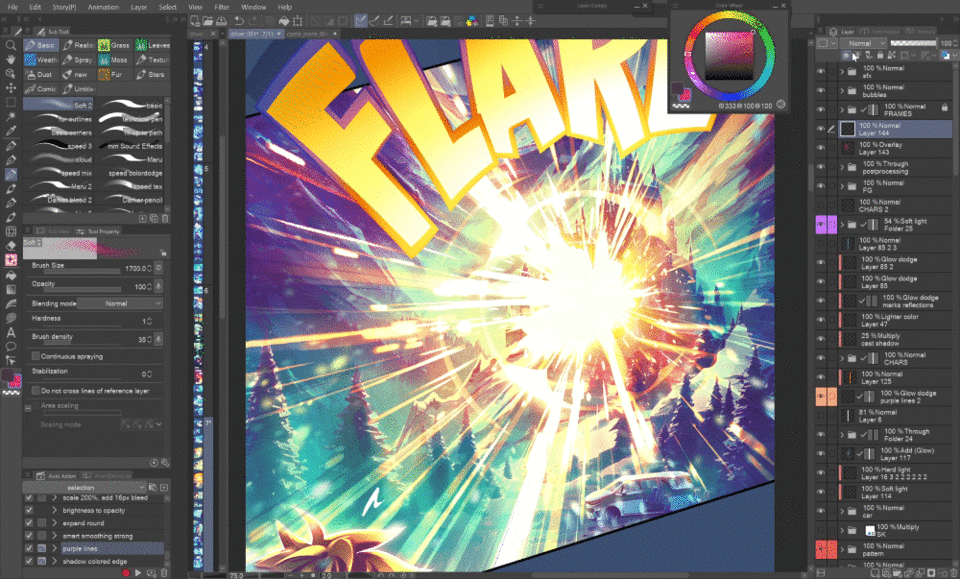
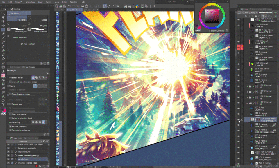
… or Gradient map in blending modes for various effects – for example, this panel had the light parts lightened even more by putting a gradient map from black (because black is ignored in additive modes) to yellow in Add glow mode.
Go ahead and play around with them to see what works best for your workflow and actual painting!
🟪 Conclusion
These are some tips and hints on what to focus on when observing colors and painting with them. But just like the colors are relative, there isn’t any rule you need to strictly follow. Since we’re working digitally, we can change anything later, so even if you’re not sure about your choice, just be spontaneous and follow your painting instincts without fear!
One of the most important things I’ve learned throughout the years of being an illustrator is that going by one’s feeling, even if it breaks rules and physics, works in 99% of cases, rather than strictly following rules or a tutorial.
Now go ahead and have a lot of fun creating magic with colors!
Users who liked this post


Comment