
Hey there! In this tutorial I’ll be showing you how to bring your traditional sketches into digital, and how to make the most of Clip Studio’s features to finalize them. Let’s get started!
1. Why?
For starters, let’s understand some of the reasons why there could be an advantage to mixing both tools in your process, rather than sticking to just one. For me, personally, as mostly digital artist, I find making thumbnails and/or initial sketches with pencil and paper frees me up from being too much of a perfectionist and trying to get everything right on the first try. By contrast, when sketching digitally, with all of the tweaking it allows, I often find that I get lost in perfecting details before even getting the “whole” picture down.
There are a couple more reasons why you might want to do it:
- Being able to resize and reposition parts without much effort;
- Making quick variations of a drawing/color scheme;
- Trying out non-permanent alterations without needing to redraw.
Now let’s get into the tutorial itself!
2. Importing your sketch
After you’re done with your pencil sketch, find an area with good lighting and take a photo of it, keeping your phone as parallel to the paper as possible. Some smartphones and tablets also have a “scanner” feature included in their default camera apps! If your model does, try it out. It might just automatically do many of the things I’ll be teaching you to manually accomplish in the next few steps.
Alternatively, if you have a scanner at home, scan it directly, it will make your life easier.
To get your image into Clip Studio, create a new file with the dimensions you want for your final artwork, copy the image from the computer folder it’s in, and paste it into Clip Studio with Edit > Paste.
There are other ways to get an image into Clip Studio, such as the Import and Open… features, in the File menu of the top bar. I’ve found issues with both of them.
- With Import your file will be brought into the program as an Image Material file, meaning it will be handled similarly to how it handles 3D model or text layers. You won’t be able to freely make changes to it (erasing, cutting out parts, etc.), and you won’t be able to perform any color adjustments.
- With Open… your photo is likely to open with a resolution of 72dpi if it was taken with your phone camera. It’s easy to forget to change this right away, and therefore easy to complete your entire artowrk with the resolution set to 72dpi, which is not ideal, especially if you want to print out your artwork at some point. If your photo was taken with an iPhone or iPad, it’s also likely that it’s a .HEIC file, which the Open… feature also does not recognise.
I suggest then that you stick to creating the file first with all the correct settings, and then pasting the image into it.
3. Editing your Sketch
Now you may want to go one of 2 ways: you can either use your traditional sketch as a base to draw on top of, or you can clean it up and use it as lineart. I’ll explain each method.
To be used as a base:
If your traditional sketch is just a base to draw on top of, you can make use of the Layer Color feature, located in the Layer Property Palette.
You’ll notice that upon clicking, most of your image has turned blue. This makes it easier to draw on top of. You may also want to lower the opacity of the layer.
Create another layer above it, and draw comfortably over your previous sketch, referencing what you want, and changing what you don’t.
Incidentally, the blue default color for the Layer Color feature is in reference to a tool often used by animators and other graphic artists, called the Non-Photo Blue Pencil. As the name suggests, it’s a type of pencil of a very light blue tone that doesn’t show up (or barely does) in pictures and scans. It’s very useful for a first draft.
To be used as lineart:
On the other hand, if your pencil sketch is mostly finalised, there are a couple of things you can do to clean it up and use it as lineart.
First, isolate your sketch by creating a selection around it, and deleting everything outside the selection. Now let’s get the image to grayscale.
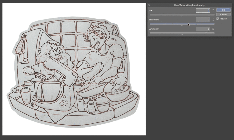
Go to Edit > Tonal Correction > Hue/Saturation/Luminosity, and push the saturation slider all the way to left (-100).
Next let’s bump up the contrast in the photo.
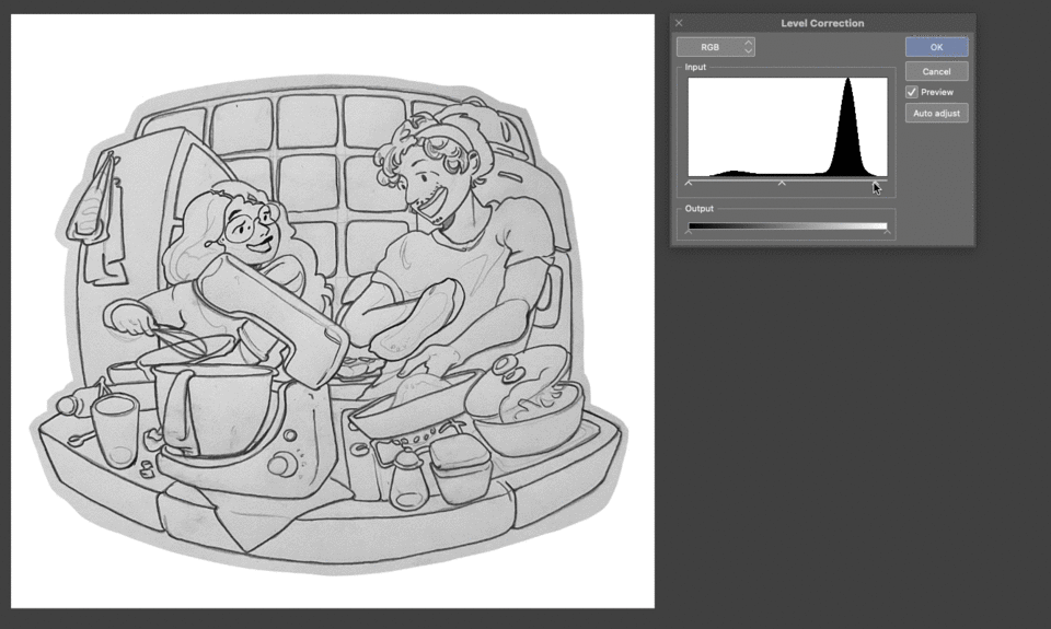
Go to Edit > Tonal Correction > Level Correction.
Understanding Level Correction
There are two parts to this menu: Input , the graph and Output, the gradient slider.
The Output slider defines the range of darkness/brightness available for the layer. We won’t need to touch it.
In the Input area there are 3 points. The left point represents Black, the right point White, and the middle point is, naturally, a Midtone. The middle point will move whenever you move the left or right points, but it can also be moved independently if you select it directly.
Here is the important part: For each of the corner points (Black and White) the closer it is to the middle, the stronger its influence. Meaning if you bring the left point closer to the center, the dark colors in your image will turn darker. Likewise, if you bring the right point closer to the center, light colors will turn lighter.
Visualise it this way: 1 is your default, Black is on the left corner, and White on the right. There’s plenty of space for greys to exist. As you push Black to the right (2), the greys are pushed as well, making everything darker. When you push White to the middle as well (3), suddenly there’s very little space for greys to exist, making your image very strong in contrast.
For our purposes, the easiest way to use this menu is as follows:
- Start by moving the White (right) point closer to the center, to whiten the paper/surface in your photo.
- Next, move the Black (left) point closer to the center as well to make your pencil lines darker.
- Play around with the middle point if there are any light grey lines still showing, but don’t worry if you can’t make them all disappear. There are other ways to clean those up.
Finishing touches
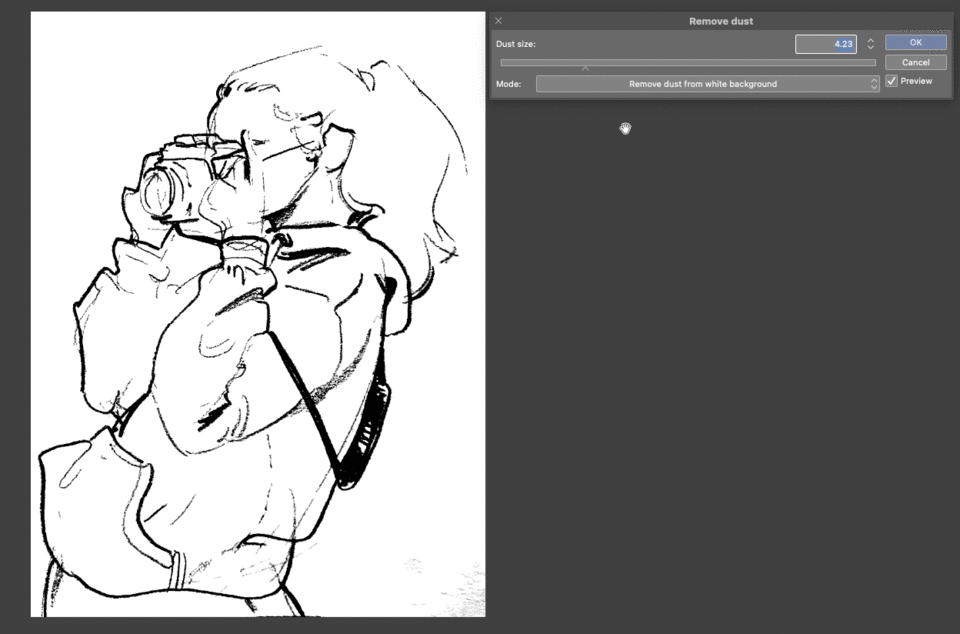
Here are 2 ways to get rid of the grey lines:
- First try out the Remove Dust feature. Go to Filter > Correction > Remove Dust…
Play around with the “dust size” slider, then click ok when you’re satisfied with the results.
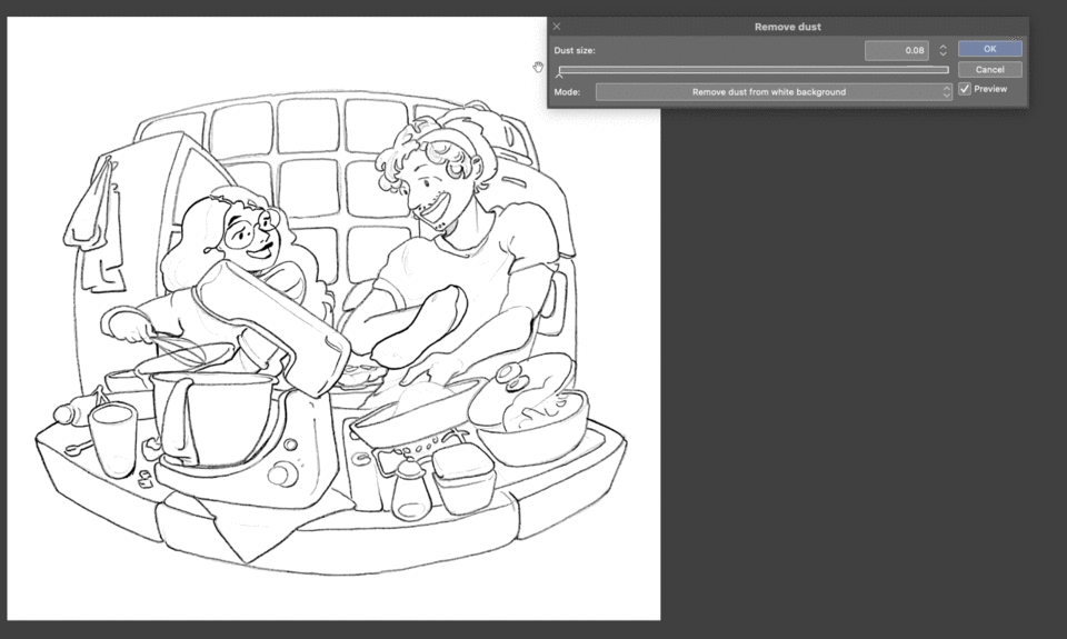
My lines were already pretty clean at this point, so it’s not easy to see the difference. For this step and the next, I included another example below of a rougher sketch I made, where you can best see how the features work.
- If there are still lines left, you can use an eraser, or your favourite brush with Transparent Color selected to erase them. A tip: You can use the lasso fill tool (find it in the Figure tools) to do the same. It requires a bit more precision, but it’s a lot faster.

After you’ve cleaned up everything, you can now select Edit > Convert Brightness to Opacity.
What this feature does is it takes the brightness levels of each pixel in your image, and converts them to opacity levels, with dark colors remaining very opaque, and light colors becoming translucent. As such, any black areas in your drawing will remain fully opaque, and any white areas will go transparent.
If you make the default Paper layer invisible, you’ll see your sketch now has a transparent background.
Your drawing is finally ready to be used as lineart!
To color mine, I ended up using the digital lineart I made earlier in the tutorial to showcase the Layer Color feature, as it gave me the chance to fine tune some details a little bit more. Here’s my final image:
I hope this tutorial was helpful to you, and feel free to leave me a comment if you have any questions.
Happy sketching!
Users who liked this post


Comment