
In this TIPS, I will explain how to combine the best of analog and digital as much as possible,
and ultimately create a digital illustration with a paper-like texture.
Step 1: Go digital
This may seem to contradict the monthly theme of going from analog to digital from the very first step, but the underlying theme of my TIPS is to combine the best of analog and digital as much as possible.
To write a rough draft without it falling apart, it's more convenient to use digital software because you can flip the page left to right with the push of a button, without having to turn the paper over on a lightbox (tracing table) every time.
So that's it.
Place a piece of copy paper on the screen to get a rough sketch.
I use a tablet, but you can also use a smartphone or tablet PC.
However, it's best to use a device that can output a lot of light, and you'll want a transparent writing pad to prevent the screen from getting scratched.
Of course, you can also skip step 1 and just casually doodle on a notebook or notepad.
Step 2: Draw the outline on the paper with a pencil or mechanical pencil
The lines you draw here will end up being thinner than you'd expect when you import them digitally, so keep this in mind and try to make your lines thick and strong.
They will still end up being thin, though.
Step 3: Scan or take a photo to import to your device
I have a scanner so I use that, but it's also fine to take photos with your smartphone.
In fact, I want the texture of paper, so taking a photo is more convenient.
If you use a scanner to read documents, the texture of the paper will be erased.
EX has a free plugin that can correct distortion caused by photography, so if you're an EX user and are taking photos, it's a good idea to use it.
Also, with a scanner, it's surprising how often hair or other debris gets stuck on the document bed and you don't notice it until you're scanning, so it's a good idea to wipe it off with a cloth first.
Don't make the same mistake as me.
Step 4: Edit the scanned line art in Clip Studio Paint
First, duplicate the scanned image.
One is for the line drawing, and the other is for the texture.
First, leave the texture alone and use this for the line drawing.
If you increase the contrast while slightly lowering the brightness using the "Brightness/Contrast" color correction, the line drawing will become darker and the paper parts will become white.
So "Convert brightness to transparency".
In this state, if you turn on "Border effect/Edge" with a color other than white,
This makes it easier to see the dirt that needs to be erased.
Here, we're using red.
This technique is also useful in creating regular digital illustrations, so keep it in mind.
If the lines you create at this stage still seem a little faint,
Duplicate the completed line art layer, then combine the two line art layers to make the image twice as dark.
Step 5: Create a digital illustration in the usual way
Start by coloring the line art in your digital illustration using your preferred method and style.
You can do this the same way you normally do it.
However, try to avoid making any corrections to the line art itself as much as possible.
The reason will be explained later.
In my case, I use a self-made auto action, "A folder set for thick painting-like work", which is also available as an asset.
I think it can be used for methods other than thick painting.
Step 6: Texture layer
Now, it's time to use the texture layer that we first duplicated and left alone in Clip Studio Paint.
If we put this texture layer in multiply mode on top, it will still look like paper, but since it's black, the color will be too dull and it will look dirty.
So, first
Make a selection from the line art layer and apply Erase to the texture layer with that selection.
It will look something like this.
Then increase the contrast in this state.
Unlike when extracting the line art, adjust it darker so that the texture of the paper stands out more.
This may be difficult to see in the image in the article, though.
Then "Convert brightness to transparency" on the completed texture layer.
Hide it for now.
Now, with all layers other than the texture that will appear in the finished product displayed, "Merge copies of visible layers".
Apply "Color correction → Levels" to the completed layer as shown here.
If you apply Gaussian Blur, place it on top of the texture layer and use "Clip at Layer Below", it will look like this.
This is a color-traced, non-dull texture layer.
Display this on top of an existing image in blending mode: normal, and it's complete.
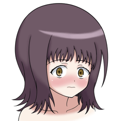
Finish
Here is the completed illustration using the above steps.
Depending on your environment, it may be hard to tell from the thumbnail, but if you click on it, you'll be able to get a strong sense of the texture of the paper.
What do you think?
I think it's a strange piece that's both paper and digital.
Now, there's one big thing to note about this method:
With digital illustrations, making corrections with transformation tools like this is very useful,
but the method described in this article isn't very suitable.
Corrections using the transformation tools also involve using an eraser or aggressive additions,
so if you do it before separating the texture layer,
the texture of the paper will be crushed,
and if you do it after separation,
the more you do it, the harder it becomes to create a sense of unity.
That's why this time the first rough draft was digital. I wanted to decide the shape at this point so that I wouldn't need to make major corrections later.
So if you're interested, please give it a try.
Bonus: How does it work with lighting effects like additive?
It will look something like this.
I think you can get some interesting effects.
Users who liked this post


Comment