
Good morning,
In this tutorial you will learn how to place 3 or more characters in an illustration or scene for a comic/story.
We will briefly review the rules of composition, camera positions and visual narrative, in order to not only ensure that our characters are well placed, but also to be able to tell a story.
Using the 3D tools that the program provides us, such as objects, settings and human bodies, plus the rules of perspective, we will be able to achieve compositions and camera angles that we thought would be impossible to achieve.
THEORY
Horizon line, camera position, compositional rules, action lines and visual narrative… These are the 5 things to keep in mind when creating an illustration with several characters in it.
Horizon Line and Compositional Rules
Depending on where we place the horizon line, the camera angle and perspective of our characters will be determined.
*The angle and inclination of the camera also determines where the horizon line will be, and whether it is visible or not.
As for the rules of composition, I have selected the most commonly used or well-known ones. You will see that sometimes two different rules will achieve the same compositional result, such as the golden ratio and the rule of thirds, the latter being considered a simplified version of the former.
Visual Narrative
Visual narrative can be more complex, in some cases the rules are clear, in others it is a matter of perception. Some of these rules would be:
Camera Position: High Angle and Low Angle. The first is used to show inferiority and the second superiority or majesty.
Profile or Front of the Character. Normally profiles are used to show that the character made a decision or realized something. A frontal shot is used to show the character, for better or worse, his vulnerability or his greatness.
Diagonal Lines or Straight Lines. The more diagonals we use in our illustration or if we tilt the horizon line, the more movement, dynamism, uncertainty or action will be generated. The opposite effect is achieved by applying horizontal or vertical lines, obtaining calm, tranquility or boredom.
Left or Right. Depending on whether our character is located more to the left or to the right, we can generate the idea of whether he lives thinking about the past, is looking towards the future, has a heavy past, or who is the good guy and who is the bad guy.
If the character is in the lower part of the scene, with a lot of space above, it can give the idea of helplessness or that he carries a huge burden on his shoulders.
PRACTICE
3D Objects and Scenarios
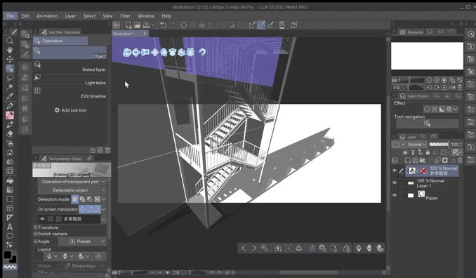
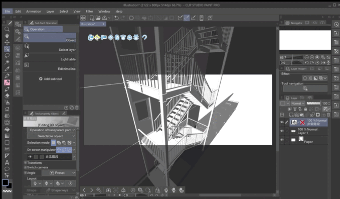
When placing 3D objects on our canvas, we will see that the movement, modification or camera tools will be activated.
Same with the scenarios.
If we go to the bottom bar, to the camera icon, already established views will appear.
But if none of them fit the angle or scene, we can create it ourselves using the movement tools.
Compositions
Once we have found the view to work with, we can create another layer and start drawing our characters.
And with 3D bodies you can achieve those poses that are so difficult to create due to such steep perspectives.
You can also create entire compositions using only 3D objects as references. Or use only objects such as bicycles or telephone poles and place them according to the perspective of your drawing.
In the following two sketches we can see that with the same composition rule, the characters performing the same action, due to the camera placement and the visual narrative, we can feel two completely different sensations of what we want to tell.
In the first, due to the vast space given to the sky, we can imagine that student life is ending for these kids and they will have to mature.
In the second picture you can feel that they are enjoying normal days during school time.
ILLUSTRATION
Let's make quick sketches of our idea. This time I wanted to draw a group of student friends traveling by train. As you can see, the first and third have the same camera angle, while the second is a front camera. The poses of the second and third are the same. And they all use the golden section as a composition.
I chose the third one, why? The first one was discarded because I wanted my characters to be interacting with each other, and the idea of them sleeping on the train, either due to general tiredness from the day, was not exactly what I was looking for. The second one, although it meets the requirement, because there are many horizontal lines it does not generate as much energy. On the other hand, the third one, because of the diagonals that we can see in the composition, generates the dynamism that I was looking for.
In my case, I prefer to first make the character sketches and then use the 3D figures to check if the characters are well proportioned, the pose is well achieved or the perspective, and in this way I can correct any errors.
When I'm happy with the characters' poses, I move on to line art.
We add color and to give it a sense of movement, we make use of chromatic aberration.
Filter→ Effect→ Chromatic aberration
I also like to add noise to the image.
Filter→Effect→Noise
END
I hope this tutorial helps you compose those illustrations with many characters, that look natural and can tell a story with just one scene.
Adieu ~
Users who liked this post


![[GaChiDa]](https://s3-ap-northeast-1.amazonaws.com/celclipcommonprod/accounts/profile-image/42/9b28e4ced95a4b0308e33f149bcc804ba90f652f1e93c334f6c4a7aea611093e.png)


Comment