Beginner's guide to neat lineart + Bonus!
Video link:
If you want to see this article as a video, click on this link:
Intro
Hey everyone, Fatima’s here!
Are you struggling with shaky lines that are holding back your artwork? or perhaps you get disappointed every time your line art doesn’t look as good as your sketch.
Worry not! ‘cause in this article I’ll be you’re guide to mastering smooth, and neat line art!
Plus, I’ve got some awesome tricks you won’t want to miss, so make sure to stay until the end!
Pen & touch settings
Before we start drawing, we need to make sure we got the right settings for pen and touch gestures.
To do this, press the clip icon in the upper bar, and go to preferences
And this window should show up:
Go to “touch gestures”
(1) will allow you to use some tools with your finger, and unchecking it will forbid finger from doing anything. (I recommend checking it for easier work) .
(2) will give you two options:
(A) will seperate the tools used by fingers and pen.
This option will not allow using fingers to draw, erase, etc. but it will allow using them for other things such as zooming, undo, and redo.
(B) will let you use the same tools for pen and fingers.
It is more preferred to use the first option
Pre drawing adjustments
Sketch layer adjustments
After finishing the sketch, we need to make a few steps before drawing line art
Select your sketch layer and from (1) above, you can change the opacity.
(2) will get you to layer property
*Note: if you have more than one sketch layer, you can put them in one folder, select the folder (by tapping on it) and complete the steps.
In layer property, press the “layer color” icon, and this color block should show up. You can press it to change the layer’s color.
*Note: if you want your sketch layers to have different colors, select each layer and do the same steps with a different color.
Your sketch layer should look like this ↑
Brush settings
Here’s a cool trick to lessen shakiness when drawing
In tool property, go to “stabilization” and adjust it for your liking.
Lower means less stable, and higher means more, just like that:
*I prefer using a less rounded brush. The brush I used for this drawing is this:
you can find more in clip studio assets*
Drawing process
We're finally gonna start drawing, yay!
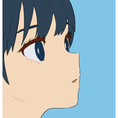
So here's a tip: you should locate the source of light is in your drawing, even when doing line art. Use thicker (bolder) lines in darker areas, where the shadow is located in your object, and thinner line in lighter areas.
This method will make your line art easier to understand, and more interesting.
Here's a trick: when you wanna do some minor fixes to your line art, instead of drawing all over again, you can use
*Drum sound*
The liquify tool!
You can find it here↑
The liquify tool in Clip Studio Paint has many options.
For now, we're gonna be using these three here.
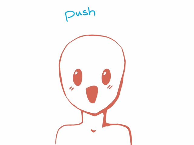
(1) is “push” you can use it to fix some line placements, just like that:
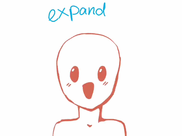
(2) is “expand”
When you want to increase the thickness of your lines, you can either draw more, or use “expand” to fix it.
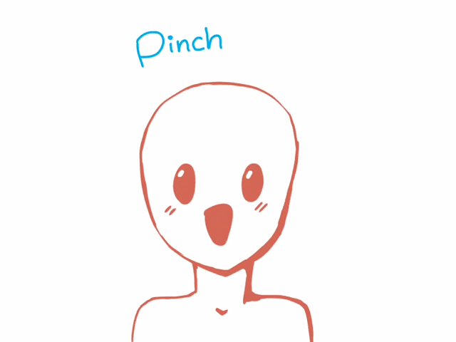
(3) is “pinch”
Pinching is the opposite of expanding. That way, you can use it for… you guessed it, thinner lines!
Tip: when two lines meet, connect them with increasing the thickness between them
But of course, lines don't always have to meet and connect (unless you wanna use the fill tool for coloring, which I personally don't recommend)
Final touches
After you finish drawing line art, hide the sketch layer.
To make the line art more appealing, let's color it!
But don't worry, it's easier than it seems, and I'll show you two methods to do it!
Method 1: Locking transparency
Locking transparency (also known as alpha lock, or lock transparent pixels in CSP) will allow you to draw within the line art or any other thing without getting outside the edges.
To use it, select your line art layer, and press this icon as shown in the image above
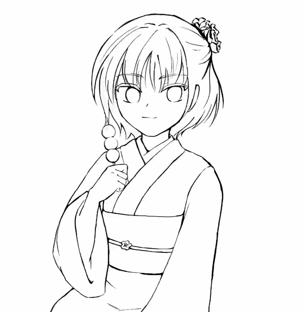
And then color it (using darker colors than your base colors)
Like I mentioned recently, this will not allow you to draw outside the lines
Method 2: Clipping
Make a new layer above the line art layer
And press the clipping icon, then color in the clipped layer.
You might be thinking, why don't we just stick to the first method? Isn't it easier?
The advantage of the second method is the ability to use more than one layer to clip, this is helpful for many purposes other than line art.
The result will look like this, using any of these methods
BONUS 1
I'll show you a cool trick you can do in Clip Studio Paint!
Go to layer property in any of your drawing layers, and press the “Tone” icon.
This will create manga effect for the selected layer.
Note: This effect will be in black and white, but if you wanted to color it, you can use the clipping method we talked about before :D
And this will be the result!
(I made added this effect to line art layer and coloring layer separately)
BONUS 2
Since we have illumination theme for this month (but it's not the main theme of this article) I'll show you some simple steps to do to make enchanting lighting for your artwork!
Step 1: light
Make a new layer above your layers, and set the blending mode to “add” and with an airbrush, draw on different areas on your picture using a variety of colors such as orange, yellow etc. depending on what scene you're trying to do.
(You can choose different brushes)
And this will be the result:
Step 2: saturation
Make a new layer above your lighting layer, and set the blending mode to “overlay”
This effect will make your lighting more saturated and less bland. Notice the image below:
Note: If you have a background and you don't want those layers to affect it, make a folder and put all your object’s layers in it, and then clip the “add” and “overlay” layers to the folder.
Step 3: shadow
Last but not least, to add a shadow for your object, here's a simple trick to do it:
Select your coloring layer, by pressing the three lines on the upper left side of the layer window, go to “selection from layer” and tap “create selection.”
That way, you've selected the coloring layer without going beyond the edges.
Now, make a new layer, below the two layers we used for lighting, set it to multiply and fill it with a different color from the lighting color.
Lower the opacity, and adjust it until you're satisfied.
(If you don't like the selection method you can just clip it to the object’s folder)
And that will be the final result 〜❁
Conclusion
I hope this article has provided you with useful information and inspired you to draw more!
If you enjoyed it, please consider liking and sharing with your friends!
Thank you for staying with us until the end 🙏






Comentario