Designing a y2k logo
What is a y2k logo?
Y2k logos are designs inspired by the internet aesthetic of the late 1990s and early 2000s. Today they're used in branding for tech companies and fashion brands.
Usually these logos use futuristic fonts with:
① Rounded edges
② Outlines
③ Drop shadows
Designers use this style to tap into nostalgia, follow my tutorial to do it too!
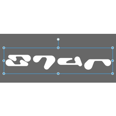
① Rounded edge font
The rounded edge font we will use is Kilo, by the famous designer @hvnt.ter
It is free for personal & commercial purposes.
https://hvnter.net/free-stuff-1
The fonts already installed on your system are also free for commercial use. However, if you want your designs to stand out consider trying new, unique fonts.
Here we select the text tool, then click “Add font from files” in the Tool Property Window to add our font.
Now with the font added to Clip Studio, type the text of your logo.
We are using the color white because the drop shadow and outline of this logo will be black.
② Outlines
Use the Layer Property Window to give your logo text a boarder effect. Select the icon that is highlighted in blue to activate the border effect.
③ Drop shadows
To make the drop shadows that y2k logos are known for I created an auto action to rasterize the text layer, change it’s color to black, and move it diagonally.
Repeat the auto action until you’re satisfied with the size of the drop shadow.
The auto action duplicates layers to create the drop shadow, so select and merge the layers after using this action.
Now you know the basics of y2k logo design
Come back tomorrow to find the auto action asset link to follow along with this tutorial.
Updates to come.


コメント