How perspective and rulers can help you draw nature
You often find perspective tutorials on how to draw buldings, or interiors. But did you know that perspective is also very useful to draw nature ? Sometimes, especially when you are a beginner in drawing backgrounds, you will find your backgrounds "flat", they will lack depth and believability, and will not blend well with your characters. Now of course "flat" backgrounds can be a style, but if that's not what you are going for, using perspective can help you fix that !
In this tutorial, we are gonna see how to use Clip Studio Paint perspective rulers to draw better natural background.
First, draw your composition. Draw loosely, you don't have to draw all the details, just have the elements that you want to draw. I want to draw a girl meeting a mermaid in a pond in a garden, so here is my first sketch:
It's not supposed to look pretty yet, don't worry ! Now, let's set up those perspective rulers.
Go in 'rulers', "perspective ruler", "add vanishing point".
I'm gonna do a two-points perspective because i think it fits my sketch better.
If you are confused about how to set up your vanishing points, try to think about the horizon line first. Is it high or low in your painting ? If it is high, you are seeing the scene from above. if it is low, you are seeing it from below.
If you are using two-points perspective, make sure both of your points are on the same horizon line, and outside of your drawing ! Here is how my rulers look:
Now, put your first sketch layer on low opacity, and use the ruler tool to add more guide lines. We want to have an idea of what the space we are drawing looks like in 3d.
Here is how mine looks like now;
Now, make sure to have the "snap to ruler" option on (this guy:)
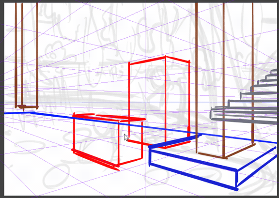
And we are gonna start making little boxes for the different elements we sketched.
Don't hesitate to use perspective to check the scale of things ! For exemple, i want the flower bushes in the back to be the same kind of height as the girl. So, i use the guide lines to see how that height would be far behind her.

Don't hesitate to use different colors for the different boxes ! Perspective can be confusing, adding distinctions is always good :)
Here is what my boxes look like:
Now that you have made the boxes for the main elements, you can uncheck "snap to ruler" and draw the things inside the boxes ! This is still a sketch, don't try to do lineart right away (unless you are very good at perspective, but then you wouldnt need this tutorial ;)
Keep your sketch and perspective grid visible underneath, and try to remember the volume of things as you draw. For exemple, for characters, try to remember that people are not flat, they are made of volume, and anything above the horizon line is seen from below, while anything under it is seen from above.
Here is my sketch now (i changed the stairs boxes because the scale with the girl didnt make sense):
You can now hide the layers of the boxes and start sketching more details ! Keep the perspective grid layer and keep it in mind while drawing more details ! For exemple:
Here, the blue and the red lilypad are the same size. Remembering that kind of things will help give your drawing a sense of space and volume.
Here is my final sketch ! You can start doing lineart, or a more precise sketch now ! Try to toggle visibility of the perspective grid to check often if you're not making incoherent things with your perspective. Also, if you're stuck on something and it feels like its not going well with everything else, wrong perspective often is the answer !
Here is my lineart ! You can see that i added a lot of details because i like to do that, still using the perspective grid to draw, even the "organic" shapes !
After that some color and rendering work and you're done :) Keep in mind the perspective when shading, try to see where your light source and how it affects volumes.
Here is the final result ! I didnt detail coloring and rendering because it's not the point of this tutorial, but don't hesitate to ask if you would be interested !
I've added another exemple of artwork i made using perspective rulers to draw nature, but with a one point perspective this time ! It can be easier if you are a beginner with persepective :)
We've reached the end of this tutorial, i hope it was useful ! Dont hesitate to ask me if you have any questions !
Hortense


コメント