
INTRODUCTION
Hello guys :)
In this tutorial I'll be briefly covering the topic of CORRECTION LAYERS in Clip Studio Paint and how you can use them to get this glow effect for your art.
You can watch the tutorial video for a more in-depth understanding :)
CORRECTION LAYERS
SO, Before I show you how to make your art glow, you need to understand what correction layers are and how they work as it is very essential to this technique.
I will briefly go over all the types of layers to save time :)
A correction layer is a layer that adjusts the colors (hues) and tones like brightness and shadows of all the layers below it
To create one go to [LAYER] -> [NEW CORRECTION LAYER]
Or just right click in the layers panel and choose from there.
Correction layers are special layers that work in the following ways -
- Every correction layer has a layer mask attached to it which you can use to mask off any areas that you want unaffected.
Use a brush to paint over the areas you want to be affected and use the Eraser to erase the areas you want unaffected.
- Change the layer modes like normal layers
- Stack them for unique effects.
- CLIP the correction layer to any layer you want
-Place them in a folder to limit the effect of the correction layer only to the contents in the specific folder.
-You can always go back to it and adjust the settings whenever you want.
TYPES OF CORRECTION LAYERS
There are a total of 9 correction layers that you can use.
5 of them as I like to consider are the basic essential layers and the other 4 are the Fancy ones where you can get all sorts of fun effects.
BRIGHTNESS/CONTRAST
Adjusts the brightness and contrast of an image. As simple as that.
You can use this if you just want your image to be a little brighter and use contrast to intensify the colors like making your traditional linework look more crisp and black.
HUE/SATURATION/LUMINOSITY
HUE - Adjusts the Hue (or color) of the painting
SATURATION - Makes the colors look more vivid by intensifying them or desaturates by removing all the color. Moving the slider all the way to the left will desaturate the image making it grayscale.
LUMINOSITY - Just lightens or darkens everything by adding white or black to the image.
POSTERIZATION
It is like a filter that limits your colors from 2-20.
This really gives you some very fun effects if you play around with it or use it in specific areas by masking it off along with layer modes.
REVERSE GRADIENT
This just Inverts the colors according to the color wheel like how negatives in photography look. So black turns into white, Red turns into green and so on.
LEVEL CORRECTION
Level correction lets you adjust the overall values like the highlights and shadows
The first node from the left controls the Shadows, second controls midtones and right one controls the highlights.
The bottom bar increases/decreases the overall brightness of your image.
You can also adjust individual RGB channels the same way.
You just need to try it out and experiment with everything and you'll get the hang of it pretty easily.
TONE CURVE
Tone curve is like level correction but a bit more advanced.
You can add multiple points on the line and adjust it
255 on the Y axis is the brightest or White point and 255 on the X axis is the darkest or black point. Pulling the mid point towards the white point makes everything brighter and pulling towards the black point makes everything darker
Just like levels you can adjust the individual RGB layers as well.
COLOR BALANCE
With Color balance you can play with the look and feel of your painting by adjusting the colors of your painting.
You can also change colors of the Shadows, Midtones and highlights as well.
Like for example if your painting looked more on the cool side you could make it warm by adding more Red to it or if you want the highlights to be more green just select the highlight option and move the slider towards green.
If you select the "Keep Brightness" option the brightness of the image will stay intact while you adjust colors.
BINARIZATION
This converts your image into a black and white duotone image. Play with the intensity for cool effects that you like :)
GRADIENT MAP
Gradient map is layer that applies a custom color gradient to the gradient of the values in your image.
You can use default gradient sets or download a variety of them from Clip Studio Assets.
This is a really cool feature that you can use in various different ways like how I'm using it for an overall effect.
Or like how I used it for giving my mermaid different skintones. Combining it with different layer modes and adjusting the opacity also gives you some unique effects as well.
HOW TO MAKE YOUR ART GLOW !!
Now that we have some basic knowledge about the correction layers, I'll show you how you can use these layers to get the glow effect.
This is a very easy technique that will make people look at your work in amazement >:)
This is my image that I drew traditionally and took a picture with my phone.
To make something look like its glowing the surroundings needs to be darkened enough so that your vivid colors will look like its a glowing light.
To get started, I used [LEVEL CORRECTION]. This is going be our important layer that determines the entire feel of the end result.
So to get that dimly lit surrounding effect I moved the highlights arrow all the way to the left which is removing all the bright areas from my image. Then I fine tune the values using the little arrows to what I feel is good for now.
Next I used the brightness/contrast layer to further adjust the image and make the lines look more dark and crisp using the contrast slider.
Then I pick a saturated green for this look and using a soft air brush I paint over the areas I want to look like they're glowing.
Change the layer modes to get different effects, for this I used Glow Dodge as it brightens all the colors while not effecting my linework. But you can use whatever you like.
I'm building up the color slowly to intensify the effect.
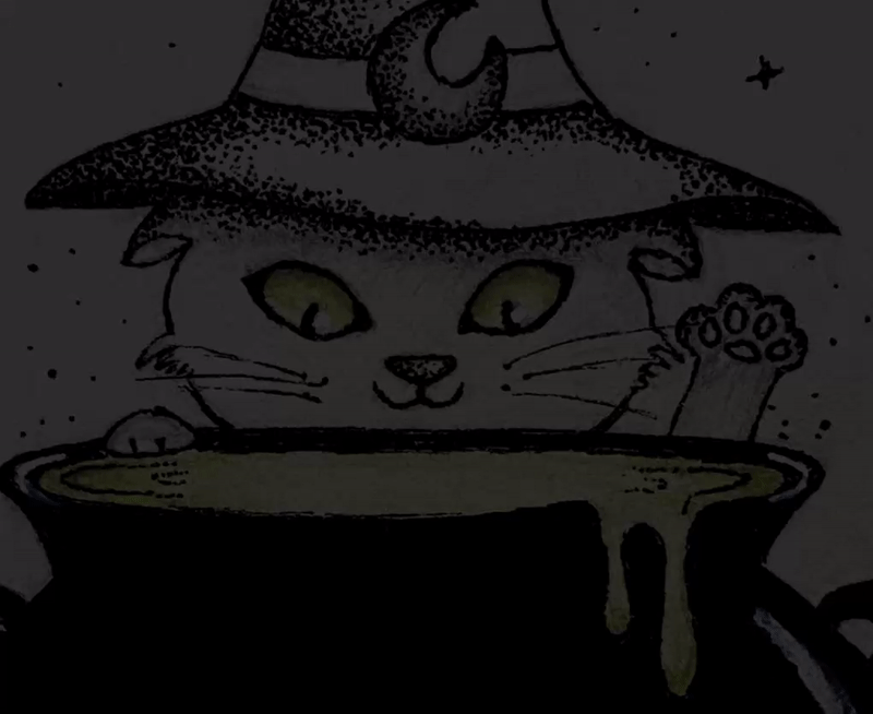
I wasn't happy with the initial color I picked so I used the [HUE/SATURATION/LUMINOSITY] filter to change the color and saturation of the initial color then I clipped it to the layer below so it only applies to my glow layer.
I just add this soft glow around the eyes and the pot for that glowy surrounding effect.
You can go back and forth between the correction layers to adjust everything like how I'm doing to make the image more darker to intensify the glow or playing around with the color layer till I'm happy with the effect.
So this is how my finished painting looks like.
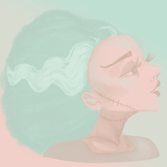
Here are some more examples of how I used this technique.
THANKYOU :)
Thank you so much for making it to the end of this tutorial. I hope you liked it and I hope you follow this tutorial to make your own glow art.
I'll be making more tutorials so please don't forget to follow me and keep an eye out for more !!
-MISS BEAN
この投稿を「いいね!」したユーザー


コメント