Coloring for beginners in CSP
INTRO
Hi everybody!
I’m Lennybunny, an illustrator and 3d artist. I use Clip Studio Paint (CSP) from 2014 circa and a CSP Expert from 2017.
You can buy CSP brushes/assets on Graphixly.com, all brushes used in the tutorial are inside the CSP Ultimate artist brush bundle. In case you want to buy my prints you can buy them on my store!
In all those years I learned a few tricks regarding inking-coloring, I will show how I colored this illustration
______________________________! Important !
If you don’t know some of the terms I will use, don’t worry I’ve made a tutorial explaining how layers work in CSP. I will put a link here to the whole tutorial.
____________________________I’m more of a comic/manga artist, meaning this first section will be geared more towards those artist. So, if you’re a painterly artist you can skip ahead to the Choosing a palette section.
INKING THE SMART WAY
____________________________Vector/Reference layer:
____________________________
Those two options are practically your bread and butter for comic/manga illustrations.
The vector layer will let you have a precise filled lineart without worrying of the brush you used.
Every line in the example has 15px of width and the image was exported to be 100% of the screen size of an A4 on a 300dpi, meaning that this what you will see once exported.
The [ Set as reference layer] is the magic option, that will let you have always perfectly filled lines. You can find it in the layer palette, button number 5 to be precise. I’m reusing the image of my layer tutorial, click on the link above for a more in-depth explanation.
____________________________
This will give you the possibility to use the Fill tool [ Refer other layers ]. You can find it by selecting the [ Fill ] sub tool group in the [ Tool ] palette.
This [ Fill ] sub tool gives you the ability to be EVERYWHERE inside your layer stack and it will always reference the vector layer. For everything to be working correctly the [ Refer other layers ] sub tool needs to have those settings checked.
____________________________
Now that we are on the same technical level regarding functions let’s see how I structured my layer stack.
I have 3 vector layers.
• Main ink

• Details

• Closing lines
And only the Main ink and Closing lines are set as [ Reference layer ]. Why? Because in this way I will need to worry about all those extra details of my inking when I will fill the illustrations with the colors.
Here’s probably a better visualization by unhiding the “Invisible ink layer”
_____________________________Pro tip:
If you ink with a white color and set the layer [ Blending mode ] to [ Multiply ] the lineart will be invisible, but it will still be recognized the [ Fill other layers ] subtool. Meaning that you will have an “Invisible ink layer”.
Great trick for creating closing line for fuzzy shapes or when you want to keep a “broken” lineart for your character.
_____________________________Meaning that this will happen when using the fill tool
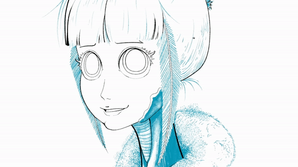
So, wanting to recap. If you’re a comic/manga artist here’s what I recommend
• Use Vector layer
• Divide your ink layers in Main ink, Details and if needed a Closing line layer
Now that we have finished our inking parenthesis we can go on the meat of the topic, that is how to color. But before like… coloring we need to decide what colors we will use.
WHAT COLORS SHOULD I CHOOSE?
Choosing a palette is easy especially in CSP, and there is a pretty easy trick to do it. But here’s a little bit of a question, before starting:
“What mood do you want to give to your piece?”
Because based on the mood you want to give, the lights change… If the light change the colors will shift towards the light color… Meaning that choosing a color palette before choosing the mood is counterproductive.
Fortunately there is a very VERY easy way to choose one, and this will even help you during the shading part of your piece. Two birds with a stone. Painting a grayscale… easy no?
- Color theory simplified
Painting a grayscale is strangely easy but very unrewarding. Unless you like black and white paintings, in that case it is very rewarding indeed!
I use a very heavy inking style, as you can see from my final inks. Meaning that painting a grayscale is very easy for me, I just need to put some soft shadow
___________________________Pro tips
A simple trick for shading is just remembering this rule:
“The sharpest the angle the harder is the shadow”
____________________________
Now comes the “color” part, because we will add a [ Gradient map ] to the top of your layer stack. To do so, just right click on the [ Layer ] palette, [ New correction layer ] > [ Gradient map ]. Press ok, and you’re done!
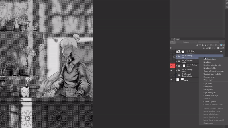
The [ Gradient map ] is a correction layer that will convert your grayscale in a color gradient, based on the chosen gradient.
To edit it, you just need to double click on the layer, not on the text but on the square part on the left.

Now you just need to double click on a gradient to apply it.
A good practice in this stage is creating a new gradient map for every mood you want to test, export all the variation and combine them inside a single page. In this way you can have a better understanding of where you want to go with your piece, practically you create a moodboard. Here’s mine as an example
______________
Ironically I didn’t use any kind of notion regarding color psychology, but I used a more “logical” approach.
Color psychology, in short how we feel based on a color, is a whole deep and complicated anthropological and social topic, because it depends on where you live and your experience with that color.
So, it’s pretty easy to feel overwhelmed by it, but the good news is that you don’t really need it. What you need to know, to set up the mood of your piece, is:
“Which moment of the day I’m showing?”
Wanting to oversimplify:
• If it is at dawn you will have a yellowish light and an azzure/greenish shadow.
• During midday you will have a pretty neutral light/shadow.
• At evening you will have a reddish light and blue tint shadows.
• At night you will have as a main light an artifical light or natural lights (moon/stars). In case of an artifical light, based on how intense they are, you will have a shadow tinted with the light color. In case of a natural light you will have, generally, a white light with a green tinted shadow
Next step is choosing how much saturated you want your color, as a general principle, the more saturated the color the more energetic it will feel.
As an example, blue is not by default a “sad” color. If you take a very saturated and light blue it will give you an energetic feeling, if you take a very desaturated and dark blue you will perceive as a less energetic color, in other words a “sad” color. Just to be clear, I’m not talking about color temperature, like blue color is cold and red color is hot, but more like how much of a feeling of energy a color can give.
So for choosing the G variant I had this thought process
◦ Which moment of the day is? Late morning, meaning that I will have a yellow light and a blue/green shadow
This straight up removed every variant except A and G by default. Now comes the next question:
◦ How much energy I want to give? I didn’t want a still dead calm feeling like the B variant, but not even something that will feel like the character drank three espressos shots brewed with energy drinks all at once (something that I really don’t recommend, unless you want to go to the hospital to prevent a heart attack) like variant A.
So, now I use that variant as a base to chose a shadow color and a light color. I choose a dark but saturated blue for the shadow color and a desaturated calm yellow for the light color. In this way I can get a pretty good contrast between those two.
There is another reason on why I choose those two color in particular and is related to the value of the color. Something that is extremely important for how we choose our remaining colors.
- Completing our color palette
To choose our remaining colors we need to introduce the concept of value regarding colors.
What I’m referring to is:
“If converted in grayscale the color how much luminosity will have?”
Here’s the two previous color if converted to grayscale
Meaning that we have a very big difference in value, giving me a good contrast.
Something that you will probably say is that one of the colors is more geared toward black, so it’s obviously darker. It’s a complete fair point, so let’s use pure yellow and blue, with 100 saturation and luminosity.
As you can see even using the “pure” chroma of the color the blue will have a darker value than the yellow. This means that it’s easier for those two color to have a good contrast.
Now let’s use pure yellow and pure red and see what happens
____________
Layer tutorial [Fill] layer explanation
_________
This will convert automatically everything in a grayscale in a non destructive way. Now just block the layer, so you can’t select it by error, and now you just need to hide/unhidden this layer to do a quick color check. I will refer to this white fill layer as “Value check” layer
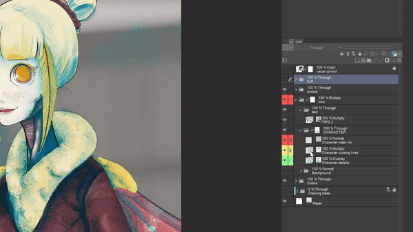
This will be a pretty good guideline now that we need to choose a color scheme.
We have already a two colors, a light color and a shadow color. Generally I work with just other two colors, a main color and an accent color, but there are no hard rules for how much colors you can use on a piece.
But, I really recommend you to keep to a maximum of 4. For two reasons:
1\. It’s easier to manage 4 colors than an infinite amount. A light color, a shadow color, a main color and color for the details.
2\. I swear, this palette doesn’t receive enough love. The [ Intermediate color ] is a palette in which you can put 4 colors and it will automatically create a gradient between those 4 colors.
Just select the color and click on one of the four squares inside the corners, it will fill that angle with that color. Is that easy
Here's an example of a fully filled [ Intermediate color ] palette.
This will give you a lot of intermediate colors, while still being in the same color range. Now we have a light color and a shadow color, we need two other colors.
Doing so it’s extremely simple. Do you remember the [ Fill ] layer? It has a pretty cool function, you can change automatically the color of the [ Fill ] layer by using the [ Object ] subtool. The [ Object ] subtool is under the [ Operation ] sub tool group, the default shortcut is the letter O
To do so, you just need to select the main color while using the object tool, and straight up select a color.
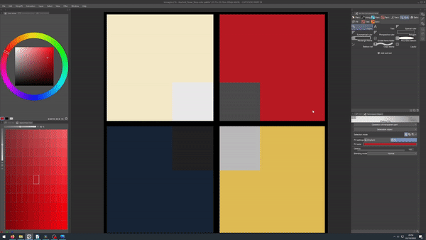
____________________________
Pro tip:
You can mask the fill layer, giving you the ability to show at the same time your fill color layer and the value checked color
If you want more information on how masking work
_____________________________
Now here’s more or less my decision making regarding the other two colors.
The main color should be the more prevalent color in the picture, because the illustration have as a setting a plant shop the main color will be a green hue. Easy no?
For the sub color I will need something that will make the main character pop, now I’ve two choices.
1\. Using a lighter blue or green, in this way I will still have a good value contrast.
2\. Using a red or purple color. Because red and purple as pure colors if converted to gray have a good middle gray value, that sits nicely between yellow and blue.
Meaning that it will be difficult for me to create with red and purple a darker color than blue, and lighter color than yellow.
This decision is more based on personal preference, I prefer red so I’ve choose red, if you like purple use purple.
I went with point 2 giving me this final color palette, once applied inside the [ Approximate color ] palette.
This will give us a full color palette with a lot of freedom and variety, while still being in a certain color range.
Remember that those are not rules but more practical guidelines that I use for color decision making. I don’t need a right answer, I just need to avoid the wrong ones.
Now that we have our color we just need to apply them
- Creating a color palette - alternative
Before going to the next chapter I want to make a little bit of a detour, just for the sake of completeness. Because now we have an alternative way to create a nice color palette, the [ Color mixer ] palette.
__________________
Explaining all the functions of the [ Color Mixer ] is a little bit out of the scope of this tutorial, fortunately Celsys made an official tutorial on how to use the [ Color Mixer ]
So how can we use it to create a color palette? Like we would do it with a real palette, at least how it was taught to me on how to mix stuff on a palette...
1 - We start by adding in the corner our palette our main colors
2 – Now we try to make a mix between our main colors at the top, right, bottom and left corner
3 – Now we create a mix between the middle color and the color in the angle
4 - Done
_______________________
This wants to be an alternative way to have a base color palette, as I said before I’m just showing the tools with possible use case scenario.
But let’s just say that EVEN with two system for having a color palette, we still don’t find the color we need? We need a lighter/darker/desaturated/saturated/carbonated color? For that we use the [ Approximate color ] palette.
- Expanding our color palette
To increase our color count, while keeping a good consistent palette, we have the [ Approximate color ] palette.
The [ Approximate color ] palette, in which you can choose a shift in luminosity and saturation of the color, without moving from the original hue value.
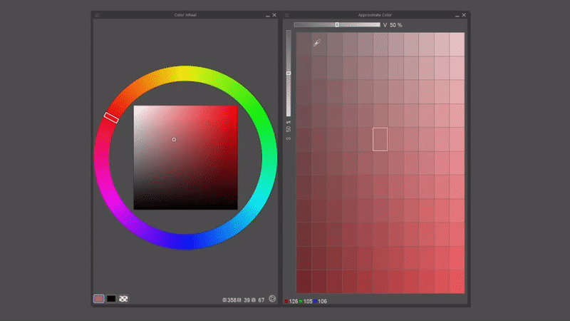
Said in other terms, is like being able to add more pigment to your Carmine red, while still using a Carmine red.
As an example, the sweater of the moth girl was a color between the red and the blu, but it wasn’t dark enough, meaning that the whole value contrast would not be optimal. So I used the [ Approximate color ] palette to darken a little bit the color and let the sweater pop up a little bit more.
Probably you’re thinking right now:
“Wait I can use the color wheel directly”
You’re right, yes you can use the color wheel directly to make those changes. But I’ve found out that the [ Approximate color ] let you be a lot more subtle in your changes, here’s a comparison of how much the color wheel changed between the original color and the approximate color
Probably you can’t even notice it, but still the color gives a complete different feeling. I don’t have the patience for that kind of precision… So, they put this tool? I use it, simple as that.
[ Intermediate color ] or [ Color mixer ] is for the big decisions, while [ Approximate color ] is for refining your choice in case you needed it.
Now just take your trusty [ Fill ] and [ Brush ] sub tool and let’s start applying colors
- Applying the color
If you’ve followed the inking section, applying the flat colors it’s easy as using the [ Fill ] [ Refer to other layers ] sub tool. Just go to the inking section and you will have all the information you need.
For the painterly artist… Just take your trusted brush, select a color and start painting the flat color… Unfortunately there are no shortcuts if you’re a pure painterly artist, at least from my knowledge.
But there is a little trick that can help you, just a little bit of layer management. Here let me show I organized my layers.
It’s a pretty easy set up, I decide a number of “planes”, like I’m stacking transparent acrylic sheet one over the other. After deciding how many I need it, I group the similar ones. At the bottom I put the furthest plane from the “camera” while I put at the top the nearest one.
____________________________
2\. [ Lock transparent pixel ] option. If you want more detailed information here’s the link for the section in which I explain it of my Layer tutorial
By the way [ Lock transparent pixel ] is button 7
The short version is that it will block the transparency of your layer. Meaning that you can’t paint outside what you’ve already painted, but you can still erase. This is great for blocking out shapes like the eyes, that are inside a bigger shape like the face.
_____________________Pro tip:
Technically speaking there is a way to automatize the process of choosing colors > applying colors, by using the [ Colorize (technology preview) ] under the [ Edit menu ]. But there are few caveats:
1\. You need a reference layer, meaning that with a certain degree you need a clean lineart

2\. It will work with only ONE reference layer

3\. Every part that is not fully enclosed in a line will be converted to pure white
It will follow those rules:
1\. If you select a layer with colors inside, it will use those colors as references

2\. If you use the [ Analyze colors and colorize ] option while using the [ Use more advanced settings ] option. It will separate the base colors, and you can choose how each single colors will blur.
The results will be as follow
_________________________Now we have applied all the colors, in a way or another.
Remember, you’ve practically three ways to do it
1\. Using fill tools

2\. Painting them using a brush

3\. Using the [ Colorize ( technology preview) ] option
Giving you an ample range of options on how you can work. Now we are on the last stage of our painting, Shading
SHADING
Do you remember the grayscale we created? Just put it above the folder with your flat colors and set the [ Blending mode ] as Overlay.
__________________
For the remaining 8% you just need to duplicate the [ Gradient map ] layer you created for choosing the mood, hope you didn’t delete it… Put it above the grayscale and turn on the [ Clip to layer below ] setting. You can use the button highlighted in the image
Or you can right click inside the [ Layer ] palette and go to [ Layer setting ] and click on [ Clip to layer below ]. After this just play around with the opacity until you’re satisfied, I went with a 25% opacity.
If this was a comic page, I would call it finished like this.
So I will do the remaining 2%.
Doing so it’s very very easy I just need to create a new layer and push a little bit the shadow and the light. I’ve chosen a light saturated green and our light color for painting those extra details.
I usually do it like this:
• For a light color, in this case the hair and the skin of the moth girl, I use a normal layer and just paint with the chosen colors.
Yes the chosen green is not a dark color, but it’s value it’s darker than the value of the skin and hair, giving you the impression it’s a shadow color
_____________________
Pro tip
For having a nice color for your lips/checks or other red zone of your character. You can create a new layer paint what you need with a darkish red color, now set the [ Blending mode ] to [ Hard light ]. Another way is taking a pure red color, set the [ Blending mode ] to [ Multiply ] and set the opacity at 50%. Use whatever you’re more comfortable with
________________
• For darker colors, like the sweater I use a new layer with a [ Blending mode ] set as Overlay.
Now the illustration is technically done. But we can do some extra steps that will let your illustration pop.
Usually those steps are inside a folder called “ Extra ”. Usually those steps take 5-10 minutes. Those are like layer adjustments, Gradient maps, vignettes etc.
FINAL TOUCHES
Ok very quick rundown of what I put in order inside the “ Extra ” folder, that stays at the top of the layer stack.
• Added a little border at the top of everything, just create a new layer above everything else and start painting, to frame a little bit the whole piece
• Created a two [ Gradient ] layers at the top and the bottom, used a lighter saturated version of the shadow color and set the [ Blending mode ] on [ Multiply ]
This will concentrate the focus in the middle area, and because the face is the higher contrast in value zone, you will usually see that for first.
• Duplicated the [ Gradient map ], the one use for deciding the mood, and set the [ Blending mode ] on [ Soft Light ], This create a nice even light mood. Not essential by any amount, but I like the effect.
Now just at the bottom of all of this in the “ Extra ” folder I like to put a paper texture set on soft light, to give a little bit of crunchiness to it.
Yeah it’s cool… but it could be better, right now the texture doesn’t dialogue with the piece, it feels artificial.
So how can we resolve it? Easy peasy, when you paint or draw the more you paint or draw over a section the less paper it will be visible.
Meaning that you will have more texture inside the middle tones, because you will have less paint/pigment there:
1 - Just right click in the layer palette now the second last one button [ Merge visible to new layer ], will flatten your illustration in a single layer, while keeping all your layer stacks. I will refer to this layer as “ Flattened illustration”
2 - Now we need to create a [ Gradient map ] layer, above the “Flattened illustration ”, that have this order from left to right white>black>white.
The black part will be where the texture will go.
If you want a watercolor feeling the order should be, from left to right, white>black, because to create lights you just don't cover the paper.
We need to select a good range inside the middle tones, that’s why the black it’s in the middle
3\. Now just merge this [ Gradient map ] layer with the “Flattened illustration” layer.
4\. Go in the top menu and click on [ Edit ] , now just click on [ Convert brightness to opacity ] , this will automatically transform everything in white as transparent. I will refer to this newly created layer as “ Middle tone mask ”
Now it’s a matter of choosing your favorite paper texture but it above the resulting “ Middle tone mask ” and activate the [ Clip to layer below option ], and merge your texture with the “ Middle tone mask ” layer. Just set up the [ Blending mode ] as [ Soft light ] and you’re done
I know this feels complicated by a lot, but trust me, I spend more time explaining it than doing it.
Now we have 100% finished our piece, congratulations now you know all you need to know for coloring your piece!
Epilogue
Now you know the full process from:
how to set up your inks, using multiple vector layers and using reference layer.
How to choose a mood using [ Gradient maps ] layer, with a little bit of color theory
How to set up and expand your color palette using the holy trinity of color management in CSP [ Approximate color ], [ Intermediate color ] and [ Color mixing palette ]
How to easily shade a your illustration, starting from a grayscale
And finally how to add some fluff to your piece
>insert image of fluff
Hope you had a good time following this tutorial and that you will use to create a lot of good art!
Shameless advertising
Hi… yeah… ehm… I’m not good with this stuff so...
You can buy the prints of my work, like this illustration, on my website
Plus I sell brushes for Clip Studio Paint, like the one I used, here
Plus I sell shirts here:
So… here’s that… if you want to support me buy something...Bye!!!


コメント