
Video tutorial : click to watch !
Introduction
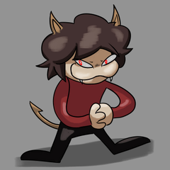
I made this drawing, but it felt unfinished.
So, I made these :
A version for each free background I found on clip studio’s library !
The transition from this, to these would have required adapting each color and value to the background.
And that’s ladies and gentlemen is working hard.
However, I prefer to work smart, and thankfully digital art has many ways to do it.
In this video I’ll show you how I used blending modes to finish my work, and give a single drawing, four different moods.
Quick reminder : Blending modes, what are they ?
As a reminder : Blending modes are an effect you can add to a layer to change how the colors blend with colors on lower layers.
And there are 27 of them on clip studio.
For a better understanding, I divided the explanation into steps:
1st step : Pick the background
First step was to select an appropriate background.
For laziness issues, I wanted to pick one, and not create one.
Then for copyright purposes, I decided to pick in CSP’s library.
So I went to all material => color pattern => background, and picked this one.
2nd step : Pick a matching color
The second step is a crucial one: pick a color that will match the background.
For that, I created a new layer above the background, then I picked a color from the background itself with the eyedropper, and filled the layer with it.
Then, I went to the blending mode options, and chose “multiply”.
The "multiply mode" multiplies and combines the color of the bottom layer and the current layer. After combining, the colors will become darker than the original color.
This blending mode will allow me to adapt the visual of each color and value on my drawing to the background, without having to change any of them.
And that’s the whole purpose.
Using a mask layer, I selected a light source, then erased some part of the color I just added to give a light/shadow effect.
3rd step : Shadows, light, rays of sunshine...add details !
I could have stopped here, the drawing has a background and a matching foreground, but we can still do better.
And that’s how It came to the third step: adding details.
See the light I just created?
I wanted it to pop even more, so I created another layer on top, selected the parts I wanted to accentuate, and picked a slightly lighter color than the previous one.
Fill tool, and there we have it.
Now the magical part : go to the blending mode menu, and select color dodge.
Color dodge makes the color of the bottom layer becomes brighter and reduces the contrast.
Now Reduce the opacity to liking, and watch it glow !
Now it’s glowy…buuut we can still do even better.
On another layer :
Pick the same previous color
Select ‘add glow’ on the blending modes menu
Reduce the opacity to 50, and with a soft brush, cast a soft glow on the character.
On 3 other layers, I chose the ‘glow dodge’ blending mode, picked the flower’s yellow color, and proceeded to add leaves with the leave brush on “decorations”, as well as rays of sunshine with a mix of watercolor brushes, and running color spray.
And with this, the feeling is complete, and my work feels finally finished.
The other 3 versions follow the exact same steps as previously explained. However, as you may have noticed, the result is completely different.
One method, 3 blending modes, and 4 different results.
This is all for this tutorial, thank you so much for watching/ and or reading.
If you have any question, drop it in the comments below, and I’ll make sure to reply as soon as possible.
Thanks again, and see you soon 😊
この投稿を「いいね!」したユーザー


コメント