◆TIP: Personalizing ASSETS Favorite Brushes◆
Hi, everyone! I hope you're doing well!
Today I'd like to introduce two of my favourite brushes from the endless ASSESTS and we'll tackle the magical "Effect Brush" that makes every drawing glow with fun little details!(*´ω`)
So without further ado, let's start!☆(=゚ω゚)ノ
INTRODUCTION: What Is ASSETS?
I believe most readers will be at least somewhat familiar with CLIP STUDIO's ASSETS catalog.
But for those who might not know, let me briefly explain the wonders you're about to find out! (゚Д゚)ノ
The ASSETS catalog is an accumulation of Brushes made by other Artists unique to CLIP STUDIO. While there are Brushes, you can purchase via CLIP STUDIO's Gold Function, there are millions of free brushes that should completely suffice!☆
In fact, the selection is so big that you might end up spending over 6 hours selecting brushes (;・∀・)
So, I highly recommend to focus on a few brushes to fully explore how you might use them!
Though these are already adjusted brushes by other artists, you might like to change some settings and make it fit your drawing style!
(´・ω・)人(´・ω・`)
STEP 1◆ LINEART
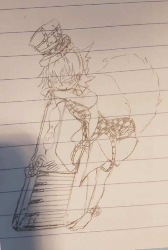
For my character Karo, I first made a simple paper sketch and used that as a base reference.
Traditional Artists, who just started with digital art, might find this to be a nice way to get used to graphic tablets and keep their drawing style as close as possible to the original.
TOOL: G-Pen(1.0)
I've already made a Tutorial on how I do my Lineart, so if you're interested please feel free to take a look at it~
STEP 2◆ BASE COLOUR
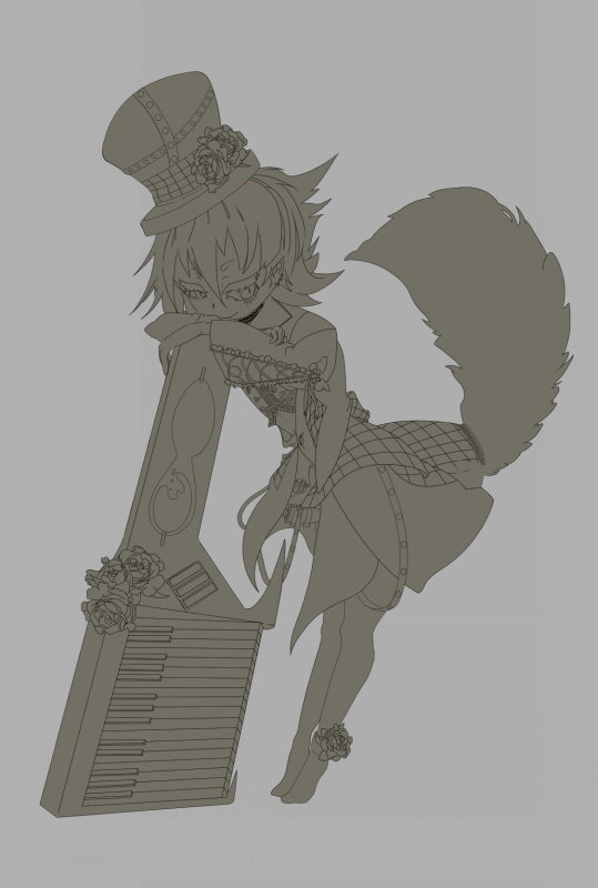
Before we start colouring our lineart right away, I recommend filling the image in with a base colour and keep each filling divided. You should use a darker colour for this, as it will decrease the chances of missing spots (・ω・)ノ □→■
(Note: Breaking our base colour down to different layers like eyes, skin, hair, clothes, is quite useful during the later colouring process and it will make it easier to correct errors later on)
STEP 3◆ PICKING OUT COLOURS&MOOD BOARD
Sometimes great lineart may look cheap, when the colouring is off.
With that in mind, I recommend you gather pictures/images with a similair colour palette as you have in mind. Gather photos that fit the colour palette and the atmosphere you're aiming to create.
Creating such a "Mood Board" might not only give you new ideas, but it will also motivate you, during the drawing process! (/・ω・)/☆
To make Coloring more convenient,
◆ Create a "New Palette" to insert the colours in, you'll be using.
◆ After you created and named your new Palette,
Swiftly insert the colours by using the pipette as shown
(Note: There also pre-made colour palettes you can download from ASSETS, such as "Skin Palette". This might be especially helpful for those, who struggle with colour theory)
With this we will have our colours ready and are good to go!
STEP 4◆ COLOURING With ASSETS BRUSH (Favourite Brush)
Before I present my favourite brushes, here's a quick explanation on how to add the downloaded brushes to your existing sets.
◆ Click on the "Import" symbol above your brush settings.
A pop-up window like this will appear.
Here all of your downloaded brushes and material can be found.
If you went wild downloading too many brushes and can't remember what they looked like, simply click on the small window above the brush images and it will open up the article you downloaded it from.
Finally, let us get to my current favourite brushes!(´▽`)
I mainly used two types of brushes for the colouring.
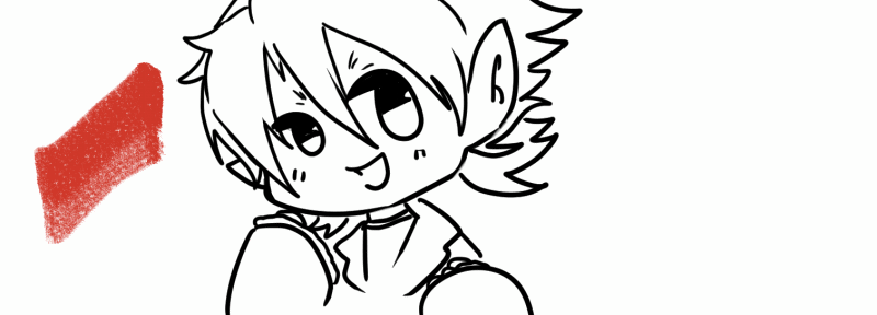
----------------------------------------------------------------------------------------------------------I've fallen in love with the texture of this brush and found myself using it quite a lot lately.
I will first insert some colour with this brush[...]
----------------------------------------------------------------------------------------------------------[...]And then with these watercolour-based brushes, I'll simply soften&blend the colours to give a more consistent appearance.
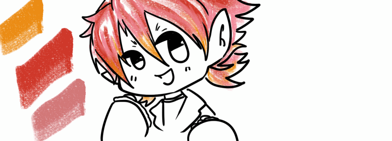
This is why I highly recommend limiting yourself to 2 or 3 brushes for practice, that way you might discover a new fun way to colour!
◆ Using this soft colouring as a base I just go over the more protruding edges and
sharpen them with the classical G-Pen
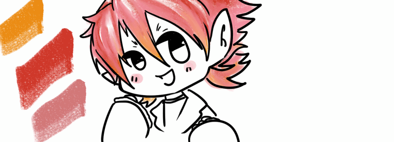
Using this technique I coloured the whole image and adjusted shining parts with the usual "Glow" Layer, Airbrush and G-Pen, until it was completed.
This is how the finished drawing looks like!
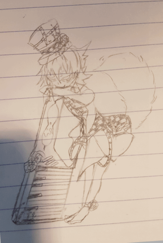
However there's still two more tips I'd like to share with you.
So if you're interested, grab a cup of tea and keep reading!
STEP5◆ BACKGROUND (USING ASSETS BRUSHES)
For those of us, who may still struggle with drawing backgrounds, experiment with different tools and brushes with different textures to find out, what works and what doesn't.
Even if a brush isn't titled "metal brush" for example, if you feel like the texture might be fitting, try it out.
It will take time to get a hang on what brushes work for what, but it will ease your workload tremendously.
For the background of this drawing I used two different brushes for the metallic grave and the snow.
For the metal-surface I used a stylized blend brush and textured brush from ASSETS.
For the Snow I used a brush, which was actually made for a "Diamond" appearance.
(Note: You can adjust the spread in the brush settings like this)
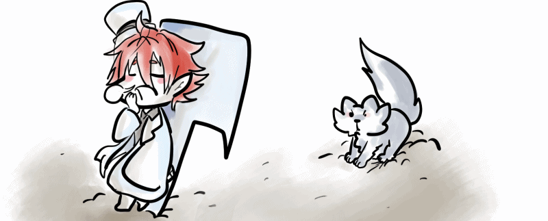
For the red gleam, I used an airbrush and the Diamond Brush combined with a "Light" Effect Brush.
◆Layer settings: Added Glow

ASSETS may seem overwhelming with its variety of tools&material.
But using different brushes will enable you to experiment and create even more atmospheric and great drawings, so I'd highly recommend slowly trying out all sorts of brushes until you find the ones that perfectly fit your style.
BONUS TIP◆ ASSESTS BRUSH AS REFERENCE
The last tip I have prepared for you is, to use Effect Brushes from ASSESTS as references in your drawings.
You might be drawing a storybook or just wish to add more detail to your drawing.
However, just using the ASSESTS brush might not actually fit your drawing, so instead we can use various Effect Brushes as guidelines.
◆Decrease Opacity of the Effect Brush
◆Create another layer and use the lines of the Effect Brush as guidelines
(Note: Adjust accordingly to personalize these items to your drawing)
Your goal is not to copy it 1:1. You want to just use its overall shape and then add or decrease detail, while keeping perspective and sytle in consideration
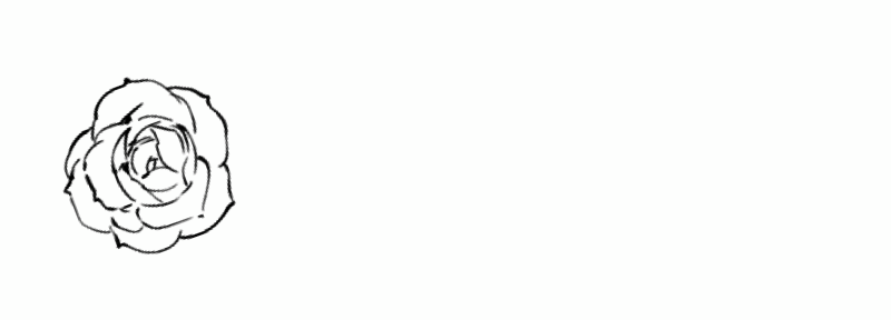
I hope that this little tip can help you out the next time you might
be stuck on details!( ´∀`)ノ
END◆ Thank you!
Thank you everyone, who made it to the end.
I hope that these tips and the introduction of ASSESTS will be of use to you (うω・`)
I'm still a beginner myself, so let's get better together!
If you're interested in future drawings you can find me on Twitter and Youtube☆
Until then, have a pleasant day and drink some delicious tea while practicing your art☆


댓글