Constellation Motifs In Clip Studio
Introduction
Hi, I’m Siobhan (Shove Off Siobhan on social media). In this tips tutorial I’ll show you how to include constellations and zodiac motifs in your art. I’ll explain what constellations, zodiacs, and horoscopes are. Then I’ll show you how to draw constellations and stars, and use them to make starry night skies in Clip Studio Paint. And finally, I’ll show my process for how I made my own illustration.
Video Version
Constellations
What are Constellations?
Constellations are groups of visible stars that make a sort of pattern, and make up star charts. Humans have used them in religion/myth and are still used today to study zodiac signs and horoscopes.
What is the Zodiac?
The zodiac is a belt-shaped area that is the visually apparent path of the sun across the celestial sphere (sky) throughout a year. The zodiac is made up of 12 signs that are also constellations. They were created by the Babylonians around 1000 BC, and thought to be some of the oldest known constellations. Because the Earth’s axis is at an angle, these signs appear at different times of the year in the northern and southern hemispheres. The twelve zodiac constellations include: Aries, Taurus, Gemini, Cancer, Leo, Virgo, Libra, Scorpio, Sagittarius, Capricorn, Aquarius, and Picses.
Horoscopes are maps of planets and the zodiac signs. They are used to interpret personality traits and relationship compatibility based on birthdate.
How To Draw Stars And Constellations
1. Drawing constellations is actually really simple and fast to do. Either with your own custom design, or images of star maps from online, lower the opacity of the design.
2. (Step 2 is actually optional; you can either follow this step, or go ahead to step 3.) On a new vector layer above, use the polygon or straight line tool to draw out the constellations, matching up your corners to that of the design. I like to use vector layers for this because it makes it easier to resize, or change line weight later if needed.
3. On another new vector layer, use the circle shape tool and add points where the lines meet. Either make them all the same size or add size variation. Resize your constellation drawing if needed, or start coloring in the circles.
For the stars, you can either draw them in yourself with the circle shape tool or use special shaped brush assets like these:
4. On a third new layer, fill in with the same color as your lines with either a brush, the bucket tool, or this neat fill tool:
Set whatever outline you are wanting to fill as your reference layer, and then set the fill tool to Refer Multiple > Reference Layer.
5. Now you can hide the sketch or image reference layers, and you’ll have a constellation drawing ready to use.
How to Make Stars Glow
1. Remember to make your stars/constellations very light colors, or even white, on top of a darker background color for this to work.
2. Duplicate your stars and constellations layer. Change the blend mode of the duplicated layer to one of the following modes: Glow Dodge, Add Glow, Add, Overlay, Hard Light, Soft Light, or Screen. Personally, I like Glow Dodge and Add Glow most for bright, glowing effects, and Overlay for soft lighting and color adjustment.
3. Then, while on this new duplicated layer, go to Filter > Blur > Gaussian Blur. Turn on preview and adjust settings for desired effect.
4. Then lower the opacity for your star layers as needed.

Try experimenting with different brushes and layer blend modes. The following brushes can be used to fill in empty space with further away and smaller stars:
My Illustration Process
1. Sketch Composition
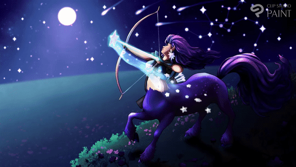
Since I wanted to illustrate Sagittarius, my zodiac sign, I wanted to use some themes and motifs for that zodiac. About Sagittarius:
In Greek mythology, Sagittarius is associated with the centaur, (a half man, half horse), Chiron. Chiron was a character who was raised by the god Apollo, and known for healing, prophecy, hunting/archery, kindness, and intelligence.
The sign’s main element is fire which means energy, action and motivation.
It is also associated with the color purple, for cleverness and creativity.
Sagittarius is associated with carnation flowers.
People who are Sagittarius are said to be outspoken, fair, honest, optimistic, ambitious, and curious.
Using these motifs for Sagittarius, I began sketching my idea. I wanted to include a female centaur, (or centauride/centauress) rather than a male like the usual design for that zodiac. I wanted to have a nature type of environment, to represent hunting and animals, as well as to add focus to the night sky. I decided the environment would be a meadow and hills, to have the sky stand out more. The sky ended up taking up almost half of the composition. I planned to include flowers, specifically carnations as a motif for the zodiac sign. I wanted the artwork to take place at night to show stars and a meteor shower for a more fantastical effect. To further that, I planned to make the centaur have a magical look with stars and fire-like light coming from their bow and arrow. I drew thumbnail sketches of how I wanted my composition to look, until I found one I liked, then added it to a large canvas with 16 x 9 dimensions. Then I resized and moved the sketch to fit the canvas. For sketching and lines, I used this pencil brush:
2. 3D Models
After I figured out a rough idea for my art, I started using 3D models to help me with the posing, lighting, and camera angle. I used the below models for this work:
Using the Object Select tool, I edited the 3D models into the position and poses I wanted. I added extra camera views to help do that, so I could pose the character how I wanted to be viewed in one, and edit the placement of the models in other cameras without messing up the one I would use for drawing.
I made sure I kept my 3D models on the same layer so they would be affected by the same light sources, perspective, and camera.
Especially since I combined a normal drawing figure model and a model of a horse. I needed to move these until they intersected and were accurate sizing in relation to each other. When done, I moved the female model’s legs out of view, into the horse’s model, and moved the horse’s head and neck until they were hidden.
For the female model’s pose, I used a downloadable pose and dragged it onto the model.
I added some star models to show magic coming from the arrow, as well as for the character’s earrings and to replace the arrow tip.
For the face, I used one of the preset head models, these are located in Window > Material > Material: Head. There are multiple presets you can use, with editable facial features. I posed the model over the original 3D model’s body, and resized it to fit. This is an optional, but helpful step.
3. Value Range And Light Source
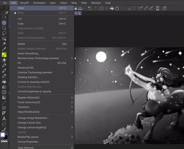
I lowered the opacity of the layer with the 3D models, and placed it below my original sketch layer, which I also lowered the opacity of. In a new layer, between the sketch layer and the 3D model layers, I used black and white to sketch in shadows and light. I made the centaur character and the hill she is on the darkest, as they are closest to the viewer. The hills and sky get lighter the further into the background it is. The brightest objects would be her bow/arrow, the moon, and the stars and constellations.
4. Draw Details and Lines
Then I hid the layer with the greyscale sketch. I lower the opacity of both the sketch layer and 3D layer.
On new vector layers above everything else, I started drawing in my lines. Drawing in vector layers helps with editing lines later like changing line weight or erasing intersecting lines easily.
5. Color Fill
I hid the sketch and 3D layers. Then lowered the opacity of the grayscale sketch, and in new layers between the lines and the grayscale, I made color fills using variations of gray. I kept each objects/area’s color in separate layers. These will be my layer masks for later. Again, Here is the asset I used to fill in each area:
6. Render
On new layers clipped to each area’s fill layer, I started rendering using gray, black, and white. I used my grayscale sketch as reference for this. The 3D models and sketch layers were hidden at this point.
For overlapping areas and edges, I used new layers that were not clipped to the grayscale layer masks. I used the eyedropper tool a lot to pick colors in order to draw those areas.
Currently my favorite brush for rendering is this one:
For lines I raise opacity and hardness level and reduce brush size. For coloring, it depends on what area I’m working in. Either I have it with high opacity and medium hardness for most coloring, or I lower hardness all the way as well as opacity for blending.
I also keep the mixing mode as Perceptual in the brush’s sub tool settings.
For the foliage, grass, and flowers, I used the following brushes:
7. Tonal Correction Gradient Maps
For this step, I used Tonal Correction Gradient Maps to help color my artwork.

This effect can be found at Edit > Tonal Correction > Gradient Map. This adds color according to value.
First I duplicated my grayscale layers, and hid them. This is so I could edit them later if needed. Then on each layer, I used tonal correction to add color. The colors can be moved and changed depending on each area. For example, I wanted my grass to be more blue, so I edited the greens in that gradient map. This is a really fast and easy way to edit or add color to an artwork.
In addition to the default gradient maps included in Clip Studio, I used the below assets:
8. Paint Over
On new layers above everything else, I began painting over various areas to fix edges or to adjust color. I used hard brushes to add in lost details and clean up edges, and soft brushes to adjust color.
Conclusion
Thank you for looking at my tutorial! I hope it was helpful and successfully explained how to use constellations in your art when using Clip Studio Paint. Below is a link to my Twitter in case you want to see more of my work:

Clip Studio Assets
Below are links to all the assets I used for this tutorial:


댓글