Concept Art Illustration with Asset Materials
Concept Arts are quite intimidating if you think about it.
You’ll have to conceptualize — bring forth those ideas.
I’ll show you how I made this illustration:
with the help of Clip Studio Assets Library!
You can finish it in 30 minutes!
I used Clip Studio Paint PRO, you can use whatever version that you have.
Let’s start!
Regarding the usage of assets on concept arts...
I don’t have that much experience, though I have worked briefly in an animation and VFX studio — and I was in-charge of the rendering, textures and UV mapping. I make the textures though sometimes we can buy online as long as the pattern / material’s TOS properly states that it’s okay for commercial work.
⭐ If you plan on buying/using assets, make sure that they are okay with commercial works.
⭐Please do not be discourage, studios use assets! It’s just a good selling point if you can make your own. Studios buy & use assets/materials too, please don’t be discourage!
Also, based on Clip Studio’s FAQ:
And on Clip Studio Assets TOS:
I think it is safe to say that when you post a material on Clip Studio Assets, you allow commercial use.
Which is great~!
=============
From here on out is just a sample of what you could do with pre-made assets or even assets that you will make in the future — I hope this gives you an idea!
Concept Art
First thing’s first, what is concept art?
- Concept Art is a form of visual art where we design an idea. We are conceptualizing, visualizing our ideas that fits on the theme that we’re aiming for.
Let’s think about VIDEO GAME themes.
• Call of Duty games = military themed—so make characters in military clothes
• Overwatch = futuristic themed—characters are in futuristic clothes
• Alice Madness Returns = fantasy horror—characters looks scary
YOU NEED TO DEFINE THAT ‘SOMETHING’
On this illustration, my concept revolves around this box brownies that I bought:
NOTE: I took this image. This image is mine ;u; )//
This isn’t a stock photo.
I want to make a character that matches these brownies!
The keywords that I have in mind were cute and sweet.
So I tried to make a character that looks cute and sweet
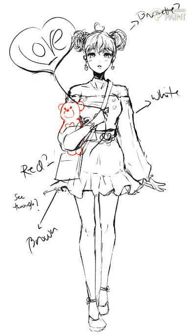
Overall, I ended up with 12 sketches:
I went with my last design
• HAIR = double hair buns, that came from the bear candy
• ROSES = from the icing
• EARRINGS= from the icing
• BLOUSE PATTERN= from the icing
• SKIRT= from the wrapper/baking paper
• BAG= I made it square to match the box
• BALLOON= turned the LOVE candy into a balloon
> Picking colors
A little trick on picking colors
With your image reference opened, go to [Filter] > [Effect] > [Mosaic]
And just move the slider.
MOSAIC effect divides the image into squares; creating a pixelated effect
The slider itself is called Tile Size; so the lower the value, the smaller the squares are.
Higher value creates larger squares
Just click OK when you’re done!
And now you have your color palette to choose from.
You don’t have to use all of the colors, but it just makes your life easier on picking colors from a reference image.
> Downloading Assets
You can access the Assets Library from your browser:
or by opening the Clip Studio App
Be sure not to get it confused with the Clip Studio PAINT app
LEFT is Clip Studio Paint — where we draw and animate
RIGHT is Clip Studio — where we can access our account, assets, tips, & asks
To download an asset, let’s say from the browser.
Select the asset that you want to download > Click DOWNLOAD > it will then ask you to open the Clip Studio app > and click Open CLIP STUDIO
⭐You have to click the OPEN CLIP STUDIO or the asset won’t be downloaded to your Clip Studio Paint
*The asset I’m downloading here is for example only and won’t appear on the illustration example here.
After that, the Clip Studio app will open.
If you want to see the downloading status, click the settings icon > Data Transfers
Your download is complete!
You can check them in the Manage Materials
A good practice is to put them on a specific folder to keep your assets and library organized.
Rename them if you want, but it’s much better if you keep the Content ID number at the end.
> Placing Textures / Patterns
Let’s add some patterns on our drawing, mainly — some patterns on her blouse.
Make sure you already have the drawing opened > click on the side panel and expand the Materials Tab > Go to DOWNLOAD > look for your material.
If you can’t find your Materials Panel; Go to [Window] > [Material] > [Material: Download]
For this example, I will be using this pattern right here:
Choose your material > Click and Drag it to the drawing.
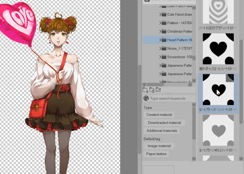
You can resize it on the Tool Property.
Make sure you’re on [Operation] > go to the [Tool Property] > adjust the Scale ratio
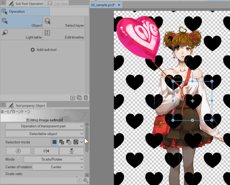
Or you can adjust the material using the Transformation points on the screen
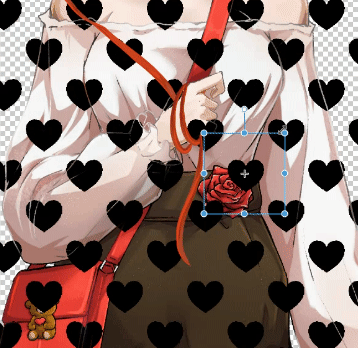
Also, remember to place your textures/patterns on the right layer order.
I prefer placing my patterns under the shadows and highlights.
Click on CLIP TO LAYER BELOW so that’s it’s clipped to the main color layer
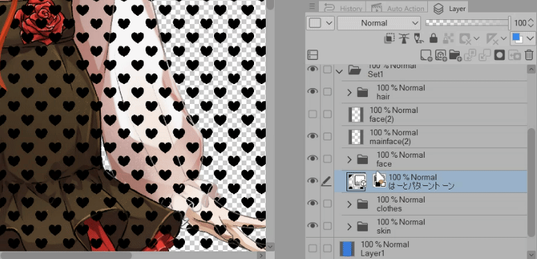
When you’re done, it should look like this:
We have place our material on the drawing, next let’s edit it to match the drawing.
> Editing a pattern (Liquify)
Now let’s edit this pattern so that it doesn’t look like it’s just floating there.
1. Right click the pattern layer > Rasterize
This will make it workable, so we can edit the pattern.
2. Right click the pattern layer again > Convert Layer > change the Expression color to COLOR
This will allow us to color the patterns
Change the name if you want.
Click OK when you’re done.
Now let’s edit the pattern.
Grab your LIQUIFY tool > change the mode to whatever you see like > and just adjust your pattern
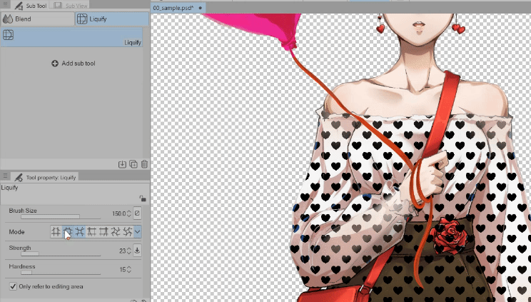
Remember that this is a pattern for the clothes, the body isn’t flat!
There are some areas that are bulky, some are stretched, some are squished.
Edit the patterns to get that effect and using liquify makes it easier.
Usually on the puffy sleeves and breast area I use EXPAND
On the area where it’s tucked in and in between the breast I use PINCH
On the upper arms I go back and forth with the PUSH LEFT and PUSH RIGHT
Then for a cute effect, because the patterns are very straight I use the TWIRL to make it look random.
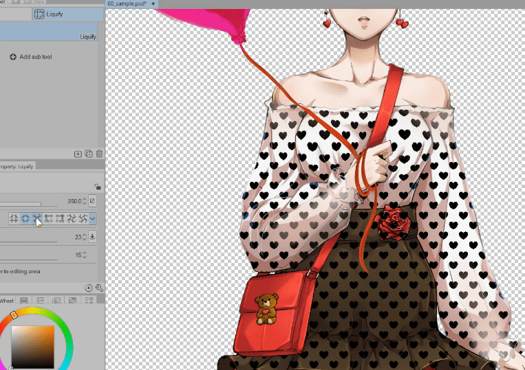
Next!
Let’s mask this pattern real quick so that only the blouse gets the pattern.
This is what our FLAT COLOR layer looks like:
ALL of the Clothes colors are in ONE LAYER so using Clip to layer below affects the other colors.
We need to only have the blouse getting affected with the pattern so let’s mask that area.
Get your [Auto select] > [Refer to editing layer only]
Make sure your on your FLAT COLOR layer!
Make sure your Area scaling on Auto select is at 0 (zero)
And make sure you’re on the FLAT COLOR layer — just select the BLOUSE > then click on the HEART Pattern layer and then click on Create Layer Mask
This will isolate pattern from all the other areas and will only affect the area that we selected.
> Coloring the pattern
This is optional.
If you want to give your patterns a customized look.
Select your pattern layer > click on Lock Transparent Pixels
It should get an icon like that (on the right image); that’s when you now that the layer has locked transparent pixels.
Now get your brush or even your Gradient Tool and just color your pattern.
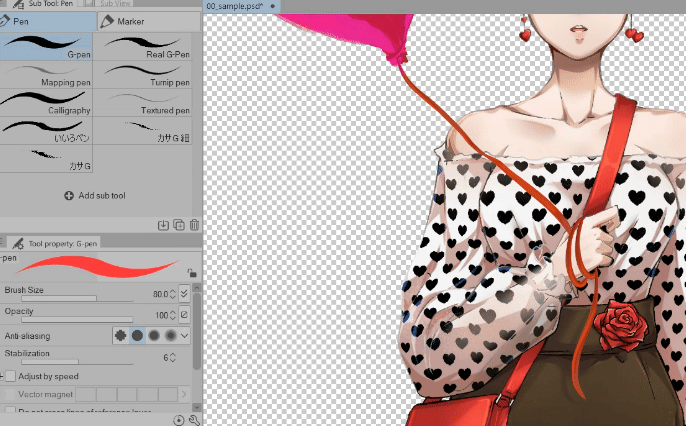
If you wanna use the Gradient Tool, you can as well
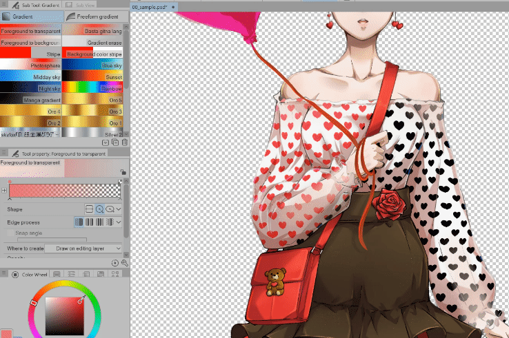
And when you’re done, it looks like this:
> Adding more elements (brush)
Remember on the rough sketch, there’s a balloon
I got lucky and I found a brush in the assets library
It fits on the theme that I’m aiming for and it’s free too!
First, let’s add this brushes as a sub tool.
Open your Materials side panel > If you don’t want to look for the brushes manually, just search on the search bar ‘BALLOON’
Click and Drag the brushes from the materials panel to the brushes panel
Brushes needed to be placed as a sub tool so you can use it.
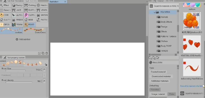
Now we can use this brushes!
Do the same with [balloon string] brush — we’ll use it later.
* >Organizing your brushes
This is just a short topic, but if you want to organize your brushes.
Look at this below:
The BALLOON brushes are inside the FOOD folder — and they’re not food!!
Let’s make a separate folder for them.
Click and drag the brush to an empty area on the panel bar > it will automatically make a folder for it.
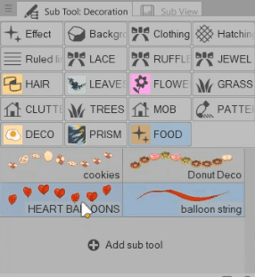
If you want to change the name of the folder; RIGHT CLICK > Sub tool group settings
and Rename it to whatever that you want.
Okay!
Let’s go back with using the brushes!
Now let’s use the brushes.
The Balloon brushes are pretty straight forward.
You can just click and drag them if you want.
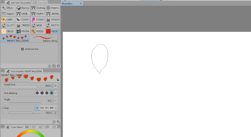
Or you can resize/ change the brush size using your [ and ] buttons on your keyboard
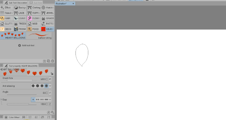
The string brush is handy as well.
We don’t have to worry about making our own
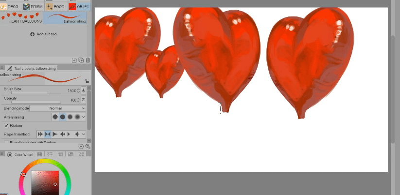
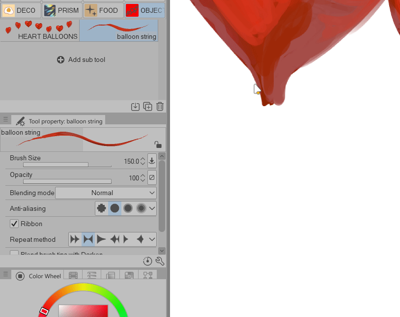
A small trick if on making the string of the balloon.
Make like an X using the string brush
and for the dangling string > change the Blending mode of the brush to BACKGROUND
Changing the Blending mode of the brush to BACKGROUND makes it so that the dangling string that we will make will be behind the balloon
*only do this if you’re working on a SAME / SINGLE layer.
And now I’m done with the character
I just made the balloon pink and added the LOVE logo on it.
Let’s work next on the background!
Concept Art - Illustration
The idea that I have for this image is I want to make it look like those illustrations on mobile games, like when you get a side story or quest — you suddenly get a really detailed illustration of a scene.
Make some drafts of some scenes you have in mind.
My idea was the guy left or she got stood up
I’m going to use the top left draft for this example.
> Setting up
Let’s start.
Open your Clip Studio Paint > Click on [File] > [New…] or CTRL N
I’m using these as my settings, it’s a preset, I’m fine with it since this is just an example and for web only.
If you’re doing for print, go 150-300 on the resolution
Click OK when you’re done.
> Import your character
Now let’s import our character.
Go to [File] > [Import] > [Create file object]
Now select your file.
I’m not going to use a JPG or PNG file, I will be using a .CLIP file
Using a .Clip file as my file object will allow me to edit easier in the future.
Click OPEN when you’ve selected your file.
When you’ve imported your file, you will get this text box — basically informing us that we are have imported a file object.
WHY I IMPORTED AS FILE OBJECT:
⭐ When you edit the character .Clip file — it will automatically register on the illustration file once you saved.
I will make an example later on.
Next I will just adjust the character, using the [Operation] tool > under [Object]
I increased the scale a bit and rotated it at -7
Next, let’s make a sky.
> Sky
Make a new raster layer [CTRL Shift N] under the Character layer > rename that as SKY
Go to your Gradient Tool > I’m using Blue Sky which is a preset from Clip Studio
And just click and drag
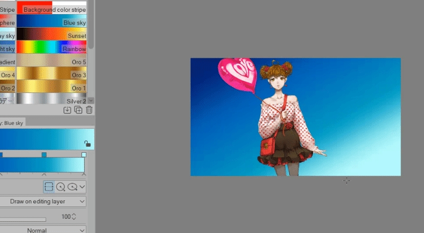
Now we have our sky!
> Trees
Let’s add some trees!
I will be using these brushes for my trees:
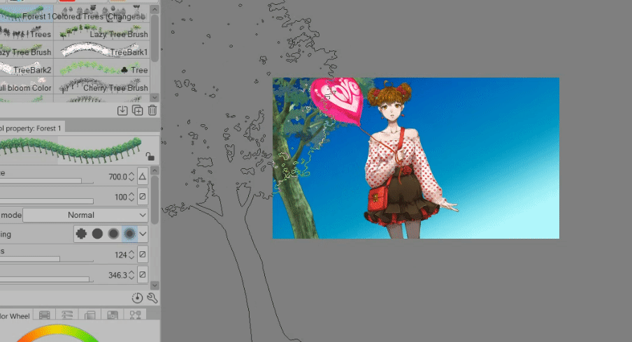
Make a new raster layer [CTRL Shift N] > make sure it’s in-between Sky and Character > rename that as TREE1
Because we will be making a lot.
If you just use the tree brushes as it is it will look like this:
It doesn’t look quite right because our character is on an angle, so let’s also change the angle of this brush.
On the [Tool Property] > change the angle to around 346
So now when we use the trees, they’re also tilted.
For TREE1 layer — I’m gonna make the (almost) foreground trees, the trees closest to the character = so make our brush bigger.
Okay! Next batch of trees.
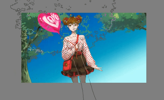
Make a new raster layer [CTRL Shift N] > Make sure it’s under TREE1
Rename that new layer as TREE2
Now make medium sized trees.
It doesn’t have to be many.
Last batch of trees!
Make a new Raster Layer [CTRL Shift N] > Make sure it’s under TREE2
Rename that new layer as TREE3
Now you can make strokes of trees in here since we need a lot to cover up the lower portion of the sky.
⭐Change the Blending mode of the brush to BACKGROUND.
It will make things easier if you left a bald/empty area.
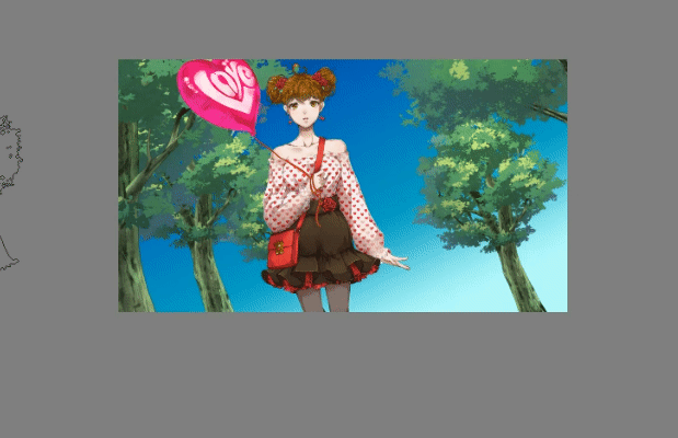
Final image looks like this:
Looks good!
Let’s blur them a bit so that our main focus is our character.
While TREE3 is still selected > Go to [Filter] > [Blur] > [Gaussian Blur]
Increase the strength to 45
Click OK when you’re done
Now let’s do the same with TREE2
Make sure TREE2 is selected > Go to [Filter] > [Blur] > [Gaussian Blur]
Increase the strength to 25
Click OK when you’re done.
Last is TREE1
Make sure TREE1 is selected > Go to [Filter] > [Blur] > [Gaussian Blur]
Increase the strength to 15
Click OK when you’re done.
We can edit the colors as well.
This tree brush came colored but unfortunately, this isn’t the shade of green that I wanted so I’m going to change that.
With TREE3 selected > go to [Edit] > [Tonal Correction] > [Tone Curves]
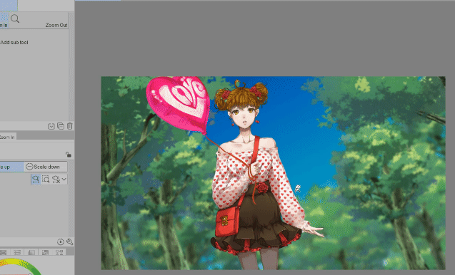
I adjust the colors based on what I need.
A darker shadow and midtones and a lighter highlights.
Edit the tones of TREE2 and TREE1 as well.
And this is what we ended up with after editing the tones of the trees
> Clouds
Let’s make some clouds
Make a new raster layer [CTRL Shift N] > Make sure it’s under TREE3 or make sure it’s above the SKY layer.
Rename that as CLOUD
I will be using this brush:
It’s very straight forward, just point and click on the area and you have your clouds.
If you can’t seem to get the size that you want, just hit CTRL T to transform your Clouds manually using the transformation points.
Scale and rotate it if you want.
The shade of blue on the clouds is too strong for me, let’s edit that.
Go to [Edit] > [Tonal Correction] > Hue/Saturation/Luminosity or CTRL U
I lowered the Saturation and increased the Luminosity
Then I just blur the clouds.
You can use any Blur brush that you want or just use Gaussian Blur
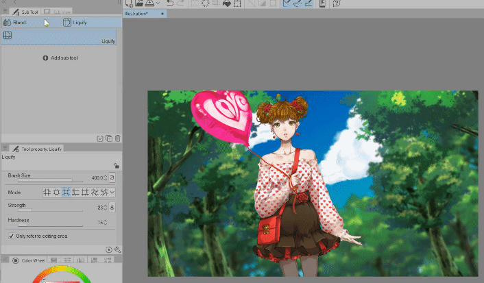
And we’re done with the clouds!
> Mob / Background Characters
Let’s do some add some mob character; these are the background characters.
Make a new raster layer [CTRL Shift N] > Make sure it’s directly under the Character layer
Rename that as MOB BG
I will be using this mob brush:
Do the same angle rotation that we did with the Trees.
This way, the mob are tilted.
Add as many background characters that you want, this is what I ended up with:
Next I blur the mob.
I will be using a brush here so I can control it and do the blurring manually.
I will be using this brush:
and just blur the background characters
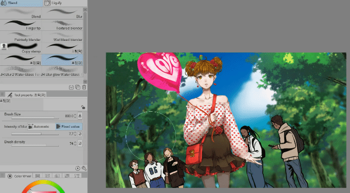
This is our before and after:
Next, let’s add the ‘running dude’ based on the draft that I made.
This will be our foreground mob
I will be using this mob for this one:
Open your materials panel > look for the material.
Click and drag to the canvas.
I’m using the image material that’s included in the brush set.
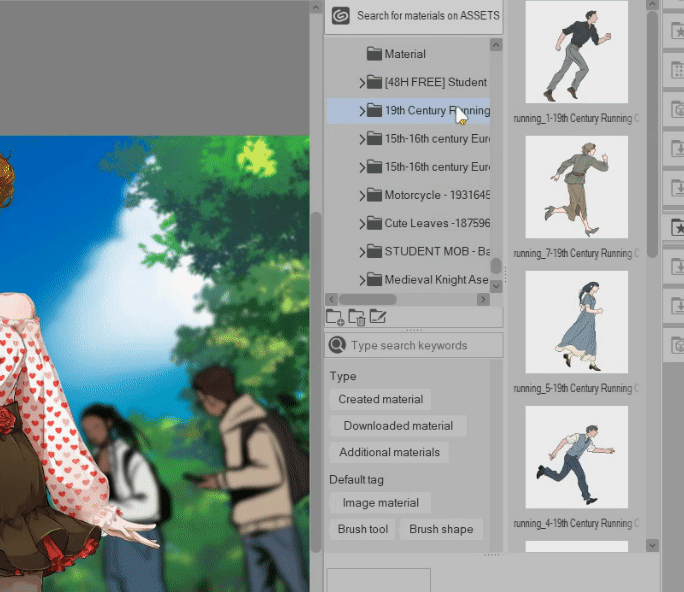
Make sure this running guy layer is above the character layer
He’s a foreground mob! Put him above!!
With the image material (the running guy) still selected > hit CTRL T to transform the image.
Scale it up, make him big.
He’s a foreground character! Make him big!
Also put him almost outside of the canvas, because our scene is that he’s running away.
If you feel like you’re lagging after you increase the size of the image material.
⭐ CTRL A (to select all) > then CTRL C (to copy) > then CTRL V (to paste on a new layer)
—- basically, we copied what’s currently on screen (the guy’s arm and hip) and pasted it (just the arm and hip of the guy) — so we removed all the other elements of that image material.
—- the excess image that’s outside of the canvas can make our file heavy and lagging.
Now our image looks like this:
Let’s blur him so that our main focus is the character.
With the running guy layer still selected > Go to [Filter] > [Blur] > [Gaussian Blur]
Set the strength to 100
Click OK when you’re done.
> Updating the file object (character file)
Let’s say, midway - we need to update the character.
So let’s do that.
Right click the character layer > File Object > Open file of file object
The character .clip file will then open up.
You can put them side by side so you can see the update happening.
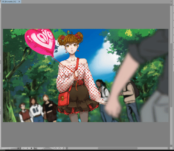
For example, let’s make the balloon red.
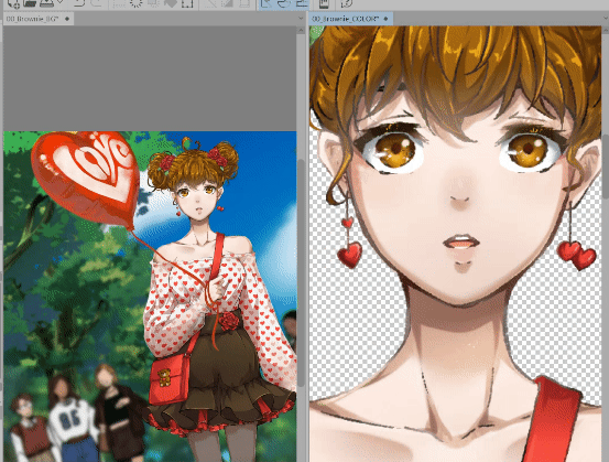
If I make it red on the character .clip file > after you save that file (character file) > any update will be reflected automatically on the illustration file
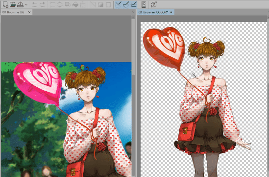
I edited the face as well
I also updated the pattern of the blouse using this brush:
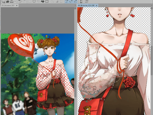
I edited the colors of the flower pattern using Hue/Saturation/Luminosity or CTRL U
Lower the Luminosity and Increase the Saturation
And this is our BEFORE and AFTER
> Color correct + tone editing
After that I just did some color corrects.
Also, let’s go back to the running guy layer, select that layer > Go to [Edit] > [Tonal Correction] > [Tone Curve]
Make him darker
Do some color corrects that you see that will fit the illustrations.
⭐SMALL TIP: Foreground is darker value | Middle ground is medium/normal values | Background is lighter value.
After some color adjustments, I ended up with this:
The buildings at the back is from here:
The sun light / prism is from here:
The timelapse is here if you want to see:
Overall, this took 30 mins to make
That’s it!
We managed to make a full background illustration with just using Assets!
And in 30 minutes as well! It made things easier.
I hope this gives you an idea on how to use the materials that we can get in the Asset Library.
Some assets are paid, yes.
But they are really good investment!
I hope you can try it out yourself!


留言