
Introduction
This Tip guide will walk you through the process of installing downloaded Gradient Map sets; how to create and manage your own Gradient Maps; how to create quick dynamic shading and lighting; how to use Gradient Maps to change/fix previous colour choices; and how to use Gradient Maps for overall tonal correction.
There is also a video portion walking through specifically the steps of installing Gradient Sets from the Asset Store!
Part 1: Installing a Gradient Map from the Asset Store
Video Version of How to Import Gradient Maps/Sets from the Asset Store
Text Guide:
After downloading your gradient map/set of choice, open the [Edit Gradient] menu. This can be found in a few ways:
Method 1: The [Advanced Settings] button in the Gradient Tool Property Window.
Method 2: In the top toolbar by going to [Edit], [Tonal Correction], then [Gradient Map].
Method 3: Adding a [New Correction Layer], then selecting [Gradient Map] (Non permanent, can be toggled on and off)
Next to the gradient drop-down, click on the Spanner Icon, this will bring up a menu with the options “Add Gradient Set”.
Clicking on “Add Gradient Set” will bring up any Gradient Maps you’ve downloaded and allow you to add them to your list of Gradient Sets.
Tip! Using the "Command Bar", you can add the “Gradient Map” option to your toolbar for quick access. This can be accessed by going to [File] > [Command Bar Settings], then expand the "Edit" section, expanding "Tonal Correction", and selecting "Gradient Map".
Part 2: Creating your own Gradient Map
Gradient Maps work by exchanging a colour’s value; with the left-most side mapping to the darker values, and the right-most side mapping to the lighter values. The individual “colour points” on a Gradient Maps scale are known as “nodes”.
To begin creating your own Gradient Map, open the [Gradient Map] menu and select the second-to-last button on the lower button bar.
Note! Gradient Maps can be used with black and white, monochrome, and already full colour images as they map based on values.
Gradient Maps allow you much more control and precision than using methods such as hue adjustment, as the “gradient” part makes them far more dynamic. Rather than shifting the percentage of every colour/value in an image by a particular amount, it allows you to shift each value to a set colour, often resulting in a much more natural and “on purpose” look, and combining this with layer settings can be a fantastic way to increase the atmosphere of your artwork, give you more intense colours, or help in adjusting colours later on in the process of creating a finished piece.
To add a new node onto the Colour Bar, click on roughly where you'd like the node to be placed - it's position can also be adjusted later by clicking and dragging.
You can also utilise the “Mixing Rate Curve” option which will allow you to more precisely adjust how the Gradient Map interacts with the values of your image from node to node. You can add up to 16 points on the Mixing Rate Curve (to remove one, simply click and drag it out of the box). The horizontal axis correlates to the position of the node, whereas the vertical axis affects the colour mixing ratio.
Part 3: Creating Dramatic Shading with Gradient Maps
After completing this illustration, let's say we want to give it a more dramatic feel.
We will start by flattening the image (except for the background/backing colour), and use the [Lasso Tool] or [Selection Pen] to select any areas we want to be in shadow (or to be tinted).
After selecting, we can make a copy of the selection on a separate layer by using copy (CTRL C), and then pressing paste (CTRL V).
Now let's work on the gradient. Opening up the Gradient Menu, we want to create some deeper, cool shadows, so we’ll aim for dark blues and purples.
Clicking on the colour scale box gives us another colour node to place, and we can change the colour of the node by selecting the “Specified Colour” option. You can also register Gradients by right-clicking in the Gradient list and selecting “Add Gradient…”
Now we’ll make a copy of the area not in shadow, and create a second gradient. For this one, we’ll want it to have a high contrast with the blue shadows, so we’ll go for light reds and yellows.
To select the contents of the “shadows” layer, right-click on it and select “Selection from Layer” > Create new selection. Then, go to the top toolbar [Select] > [Invert Selected Layer], now you will have all the parts outside of that layer selected.
Return to the original layer, and create a new layer copy of the selected section by using CTRL C (Copy) and CTRL V (Paste). This will be our “lighter” or "lighting" layer.
If we want a little more of the original colour of this character illustration showing through, we can use layer opacity to reduce the impact of the shadow layer and/or the light layer.
Using the “multiply” layer mode for the “shadows” layer will add the colour and values from that layer to the “original” layer.
Using “screen”, “glow dodge”, for the “lighting” layer will apply the colours and values from our “lighting” layer onto the overlapping areas on the “original” layer.
We can also experiment with more interesting colour combinations
Part 4: Adding and Amending Colours to Illustrations
By splitting up the component parts of an illustration (in this example, a character illustration and background), not only can you create very dynamic and dramatic artwork, but if you paint in monochrome you can use this method to add colours - or later on in an illustration, easily adjust colours you want to change.
Note! Black and white will only take the right most (lightest) and left most (darkest) value. There may also be small differences between the results of adding a Gradient Map to a monochrome section, and adding a Gradient Map to a full colour section.
For this illustration, we will select the different parts of the character (hair, skin, clothing) and use different gradient maps on each. You can do this by having each part on separate layers, or by using the [Selection Tool], however I would recommend having them on separate layers with duplicates of the original layer, encase you want to start over without having to Undo everything.
For the hair, we want to change this character's hair from blonde to brown, so we can set up a Gradient Map which quickly changes her hair. For this, we can pick a cooler brown on the darker side, and warm yellow on the lighter side, with more neutral browns in between to help the hair have more depth.
When highlighting just one layer, the Gradient Map will only apply to that layer. In this example, as we have each "section" of the character separately, this only change that section.
For the clothes, we’ll go for a blue shirt, and for the character back-pack and shorts we can quickly adjust them to be more of a green colour.
We can also use Gradient Maps in this way to achieve interesting effects quickly and effortlessly.
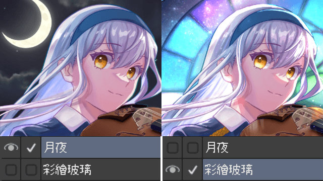
We can also add one Gradient Map to the whole illustration, this can dramatically shift the mood (eg towards a sunset feeling) with ease! A combination of both our earlier colour edits and a "sunset" feeling gradient map gives us a dynamic range of colours, which we can continue to edit further if we’re not entirely happy with the outcome.
Part 4: Gradient Maps for Tonal Correction
With this illustration, perhaps we want the foreground of the image to have a warmer hint to it, and the background to have a cooler tone.
We can do this by adding a flat colours and using the “overlay”, “multiply”, etc. layer settings, but this can end up looking flat. Using Gradient Maps however can help keep our illustration looking dynamic.
After separating the foreground and the background, we can use Gradient Maps and a combination of layer types to tweek the illustration.
First we’ll make a duplicate of our foreground layer and background layer, take the top most of the background layer and begin adding a gradient map of cooler colours.
After applying the Gradient Map, we make a duplicate layer, and change one of the layer types to “Color Dodge”, putting both the opacity % down to 33. Using this particular Gradient Map will result in adding a blue tint to the lighter and mid-tone areas, and a purple tint to the darker areas, reducing the layer opacity ensures that some of our original colours come through.
Onto the foreground, we want the effect to be more subtle, so we will use a Gradient Map but reduce it down to 20% Opacity after applying it. Duplicating this layer, and changing the layer type to Overlay and reducing it to 13% gives us a much warmer but still shines a lot of the original colours through.
Like with separating the parts of an illustration in the [Adding and Amending Colours to Illustrations] section, if you’re doing an illustration of a character on a background, you can use gradient maps to easily create and experiment with contrast between the background and the subject.
The best way to learn how to use Gradient Maps is to experiment! Take an older piece of artwork and see how adjusting it using Gradient Maps can help to change the atmosphere.
If you have specific colour combinations and colour palettes that you love, it can also be useful to make a handful of your own Gradient Maps with those colours for use when planning artwork.
對此投稿按「讚!」的用戶


留言