
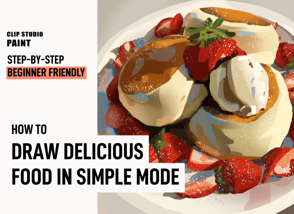
Draw and render delicious, vibrant foods and drinks! Rendering tips, coloring guide, bounce light made easy, brushes, and more!
1. Gather references, and how to choose the right ones
Aside from photos you take, Pinterest and Instagram are great sources of inspiration and material. However, not all pictures you find will be good references: sometimes they have odd flat lighting, extreme grain, or are not in the mood you’d like. That’s why having MULTIPLE references will help you. You can use one reference for composition, another for lighting, another for the background!
2. Sketch
This ideally shouldn’t take more than a handful of minutes. If you’re a beginner—don’t get frustrated with taking longer! You’re learning, and you’ve got this. It’s a great chance to train your eye to recognize general shapes, so don’t underestimate it.
It’s important to know what you want to explore more. For example, if your focus is a color study, it’s all the more reason to sketch quickly. If you want to experiment with bold, shape-expressive lineart, then focusing on the sketch might prove better for you.
For color studies, I like to keep my sketch as light and general as possible, sometimes outlining the most prominent shadows to aid with coloring later.
3. Block in colors
Take it easy. Don’t stress it, really. You don’t have to get every edge perfect, every curve smooth—blocking is loose. See it as a guide, or color-sketching. Your aim should be to put every color in its place—not the one in the light, not the shadow, but a midtone: this is generally found in areas that don’t face the light directly but are not in shadow either.
I like to block in the general shadows as well, only to give the painting a sense of dimension from the get-go!
3.1 Check accuracy with color-picking tool & tips
But how to pick colors? How to know if I’m picking the right one or if it’s too light or too saturated? This is where the color-picking tool becomes a learning device!
You see a color. You want to guess what it is. To get as close as possible, I like to use the YouTube Guy Mixing Paint To Match the Card Technique. Get your reference on the canvas, and check how close you got. Is your guess too bright? Too saturated? Too grey? Too orange? Adjust a bit. Those impressions will guide you to picking what you want!
Another way is to guess, then color-pick your reference to check how close you got. The more you do it, the better your eye becomes—after two, maybe three color studies, you’ll find that you can guess colors exponentially better! You’ll see that you already memorized those colors somewhat, and your eye is getting more and more accurate. It’s a muscle, so you can train it!
NOTE: block in the background too. A plain white canvas will make the colors look wonky, like they’re too dark or too bright or too something. Having a background will help immensely.
HELPFUL TOOLS: hard-edged brush, lasso tool.
4. Shadows
4.1 Find light source
Very important. You probably know the drill. Identify where the light comes from. Is there one light source? Two? Do you want to stick to your reference, or do you want to position the light source somewhere else? You decide!
Once that’s done, time to pick your shadows: darker and more saturated. These are general shadows to mark the areas facing away from the light. I like using airbrushes for this part, to have a soft transition from midtone to shadow. See them as ‘general shadow’! It’s good to have a variety of soft edges and hard edges as well, for yummy reasons.
4.2 Ambient occlusion
The darkest shadows. The ones in the crannies. They’re much darker than the general shadows, and often appearing almost black. Note: if you’re rendering something semi-realistic, don’t use black. In most cases, a very dark red or purple will look almost black in context, and they’ll offer some color variation (more on this in the next section).
Ambient occlusion is great. It defines shapes and edges, and communicates of soft or rounded or sharp something is. It’s important to remember that in nature, areas of ambient occlusion are soft-edged, gradually becoming darker.
HELPFUL TOOLS: airbrush, lasso tool, any hard-edged brush with pressure sensitivity for opacity. Multiply Layer mode.
5. Light
We already know where our light source is. Lovely! Then we know where our light-exposed areas are. To find this color, in most cases you need to pick your base color, then shift it above (higher value) and left (lower saturation). How much depends on your case.
5.1 The Yummy Glow
It’s usually on metal, glass, and sleek materials. Small but lovely. I like painting it with a small airbrush, using a bright yellow-orange color in Add Layer mode (20-40 opacity). Then I create an Overlay Layer below it, and use a slightly darker, more saturated orange to ‘halo’ the side that faces AWAY from the light source. I like doing this for highlights as well.
HELPFUL TOOLS: airbrush, hard-edged brush. Add Layer mode (about 10-30 opacity in most cases. Add Layer packs a punch), Overlay Layer mode.
6. Bounce light (not as tricky as it seems!)
Light gets to places, steals some of that color, and then hops somewhere else. Usually on what you’re painting. This is, surprisingly, a good thing.
Let’s get this down first: bounce light is always found in SHADOW areas. Why? Because light likes going places. If it can’t get there via direct light, it will find another way.
Where light lands, it leaves a trace of its previous stop. Light from the golden setting sun will leave a trace of orange sheen where it lands. Light from the bright blue sky will hop down onto wall, grass, clothing folds, and leave a trace of blue there. Light bouncing off a strawberry will steal a pinch of red and slap it on the plate it’s sitting on.
6.1 How to pick bounce light colors
How to FIND what color it is, though? Two ways. Both hinge on this rule: grey connects all colors together.
The first way is to color-pick your shadow, slide towards grey just a tiny bit, then make it a smidge brighter. Straight left, then a bit straight up. This works for most simple bounce light.
The second way, my favorite, is to color pick the light ‘stop’: the strawberry midtone, the blue sky, the grass, whichever your ‘previous light stop’ is. Then, choose any hard-edged brush (no pressure settings), lower its opacity to about 10-20 percent, and put it on the relevant area.
A note on color variation
Hue: what color it is (red, blue, yellow, etcetera). Value: up and down, how light it is. Saturation: left and right, how intense or grey something is. With that out of the way:
Things go well together when they have the same value. So, if you want to introduce some color variation but don’t want it to clash, color-pick any area, then slide your pick towards grey, and shift the hue wheel around. Apply your choice on the area, and see how it works!
HELPFUL TOOLS: hard-edged brush.
7. Highlights
Those hard light bits. Remember to place them mindfully: not too many! They’re usually in the glossy, slick, sharp bits, and especially in the silverware, glasses, and ceramics! An untextured, hard brush with pressure-size settings is perfect for these.
8. Chromatic aberration
This is not necessary, but I like it. Duplicate the bounce light layer. Then, on the new layer, use the Chromatic Aberration filter, just a bit. You can also choose to slightly Gaussian it for a blur effect. Adjust layer opacity to your liking! I also do this with the highlights layer sometimes.
You can find this in the commands bar, Filter > Effect > Chromatic Aberration.
It looks especially good on metals, in my opinion. Another example:
9. Texture
Clip Studio Assets has countless amazing textures available. How to apply them? First, get them in your Meterials CSP folder. Then, drop your texture on top of your artwork (it will be read by CSP like a picture) and adjust it to cover the whole area.
Change the Layer mode to Overlay and lower the opacity to about 10.
And there you have it!
對此投稿按「讚!」的用戶


留言