Character Concept Illustration Guide
Character Concept Creation Into Illustration
Hello everyone. I am Ammilight, Today I want to tell you all how I personally make concept characters primarily using symmetrical rulers and vector layers, I shall not waste any more time, let us start. Do note my first language is not English, so there may be some grammatical errors.
Preparation and Gathering Concepts
But before we draw our concept character, we have to start with keywords!
What are “keywords” you may ask? These are words with specific meanings related to art, such as "abstract", "icon". It is essentially the idea or concept embedded into the character’s theme. For example I chose “space”, if you were to think of “space” and “advance tech” together you can probably imagine massive megastructures and flying space crafts. Another example is if you were to choose “life”, it could be just the daily ways or outfit one wears everyday or the art could be a representation of the character’s life.
Next is the theme of your world, you don’t have to create a whole novel for a character like I have. All you need to imagine is what theme your character belongs in, like could you imagine a person wearing a robe, a scepter, a witch hat and flying with a stick in a world where people have augmented strength, megastructures and weapons of mass destruction that can annihilate everything. Yeah, it’s a bit out of place. Your character must fit within the world you are creating. If you choose Sci-Fi then make them wear futuristic armor and weapon, if you choose Fantasy give them magical tools, if you choose Slice of Life then just make a casual outfit, if you choose Thriller then make them more serious looking. The list goes on, hence you should choose what you want. After you chose your desired theme we will go next towards the foundation of your character.
Foundation of a Character
Giving Your Character Personality
It is a no brainer that a character needs personality to be more appealing (unless they don’t have emotions, but their representations can still be shown around them). A prime example of things that are affected by personality are the clothes they wear. An example I can give that we see are the different types of students, specifically on how they present themselves. A serious, professional and academic person will have their uniforms clean and tidy with no loose ends. On the opposite spectrum, we have the lazy student. They tend to let themselves go and have a loose uniform and wrinkled, with their shirt not tucked in their pants. What the characters wear can represent their personality just by the clothes they wear. A shy person wearing oversized clothing which covers their body or an aggressive person having more exposure with their clothing for example, though this is not always the case but it is a great way to imagine on how your characters feel when wearing certain outfits they like or don’t like.
The Use of Color Language
Colors represent emotions, also known as Color Semiotics or Color Symbolism, explores how colors convey meaning and evoke emotions across cultures. Here's an overview of examples but not limited to:
In character design, color choices can convey personality traits, like warmth, coolness, or energy Evoke emotions, such as happiness, sadness, or fear Create contrast, highlighting character differences Establish genre and tone, like sci-fi or fantasy Influence character development and arcs Support thematic messages and symbolism
Deciding Your Colors Properly
Since the dominant color of my character is yellow, if you selected yours, then you are recommended to follow the color theory.
There are some of the ways of how you can choose your colors, this is also very important for backgrounds. Assuming you only wish to draw the background with nothing but a singular color, the color theory will greatly assist you with this task. Unless you are just going to give it a white background, then that’s fine.
If your background has lots of details like buildings, structures, planets, rocks, etc. You can use the color theory to your advantage as well. If you already have a detailed background you spent hours on, then you can just make a soft layer. Create a layer then change its mode to “soft layer”.
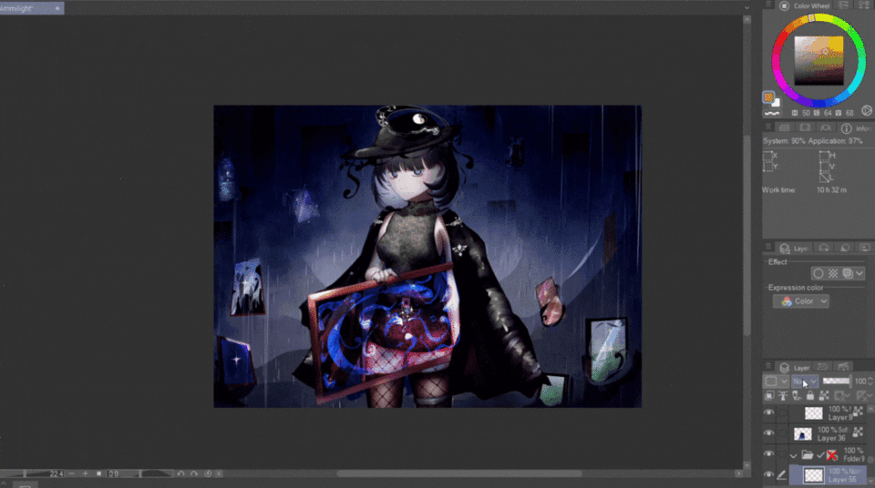
Example of Color Language/Symbolism
This is an artwork I made, As you can see, the character’s primary color is black, secondary is variants of blue, while the accent color is white. I wanted to make the character feel gloomy and emotionless. Alongside the dark background that’s raining, it can give the viewer of your art context of the character without knowing their background information. I asked my friends to determine her personality without showing or explaining any lore behind her.
“Without background information, am going to say she’s nonchalant and doesn’t care anything, and she looks like the type of person to have a black cat as a pet"
“She looks like an edgy person, calm and collective person on the outside but is actually a shy introverted person on the inside”
Even though my friends were somewhat wrong, it essentially gives information to the viewer just from the color and art alone. So keep that in mind when drawing an illustration.
When drawing your character based off their personality or what you want to make them wear, make sure to use references. Keep collecting references that match with the theme and go mix and match!
Another example of a sketch I made, as you can see from the half body, the primary color is white, secondary is yellow and accent color is brown or gold. Though it may seem that the yellow color is the primary color, if I were to show you its full body, the white is significantly more than yellow. However, I do not have a character sheet, which is a problem if I wanted to redraw it fully from all sides. You will waste time thinking of its design, this is why character sheets are important. I asked my friends also what her personality is basing solely from this photo.
“She kind of looks like a noble or royalty. Though, the drawing of yours shows that she is bored or tired?”
“It kind of looks like she’s tired, and she loves to eat snacks and sweets. She looks like a student who’s lazy but looks dominant and aggressive, I don’t know I’m just guessing. And I guess she looks like she’s the type to be always be clean”
Symbolic Items
Symbolic Items are things that can give insight to your character. There are many items that are well-known and easy to recognize, it just depends on what you want it to be. These depend on you, but you should add items that either: Represent their character, represent their history, represent their relationship, represent their status, and many more that can represent the character. This can be anything really. Here’s a sketch I made that shows them.
A common example is a sword, its easy to know what its for. You may also use items from jobs like the outfit of nurses or police, there are many references out there you can search online! Here are some symbolic items but not limited to (there were a bunch of them but I could only fit few, search online if you need to.):
As stated before, there are millions of things to choose from online. You just have to research about it!
Sentimental Items
Sentimental items, well, are sentimental things that have value based on a person’s history. This can be as simple as an old hair clip from someone important to a family heirloom. Though this is completely optional, it can still give personality and a story to your character. This part is short since it’s just giving items that have value to your character, so it can be pretty much anything you want.
Character Sheet Before Illustration
Before we start drawing our original character, we must first draw a character sheet before drawing the full illustration. You can skip this part if you are only planning to draw your character once or twice with different outfits, but if you want to draw your character consistently multiple times you’re gonna need a character sheet. It doesn’t have to be fully detailed, all that matters are the most important parts of your character.
Redesigning a Character
If you already have a character you drew but you have yet to make a character sheet, I highly recommend you make one so you can draw the character freely without having to make things along the way. However, if you want to change your character to a new style, you can take notable features from your original to the new design.
This was my first original design of my favorite character, but I wanted to change their style. So I took the drones with eyes for cameras and the halo that acts a portal into an umbrella. The character’s eyes and color of the hair will still retain though, but it will be changed to a different style. This art of mine also suffers from not having a character sheet, which made it extremely hard to draw. It is the reason why I am changing in the first place.
This was the new design, but it was still uneven and I completely forgot to draw a character sheet. There is a problem with these types of artworks.
If you fail to draw a simple character sheet, you WILL give it too much detail, to the point it becomes impossible to perfectly replicate. Like the cannon strap that’s attached to her arm, it is very hard to draw from all sides and angles.
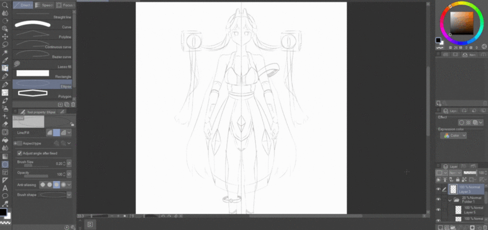
Symmetrical Ruler is Your Best Friend
In making a character sheet, I recommend you use the symmetrical ruler so the process is easier and balanced. You will also have to do this for the back part of your character.
The rest of the process is you giving the character their details and items, I highly recommend that you make the character simple and easy to draw as to not have a hard time when you are drawing the character in different angles or animating.
This is a simple sketch of my original character, I wanted to make her look elegant with a steel-like dress that protects her lower body with the crystals acting as energy reserves. While her shoes have boosters that propel her, wanted to make it high heels but it would be hard to walk. Her drones carrying things for her, including her hair. I’m not the best at character design but this is what I think fits her world.
Use Vector Layers for Inking/Lineart!
Vector layers are amazing, I am not kidding. Vector layers WILL assist you in your inking process as you can fix your lines without erasing and redrawing. Particularly, my favorite part of the vector layer is the ability to expand or shrink your lines. But where do you find these options? It’s right below this text.
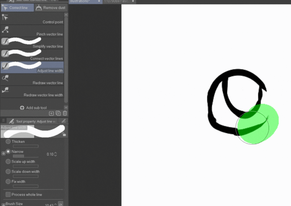
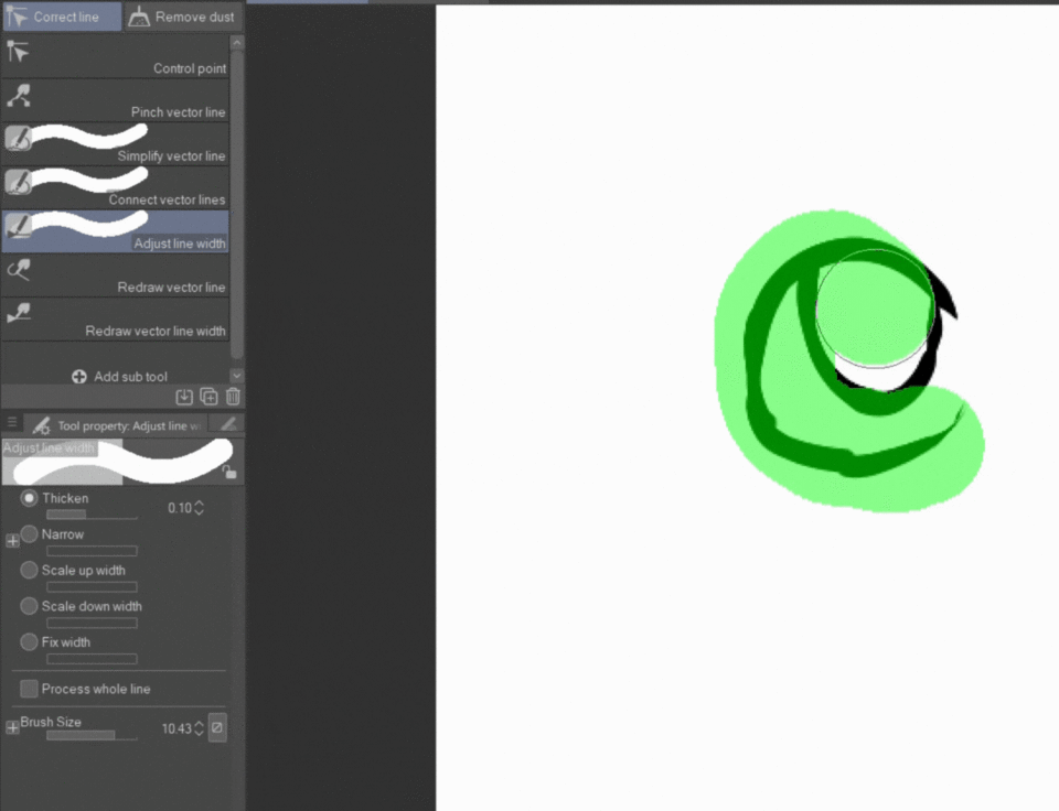
You can also use the “Pinch vector line” and “Connect vector lines” to fix your line art. Either by connecting them or dragging the line to your desired location.
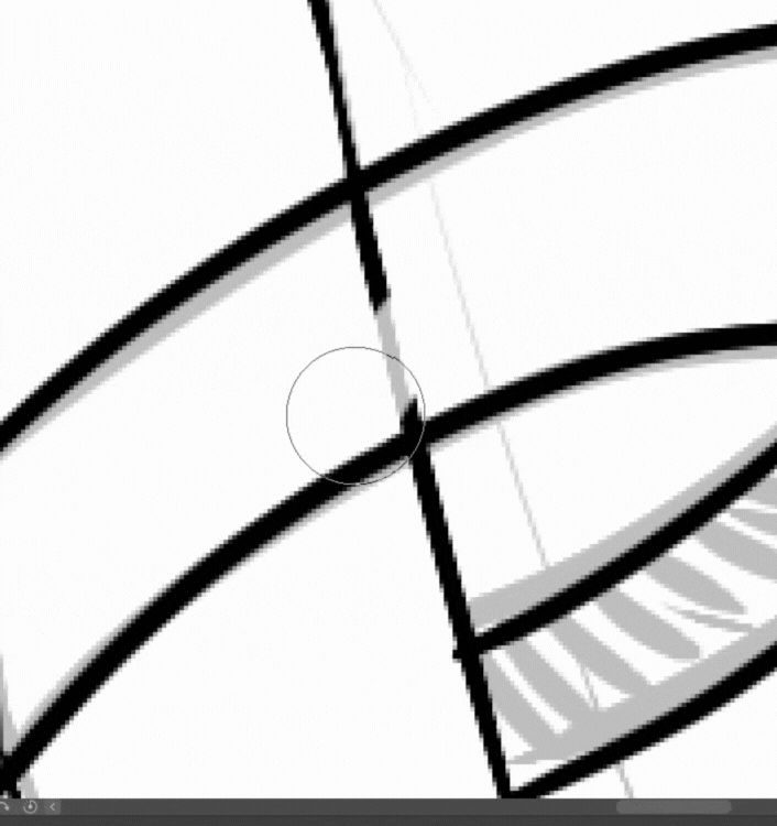
Vector layers also adjust themselves when erasing or drawing, it’s pretty neat.
This is my line art, but I felt like it was a bit too thick. This is where my beloved vector layer saves me.
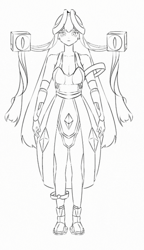
The effect is noticeable if you were to compare it.
Since I am finished with the front side, I will now draw the back side of the character.
Base Colors
After you finished with the line art process, all that is left is to add the base colors of your character. It is recommended to use colors that are desaturated. In character sheets, you don't have to fully shade your characters since it is meant for you to use as reference when drawing the character. When picking your colors, it is best you balance them evenly. The 60-30-10 rule is a color theory that can help you determine the ratio of colors in a character design: 60% The dominant color, which is usually neutral and often used as the background 30% The secondary color, which supports the dominant color and adds visual interest 10% The accent color, which highlights specific features or parts of the design.
Drawing Your Character
Now that we have completed our character sheet, we can start drawing our character in any position, angle and any way we wish to. The character sheet is there to provide a reference while drawing so it doesn’t look too far off from your original idea. You should use Vector Layers to do the line art, it will help a lot!
Draw a sketch of your character, feel free to give her minor changes like a bracelet or an umbrella like mine. What matters most is that majority of your initial design is still intact!
The process is still the same as a character sheet, but this time you won’t use symmetrical rulers for the whole body. Shading is the most important part of an illustration. While line art can make it look cleaner, the way you shade your character will decide the illustration’s mood.
Add your base colors, make sure it’s not saturated as to not burn your eyes. I already added a bit of shading to the hair and a white gradient for the crystals.
When you are only drawing a character by itself, if you don’t have a background like this one, use either a saturated color or desaturated depending on the tone of your art. Pick colors that . Just make sure to give contrast to the character’s area and the background as to not make them blend perfectly with each other.
The last step is the lighting of your character. After finishing that, the rest of the process is you fixing or adding things to the character or background that you have yet to finalize.
You’ve reached the end of my tip, thank you for reading through all this! I hope my tutorial inspired someone, to know of my previous mistakes and learn from what I have experience. Once again, if you’re planning on drawing a character multiple times, make a character sheet. If you’re only drawing it once, you do not need to!




Kommentar