
Introduction
Colorizing a black and white image can sometimes be really complicated, especially if you want to keep a great freedom of modification of the image, for example to propose several versions of colors for a character.
The technique that I will discuss in this tutorial is perfect for solving these problems. It is effective for character design or illustrations in which lighting does not play a central role. It allows great control and unparalleled flexibility to color every part of a drawing!
The basic drawing - Grayscale
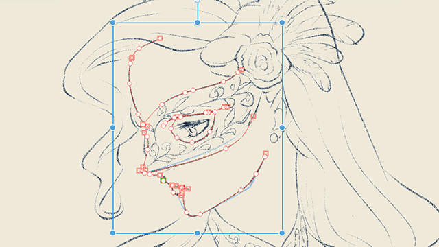
To make the best use of this technique, you need a fairly advanced gray level image, like this one:
The rendering does not have to be totally definitive because there will be some retouches to do once the colors applied. On the other hand there must be a good variety of gray levels, light areas, dark areas and a good modeling between the two.
To have a good working document, I advise you to use above all a layer of levels (Layer> Level correction) and to bring closer the small black and white arrows of where begins and ends the contour
This will allow you to have more amplitude with which to work for your gradients.
Create your first gradient
Here is the tool we will use throughout this tutorial: the gradient image layer
You can find it in Layer> New Correction Layer> Gradient Image Layer. When you click on it, a window opens and it looks like this:
You also see that your image has changed, it has been applied the gradient in question.
The way this layer works is that it will replace the different gray levels of your image with a gradient (B). The dark colors are replaced by what is to the left of the gradient, the light colors by the right and all the intermediate colors by the corresponding colors on the gradient.
In menu (A) you have several sets of gradients already present but I advise you to create a new set for your personal gradients, to find them more easily.
For the moment we will try to find the colors of the skin of the character. Let's start by changing the two colors to the extremes. To do this, click on one of the two small arrows at one end of the gradient then on the color box (C), then start again with the arrow at the other end:
It's a beginning but it's a bit flat, it's lacking in life, let's add a more saturated color to the media by clicking on the small gradations below the gradient, it creates a new arrow that allows you to choose the color of this position of the gradient
It's already better but we can certainly further refine this gradient until we have something really convincing. Feel free to create and move arrows until you find what you like. Everything is always reversible so it's time to have fun without fear.
Locate the gradient
When you created your gradient layer, it came with a mask:
This mask will serve you to use this first layer of gradient only on the skin, by erasing the layer wherever you do not need it. To do this, click on the mask then take an eraser and erase on the image all the places where you do not want the gradient applies. If you have erased too far you can use a brush for the gradient to apply again. This is the interest of the mask, it is reversible.
Alternative: You can also use the lasso to select the skin then invert the selection (with ctrl + shift + I or selection> invert the selected area) and delete with the "Delete" key to delete everything except the skin.
Create other gradients in the image
Now you just have to follow the process again with the different areas of the image. To go faster you can select the area you want to colorize before creating the gradient image layer, so that the mask will be in place when you create the layer.
Note that you can save each gradient by clicking on the small icon that you will find here:
By adding gradients little by little you can fill the entire image and from there retouch to balance the different colors, until you reach something you like:
Create a transition between two gradients
To create patches on the creature's skin, I decided to use 2 layers of gradient image on top of each other and to make the top one appear only in some very localized places. By masking the entire layer and then painting with a soft-edged brush I was able to create subtle transitions between the two layers and give more life to the skin.
Note that I have also added some metal to the toga, using the golden color layer already created previously.
Here is a closeup on the eyes to better understand the effect of this new layer:
I groped a bit to find the ideal opacity for these color spots. You see above that it gives opacity 0% (no effect), 100% and the opacity kept in the end, 60%.
Variations
The file is in place so that I can easily create variations on the character. For this I advise you to create a folder to put all the layers that make up your image. This folder you can then duplicate to test a new version of the colors of the character without losing the one you just made.
You can now hide the first folder (small eye icon in the layers window) and change the gradient image layers of the 2nd folder as you wish to create a completely new color scheme. You can then redo the same manipulation for a 3rd version, etc ...
Final painting
When you have several versions you can make your choice and it will be time to finish your painting. There are almost always small touches to make on your color image.
Create a new layer in normal mode and start painting to arrive at a final drawing as successful as possible.
That's all for this particularly useful technique for concept art and in particular for Character Design.
I hope I have been clear enough and you can quickly add this new rope to your bow!
About me
I am Richard Vatinel, illustrator and independent concept artist for more than 10 years.
I give courses online via the platform Aududidact Artist:
And you can also find my portfolio on my website:
Users who liked this post


Comment