Vehicle Design With Rust Texture And Heavy Wear
Hi everybody, I am Leonardo, in this tutorial I’ll show you how to design a simple vehicle with wear signs and rust in a natural way. This can be used before the creation of a 3D model, to test your ideas before investing the time of modeling and texturing. This method can be used for background objects too.
I start always with the side view, if possible, you can design the front and top view, that gave you the necessary information to avoid improvisation (There is nothing bad of improvising, but it’s a more experimental process and you can expend too much time developing the final design). For my vehicle, I’m going to use a simple side view because it’s a simple design. This design is boxy because I didn’t want to spend too much time in the perspective part of the process, but to show the texturing step, that in my opinion there are not too many tutorials. I create the design in a different file from the perspective drawing.
To build the draw, place the two points perspective in the desire position in [Layer] + [Ruler-Frame] + [Create Perspective Ruler], and create the basic cuboid that envelops my design, I always use a ruler, but is not necessary because you can assume the size of the grid (of your perspective ruler grid) to an arbitrary dimension, but the ruler gave me the reference of the scale and proportions (I’m too square). I create some cuboids that fit the tires of the truck too. For all the lines I used vector layers.
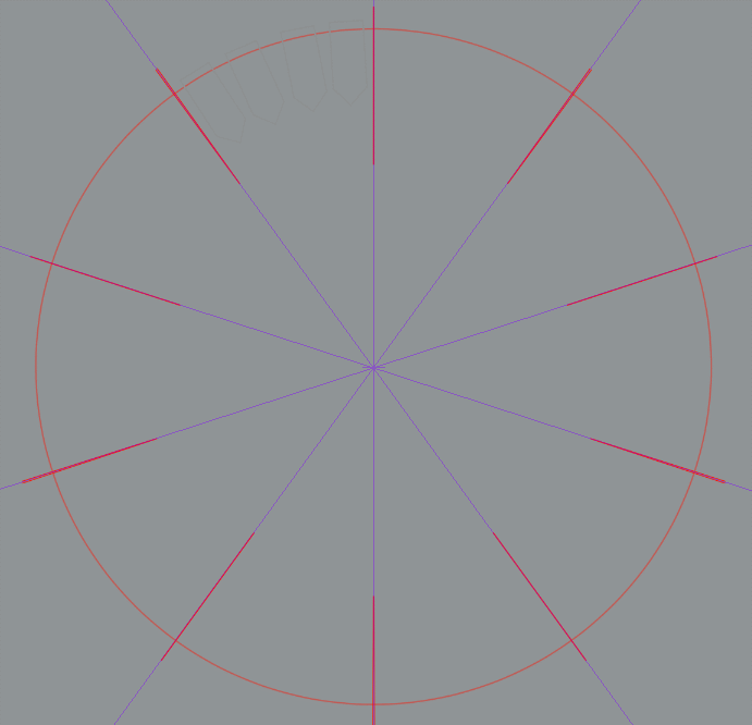
For the fast creation of the wheels, I use the symmetry ruler. [Tool] palette, select the [Ruler] on the [Sub tool] palette, select [Symmetrical ruler].The ruler is set for symmetry every 45°, there is a reference in the draw to keep the right distance, I just trace the reference to create the tire tracks, the rim and the rest of the decorations.
For the creation a name for the tires, I create a new brush, first with the text tool I wrote the name and rasterize the layer, then with the layer selected [edit]+[Register material], named the material and check [Use for brush tip shape], it’s better if you tag the material for easy location.
With the Ellipse tool, using the [Tool Property] palette [Ellipse] on the [Sub tool] palette, make the circle concentric to the wheel, and increase the brush size, open the sub tool details change the brush type to one that curves around the line, I used the brush [Melody], change the brush tip, find the name created and erase the Melody tip, change the direction until is parallel to the line. To create just one name, change the repeat method in [Stroke] for [One time only]. finally, adjust the size you want for the name.
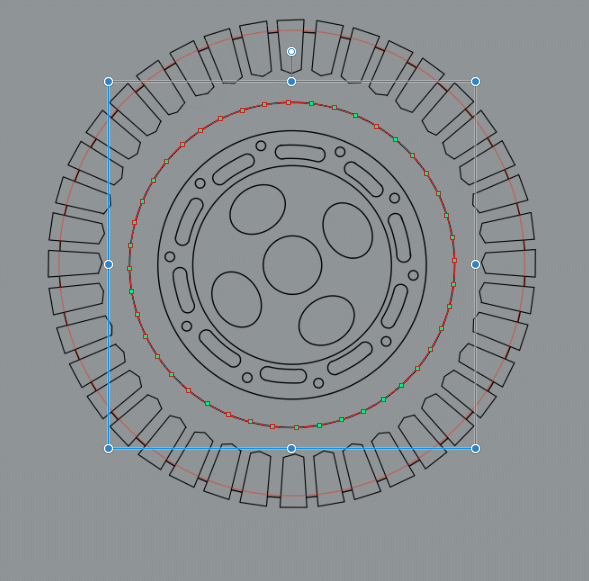
Placing the wheel in the design area is easy, use the cuboid as a reference and with the Free Transform tool (Ctrl+Shift+T) or [File] + [Transform] + [Free Transform(D)] drag every handle to the correspondent corner.
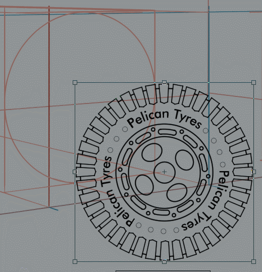
In the same way, bring the side view and using the Free Transform tool adjust the design to one of the sides of the cuboid, this will be the reference for the perspective drawing.
Create the dip of the wheel using perspective lines as references and draw the missing tracks, I used the [Mesh transformation] tool for this by setting two horizontal division and 10 vertical on a flat track, but this is not easy to achieve accurately so it’s better to use the perspective line has reference and draw the tracks.
In a raster layer, I shade the wheel in a blue-gray color.
Adjusting the rest of the wheels to the respective places, this is the final result.
Using the side view has the reference, I create the perspective of the vehicle.
In a raster layer, I create the silhouette of the car keeping the stairs in a different layer to separate the texture of the vehicle and the stairs.
I download a seamless rust texture and register the material in [edit]+[Register material], named the material and check [Tiling], it’s better if you tag the material for easy location. Then I drag the material from the [Material] palette to the canvas and adjust the size for a good tiling. Select the pink, silhouette left Click over the image in the layer palette, them over the rust layer right Click [Layer mask] + [Mask outside selection].
Now change the pink silhouette for your base color over the rust layer.
In a raster layer over the base color, I start creating the volumes in a multiply layer, to avoid painting over not wanted areas, I used the Polyline tool in the [Selection Area] to separate the different plans.
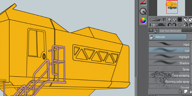
This is the shadows I create for the vehicle, noting to hard just a plan separation that helps to sale the volumes.
Under the base color it the rust texture we need to start carving the yellow color to reveal the rust, for this I used a texture brush.
To create realistic scratch, I search for scratched metal texture and them I placed it in the desired area, then in the scratch texture left Click over the image in the layer palette, inverse selection, turn the texture layer of and in the base color layer I start to erase the parts I didn’t want. In this way, the final texture has naturally been carve.
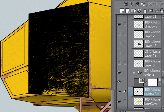
This is the scratch vehicle; I apply some highlight for extra volume.
For the windows, I just create a silhouette of the interior with some gray color
And then some highlights in a different layer.
The process for painting the stairs was to change the pink color for a gray textured color.
Then the shadows in a separate multiply layer
in another layer over everything the highlights.
This is the final render
English is not my native language so please forgive me for my grammar mistakes. If something is not clear enough, please let me know and I’ll try to improve it.
I hope this tutorial helps someone to create texture design. Thank you.


Comment