
Hi all!
In this tutorial I will teach you a method to edit a retro style comic cover. All the materials I used to make this edit are available in the tutorial steps. I hope you like it.
Before moving on to the tutorial, let's remember the basic elements that we must include on our cover:
• Editorial seal
• Title
• Publication date
• Author / illustrator
• Price
• Volume / Series / episode
• Barcode
(Note: Not all the images that accompany this tutorial are in GIF format)
Let us begin!
Background
We create a new document and with the "Fill" tool we select a color, in my case I chose red. Then with the tool "Figure" >> "Line" >> "Dispersed saturated line" we draw the background.
We stand in the center of the document and slide the tablet pen to mark the desired distance.
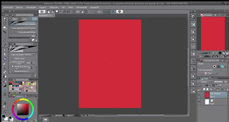
The modifications that I made to this tool are the following:
Brush size: 30.0
Line interval (angle): 1.6
Group: 7
Difference from position: 159
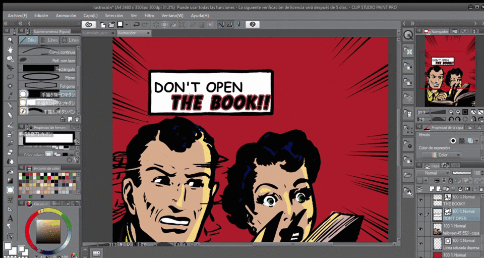
Characters
We drag the render of our characters to the canvas, to preserve the retro style, line-art is very important and painting with solid colors. To speed up the coloring process, we duplicate the image and on the layer that is below we paint, you can use the "lasso" tool. When we are satisfied we combine both layers.
We can add a dialogue that gives the reader an idea of what the story is going to be about. The typeface I used in “DON’T OPEN” is Comic Sans and in “THE BOOK !!” is True Crimes (the link where you can download the source is at the end of the tutorial)
Link to download the speech bubbles:
They are quite useful since we can edit them and adjust them to our needs, to modify them we select them and holding down the "Ctrl" key we drag the corner we need to indicate which character is saying the dialogue.
Typography
The title is very important for the cover of our comic, so it should stand out. I put this title because I love suspense stories.
To put a border, we select our text (1) >> We click on the pen (2) >> Text (3) >> Border (4). We change the size of the border in this case to 23 and in color we select black.
To give more weight to our cover, we can add a phrase to attract attention, in this case it was: "NEW STORY OF SUSPENSE" You can put whatever you want here, for example: something related to a limited edition or a side story of the comic that are already doing.
To create this black strip, we select the tool "Figure" (1) >> "Direct drawing" (2) >> "Rectangle" (3). We fill it in and add the text (4)
Final details
To make our cover look more professional, we can create a simple editorial stamp. Although it is small, it must be legible. For this we make use of the dialogue bubbles again and modifying it a little we give it shape.
Let's not forget to add the price, the volume number (it can also be series or episode) and a barcode, again, we can download it in CLIP STUDIO ASSETS, I used this:
To change the color with the Ctrl + U keys, we raise the brightness a little.
To give our cover an aged look, we selected the “Cracking & Wear” texture
We drag the texture on the canvas, with the Ctrl + T keys we modify and adjust the size, then we right-click on the layer and select "Pattern".
To finish we edit the texture layer with Ctrl + U we raise the luminosity a little.
Final score
Ta-chan! this is our final cover:
Final note
Remember that at the beginning of this tutorial I put a list with the basic elements that a cover should have? Well, I forgot two things: Author and date. The good thing is that I remembered before sharing this tutorial. (úwu)
I leave the link to download the font that I used for the title:
And in case you are interested in the link to download the render of the characters that appear on the cover:
Thank you for having come this far.
Regards.
Users who liked this post


Comment