
Character design and splash art.
Here I will show you in a summarized way some of the processes that I carry out to create a character and make a splash art. This example that I am using was for the contest that Clip Studio made with the theme of GalaxysCutest, I found it interesting that you see the process I did to finish this splash art.
First thumbnails.
The first thing I do to create a character is to create thumbnails (miniatures) of my character, analyzing the silhouette and shapes that a black spot generates, I do what I see necessary, they can be from 5 to 20, that depends on each person, for this I try to make the silhouette clear and recognizable, why? Well, if we have our character in a crowd or in some environment, it will be easier for us to recognize him despite so many elements / noise in our composition, so we will make sure that it is a recognizable silhouette, where we have very descriptive elements of the character, and that It is understood what these elements are just with a black silhouette, whether it brings objects or clothing / fabrics etc.
Thumbnail selection.
Now we have to choose the thumbnail that we liked the most. If we have elements of other silhouettes that we liked, then we can add them to our selected silhouette, cutting out the figure that we liked the most and pasting it on our silhouette, or we can also redraw them by hand. We can also add details in other gray tones to create an interesting outfit, I added some elements that I liked from the other silhouettes to the selected thumbnail and I detailed in lighter tones.
Add details.
In order to work on the silhouette, we can use the "Lock transparent pixels" tool to work more comfortably without leaving the silhouette.
Dress design.
I made more thumbnails because I didn't like the first outfit, I created several and modified the silhouette with a yellow frame, the blue miniature was the result of modifying the previous miniature more.
Color palette for our character.
I made a layer on top of my character with 1. "Combination mode"> "Color" to be able to add color to our character and see which color combination is more harmonious and according to our character, I also used tool 2. "Adjust the bottom layer »so that the color would not come out of my character.
Thumbnails for splash art
With our character designed and color palette ready, we will make a few more thumbnails to accommodate the composition of our work, the location of the elements that our painting will have. For this type of illustration use the rule of thirds in combination with other types of composition. Likewise with these thumbnails, we will decide which one we like the most and how we will accommodate our composition.
I selected the thumbnail in yellow because I could apply a more interesting composition and I could better use the law of thirds.
How to direct the gaze of a spectator?
One method of directing a viewer's gaze is by using the law of thirds, how is this done? The lines that intersect on the law of thirds grid is where you will place your points of attention. In your composition it is not necessary that they be exactly at the intersection of the lines, it is only an approximate of what your point of interest is.
Lighting: this also helps us a lot when it comes to focusing attention and also being able to capture certain emotions in the viewer, if you put a point of interest in the light you can cause attention to be diverted to that light.
Planes in your composition: the use of planes helps us to generate depth in our composition, (planes are those elements that are placed in front of each other, a plane is like Clip Studio layers) example; We have some plants very close to the viewer, being in front of all the layers generates a plane of proximity, generating a little more depth, another plane is the character, the tree is another, etc.
Blur can also draw our attention to the sharpest / most focused site, this can also cause a sense of movement.
The gaze of a character can also help us to direct the view of a spectator, for example the piece I used for these tips; The hologram, the protagonist and the alien in the background are looking in the direction the protagonist is pointing, making your eyes go towards his hand, that can cause you to see the end of the tunnel that is in the background. Using a character pointing in one direction also causes us that feeling of turning to see what the protagonist is seeing.
Vanishing point: it is one of the most used resources to direct the gaze, this method is almost self-explanatory, all the lines that converge in a vanishing point make the viewer look towards that point.
Add color to a thumbnail
When we have already chosen our thumbnail, we will scale it to the size and resolution in which we are going to work our canvas.
When we have the thumbnail scaled, we can make modifications to the position of our character, modify the landscape and accommodate the elements that we did not like from the beginning, it is still a dirty sketch in gray scales, so at this point we have not yet we have a high level of detail and we can modify it more comfortably. When we are satisfied with the sketch or we finish detailing our sketch we can continue adding a base color to our canvas.
To add color to our thumbnail we will go to the Edit / Tonal correction (D) / Color balance ...
In the new pop-up window that has been displayed, we can add color to our canvas with the sliders. In the "Color level" section we have the following options: Cyan, Magenta, Yellow, Red, Green and Blue. We will choose the color that predominates in our composition.
Now we can continue with the painting, we can also cut out our character or elements that we want with the selection tool, we cut them and paste them in different layers, we fill the spaces that we cut with more paint and continuing the background. You can also make a new layer with Blend Mode (Color) and color other elements that have different colors or paint the character's colors.
At this point I will omit the details of the whole process that I do to finish a painting, because this explanation could take too long. This tip is more focused on character design and composition for a splash art.
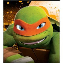
Final score.
To get to this result, I changed the character's posture because I didn't like the initial posture, as well as adding more elements.
Video explaining everything summarized (in Spanish).
In this video I explain the above explained a little better.
Users who liked this post


Comment