
Introduction
Ever wanted to make something more magical? Let's make those colors pop with magical effects!
Creating magic effects for your illustration may feel daunting if you don't know where to start. If you're feeling a little lost, here's a little guide to the way I go from base to finish with just a few steps (and layers).
Deciding and Creating your Base Shape
Anything can be magical!
Don't limit yourself. It could be the magic cast with the use of magical tools to the living things glowing in the dark making it seem as if they were born from magic.
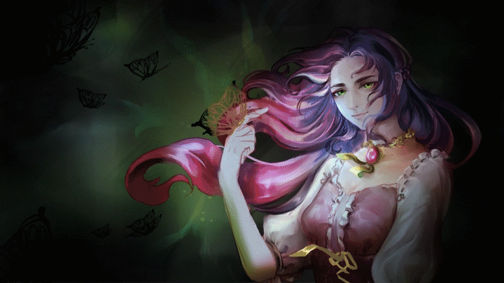
These basic shapes can be purely out of your imagination, from several references or a mix of both. The ideas are limitless, but for now, the base I used here is in the shape of butterflies in order to complement the character and pose I made.
I used black as a base color but turned it to white here to make it stand out from the dark background. You can color it as you like.
Coloring: Grayscale or No?
Now here's a question: Should you immediately use colors in you base shape or keep it in grayscale?
It depends on you and how decided are you to what kind of effect you want. For example, if it's going to be a normal fire one, you can go for an immediate base with the colors of either red, orange, or yellow. Even then, you can still use grayscale to create it.
But if you're undecided or perhaps just simply want to experiment with colors, I recommend using black or white as the base to clearly see how it contrasts its direct surrounding or background.
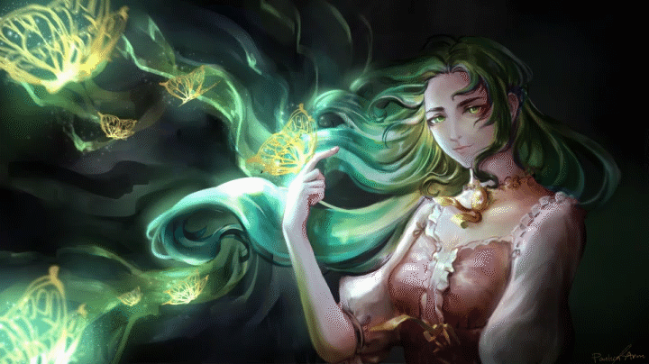
The image above is colored using a clipped add (glow) layer (you can also use overlay or gradient maps) above the base shape since I wanted golden butterflies with a lighter color in the middle. Instead of coloring each butterfly per layer, I grouped them into a folder. Yes, you can clip a layer to a folder containing layers for each butterfly I made in order to colorize them in one go.
Note that by using add (glow) layer, your base shape layer should be dark for the color to come out like the golds in the image. I used black for the butterflies but for clear representation, I turned it to white in the image above.
Using Gradient Maps
However!
I just couldn't help but show you these amazing things called gradient maps. These can help if you're lost as to what color you'd like to have with just a click to see the preview of how it looks with one map to the other. You can even customize it to your own tastes by changing the colors!
Try experimenting by moving those circled with red in the image attached above. By clicking in between those, you can add another color through the one circled in blue. That also works by clicking on the points themselves if you want to change, for example, the violet to red. You can also change the gradient mixing rate through the curve encircled in violet.
Don't worry, they're pretty beginner friendly so do give them a try! Below are samples of the gradient map sets Clip Studio has by default used to colorize the golden butterflies (1st of the 4 panels).
Note that, when using gradient maps to colorize your shape, you must at least have different values or transparency to see more than one color. We will come back to this one later on.
Make them Pop! The Glow Effect + Particles
It doesn't end with just coloring our base shape. What makes it magical is the way it pops with the glow and particles we're going to add. With just two additional layers and two airbrushes (you can use soft round without texture if you want to for the general glow), we can look at our glowing butterflies with satisfaction. You can also use hard and soft brushes to create this effect to suit your tastes.
Now it looks magical already. But, hey, do you want to add a little something else? Like a trail that the butterflies left in their wake?
Additional Effects: The Organic Trails
The movement of butterflies in the atmosphere are organic, and rarely are they straightforward. Therefore, our trails which are left behind by the said butterflies should be organic as well.
It's a process of trial and error. Take your preferred brush and move them with slight curves. Let your hand and inspiration guide you as they eventually lead you to the butterflies themselves.
First and foremost, we will work on the subtle trails which is what I named as the 'bg' layer or background. Using the soft airbrush we put big strokes that converge to the main butterfly on the character's hand.
With that in mind, we can add another layer for trail number 1 in color dodge mode. Since I was satisfied with the black areas and only wanted to lighten some parts of the areas where we put on some color using the airbrush, color dodge mode was my go-to. This time, we go for a more detailed trail that hits the butterflies leading them to the main butterfly again. We can blend out the farther areas to make a fading out effect in order to have out butterflies still stand out.
The same can be said with the add(glow) layer or trail number 2 with a more detailed approach, highlighting the outermost areas of the first trail to have a water-like look.
Lastly, the negative spaces. The trails were too much and I wanted those dark spaces that cancels out the brightness of the trails we initially put. With the trusty multiply layer, we can add a bunch of organic trails that does the opposite of what we previously did.
Now we have glowing butterflies with their glowing trails!
Magic as a Light Source
We've shown how out magical butterflies glow along with their trails. It follows that they should also illuminate their surroundings and, in this instance, the character in the illustration. I've already incorporated the lighting in the character's painting but the additional glows completes it.
Other Effects: Creating fire
It's different having a solid shape to create a magical effect with it. So we'll try out something more organic, something similar to the trails we made, but this time, they're the main effect.
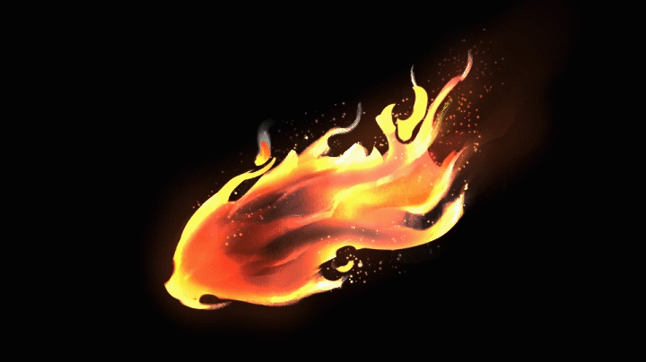
Say hello to the fire effect.
Magical Effects: A Quick Rundown
As usual, we start with the base shape. Don't worry about going into detail and just move your brush to make something that resembles the fire we want to create.
Next, instead of adding more strokes. We will erase them using an eraser (or if you want to retain your brush's shape like I do, I click 'C' which enables you to mimic the eraser instead. To return to painting, just click the button again and you're back.). I'd like to call these putting on those negative spaces which is either slightly transparent or invisible. By using a soft brush to erase most of the middle part, we now have different colors due to the translucency we made using the soft airbrush to erase some parts.
Using the sunset map to color my base shape, we now get something that resembles fire more. different values and transparency are important here in order for the gradient map to work. The negative spaces or erasing parts of the base shape using a soft brush and blending out some of the edges create almost transparent pixels. The more transparent or darker they are, the more the colors from the left side of the map will appear while having a more solid and lighter color will make the colors on the right side appear.
I recommend experimenting with them to get how they work and they will literally bring magic to your life.
After that, we can add more details as much to our liking! I usually go for adding details and particles using add(glow) layer, and multiply for the dark detailing.
Underneath is the breakdown of creating the fire effect in five steps while consisting of four separate layers. 1- BASE SHAPE; 2 - NEGATIVE SPACES; 3 - COLOR; 4 - DETAILING AND GLOW EFFECT; 5 - MORE DETAILING AND FINALIZING.
The layers are, in order from bottom to top; A - MAIN SHAPE (NORMAL); B - PARTICLES (ADD)GLOW)); C - GLOW DETAILING (ADD(GLOW)); D - DARK DETAILING (MULTIPLY)
You can then create your own fireball! or any magical effect for that matter!
The Key to Magic is Contrast
We always associate magic with something that glows - something bright that in order to make it pop we tend to go for dark backgrounds. But what if you're using magic in bright daylight? There are ways to still make it pop and glow. The key is contrast.
It's preferable to have strong contrast in order to make the effect stand out. See how the fire we made becomes barely visible when having a white background whilst the inverted fire still stands out with the black background. The blue glow makes it stand out, making the blacks still recognizable.
Now if we do the same to the original fire effect in the white background using multiply or normal layer mode, the shape can now be distinguished from the bright background.
Some Ideas for Magical Effects
As I said in the beginning: anything can be magical!
It could be from (1) Magical Hairs, (2) Magical Eyes, (3) Auras, (4) Wings, (5) Magical Tools, (6) Simply Magic out of thin air, and so much more, so long as you make them look magical. Don't be scared to try different things and make them magical! It will lead to new discoveries and loads of fun.
I hope you found this article to be helpful! Enjoy and create those magical effects with much gusto!
Users who liked this post


Comment