
Intro
This tutorial is about how achieve some high level artwork only using the basic features of Clip Studio Application or any Application there might be. I believe most applications has common features with the use of that, we will be able to achieve a quality work. I consider these features basic because we've always been using most of it to any artworks we do.
Video Tutorial
For more visual tutorial, you're welcome to visit my youtube channel. :)
Requirements
1. You need patience as we will add a lot of layers to our work for safety purposes and will be able to change some details that requires changes like shadow color, especially if we are trying to aim for a splash art quality artworks.
2. You need to learn Drawing Fundamentals first since I'll only be teaching you how to color a lineless art. Drawing and Coloring is 2 different thing.
But!
Whatever the skill you have now, if you're not confident with your drawing just yet, that is okay!
But please make sure to study the Drawing Fundamentals after this.
That is a very first requirement for drawing and you can draw almost everything after it.
Step One: Clean Sketch
Well here, you need a clean sketch. It doesn't need to be a very clean line art and rough sketch will do as long as all the details you need is there.
Lower the opacity to 50%, or maybe lower as long as you'll still be able to see the sketch.
Sketch is our guide until the end of the tutorial.
Step Two: Separated Colored Layers
You have to create New Layer (Raster Layer) and bring it under the sketch.
Make sure the sketch is always on top of all layers.
You can simply use any pen you wish. In my case, I'll just gonna use the simple Mapping Pen
As of the color, just pick anything you like, will gonna change that later on.
------------------------------------------------------------------------------------------------------Another speed up technique will be using the Lasso.
If your hand is stable enough, this will be easy to you.
If not, just try to practice it because this is very important tool and can be useful to speed up your process. We will be also using it later so keep this in mind.
------------------------------------------------------------------------------------------------------
For sure you'll be bombarded with a tons of layers if you keep adding layer every part of the detail especially when drawing is becoming complex.
To help you out, try to recycle some layers. Use the existing layer as long as the 2 object isn't overlapping each other. In my case, that would be the ball and the puppy.
I have 5 layers in total because I am going to add new layer for the eyes of the puppy later on which I forgot to add in this part.
No need to worry about it, this is the exact point I wanna show. You can just simply add more layers for new details.
Step Three: Change the Color into its Right Color
On each layer, you have to apply the "Lock Transparent Pixels" to avoid painting outside the layers.
One you click that, the icon would appear on the right side of your layer.
------------------------------------------------------------------------------------------------------Wherever you paint on the layer, stays within the existing paint in the layer so you don't have to worry painting in it recklessly.
A little similar painting in a selection but without having a selection.
------------------------------------------------------------------------------------------------------You are now be able to do this to all of your layers.
But what if you are not satisfied with the colors and wanted a subtle tweak on it.
That would be simple with the use of Hue/Saturation/Luminosity.
First, use the Lasso to quickly select the object you want to tweak.
Then go to Edit > Tontal Correction > Hue/Saturation/Luminosity
Using this feature, you'll be able to change the color easily by sliding one of it.
Hue is for colors
Saturation is how bright or pale you want it to be
Luminosity is for light to darker to light.
Do the Background First?
Well, since you've done coloring it to its right color, I suggest to add your background.
Just any background would do, but if you want to keep it white, you can leave it.
But remember, when you will add a background, this affects the entire drawing when we are trying to achieve things realistically.
But if you are just doing some stylized colors, you can ignore this part and not gonna consider this as part of any steps.
This is also the part where I added the puppy's eyes.
Step Four A: Adding the Shadows (Selection Method)
------------------------------------------------------------------------------------------------------Add New Layer
then "Ctrl + Click" the picture on the layer to make a selection of that layer.
The object must be selected after that like on the photo below.
------------------------------------------------------------------------------------------------------Then, make sure that you're using the New Layer to paint.
You can use a non black color as for your shadow. You can go purple to make it more stylish look or Blue for realistic since there's a sky above and shadows absorb that color. Surroundings affects the color of the shadow.
Then change the blending mode to Multiply
If you lose the exact color for the specific shadow, just return the Blending Mode to Normal and Color Pick the color to get it back again.
Color Pick Shortcut is "Right Click" or "Alt + Click" to the area you want to pick
You must see the cursor changes into this.
You can also use the Hue/Saturation/Luminosity whenever you want to change the shadow color.
Step Four B: Adding the Shadows (Clipping Method)
It will be a little confusing when you already have a lot of layers lining up.
To make it less confusing, maybe use the Clipping to Layers method.
It is the same as Lock Transparent Pixel but you are using another layer above to paint and never touch the Layer Below it.
Same Result but in different layer and safer method.
You simply Right Click to the Multiplied Layer
Layer Settings > Clip to Layer Below
It should show you like this on Layers
Step Five: Soften the Shadow Edges
You simply just need to blur the edges of the shadow if the object has curves and less polygonal.
The reason why I didn't let you use any soft brush or airbrush while adding the shadow because adding the shadow in celshading will help you see the shape clearly.
So at this point, it's time to soften the edges need to be soften.
You can also control the intensity of the blur if you wish to
and do it to all the subject
Step Six: Ambient Occlusion
Yeah, I know, I always mention this to any tutorial I have but it just happens that this is one of the important factor for a lineless art.
Without it, the information isn't there since Ambient Occlusion acts as a Line Art.
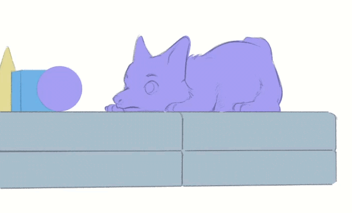
Let's see how the drawing looks like without any sketch.
We lose a lot of details now.
I also intended to put that platform for this moment. We won't able to see the information without these darkest shadows.
Ambient Occlusion is the darkest area of the shadow and we usually sees it on the corners of any object.
In the world of Line Art, Thicker lines means more Ambient Occlusion and also means larger shadow on that area.
------------------------------------------------------------------------------------------------------To add Ambient Occlusion, you gonna need the Lasso.
Select the corner areas like the paw, the mouth, or that line on the platform.
------------------------------------------------------------------------------------------------------Then, use Airbrush and gently add a stroke to it, just on the side.
and clean it with soft eraser whenever you think it's too harsh.
And when you applied it to all the object, it looks finish.
But we're not done here.
Step Seven: Ambient Lighting (Optional)
Others might not see this important especially into stylized work so I might label this as optional.
In achieving realistic, this is important to make it more look real. It is so subtle that if you are new on studying art stuff, you won't be able to notice it.
Ambient Lighting is just another word of Reflected Light or Bounce Light. It means, a light that is not came directly from the main light.
Once the light bounces and hits the shadowed area of the object, that's the ambient lighting.
So adding this subtle detail will help your coloring add more to it.
It might not look important but trust me, one of the important thing you need to consider.
And once I added this, you'll see a subtle satisfying difference.
All you need to do is add more layer
then color pick the highlighted area of the subject
and add gently to the shadow area where you think the bounce light hits.
Of course, it's almost nothing, it so subtle but that also depends on the intensity of the bounce light. If how reflected of the ground or wherever the light bounces.
Example, mirror can reflect light easily, but wood, not so much but still reflects.
Step Eight (Last): Overpaint
Of course, everything is always ended up on overpainting.
We need this to do our finishing touches. Before you do everything, make sure that you are prepared to never go back from merging the layers.
Without overpainting, it will lacks a finishing quality to it.
Remember that it's not about the method, it's about you, the one who can finish the work with all the knowledge in mind.
To start the overpainting, you have to merge the layers of each object first.
Select all the layers you want to merge
Then right click and select "Merge Selected Layers"
once it merged, simply apply the Lock Transparent Pixels to it and begin over painting the highlight or the specular lighting or whatever you prefer to call that brightest part of the highlighted area. The important is, you know how to put it.
For me, this is considered as done. But this is just a simple illustration. How about we try this to the complext one.
Complex Details Sample (Recap)
------------------------------------------------------------------------------------------------------
------------------------------------------------------------------------------------------------------
------------------------------------------------------------------------------------------------------
------------------------------------------------------------------------------------------------------
Adding all those shadows.
------------------------------------------------------------------------------------------------------
------------------------------------------------------------------------------------------------------
------------------------------------------------------------------------------------------------------
And of course, finalizing it, painting on top of all of the layers. Careless but trust my skills.
Outro and Advices
For me, these method is just here to help you to be able to see things visually for you.
What I taught you here is just like pointing out some subtle details you might didn't see when you're drawing or studying.
Sometimes, our brain does know there's something in there but can't point it out what could be it.
Once you complete the one to six step, you are now free to do the final move. One to Six step is enough for you to see what's really going on to your illustration and adding those details additional details wouldn't be that hard.
I just helped you to break down the information for you to understand more.
Trust your skill, practice, never afraid on failure, as an artist, we improve constantly and can never be perfect but can be better.
Users who liked this post


Comment