
Hi Clip Studio creators!
I love creating digital watercolor in Clip studio, it's the best program I have used for watercolor techniques, and I am discovering more and more amazing techniques and features as I go.
NOTE: This tutorial is more about my advanced process than the basics, so it will probably only be easy to follow if you already have some experience in Clip Studio.
Digital Watercolor - What is possible?
I have always loved traditional watercolor, and used it a lot in my illustration over the years, I even did a whole children's book in watercolor! But for a long time, DIGITAL watercolor wasn't an option. I used to paint in traditional watercolor, then scan it into photoshop and do my linework over the top! Thank goodness, those days are long gone and we can now use digital watercolor.
So what is possible? To a certain extent - anything! Using scanned textures, and the tools already available in Clip studio, I think you can create the results you really like, quickly and at a professional level. You just need to get your grip on a few techniques particular to clip studio and digital watercolor.
So, if anything is possible, I suggest you gather some great reference artwork of where you would like your watercolor pieces to go - gather reference from Pinterest or elsewhere, of watercolor artists that you like. Some of my favourite watercolor artists are below (please follow the links to view artists work):
EDMUND DULAC
A golden age illustrator. I love his vibrant colors, and natural textures. Also the way he uses color warmth and coolness.
ARTHUR RACKHAM
A legendary, groundbreaking illustrator from the late 20th century. I love his explosive imagination, powerful lines, and lovely colors.
Digital Watercolor - My Style of Watercolor
Now, I know everyone has a very different style and approach to art, so I am going to be focusing on my own personal techniques. But I do want to say, you can apply everything I describe in this tutorial to YOUR OWN art style - there are no limitations here, just lots of options!
All that to say, you can see some of my art work below, using these techniques, and using Clip Studio to create art in digital watercolor:
And this is my painting I will be discussing and walking through in this tutorial. It's called 'Look Up':
These techniques come out really well in both digital display AND traditional prints, so if you create a watercolor painting you like, I recommend you get it printed at your local print shop to potentially sell as a print or just put on your wall.
You can seem ore of my artwork on my website:
And my instagram:
Process and Overview
So my process, which I do recommend you follow at least for this tutorial, has a few important steps before we get to the watercolor painting:
PART 1
Rough sketch, Lines, Flats
PART 2
Watercolor Base
Coloured lines
Watercolor Shadow
Highlights
Effects
Rough Drawing
I usually develop my best rough drawings / layouts as a thumbnails. There is something about simplifying a page into a tiny sketch that really helps me create a nice balanced layout. Plus at such a small size it is so fast to rub away areas and redo them, or just start on a new rough sketch.
This is what I did in my traditional sketchbook, then took a photo of it in my ipad to bring it into clip studio:
This rough sketch was really small, about 1/4 page of my small sketchbook. I also did some other sketches , but decided to stick with this one. It has a nice flow or energy to it. I don't mean that in a weird way, I just mean that the lines and elements have a nice sense of movement and focus to them, like so:
Don't be afraid to fill page and pages with rough sketches before you find one that works for your illustration idea. Don't worry if you spend lots of time in the rough stage, it is one of the most important moments in your process - Any rough sketches you don't use you can always use later on for another illustration.
Now we have finished the rough, it's time to do the hard pencil lines.
Pencil Lines
Now, import your rough sketch into Clip Studio, and make sure the page size is at least A4 / Letter size, and that the resolution is set to at least 350dpi (600dpi is what I often use).
Import your rough sketch then set your opacity low, and on a new layer, start to create your lineart.
Some notes on lineart in watercolor:
- Sometimes less is more with lineart for watercolor illustrations. If you look at the examples I used above of Edmund Dulac, you can see he used thin, fairly even lines. But at the same time, you can use bolder lines, you just have to work out what works for you.
- I often use a thin line when doing watercolor illustration, and in this painting I used the default 'Textured Pen' inking brush for a nice clean yet toothy line. I increase the stabilisation to 20 to help smooth out the lines, and I set the brush size small, to 0.5.
- Something I find very handy when inking and throughout the whole painting process, is the 'Sub View' panel. You can basically load any of your favourite reference images, for example a inked artwork you really like, and use it as reference as you draw:
Now, once you have tested out your pen, start to draw your hard lines on the new layer. Focus on outline texture and overlapping shapes. You don't need to worry about shadows, unless you want a ink textured look - just focus on the outlines and texture of the clothes etc:
Remember to keep your linework as clean as possible. This will help get a prime result. Some examples of linework that works well for watercolor artwork:
I base my linework for watercolor illustration on references like Edmund Dulac. To analyse his linework, ignore the color and just observe the linework.
Its very clean, clear. Note how he develops shadows with his watercolor, not his inkwork:
Flats
Flatting is a very helpful, but not completely necessary step in the digital watercolor art process. Basically, flats are selections of colour that we use to control our watercolor painting flow, so the strokes we make stay within the line - it is super helpful to keep things tidy. But, if you want a more natural, looser look, you can skip the flats process.
So, unlike many comic artists who set there flat selections to any random colour, I like to make my base colour decisions when doing my - basically I find it a very helpful step in the process to decide the colours I want to use in my painting.
So, first:
1. turn off the rough layer, we don't need it anymore, we have finished lineart now as our reference
2. create a layer underneath the the Linework layer
3. Select the default soft spray paint, and begin to paint in your colors very loosely - this is all about mood, not accuracy:
Please don't worry about staying within the lines, these colours are just notes to your future self to help you create a 'feel' or emotion through your colour selection.
Once you have a general feel of the colours you want to use, select your line layer, and lock the transparency, then set the line layer to be a 'reference layer' using the lighthouse icon:
This will make the line work a reference for your flats, that will be created on a different layer.
--
So now we have a rough idea of color let's move onto the FLATS.
create a new layer UNDERNEATH the linework layer, then select the paint bucket tool, and use the below settings:
Just to break down some of the settings:
'Close gap' is very important, as it will close any gaps in your lineart as you create your flats. without it, even the smallest gap will make your paint bucket spill to other areas of your artwork.
'Tolerance' will set a tolerance lever to allow variations in colour (in this case any grey in your lineart) to be ignored.
'Area Scaling' means that the paint bucket will fill a little bit past the line, which is very helpful to make sure you don't get fuzzy spaces around your lineart.
'Refer to multiple' tells Clip which layer to refer to in the fill process - in this case we want the paint bucket to refer to the lineart. So even though we are in a different layer below the lineart, our fills will be constrained to the lineart outlines.
Now begin to fill in your flats layer with the 'general' colour of each object. Refer to your previous colour sketch using the eyedropper tool to select colours then click to fill each element with a flat base colour.
Keep fiddling and getting your colours just right. I didn't like how low the contrast was between the background and the foreground, so I darkened the bottom part of the scene and background:
Now, onto the 'Watercolour' painting part!
Watercolor Base
Traditional watercolour is built up in layers from light to dark, and digital watercolour seems to work well if you follow that same process.
First of all, you will need to download these amazing, life-changing, mindblowing brushes, which are totally free thanks to the generous creator ×ェ× :
Please familiarise yourself with these brushes on a blank page, they are all very helpful brushes, and I really enjoy using them as they are, and tweaking them to suit my needs. Anyway, the main brush you will need to create your base watercolor is found in this set, here:
(NOTE: I DON'T SPEAK JAPANESE, SO I ADDED ON THE WORD 'plain' TO HELP ME REMEMBER WHICH BRUSH THIS IS)
This brush is very good for many things, its versatile, and has a watercolour edge, which you can turn on and off, depending on what you want to do. It gently mixes the the foreground and Background colours, so if we select red/pink as foreground and a blue as background colour:
We will get a nice gentle mix of the two colors:

Using the pen pressure, you can start with a hard edge, then as you soften and rub an area, it can become a soft edge, just like regular watercolour. Example below:
So once you have gotten the hang of this brush, go back to your illustration document and create a new layer called 'Base' or something similar, to put down your base watercolor.
Select the flats layer, and then using the magic want tool, click on the area you want to start painting. Make sure that 'refer to selected layer only' is also the magic wand setting you use, and your magic wand tool is set to 0 area scaling. Here I selected the large green cloud to get started with:
Now, turn off your flats layer and on your 'Base watercolor' layer, begin gently painting in your base layer of watercolor:
Keep going on each seperate element, creating a base watercolor wash for each element. Remember to really play with the colors, don't be afraid to use reference to choose some nice colors and experiment with what works and what doesn't. Sometimes the most surprising colors work well together.
I didn't do a timelapse recording of this particular painting, however, here is a timelapse of another painting that I did recently, where I lay down the base watercolour colors:
OK, now sometime this technique doesn't work for all areas, and large areas of colour require a different approach. For example I wanted to add texture and depth to the background behind the girl looking up to the sky.
To fill large areas I like the triangle scatter watercolour brush that comes in the set I recommended you download previously:
This brush also mixes the background and foreground color, so make sure you select both of those colors before you get started.
To fill an area with this brush, I suggest using a few layers.
I created a new layer, and filled it with a bit of texture, using scattered triangle and circle shapes, by increasing the scatter in the brush settings:
I then created a new layer on top and carefully painted in the background again using the same triangle brush, until I got a nice solid layer of color, like so:
NOTE: I also finished painting in the base watercolour for the crowd and the girl in this step:
That's about it for our base watercolor - it may not look like much yet, but trust the process, once we put in our shadows, highlights and extras, its going to look great!
Colouring Lineart
This is optional, and it is not something many of my references do, but I like to color my lineart in at least some areas. I find it ads unity to the artwork. I even do it in my comics!
Basically, all you need to do is firstly lock the transparency of your lineart layer, so that you can color the linework directly without worrying about destroying your linework.
I then select some solid colors, like red, or blue (this is a very intuitive part of the process and hard to advise on), and color the different areas of my illustration. In the areas closet to the bight lights, I make the lineart almost white, a bright yellow color.
You really have to follow your gut in this part of the process. Experiment.
Some of the objects, like the star shapes, I have given a bright line color to make them 'pop' in the composition.
Remember you can leave some parts as black lineart, just change the colors of the lines you think look best.
You should end up with something a little more cohesive, like this:
Watercolor Shadows
The Shadow layer is very important in watercolor painting - think of it as just another layer of paint you are putting on artwork. It brings depth, dynamics and focus to your composition.
Currently, your artwork should be in about this stage, with all your base watercolors laid down in generous washes of color:
IMPORTANT TIP: if you base watercolors are not bright enough, duplicate the layer. This will double the saturation of your base watercolor. You can then adjust the opacity of the duplicated layer until it is just right, then merge the two layers together. That is more or less what I did below to obtain some very vibrant but smooth washes of color.
To create the shadow layer, I get the same round brush we have been using to lay down our base watercolor, and select a deep shadow.
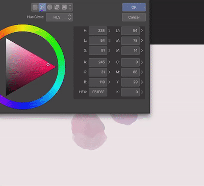
A note on shadow color - As the base colour of my illustration is mostly green, I have selected the complimentary color Red as my shadow color. If the main base colour was blue, I would go for an orange brown shadow color.
You can use the color wheel. If your main color in your illustration is on one side, choose a shadow color from the other side of the wheel, which would be a complementary color.
So this is the color I chose for my shadow color, a purply red, with the background color of bright red, which subtly mixed to the foreground colour as I painted:
I then create a layer called 'shadows' above the base watercolor layer, but below the lineart. I set the opacity to 61%, but you can adjust that level depending on how heavy you want your shadows to lie:
Then I gently but confidently begin to paint in my red shadows. I use the selections from my flats layer to help my stay within the lines, just as I do with the base layer.
Things to remember when painting shadows:
There are soft shadows, and hard shadows, depending on how close or far away each object is from the other
If an object is far away from the object below it, its cast shadow will be further away.
Cast shadows really do help define the form below it (see how my cloud shapes above curve and distort cast shadows falling on their surfaces.
You should end up with some real depth beginning to show in your artwork due to the interaction of the shadows:
I didn't record a timelapse of this particular illustration, but below is an example of another of my illustrations where I am painting in the shadow layer:
And this timelapse clip below shows how the shadow layer can help actually define the form of the object in a lot of detail:
Highlights
Highlights can really make an illustration stand out, especially in such a delicate medium as digital watercolor. But they also need to be used sparingly.
I didn't use many highlights in the illustration 'Look Up' that we have been discussing, except for the linework that I changed to bright yellow or whites:
But I did create a layer, and using a white color and the round watercolor brush, dotted in some textured highlights to create an atmosphere of brightness in areas that needed it:
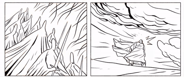
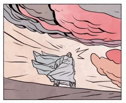
On a page from my comic The Temptations, you can see the before and after effect of adding in highlights. First I created a layer below the lineart and selected the default Textured Pen (that we used previously in the tutorial).
This is the page without the highlights:
Then, thinking about a light coming from one direction of the characters, I drew in highlights on the sides of the objects, and a rim light totally surrounding the main figure in the illustration (Jesus):
Here is a little video of me painting in the highlights:

You want to make your highlights work for you, to bring out focus as well as realism. Also, don't overdo it!
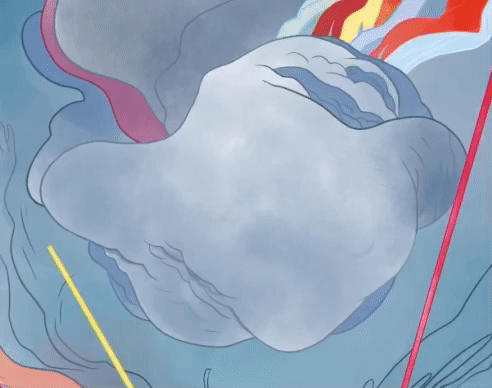
In this illustration, I selected the background, and gently painted in a white highlight using the round watercolor brush, as you can see below. I also used focus lines leading to the main character's head, to bring focus, as well as a white outline surrounding the whole character:
Effects
Sometimes effects are key to make a digital watercolor painting look more traditional. Here are a few tips I highly recommend.
So at this point, 'Look Up' was looking good but it needed more depth in some areas, so I create a layer set to 'hard light' (or you can use 'vivd light' if you like). I also created another layer on color burn to darken some areas of the painting:
Then I gently painted in textured washes on each of these layers, to create more depth and contrast, using the same triangle watercolour brush we used before:
Some closeups of the details I painted in using green, blue and red colors:
Another important technique is a 'soft light' layer, using a watercolor texture layer.
I developed the below texture from my files, and it works well, fee free to use it yourself:
Or, if that doesn't suit you, the file included in ×ェ×'s watercolor set we downloaded earlier, you will find it here, which you can just drag onto your canvas and set to 'soft light':
So this is what the illustration closeup looked like before the 'soft light' texture:
I set the watercolour texture to 'soft light' and play around with the opacity on this layer:
The result, a subtle but beautiful change:
Optionally, you can keep adding in textures. I like to add a nice paper texture to my watercolour illustration:
You can find these types of paper textures, often seamless, on google or on texture website. Experiment for what works for you!
I set this layer to 'multiply' and lower the opacity:
And the final result is the below:
Conclusion
That's about it!
All the above techniques can be applied to your particular artwork and style - just use the principles I have defined in detail, and apply them to your drawings.
Some final notes on watercolour illustration:
Use reference for your watercolour paintings and for colour, it really helps!
don't be afraid to experiment
use overlay textures to make your watercolor work more dynamic
Clip Studio has a LOT of tools. I have only covered a few. They can all add up to help you create better art, and a more enjoyable and rewarding experiment, so get educated on everything Clip has on off.
Please let me know in the comments if you have any questions.
Tag me on instagram at @dropthedrawings to show me what you come up with!
And check out my art here:
Thanks very much for reading, I hope you enjoy trying out these techniques!
Users who liked this post


Comment