
Hi! My name is Manu Mercurial.
In this tutorial, I will show you how to paint any character illustration in just Six steps, by thinking of Lighting as a tool to tell a story!

Before we get to painting, we need to talk about LIGHT. There are two things that you always have to keep in mind: where the light is coming from, and with what intensity. It is also important that you try and ‘Push your Values’ in your illustrations, by using the entire range from absolute darkness all the way to pure white, and not staying only in gray tones.
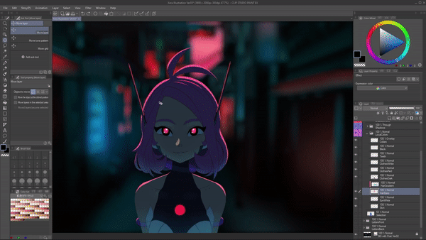
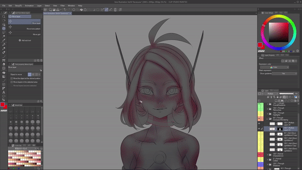
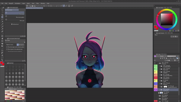
I wanted to create an illustration of my original character, Xeraphine. So this is the line art that I will color.
Step 1: Local Colors (Color flats)
With this line art as a guide, we can start filling the color flats, also known as Local Colors. They are the actual colors that the object has without worrying at all about the lighting. It's important that you do it cleanly because these color flats will also double as selections that we can use when we are rendering each part of the character.
I recommend these settings in your fill or bucket tool. Use the close gap function so the color doesn't spill and also the area scaling. That way your feels will bleed out a little bit under the line. You just have to paint your color flats on different layers depending on what part that is.
For example, I separated the skin in one layer, the hair in another, her clothes, and her small details.
You can use the different layers not only as selections, but also as clipping masks. You can create a new layer and place it on top of the layer you want to use as a mask.
Then click on the 'clip to the layer below' button. Now I can draw a single light blue stroke and you'll see it will only show on top of where that pink hair is. This is really useful to create the gradient on her hair without worrying about painting it carefully.
Step 2: Color Integration
This integration pass is what allows me to use whatever color I want and still make it feel believable. Its goal is to “contaminate” the local colors with the tones in the environment, to make the character feel like it is actually standing in the scene.
In the case of our illustration, what we'll do is grab the entire folder where I'm placing the color flats and left click on it while holding the CTRL key. And this will create a selection. I will fill the entire thing with a blue color and in the same way I colorized my animation.
I will use the 'Multiply' blending mode and lower the opacity of this blue to make the character feel like she is standing in the middle of that background. See how it contaminates all the local colors? And again, I'm not worrying about the lighting yet. Just making her feel integrated to that place. In this case, one small detail that I will save is grab the layer for the red eyes color fill and move it on top of everything because I don't want it to be affected.
Step 3: Highlights
This is one of the funnest parts of the process where again, you just think of where your light is and how intense it is and then apply it to your character.
In this case, if the light source is the letters that are behind her, then I will create a rim light, which is a highlight all around her silhouette. That creates a lot of contrast and also separates her from the background.
If I just left this rim light and started painting shadows, the entire character would be tremendously dark. That's why I decided to add a fill light that's coming from below. With control pressed, I will left click on my skin flat color layer preview.
Just like with the folders, clicking this small preview will create a selection that I will use to paint this fill light. Fill lights are not as sharp as rim lights, so I will use a softer brush and paint it with a big cadence.
This is why we spoke about light direction and its intensity, because it's not the same to have a really bright light right behind you to a more tenue light below you. And the cool thing about art is you don't really have to be realistic as long as it's believable. So experiment away!
One of the coolest things about this pipeline is since we have everything in separate layers. If at any point I feel any of the colors is not working, I can just go to the layer and press control + U to trigger the hue and saturation adjustment and just modify it to my heart's content.
Step 4: Shadows
It's important to use color in your shadows, even if it's really desaturated. You never want to paint with black because then you lose the ability to play with that. After this I will change the blending mode to ‘Multiply’ so they actually darken my character.
The key to shadows is not to think of them as something you paint on the subject, but it's actually the absence of light that causes a shadow. So the lights will be the ones to tell you where a shadow should be.
There is three types of shadows. This is an old drawing from 2017, but it has a perfect example for the first two.
The first one is Cast Shadows. Whenever there's an obstacle between the light source and the subject, a cast shadow will be cast upon it, and they're characterized by their sharp edges.
In contrast to this, we have Form Shadows, which are the shadows that happen when the object surface shies away from the light source and they are characterized by actually a soft edge.
An example of this will be the cadence on her belly, which is actually way softer than this sharp edge, which is a cast shadow casted by the arm. You have to take this into account when painting shadows on a character.
The third type of shadow is Contact Shadows, also known as Occlusion. These are shadows that exist where two surfaces make contact, and they are there regardless of the light source. This is an important pass because it's the one that gives volume to the object. For this illustration, this is our occlusion pass and you can see it's strongest whenever there are two surfaces that touch each other
If we add our highlights, you can see how much it's already carrying the weight of the illustration. If we turn on our local colors, it's already there. Just need to make our integration pass stronger. And it feels like the character is right there.
Step 5: Material Rendering
We're going to take it further with our step five, the material rendering pass where we basically go in and make everything feel like what it's made from.
So making skin, looking like skin by adding some subsurface scattering. You can see the reds i'm adding here. Also a little bit on her eyelids. For the hair I'm going to add highlights and texture. Add some glow with the Add glow blending mode to her chest light.
This is a game of patience, but also a game of using references. If you are not sure how to paint any of these materials or parts, I recommend you look up a similar art or photograph and try to imitate what you are seeing.
Step 6: Post-Production
Post-Production is basically making the image look as good as it can get. These are broad changes like gradients on top of everything using blending modes like Add glow to make it lighter, Overlay to make it more saturated or Multiply to make it darker. It's up to you to decide what's the effect you want.
Now, the real key aspect to your success in painting and illustration is not really in the painting, but actually using references. As many as you can. Take your time to actually look for things that you like, not only in lighting and color, but in the drawing, the pose, the background, and even the story. All professional artists use reference!
And remember:
“Every line you draw, you are one line closer to your dream.”
@ManuMercurial on every platform:
www.youtube.com/c/ManuMercurial
www.twitch.tv/ManuMercurial
www.instagram.com/ManuMercurial
www.twitter.com/ManuMercurial
Users who liked this post


Comment