
I usually browse the avatars of social media roughly. Under such circumstances, how can people see the content of the painting clearly in a small space? Spend most of the time drawing trivial and too detailed pictures, but the effect is not good. In view of the above situation, I recommend these 5 ways to improve, focus on the key points you want to express, and make adjustments and simplifications. Keep the eyes of others.
The difference between avatar illustration and general illustration
The avatar is not like an ordinary illustration. You can spend a lot of time watching the details. If you stuff all the content in a narrow area, you can't see anything clearly. Use a partial magnification method to emphasize the key points and weaken other things. interference.
I demonstrate it in the way I am most familiar with - the avatars of characters are like small game icons all over the desktop of the mobile phone. You can recognize which game it is at a glance, especially those role-playing video games (role-playing video game , referred to as RPG), usually in the picture are very representative characters in the game.
The following characters are models for this lesson◝( ゚∀ ゚ )◟
The following methods can be tried no matter what style of painting is used, whether it is pixel style, cartoon style, or even graffiti style, even if it is a style like random graffiti, it is still very eye-catching.
composition planning
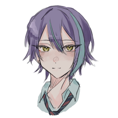
Circular composition:
At present, the avatars of social media are mainly circular. No matter what size they are, they will be cut into a perfect circle. You can use this range to draw and try to follow the arc of the circle. The position of the wings and hands in the picture is just right. Follow the circular frame to perfectly combine the picture with the frame (head sticker range).
*Tips for drawing a perfect circle: Align the middle of the cross with one of the corners of the canvas, press shift to draw a perfect circle.
close up:
Emphasize the characteristics of the character and make people feel more deeply about the character, EX: Heterochromatic Hitomi
*Tips for drafting: For me, it is not easy to grasp the proportion of the skeleton when drawing a close-up composition, so I often draw crooked, then I can draw a little prototype in a small area first, and then enlarge it later, because in the draft stage, It doesn't matter if it's a little blurry.
Consistent with the cover:
Taking Twitter's specifications as an example, the aspect ratio of the cover is 3:1, but in order to make the whole picture on the page coherent, the size of the canvas needs to be paid attention to, and the width should be 2 avatars long. The range must be set to the bottom left, as configured for the social media.
color planning
Contrast of cool and warm colors:
The contrast between the two colors is very attractive, but according to the color principle, warm colors will visually give people a feeling of expansion and progress, and cool colors will give people a feeling of shrinking and retreating. It has a warm tone and can accentuate the focal point of the painting even more.
Bright Contrast:
The more the difference between the brightest part and the darkest part in the picture, the stronger the contrast between light and dark in the picture. When your picture has a high contrast between light and dark, it is easy for people to notice the key points. For example, I believe that your eyes are all focused on the character's expression, the items you are holding, and everything else is buried in the dark, so people won't notice it.
Compared with color, the human eye is more sensitive to changes in light and dark. If you want to check whether the contrast between light and dark is strong enough, you can convert the image to grayscale (Layer > New Tone Compensation Layer > Gradient Correspondence). "vice".
Materials and brushes used
Users who liked this post


Comment