
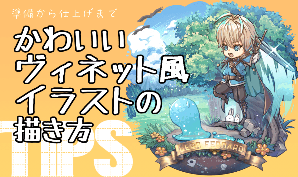
QUICK NOTE
Some of my drawings here are horror-related but nothing too graphic.
INTRODUCTION
Being a self-taught artist, a lot of my learning process has come from many tutorials from amazing artists who’ve shared their own tips and tricks online. So, in an effort to not repeat all the tips that have already been taught and expanded upon much better than I could ever do, I will share the 3 things I always try to remember in creating “Dynamic Poses”, making them able to work no matter what style or pose you’re using.
PART I. CHARACTER
One of the issues I see people have difficulty with in dynamic posing is maintaining the essence of a character itself. It’s either you showcase the character’s design, sacrificing an awesome pose, or vice versa. Here are the 3 things that help me in maintaining my characters’ personalities when I’m posing.
1. CONSISTENCY KEYS
I’m sure there’s an actual term for it but “Consistency Keys” is the one I’m calling it for now. It’s about finding the specific parts of your character that make them instantly recognizable. You see this all the time in the most iconic characters in history, but for copyright reasons I won’t be showing them SO, here are my own characters instead.
This is Merry, and she’s an OC I’ve had since 2017. At the time I first created her, there wasn’t much thought of any storyline -- just personality. And while I cringe at the original takes I had for her in the beginning, you could clearly still find consistency between all these poses. I did that by honing on several things: her top hat, her clothes, and her spiral-y hair.
All of these little things add up to a nice, recognizable silhouette, which is the number one thing you have to keep in mind for character design. WHAT NOT TO DO is to prioritize detail over the silhouette, like this old drawing I did way back in 2010.
WHAT NOT TO DO: Detail Over Silhouette
BUT that isn’t to say that detail is bad. If emphasizing details is part of your style then, by all means, emphasize away. In fact, this drawing was inspired by one of my favorite artists growing up, hellobaby. Their work is chock full of detail but it never takes away from the actual silhouette of the subject of the piece. This old drawing was me trying to emulate their style, but at the time I didn’t understand line weight and line economy as much as I do now, so the details I use just became noise, and while you could technically see a recognizable silhouette, I think it could’ve been done better.
QUICK EXERCISE: Consistency Keys
It’s best to learn how to practice this with real people as well, so using these photos of yours truly, what shapes could you immediately identify as the Consistency Keys? (please excuse the blurred-out book covers. Gotta be good with the copyright gods lmao)
Just at an initial glance, you have the squiggly hair, the poofy sleeves, and the lanky legs. Draw those 3 things, even exaggerate them for stylization if you want, and they are sure to be recognizable!
2. CONSTRUCTION
Next, you’ll want to get your fundamental knowledge about drawing 3D objects down because a lot of character construction IS just understanding how basic 3D shapes work.
In our example here, this is one year later from my first creation of Merry. I had been busy with work but at that time, I took the opportunity to pursue learning anatomy AND stylization.
Since this was going to be my first real drawing of her one year later, I wanted to actually find her “core/center”, so keeping in mind the “keys” mentioned before, I redrew her in a more realistic approach, but still stylized. THIS was the Merry that finally got me thinking of a storyline.
WHAT NOT TO DO: "It's My Style"
THIS is one of my earliest drawings I could find, dating all the way back to 2009. Yes, you could clearly see the style inspiration from anime, what with the big eyes, pointy facial features that sit on a head that is way too disproportionate from the very flat body, and of course, the very unnatural, and unnecessary posing going around.
Of course there are many areas of improvement in this drawing, but what I’d like you to take away from this is to not use the age-old excuse of “It’s My Style.”
Yes, you could argue that maybe this drawing could be a “style” on its own, but since I’m the one who made it I’m saying no. I was clearly very young then, a baby artist that didn’t know much, and that’s okay! Because I was definitely excited to draw, and I hadn’t stopped drawing since.
A lot of veteran artists (and just creatives in general) give the age-old tip that is “practice, practice, practice”, but let’s break that down a little bit:
Time affords us the opportunity to learn from our mistakes, to “practice, practice, practice”. But most of the time we think about it as the physical act of doing. That’s why to some budding artists, hearing the phrase could become a deterrent instead of providing hope. After all, wasn’t it Einstein that said that insanity is doing the same thing over and over and expecting a different result?
(No, actually. It wasn’t Einstein. It was Rita Mae Brown, an amazing mystery novelist who wrote this specific quote, as one of her character’s quotes, in her 1983 book called “Sudden Death”. Thought you should know. ;))
Anyway, the point I’m trying to make is that the other half of “practice, practice, practice” is using your mind. Look at a random object near you. Observe how it looks from that ONE specific viewpoint. Then grab the object, and observe how it looks on all sides and all angles.
THAT, my friend, is observing 2D and 3D perspectives. Keep that in mind, add it to your mental library, and soon enough, by connecting your observations to your sketching, it will become more intuitive with time.
QUICK EXERCISE: Construction
Using these two totally hype poses, observe how the limbs work. Using cylinders, circles, or whatever shapes you can find, break down the construction of these poses in 3D space, and try finishing the pose using only your shapes.
3. CONTRAST
Here’s the fun part. Line of Action, we all know this. We’ve heard of it time and time again. Makes dynamic poses go whoosh. But what if you don’t want to make pose go whoosh? What if you want pose to just stay still? Contrasting shifts of body parts is where it’s at.
Take a look back at this pose from before. See how the right fist goes up with the left leg? That’s contrast right there.
Our bodies have weight, which is affected by gravity, so our bodies naturally compensate for shifts in our weight so that we don’t fall face first because of gravity. It’s why we naturally walk with opposite arms and legs, and trying to walk with the same arm and leg feels unstable.
Interestingly enough, contrast makes more “relaxed” dynamic poses still look dynamic anyway. It’s about finding the natural straight and curve in a pose, and applying them as they would naturally occur. The best way of sometimes doing this is to simply do it yourself, or look to others and observe if they could do it.
Afterward, when you’ve got the “relaxed” poses down, then you can try bending the rules a little bit. For example, here are two more of my OCs: a merman and a lynx-lady. Their designs intentionally have very contrasting body parts, and that’s part of why I love them so much.
The merman has its upper body that has the general mobility of a human male torso, with the limitations of its bones, joints, muscle, etc. BUT, the tail is fluid, thus giving more opportunities to create contrasting shapes, both in action and stasis.
And vice versa for the lynx-lady. With her, I wanted her body parts to be more angular, and yet create an illusion of curvature. It makes a very fun challenge for posing and contrasts nicely with the merman.
SPEAKING OF WHICH, another thing you can do is to add contrast in characters posing next to each other. That way, it gives off a feeling of fitting in each other’s space like pieces of a puzzle, or even vice versa.
WHAT NOT TO DO: Contrast with no Context
On the left is an old OC, and discarding the fact that she has SIX fingers (which she was accidental) the main issue was that I took contrast to the extreme. Our heads cannot turn that way unless our shoulders turn to compensate for it. But at the time, this pose was so common in anime, I literally have at least 2 old fanart drawings that I can’t show because of copyright reasons BUT they’re doing the same neck-cracking motion.
On the right is the same OC drawn a year later, and sure, there’s clearly been some learning done both in fancy-schmancy text and interesting contrast. BUT contrast for the sake of contrast doesn’t work as well in the context of her character and has no value whatsoever, PLUS her character design overall is just suffering a little too much with details that, at the time I thought were cool, but now I just think are too much.
But don’t worry. High-contrasting poses still work, no matter what style you use. Great examples of these are present in manga like Soul Eater, My Hero Academia, and Attack on Titan. With specific artists, Derrick Chew’s work on all things Harley Quinn or Artgerm’s on Catwoman. I’ll link their profiles down below or you can just google them yourselves.
As an EXERCISE, here is an old fanart I did of one of an OC, belonging to one of my long-time favorite artists, Shaun Healey aka Endling. (I found him during the prime age of deviantArt and I’m DEFINITELY linking him below because I just found out that he’s a CGMA Instructor now??? That’s amazing!)
I was really proud of this piece at the time because it was the first big contrasting pose I’ve ever done, and that’s also thanks to the character itself. Her arsenal is this giant sawblade weapon, so it takes a BIG swing to move.
But beneath all the cool get-up, try to see the pose underneath. How is her upper body twisted in relation to her lower body? Where are her arms? Her shoulders? Could you push this pose more to heighten the anticipation?
PART II. COMPOSITION
Most of you have already heard of this term in the Environment Art world or cinematography, or at least that’s where I first heard of it. But composition itself simply means “putting together”, and when it comes to dynamic posing, it’s putting together everything that was mentioned above in a way that naturally flows through your art.
Make your character silhouette distinct with the consistency keys, keep in mind the construction of your character’s body
WHAT NOT TO DO: Contradicting Elements
With the chocolate one, even disregarding the bad values going around, focusing on the girl, there’s just no way that she’s remaining balanced as she is with how her legs and feet are bent, and how her upper body is leaning way with her arms tucked in. I tried doing it myself and, no, I will NOT be showing documentation of that, but basically: her pose is impossible unless she’s just that naturally flexible with her feet, ankles, and have IMPECCABLE core strength.
And then the second one. Oof. While I do still think that this character design is cool, the consistency keys are there, the contrast, the construction (sorta), it just doesn’t work. Same as the chocolate one. Sure, it fits the style of old shoujo manga, which I was heavily influenced by back in the day, but all these inconsistencies end up making it look like quirkiness for the sake of being quirky, and I don’t want that.
Now, by this point, you might be thinking, “hey, it’s natural to look back at old baby art and cringe at all the mistakes you’ve made”, that is true. But it doesn’t mean we can’t backslide and make the same mistakes again. Case in point, here’s a “self-portrait” I made last 2019:
I do not like this, at all. But at the time, I did. So much so that I even turned it into a YouTube banner. Now though, when I look at it I can’t but feel how wrong it feels. Yes, you’ve got your keys, your construction, your contrast, but composition? All of these elements working as a unit? It feels wrong.
Compared to a much earlier self-portrait I did 2 years before, THIS one feels MUCH better. But why? If anything, there were a lot of improvements on the fundamentals in the 2019 one, but the 2017 one still feels right.
Why? Well, that’s what our last -- and I think the most important part of dynamic posing -- topic is about, and yet I don’t see many people discussing it. And you’ve probably already caught it mentioned once or twice here, actually.
PART III. CONTEXT
Of course we’re going to start with the handy-dandy Merriam-Webster definition first, which states that “Context is parts of a discourse that surround a word or passage and can throw light on its meaning” or the “interrelated conditions in which something exists or occurs.”
And with drawing Dynamic Poses, that basically translates to “Does your pose actually fit the scenario it’s being used in?”
I know it sounds very rhetorical; your answer is obviously going to be “Yes!” because it’s your character, and no one else is going to know them better than you. But that’s just the thing: you don’t. OR at least, not immediately. When you’re at a point where you can naturally think about your OCs every natural reaction to forces that come for them, then you’re on top of your game.
Case in point, look at every single piece I mentioned in the “WHAT NOT TO DO” sections. All of them miss that one important thing: CONTEXT.
Heck, I’ll add even more:
These were freebies I did for other people’s OCs back in 2020, and they look so flat and straight when I really thought they looked cool at the time. And here was an old group commission from 2014 and they were all supposed to be superheroes, sure, but they all didn’t have to have ONE knee up (which was not something my commissioner specifically asked for, btw, and they were so nice)
And this princess-looking one was a birthday gift for my bestfriend, bless her soul, and there’s absolutely no context other than she’s some birthday princess. But the worst has to be this one from 2011, where he’s supposed to be in some giant ice cream sundae world and he’s doing that same quirky, feet are twisted pose. It’s all just jkaldjfjadjdafklj
WHAT you SHOULD DO:
1. Know the Purpose of Your Pose
These poses were meant to showcase the personality of each of my characters with just one look:
And THESE poses were meant to showcase the actual “anatomy” behind their impossible feats:
And THESE Poses were meant to make you tense, and wonder what on earth is going to happen next:
And all of THAT was from 2017. Man, I missed those OCs. Let me know if you’d like to see more of them because it’s been so long since I’ve thought about them, and seeing them now gives me the warm fuzzies.
But I digress – it’s good to think beforehand about your reasoning behind a pose. Sure, if the pose looks awesome, the character has reason to do it, and the camera angle is sick, by all means, do it! I’m basically describing the Superhero Landing at this point so of course you have to, right?
Well, yes and no. Look back at the bubbly piece before:
The reason why it doesn’t work, other than the weird composition, is because its main purpose was to represent who I was, and my overall go-with-the-flow, pretty laid back but also with a bit of anxiety on the inside kind of vibe at the time. And while it might be doing that job technically correct, what it used to represent is no longer accurate because I’ve changed, and now this just feels like staring at a bad AI rendition of what a perfect artist persona I would be.
And the 2nd thing that comes hand-in-hand:
2. Does it Elevate Your Piece?
Again, it’s a pretty obvious thing, but in my case as you’ve seen from all the old art I’ve shown you, it can be easy to forget.
I could be spending so many hours trying to nail a really cool pose from a really cool angle, tearing my hair out to make sure the foreshortening and the proportions are right. But when it comes down to it, how much time are people going to spend looking at that specific image, and how much of an impact do you think will it make?
If your answer to both questions is, “Not Very” then, my friend, you may want to consider trying a different pose entirely. Something that gets the same emotion across from the character, and also what you want the viewer to feel when they look away.
And vice versa is true! If you feel like a character has the potential to become great with a really fun, dynamic pose, which serves their story and is achievable in your current skill level, then GO! DO IT! Do some thumbnails, get your character’s anatomy down, and make them shine!
CONCLUSION:
what makes Dynamic Poses work the best, based on what I’ve observed as a self-taught artist, is that sure, getting your fundamentals down in character art & design, and understanding contrast and composition is vital. But I would like to argue that Context is the real Key here, and your careful use of dynamic poses in the best moments of a story matters.
Know when to hold back a cool pose if it’s only making the rest of your progress suffer so that when you DO use them, the moment stands out and becomes much more memorable.
Unless if it’s for comedic effect, or the context of the characters are that constant dynamic poses are natural. Those are pretty awesome too, and I think you already know which stories I’m talking about. In that case, more power to you.
Users who liked this post


Comment