
Introduction
Henlo, my name is Mari.
Welcome. For this tutorial, I will tackle the topic of creating Pencil Illustrations. This tutorial displays an exhaustive amount of information for all curious minds. Feel free to proceed, and please, enjoy.
Supplementary Video
(2023.09.03) Voice-over and clips of the speed-up of the real time drawing process will be exclusive to the video. The order of information will be the same as the written content so it’s easy to follow through side by side.
※ I’ve finally managed to recover my edited video file, so I’m also including it only as an update! UwU
Having a laptop that lagged an hour each time I added stuff has gotten me in a wonky situation.
About Traditional Materials
In Traditional Art, blending colors often rely on the properties of Physical Materials, such as the Paper Characteristics, Tool Types, or Canvas Texture. Digital Art relies more on the Customization of the Controls, Tool Dynamics, Transparency, Layers, and Blending Modes allowing precise control and experimentation.
Since we are going to replicate Traditional Pencil Drawings into Digital, it is important to have a general idea and information regarding the materials used in real life.
▷ Paper
Sketchbook or Drawing Paper Texture is suitable for pencil work. The paper surface's texture and absorbency significantly affect the overall roughness or smoothness of the pencil drawings.
In Digital, even if we use textured brushes, we rely on over all-paper texture to create a more realistic effect.
Other types of paper, such as watercolor paper, kraft paper, etc., can be used to achieve unique textures or to show a more prominent display of light and dark values.
▷ Pencil
Graphite Pencils in real life will have different degrees of hardness. Softer lead equals darker markings, while harder lead equals lighter markings, making it easier to erase. Unless it’s overworked as the layers top on each other, it can be erased out of the paper.
Graphite Pencil Grades:
① Light pencils like the 4H produces light or fine lines which is ideal for preparing the initial sketch outlines.
② Medium pencils like the HB are versatile making it ideal for general drawings and shading.
③ Dark pencils such as 4B or 6B produces darker lines to create shading and contrast.
Charcoal Pencils will be an alternative for producing deep black matte for certain areas since Graphite Pencils reach a shiny, smooth surface upon heavy application, and they will tend to appear to have a light gray reflection. Unlike Graphite, Charcoal-based Pencils tend to crumble easily and produce more dust visible upon heavy application.
Through visual comparison, it is possible to analyze what texture, color, and shading needs to be done in order to create convincing pencil drawings.
To achieve lighter shading values such as highlights, Traditional artists may resort to using White Charcoal Pencils.
Despite the name, it has no relation to traditional charcoal since it contains titanium white pigment or calcium carbonate. Calcium carbonate is also referred to as chalk.
White Charcoal Pencil paired with Black Drawing Paper produces a strong contrast, making the subject pop out more.
White Charcoal Pencil can also be paired with Graphite Pencils, Charcoal Pencils, and Colored Pencils while making use of Kraft Paper, Tonal Paper, or other Colored Paper to display a variety of light and dark values.
Colored Pencils leave more pigment adhered to the paper surface when it is being erased. To give an idea of the properties of the Colored pencil, its core is made by a mixture of pigment with wax, oil, and a small amount of clay.
Now, I’ve compiled into a color chart the colors for Color Pencil Shading. Graphite Pencil Color is also added as a bonus.
There is a limited selection of colors for color pencils compared to the vast choices one can get in the digital spectrum. Leaning towards more on the saturated spectrum, the range of colors make it easy to create vibrancy.
Shaded colored pencils will stick to paper that has sketched graphite on it. However, it is tough to get graphite layered over colored pencils due to clashing material properties. It is a practice to have Graphite pencils laid down on paper first, with colored pencils layering on top.
However, the heavy layers of shaded graphite resulting in a shiny, smooth surface will also create difficulty shading above it before reaching the colored pencil stage. Traditionally, it is a practice to keep the graphite pencil lightly sketched on the surface for roughing out the form of the subject.
In digital, there is no such disadvantage but it is good to take note of it since we are replicating traditional material impressions.
About Traditional Pencil Techniques
▷ Shading Techniques
There are eight types of shading techniques that I will introduce. Each of them is used to do real-life pencil illustrations.
HatchingーShading Parallel Lines in the same direction. Closer Lines = Darker Areas.
CrosshatchingーShading two sets of Parallel Lines in intersecting directions.
TonalーShading in different Pencil Grades and Pressure.
StipplingーShading varying Size and Density of Dots. Closer Dots = Darker Areas.
ScumbleーShading rapid overlapping varying Line Shapes.
SmudgeーBlending to create a smooth Transition.
CircularーShading Circular Line Shapes.
ContourーShading in Lines following the Shape of the Object.
▷ Tilting
Adjusting the angle of a pencil during shading serves multiple purposes. When the pencil is held flatter, it can cover broader areas lightly. Slight tilting facilitates seamless blending. Holding the pencil upright creates a darker shade and sharper lines for detailing while layering with different tilts creates or adds depth. Mixing various tilted layering creates a dimension that also helps simulate highlights and shine. Thankfully, Clip Studio Paint covers the tilt settings, making it easier to replicate the properties of a pencil.
Tools, Materials, and Settings
Using Default Tools and Materials or relying on Downloadable Assets, we can already achieve drawing traditionally in Digital. Creating settings for our preferred tools or gaining access to tools done by other people can now be done effortlessly.
▷ Paper - Default
Recommended default image materials for paper texture are the Additional Materials under Material: Textures from Clip Studio Paint.
❓ How to Access and Utilize Additional Materials :
Step 1 :
Find it underWindow > Material > Material: Texture, then on the bottom left corner, look under Type and click on Additional Materials④.
Just in case Material:Texture is not listed, choose either Material: All Materials, or Material: Monochromatic Pattern. If none of those are listed as well, just choose whichever and locate in order: ①All Materials > ②Monochromatic Pattern > ③Texture
Step 2 :
Under Material: Texture, click and drag the preferred material to either of the two locations.
1. Canvas
2. Layer
If the Additional Materials were accidentally deleted or it has not been downloaded yet, simply download the materials from CLIP STUDIO by clicking Download additional materials now(C) under Settings. The settings icon is the second to the last icon on the top right corner.
▷ Paper - Clip Studio Assets
These are some of the recommended Paper Texture Materials from Clip Studio Assets.
Drawing Paper Texture
Real Paper Texture
Kraft Paper Set
Monochrome Texture Pack
❓ How to Download and Import Paper Texture Materials for Use
▷ Brushes - Default
These are the following recommended default brushes.
Pencil Brush
Graphite
① Real Pencil
② Design Pencil
③ Colored Pencil
④ Rough Pencil
⑤ Tapered Pencil
⑥ Pencil
Charcoal Pencil・White Charcoal
④ Rough Pencil
⑦ Chalk
⑧ Charcoal
Eraser Brush
⑩ Kneaded Eraser
Smudge
⑨ Noise
⑪ Blend
Brushes - Default Comparison Chart
▷ Brushes - Clip Studio Assets
The following downloadable brushes or tools are recommended.
Perfect Pencil (With Tilt Support)
R Pencil
Realistic Pencil For Animators - In-House Personnel Supervised Edition
Thick on Soft Pressure - Pencil Set
Realistic Pencil
Mechanical Pencil 0.5
Sharp Pencil ( Linear / Curve )
Brushes - Clip Studio Assets Comparison Chart
❓ How to Download and Import Brush Tools for Use
▷ Achieve Smudge Effect
Smudge Effect
For ⑪ Blend, it is important to note that depending on the pressure upon using the tool, the shade will also lose its texture and wash-out.
For ⑨ Noise, instead of blending after manually shading, this adds more into the drawing as a normal brush while gaining the effect of that of a smudge. Use this to shade while still being able to obtain that soft smudge effect.
▷ Blend Colors like Real Colored Pencil
Clip Studio Paint released an update for 2.0, Mixing Mode, allowing users to blend colors more similar to real life traditional coloring. Follow the steps to enable the feature.
Step 1 :
After selecting the desired brush to use for coloring, find the Sub Tool Detail.
There are two locations.
Location 1 : Under Window.
Location 2 : Bottom right corner of the Tool Property.
Step 2 :
Find Ink and enable Color Mixing. Change the Mixing Mode from Standard to Perceptual.
Take Note: Blending Mode cannot be selected when using Color Mixing. Also, depending on the colors and brushes some may blend better with Standard Mixing Mode.
↓ Location 1 : Under Window.
↓ Location 2 : Bottom right corner of the Tool Property.
↓ Sub Tool Detail > Ink > Color Mixing > Mixing Mode
▷ Erase using Any Brush
It is possible to erase using the same default brushes or brush assets by switching from a solid color to a transparent color. Use it to erase portions, to erase mistakes, or to refine, while still maintaining the same texture as the brush used for drawing.
Step 1 :
Select the transparent color in any of the three. Under bottom right corner of the ② Tool, Bottom left corner of the ②Color Wheel, or the bottom right corner of the ②Color Slider.
Step 2 :
Select any brushes recommended from this tutorial, or your own preferred pencil brush. After selecting desired brush, erase the parts needing erasure.
Creating own Paper Assets
Clip Studio Paint offers a myriad of customization options, so feel free to explore and customize the settings to further match your preferred drawing style. The following information laid out are ways to create and use your own materials.
▷ Create a Seamless Paper Texture using own Images
Step 1: Create a New File by hovering over to File, and then click New.
Set Project File to Illustration. Set the File Name to the preferred Name. Specify Canvas Size to equal sizes, creating a square, such as 2000 x 2000 pixels. Adjust the Canvas size according to the Image size to be imported.
Step 2: After the new document opens, get to the location of the chosen photo from the folder where it is stored, and then drag and drop the file into the Layer.
Step 3: If the size of an image extends beyond the canvas size, turn the image material into a pixel-based layer by right-clicking the layer, then hovering over it and clicking Rasterize. Remove the excess by ①Select all and ②Delete Outside Selection, then after deleting, ③Deselect after. Convert the layer back into an Image Material Layer, then hit OK.
Take Note: If the image size is the same as the canvas, skip this step and move on to (Step 4)
Step 4: Next, we will make the Paper Texture Seamless when used as a repeating texture image. Turn on the ①Grid, then go to ②Grid/Ruler Bar Settings. Set the Start point of the grid/ruler bar to Center, Gap (D): 1000px, Number of Divisions 1. This will create equal sections.
The specified number for the Gap is half of the canvas size. If, for example, the canvas size happens to be 1000px x 1000px, you can make the Gap(D) into 500px.
Take Note: If it already looks seamless, skip this step and move on to (Step 5)
Select ①Operation Tool, then under ②Tool Property check the Tiling Checkbox.
Get the top left corner of the image to the center of the grid by dragging.
Rasterize the image again and turn off the Grid.
Select the ①Blend Tool and make sure the Copy Stamp is chosen. Under the Tool Property, specify the ②Size to 500. Open the ③Sub Tool Detail under the bottom right icon of the Tool Property, then go to ④Brush Shape, select ⑤Pencil, then ⑥Apply Brush Shape.
If copy stamp is not selected, it is found under Sub Tool after selecting the Blend Tool.
With the Copy Stamp still selected, Hold alt and click on the part to be used for cloning the texture. Proceed to conceal the ①uneven texture until it reaches a ②seamless texture.
Convert back the seamless texture into an Image Material Layer by right-clicking the layer, choosing ①Convert Layer, setting Type to ②Image Material Layer, and then hit OK.
Select ①Operation Tool. ②Tick the checkbox for tiling. ③Drag the image material around to check for unevenness.
If the paper texture still looks uneven, undo Convert Layer by pressing ctrl+z, and then continue using the Copy Stamp and even it out.
If it looks seamless no matter what angle or position, move on and register it into a texture material (Step 5).
Step 5: To register a Material, while the layer containing the seamless paper texture is selected, go to Edit, then hover over to Register Material, and then hover over to Image and click.
After the Material Property opens, under Choose Save Location, find the Texture subcategory under All Materials > Monochromatic Pattern. Under Paste Operation, tick the checkbox for Scale up/Down and Tiling. In case it will be used as a texture for a brush, tick under Material Settings for Brush the checkbox of Use for Paper Texture.
Step 6: To import the created material. Go to Window, hover over to Material, and then find Material: Texture.
If not listed, choose either Material: All Materials, or Material: Monochromatic Pattern. If none of those are listed as well, just choose whichever and locate in order: All Materials > Monochromatic Pattern > Texture
Under Type, choose Created Material and locate the texture that was created. It will usually appear as the first since it has just been generated.
Optional: Change the hue, brightness or contrast of the texture to create a more distinct roughness, smoothness, or different paper tones, by using Tonal Correction or Correction Layers. I personally use Correction Layers to have more freedom in experimentation.
For this particular Paper Texture I am using Level Correction. I drag both arrows on the left and right to get a slightly light toned paper with contrasted texture.
Done!
▷ Generate Paper Texture Digitally
Create a Paper Grain :
Step 1 :
①On Layer Panel, Select Layer 1
②Choose Fill Bucket Tool under Tool
③Choose Desired Color, under Color Wheel
④Click on Canvas to Fill
Step 2 :
Create the Base Texture:
①Create a New Layer
②Go to Filter>Render>Perlin Noise
+Set the Scale to Desired Amount, ranging from 1 ~ 10%
Step 3 :
Do the following to create an emboss:
①Create a New Layer
②Go to Filter>Render>Perlin Noise
+Set the Scale to same Desired Amount as Step 2.
+Set Offset by -2% ~ 2%
③Reverse Gradient
④Set the Blending Mode to Overlay
⑤Set the Opacity to Desired Amount.
Optional +Adjust the Brightness/Contrast.
Step 4 (Optional) (Repeatable) :
Create more Variety in Texture:
①Create a New Layer
②Go to Filter>Render>Perlin Noise
+Set the Scale to Desired Amount, preferrably ranging from 1 ~ 10%
③Set the Desired Blending Mode
④Set the Opacity to Desired Amount
Optional +Set Offset by -2% ~ 2%
Optional +Reverse Gradient
Optional +Adjust the Brightness/Contrast
Step 5:
+Select all layers containing Perlin Noise, and right click on any
+Select Create Folder and Insert Layer
+Set the Desired Blending Mode
Optional +Set the Opacity to Desired Amount.
Step 6:
+Select all layers, and right click on any
+Select Create Folder and Insert Layer
+Rename Folder to Paper Grain
Paper Grain Done!
Create a Paper Crumple :
Step 7 :
①Click on the Gradient Tool
②Set Foreground Color to Black.
②Set Background Color to White.
③Under Sub Tool, choose Foreground to Background
④Under Tool Property, set the Blending Mode to Difference.
⑤Create a New Layer
+On the same layer, click on the canvas and drag from one end to another end.
+Repeat the process at different angles thrice, following a triangle.
+On the same layer, right-click and duplicate the Layer
+On the duplicated layer, add more gradients on top of each other at various angles.
+Repeat until satisfied or until a crumpled look forms. Do not overdo it.
Step 8 :
①Add a layer below each layer, fill with gray color using a Fill Tool.
②Remove White Color from Gradient Layers using Convert Brightness to Opacity
③Merge each Gradient Layer to each Solid Gray Layer
④Set Blending Mode of the Top Gradient Layer to Add
Step 9 :
+Select the 2 layers and right click on any of the two
+Select Create Folder and Insert Layer
+On the same folder, set to Desired Blending Mode, or to Overlay.
+Set the Opacity to Desired Amount.
+Rename Folder to Paper Crumple
Paper Crumple Done!
Convenient Digital Techniques
The following convenient features help gain more control in creating precise and clean shading, simulation of light and dark values, and refining texture.
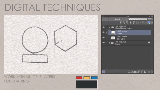
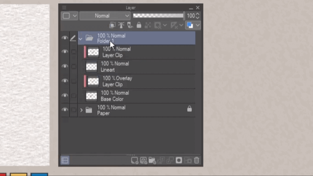
Work with Multiple Layers for Shading
・Layers
・Layer Opacity
・Blending Mode
It’s possible to work with just one layer but to make room for mistakes, it is good to use multiple layers.

Here is an example of what can be done with multiple layers. Creating separate layers for the sketch, base color, shading, and highlights will help create details at each stage without damaging the overall image.
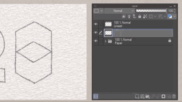
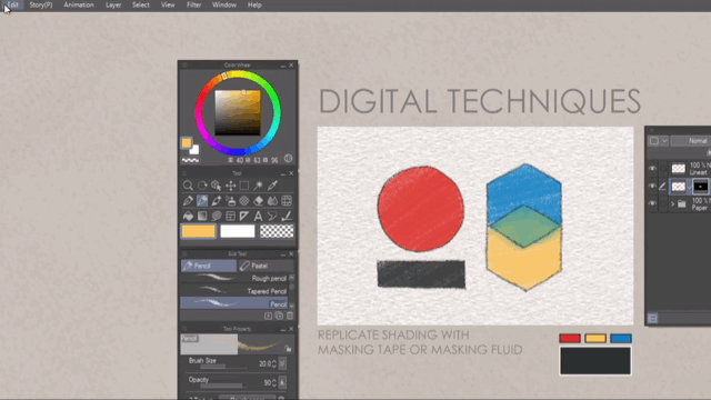
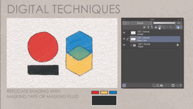
Replicate Shading with Masking Tapes/Masking Fluid
・Selection
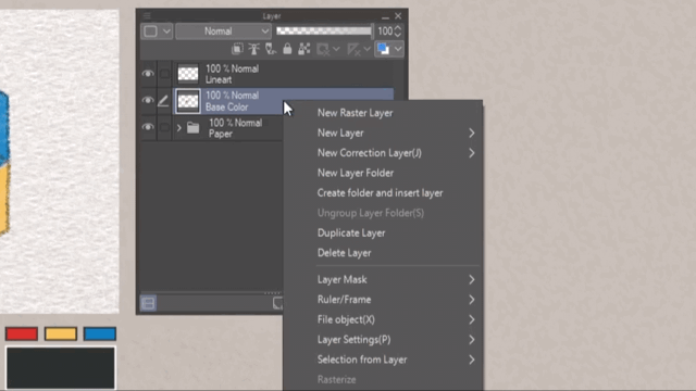
・Layer Selection
・Layer Mask
・Clipping
・Lock Transparent Pixels
Masking technique similar to traditional drawing is done to focus on getting clean shadings without going over the lineart. Digital art allows for non-destructive editing, meaning, modifications, or undoing changes without permanently altering the original content is made possible.
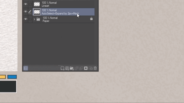
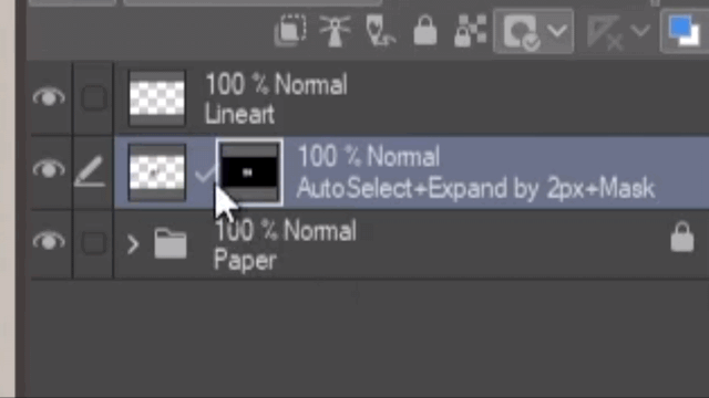
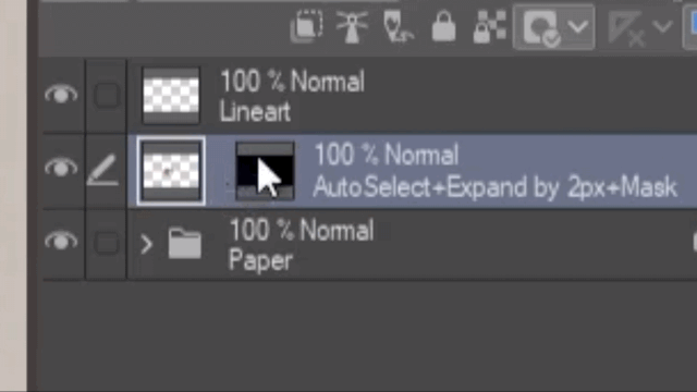
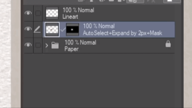
For Selection such as Autoselect, two ways can be done. Selecting inside of the lines and then expanding it to avoid filling with white pixels remaining, or creating a selection outside of the lines and then making an inverse selection.

Create a layer mask based on the selection. Layer masks are an indestructible feature that helps in revealing or hiding specific parts of the layer, or to control the transparency of the layer.
Layer masks are handy when creating smooth transitions between different parts of the illustration. It is also helpful in making intricate selections and then applying effects.

By unlinking the mask, we can move the position of the colored layer without ever going over the lines. This is helpful when moving patterns within a colored portion of the lineart.
If the mask is linked, the layer will move along with the mask intact.
Making intricate erasures without permanently damaging the initial shade is particularly helpful.
To reverse selected areas that were previously hidden or revealed, create an inversion of the mask by using the Reverse Gradient.
After shading, there is an option to apply the masking directly to the layer. However, merging the mask's transparency information with the layer's content will result in permanent alterations.

Layer selection allows the process to create selection within a specific layer. Use this to apply changes, edits, or modifications to the desired layer. This is particularly useful when there are existing layers that need editing.

Another way to color without going over the lines while directly editing on the same layer is by locking the opacity. Do this by clicking on Lock Transparent Pixels. This feature focuses on preventing changes to the transparent areas of a layer.
Another way of masking is by Layer Clipping. This allows the user to limit the visibility of one layer based on the content of another layer. This is particularly useful when adding adjustments through Blending Modes or creating Effects on a Group of Layers.

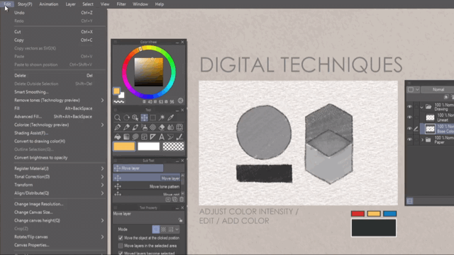
Adjust Color Intensity / Edit / Add Color
・Tonal Corrections
・New Correction Layers
Tonal Corrections or Correction Layers adjust the tonal aspects of an image. These are useful for refining the overall appearance, making it brighter or darker, or it will enhance the contrast. Correction Layers are the non-destructive version of the Tonal Corrections.
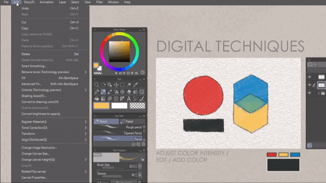
Unless it is within a folder, clipped to a folder, or clipped to a layer, note that upon using Correction Layers, everything else below it will be altered all at the same time.

My favorite thing is the Gradient Map, especially when doing grayscale coloring. It helps me focus on trying to replicate the pencil texture, focusing first on the light and dark values when shading and then using the Gradient Map to add the desired colors.
Add More Texture
・Convert Brightness to Opacity
・Reverse Gradient
When pencils are shaded or pressed against the paper, some texture is lost and replaced with a shiny, smooth surface. Paint over texture above the softly shaded areas, adding realism to the pencil illustration.


Drawing Process
(Update 2023.09.03)
Now proceed with the drawing process for pencil illustration.
Prepare the Paper:
Create the desired paper texture for the base. Create a folder containing the Paper Texture and related Layers. Create a Folder above the Paper containing the Drawings. These are the Sketch, Lineart, Color, etc. Create a Clipping Layer containing the same Paper Texture set to the desired Blending Mode and Opacity, above the Folder, containing the Drawings to control Texture.
Sketching the Initial Outlines:
Start with light, loose lines to rough out the basic shapes and proportions, roughing out the colors is an option. Ensure accuracy by using reference images. Make sure to have the initial sketch as a separate layer to have the option to delete it once it is not needed.
Building up the Shadows and Values:
Gradually build up the shading and values by controlling the pen pressure. Lighten or darken the areas of the drawing based on lighting, depth, and dimension. Use Selection or Layer Masking to shade without worrying about going over the Lines. Make use of Layers and Blending Modes to control shading, color, and texture. Do not get lost on the subject while doing this.
Blending and Smudging:
Create a seamless transition between light and shadow areas by blending, or using a soft brush to create the smudge effect. Shade while maintaining the texture. You may also erase unnecessary parts for a sharper finish.
Creating Textures through Shading Techniques:
Experiment with different pencil strokes and techniques to depict textures. Varying the tilting, direction, and pressure can add interest and realism. Remember to adjust the Paper Texture to show where roughly shaded areas or smooth areas are.
Adding Details to the Subject:
Use thinner brush size to replicate mechanical pencil’s lead size or freshly sharpened pencils for finer strokes. Pay attention to small details like features, textures, and patterns.
Refining and Clean Up:
To identify areas that need adjustments or refining, taking breaks or stepping back to assess the overall details will be helpful. Erase gently to lift or lighten areas as needed without damaging the texture of the drawing.
Done!
Thank You
Thank you for making it this far and I hope this tutorial can be of proper use. If there are any questions, or would like improvements in my making of the tutorial, please leave a comment down below or you may find me under the list of socials on my website.
Thank you again, and have a good day.
Users who liked this post


Comment