
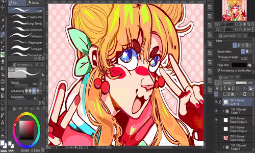
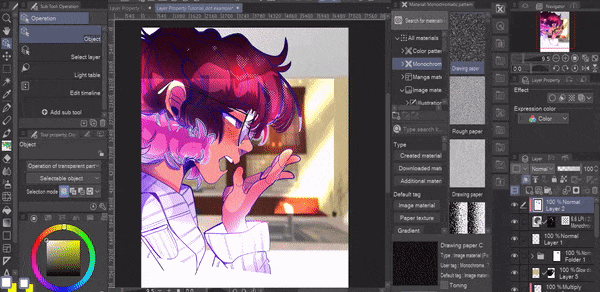
Clip studio paint has many tools and brushes that artists can use to speed up their workflow, but today we’re going over a very powerful and honestly under discussed panel within your workspace. The Layer Property Panel! Alright alright, it’s not the most flashy looking tool within Clip Studio Paint but stay with me here-
Introduction To The Layer Property Panel
If you can’t find the layer property panel. Go to window, and click the Layer property panel.
If it has a check it means it’s already visible in your workspace, if it’s off it means it’s not currently visible, clicking on it will make it appear again.
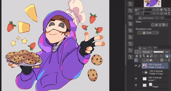
The Layer Property is split up into two separate sections. The Effects and The Expression Color.
The expression color settings changes how many kinds of colors can be handled in a file or layer. You can change the expression color on individual layers
or before creating your canvas you can change the settings for the file so all of the layers you create within it will have the same expression color settings.
Understanding Expression Colors
But why do we care about the expression color? What does it even do? By default every clip studio file you make will have the <color> setting on every layer, wow crazy, Nothing changed. Congratulations.
You can draw and paint, with all 16.77 million colors, pretty much all the colors that the human eye can distinguish. Did you need to know that? No, did I tell you anyways because I want to show off that I read the clip studio paint manual multiple times for these tutorials. Yes.
Monochrome Expression
Let’s talk about the Monochrome Expression setting.
It only allows two colors on the canvas, black, white, and transparency.
This setting is important to turn on for artists who want to print monochrome manga and comics. Or if you just really really hate the color gray for some reason.
You’ll notice that painting with any brushes that have anti aliasing (these gray pixels that show up when you draw a line to make it appear smooth) only the color black will appear on the canvas.
If you want to create some fun shadow effects with a Monochrome layer, merge your artwork and duplicate it.
set the top layer to monochrome.
Then click [apply expression color of preview]
switch the layer back to color
Finally, to remove the white from the layer.
Go to edit, and click [convert brightness to opacity]
Now you can change the shadow color and use it however you’d like!
Gray Expression
For those artists who love the saying that "Life is not always black and white, it's a million shades of gray." Meet the Gray expression color setting. It doesn't include a million shades of gray but rather 256, sorry to disappoint.
HOWEVER it does allow for a bit more wiggle room when it comes to creating manga or comic panels in the classic grayscale style. You can technically paint with “color” but it’ll always appear with the equivalent tone of gray.
Quick note, if you decide to change the expression color on a layer it won’t add any additional colors onto what you’ve placed.
For example if you swapped from a monochrome layer to a grayscale layer it won’t add any anti aliasing unless you paint on the layer after the changed settings.
Intro To Layer Effects
Alright alright, I’ve talked your ear off about 3 settings, we’re going to take a bit of a break from the thrilling world of black, white, and grayscale to jump into some layer effects! The secondary part of the Layer Property Panel. Starting out with the Border Effect.
Using The Border Effect
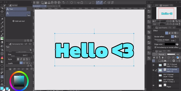
The Border Effect is simple, but ONE OF THE MOST VERSATILE tools you need to know how to use. From thumbnail borders, text effects, stickers, sprite outlines, and it even can be its own drawing assistant. I use the Border Effect all the time, and it’s sooo easy to use.
With a click of a button it will use anything you have placed in a layer and create a border around the outside. Sometimes it doesn’t always give the best results because there’s two things to keep in mind.
1 you’re using a textured brush. Like I said it uses the art on the layer you select and outline it exactly which means textured brushes will create a bumpy effect.
And number 2 during the art process you might’ve left very small pixel fragments on your canvas and the effect is picking it up.
You can fix both of these errors by erasing around your art.
BUT SOMETIMES that takes way too long. I personally suggest selecting all of the elements of your artwork,
[Hit CTRL on the layer icon if all of your artwork is on one layer, otherwise you can hit CTRL and hold shift as you press CTRL on each layer for your artwork]
invert the selection
and then increase the selection slightly.
Once you’ve done that you can hit delete or click the delete button in the selection toolbar.
You can also create interesting shapes by taking a larger brush, adding a border effect to the layer and then drawing.
If you want to turn the shapes you made into lineart make sure the stroke color is black, then hit [convert brightness to opacity] after that you can change the lineart color to whatever you’d like.
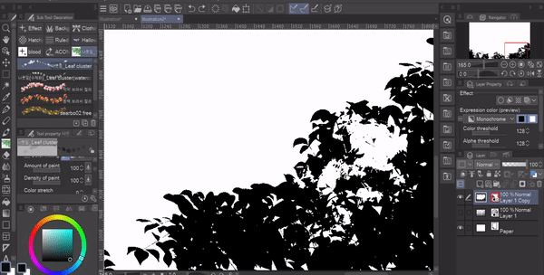
Watercolor Border Effect
You can also change the outline to a watercolor effect, keep in mind this can be very process heavy on your computer so be sure to be careful with it.
The Area slider changes the width of the watercolor effect, the higher it is the larger the border will be.

Opacity changes the transparency.

Darkness changes the luminosity of the border.
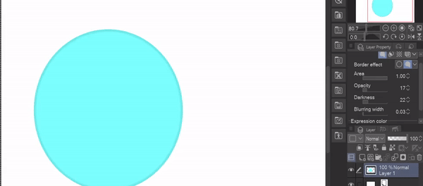
And finally Blurring width changes how much blur is added.

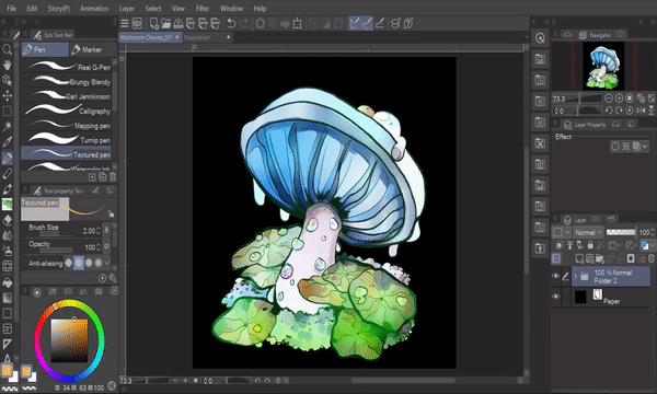
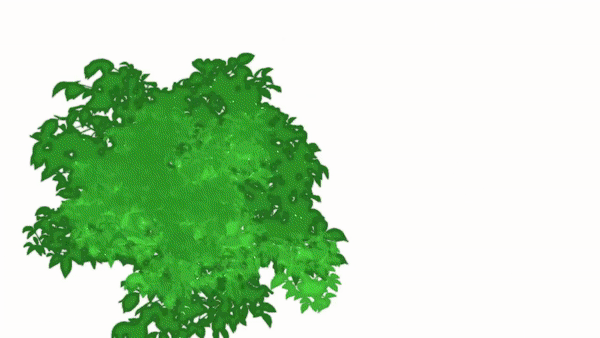
The best way I’ve found to use the watercolor effect is for painting the underparts of bushes and trees since it creates a slight shadow behind everything.
It could be used to also create a drop shadow effect, but I prefer using the normal outline with a duplicate of the image below and blurring the result afterwards, it just gives me more control over the results.
There’s so many things you can do with the Border Effect, I highly suggest playing around with it and seeing how many different ways you can use it!
Adding Multiple Border Effects Together
If you want to layer multiple border effects onto one image to create a sticker effect, create a white border that you like the sizing of, rasterize the image, and then add another border effect on top to create another outline.
Keep in mind once you’ve rasterized a border effect you can’t make any changes afterwards. So keep a copy of the original image just in case you want to try again with different settings.
Understanding Tone Effects
Alright let’s talk about tones, although I’m no professional when it comes to the various rules and tricks to applying tones to an illustration like a manga artist. There are plenty of tips on the clip studio page from other artists that you can check out if you’re interested in that.
I do however use them to create simple and easy backgrounds and effects for my illustrations.
There are two major types of tone layers you should pay attention to, the first being a proper tone layer, indicated by a fill layer, mask, and tone icon.
And the Second being one you create from the layer property panel which just has the tone icon.
Proper tone layers brought onto the canvas through the material panel won’t allow you to paint any additional colors onto the layer. While ones created through the layer property panel will allow you to draw as many different shades as you want onto the same layer.
I find the most simple beginners exercise to understand the settings of a tone layer is to take a filled shape tool, create some scattered shapes and then duplicate it.
Then turn the top layer into a tone, and change the density settings from [use color of image] to [use brightness of image] Now you should be able to see the layer color underneath and your tone.
If you want to change the color you can create a new layer above everything and fill it with whatever color you like.
This method will allow you to continue to change the tone texture as many times as you want without flattening the image.
Alternatively If you’re looking to just add some simple textures to an image you’ve already made, you can drag a preset tone from the material panel
Set the frequency
Then click on the layer mask and hit delete on your keyboard, now you can take any brush you’d like and paint on the areas you’d like the tone to show through.
Once you’re done you can create a new layer above and clip it to your tone layer, from here you can paint the tones any color you’d like.
Tone Effect VS Tone Layers
One of the major reasons you’d want to use a proper tone layer vs a tone layer created through the property menu is consistency. If you paint with multiple tones on a layer with tone effects it will layer and create an inconsistent effect which can be fantastic! If you know what you’re doing with it.
Otherwise, it can be really annoying to edit a tone and not be able to tell which color shade you used on certain sections.
Essentially a tone layer’s density is based on the colors you place onto the layer. The darker the color is, the more visible the tone will be and vice versa.
Tone layers you get from the material panel are one consistent color vs having multiple in one layer. As you change the density settings in the layer property panel it’ll change the entire tone instead of only sections of it.
Layer Color
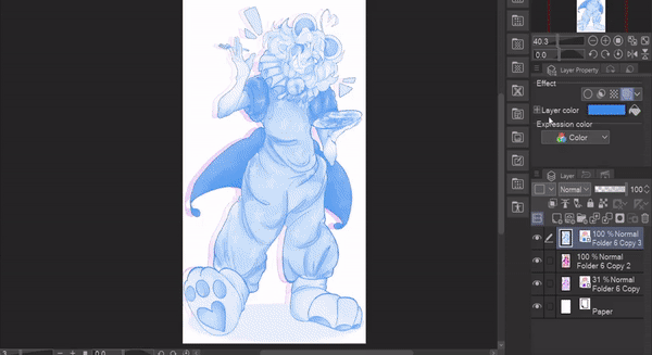
Let’s talk about the Layer Color Effect! At its core it’s a very simple effect. When turned on it changes the layer into a monochromatic version based on the color selected in the effect panel.
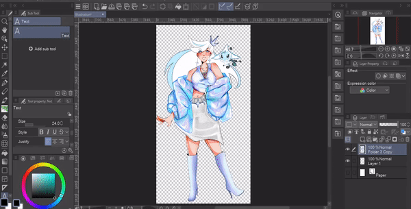
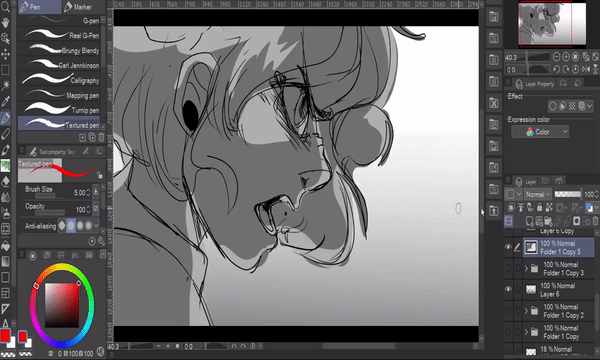
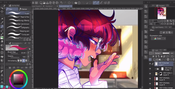
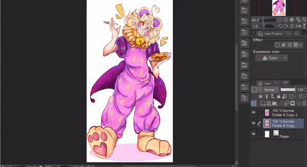
I use this tool all the time when creating illustrations, for example in this illustration I put down the base colors I want to use under my sketch BEFORE getting into lineart, why?
Doing this helps me send rough drafts to clients and it helps me see the difference between objects in my image.
I also use the layer color effect to make my draft one solid color that is less distracting to look at and I do my lineart on top.
Additionally I use this effect to create a backdrop of a character. This is great for creating that extra bit of depth to your art.
Something that is commonly forgotten with this tool is that you can actually set two different colors! By clicking the plus icon you’ll be able to see a sub color you can change. You can also use this tool to create fun overlay’s and color adjustments for your art.
Try it out! I’m sure you’ll be able to create lots of fun effects with this.
Extract Line Alternative For Those Who Don't Have EX
Whew! So far we’ve covered a TON of information, but you might’ve noticed I intentionally skipped over one of the effects, the extract line feature. That’s because it’s exclusive for people who have the EX version of clip studio paint, so instead of jumping into it now I want to cover some alternatives for people who own the Pro version. Sometimes I'll even use this method instead of the Extract line feature in the EX version because of how nice it can look.
Step one: take a 3D model or image you want to create lines for, I’ll be using a 3D model. Since I’m using 3D I’ll have to rasterize my layer. After that create a duplicate of your layer. Name one, “Color” and the other “Line” this will just make the process easier.
Turn off the visibility for the "Color Layer". Now with the "Line" layer selected go to [Filter] -> [Effect] and click [Artistic]
Once you're in the [Artistic] menu click on the option that says [Lines only] once you're satisfied with the result click [Ok]. Depending on the image you use you’ll have to tinker with the settings and the image itself to get the best results.
Additionally if you want to work in grayscale you can make another copy of the base image, set it to monochrome and remove the white like we discussed earlier. This will create a shading layer based on your image! If you don’t like the results, click the plus icon, and then change the [color threshold] slider.
Image after color adjustments
Extract Line EX
Extracting lines from images also known as LT Conversion, is an EX exclusive feature. For the most part, it's pretty straightforward.
You can either right click and select the option [Convert to Lines and Tones]
or you can use the [Extract Line] icon in the [Layer Property] menu. I’ve talked about this feature before in my Ultimate Guide To 3D Models but if you haven’t seen that tutorial before here’s what you should know about this feature!
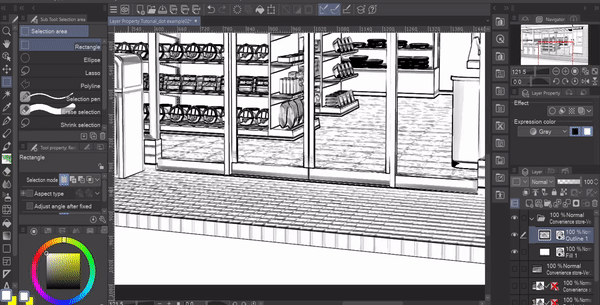
Using this tool you can easily create lines for webtoon and comic backgrounds. No matter which method you use you might sometimes get some random pixel fragments,
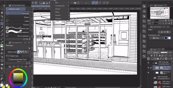
for those cases I suggest going to [Filter] -> [Correction filter] and click [Remove Dust]
This will get rid of all of those random pixel fragments. Doing this is much faster than erasing all of them yourself. NOTE! Be sure to have [Remove Dust From Transparency] on or this filter wont do anything to the image.
You can also use [Adjust Line Width] in the [Correction] filter drop down menu to make the lines thinner or thicker depending on what you want to accomplish.
Overlay Texture
Finally we’ll talk about one last effect in the layer property panel. And right now you can’t see it! Why? That’s because it’s specific to one type of layer, image materials!
For the most part you’ll use this setting for textures, it’s called [overlay texture] It controls how intense a texture will appear on your canvas.
If you want a texture to only affect one layer you can either clip it, or place it inside a folder with the contents you want it to overlay underneath.
[ Finishing Thoughts ]
And that’s it!! Thank you so much for joining me. Make sure to like and favorite this tutorial to save it for later. It also lets me know to make more tutorials in the future! If you want to see more of my artwork you can find it here on my Linktree where you can find my Insta, Tiktok, and Youtube where I post even more content like this!
and with that I'll see you next time buh bye!
✧ Wanna Read Another Tutorial? ✧
Users who liked this post


Comment